Archives: projet
LCI
CONTEXT
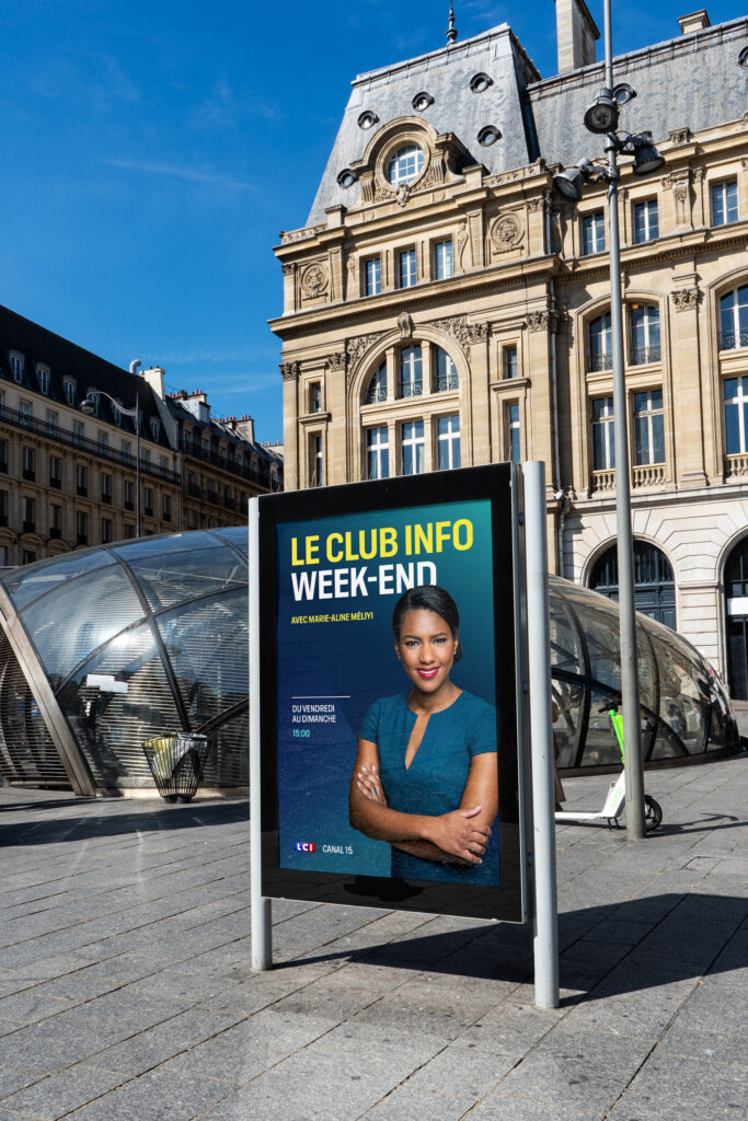
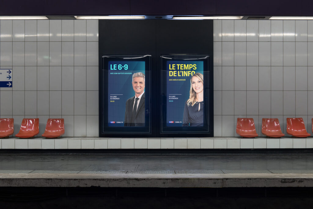
As part of the reallocation of French TV channels, LCI asked 17mars to rethink its broadcast identity. By moving from channel 26 to channel 15, the TF1 group faces a dual challenge: to strengthen its current audience while seizing the opportunity to attract new viewers.
CHALLENGE
Rethink how information can be presented to viewers in a content-saturated environment. Adapting the channel to new, more digital-oriented news consumption habits. LCI is asserting its hybrid identity: a channel that can be read as much as it can be watched.
SOLUTION
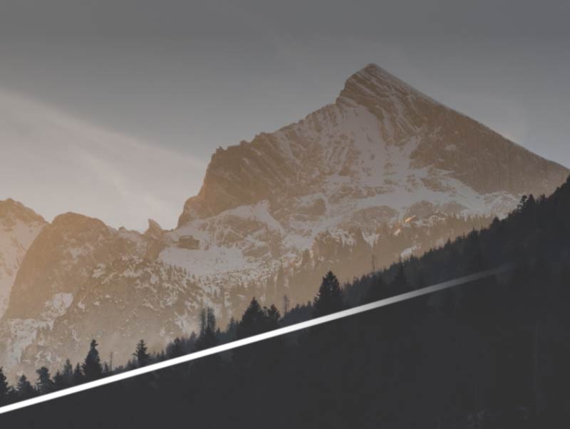
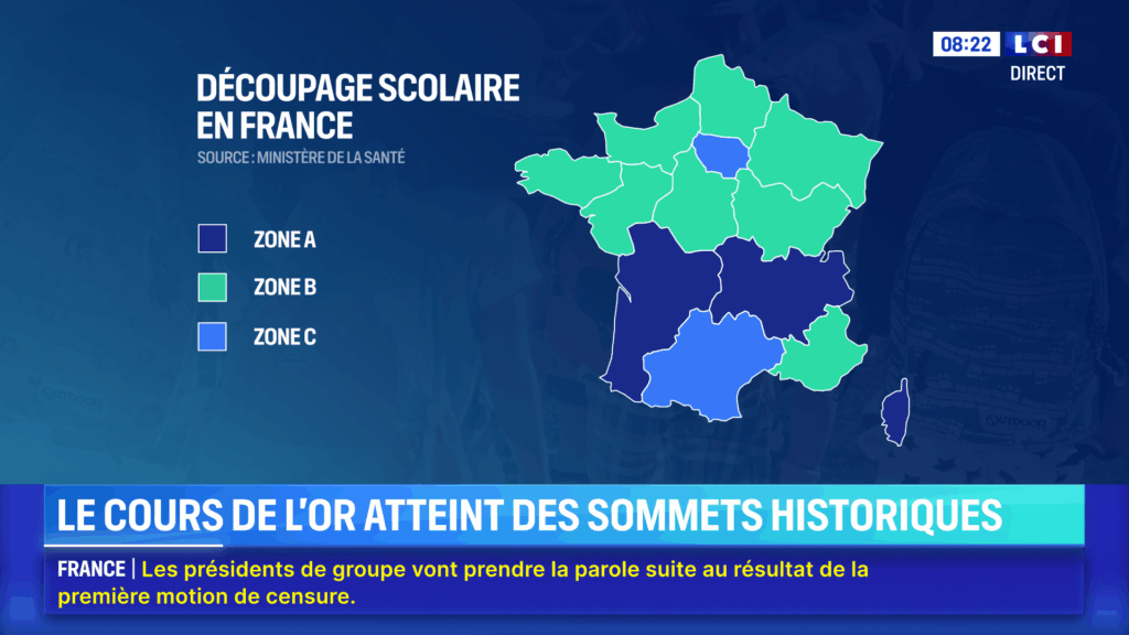
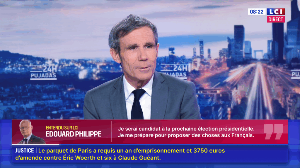
We designed an adaptable, dynamic layout, articulated around a beam of light. Symbolizing the vitality of information, it guides the eye, prioritizes content and illuminates the interface. Thanks to a modular, multi-flow system that can handle two events in parallel, the layout evolves in sync with current events. Responsive and switchable, all elements coexist in a fluid and legible way.
Our digital-inspired approach features an unhooked composition in widget mode.
The color palette is part of the channel’s revival, now incorporating TF1 blue, cyan as an accent color, lemon yellow to highlight key information, and a vibrant raspberry red for live broadcasts. The strength of the Bild typeface combined with the legibility of Inter make an effective complementary duo for a news channel.
JINGLES
CAMPAGNE
MICROLAB MK3
CONTEXT
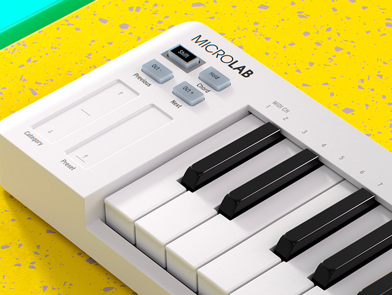
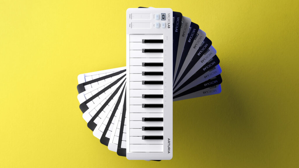
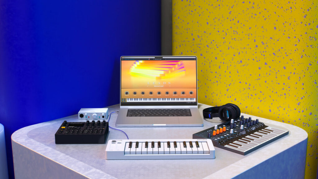
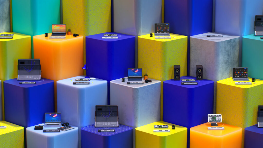
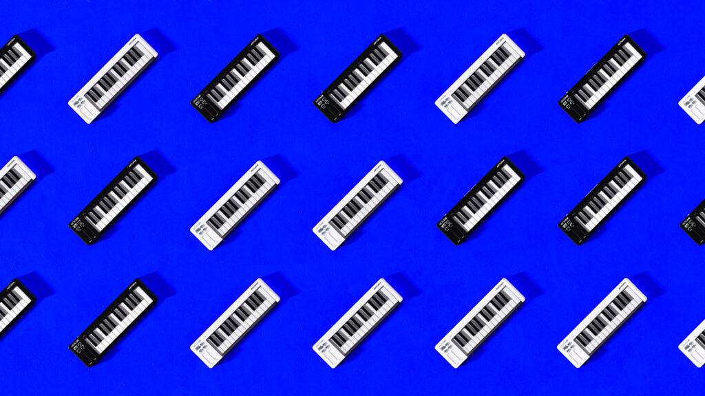
As part of the launch of the MicroLab Mk3, Arturia asked the agency to design a film highlighting this new keyboard and its baseline: “Make music anywhere”
CHALLENGE
Bring to life a tool combining simplicity and ultra-compatibility, designed for experts and beginners alike. Create a film that is both didactic and dynamic, just like the MicroLab Mk3.
SOLUTION
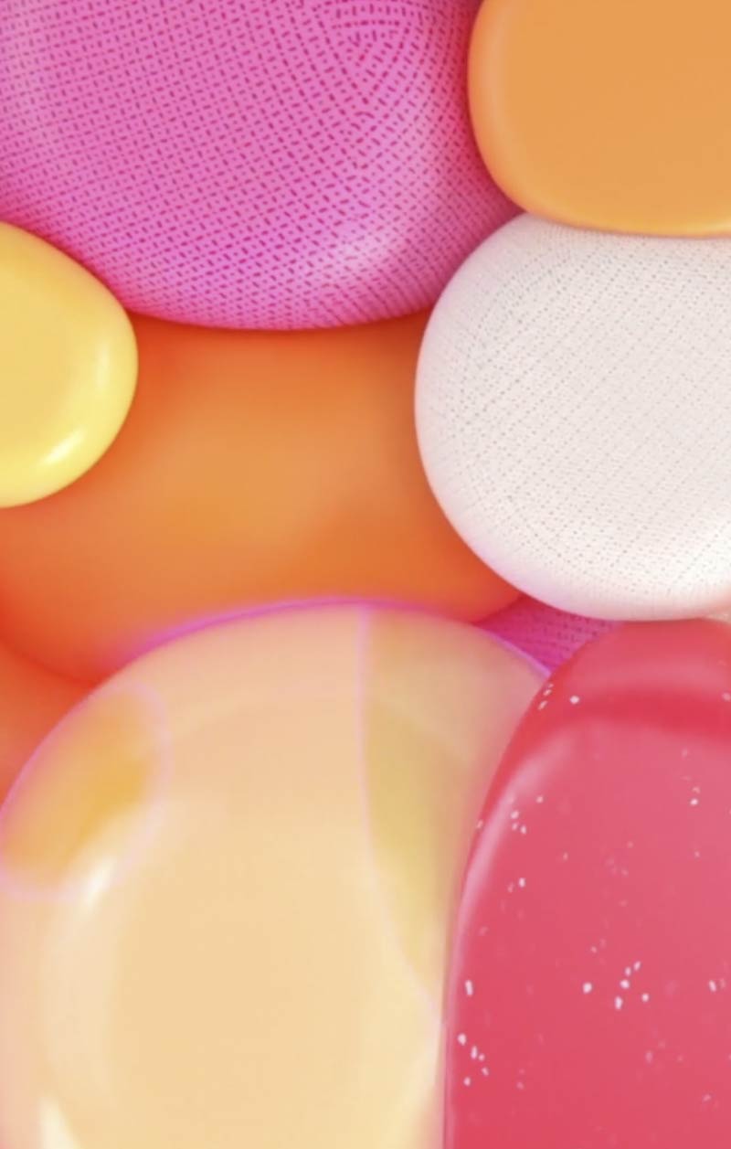
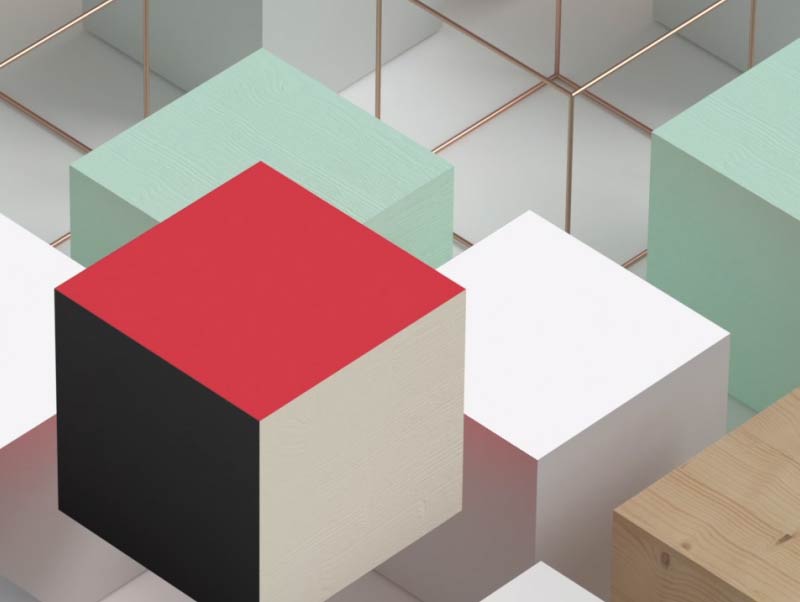
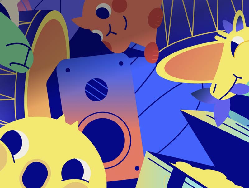
We imagined an evolving and modular setting, designed to reflect the versatility of the MicroLab Mk3. This pop universe, in constant motion and comprising different textures and compositions of objects, was conceived as the ideal playground to showcase and sublimate the keyboard.
PROCESS
DECATHLON X GRIEZMANN
CONTEXT
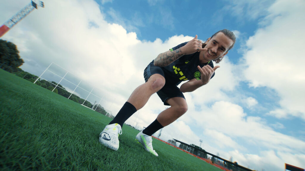
Decathlon is causing quite the stir in the football world by making Antoine Griezmann their official ambassador.
CHALLENGE
Ensure the film’s 3D production, special effects and compositing.
SOLUTION
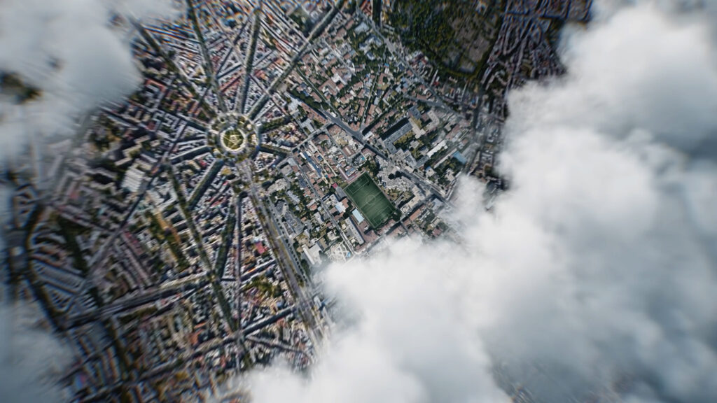
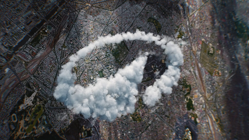
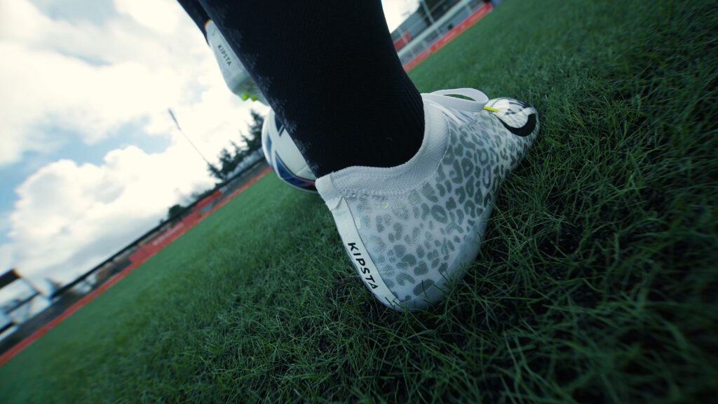
We went for a photo-realistic rendering that accentuates the impact of the scene, becoming direct and authentic. Particular attention was paid to the dynamic of the movement, the logo’s cloud texture, the splice and highlighting of the shoe.

PROCESS
FREEBOX PRO
CONTEXT
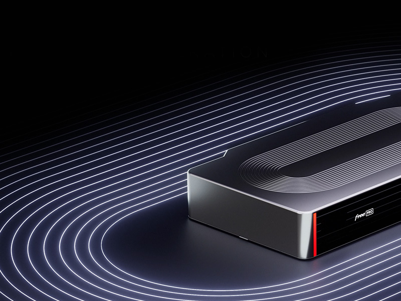
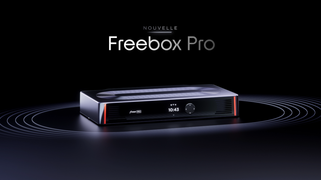
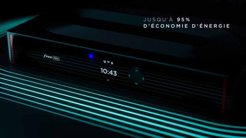
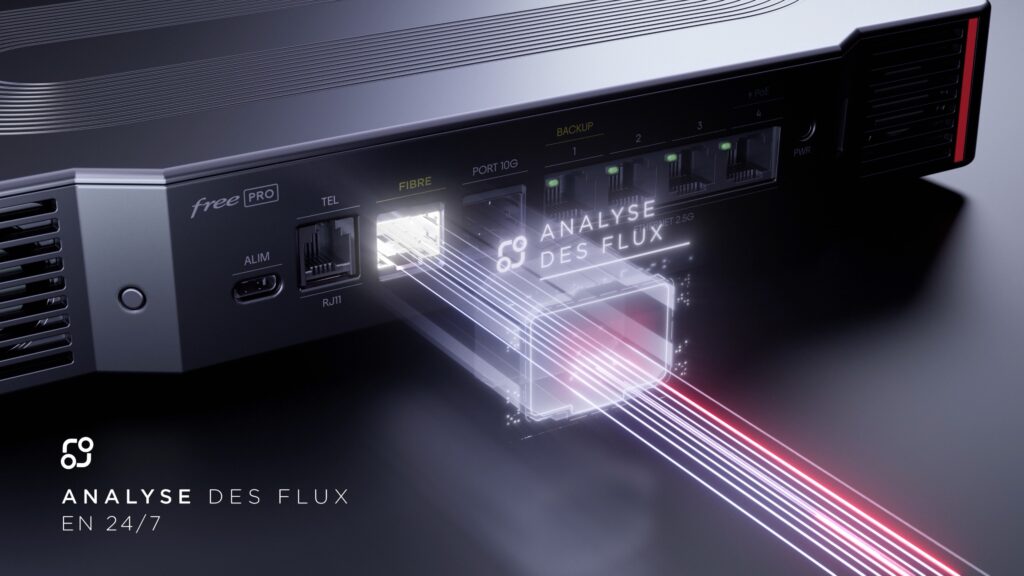
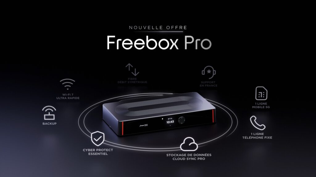
Free entrusts 17mars with the creation of the visual territory accompanying the launch of the second generation Freebox Pro.
CHALLENGE
Develop a sober, striking graphic language for a professional audience.
SOLUTION
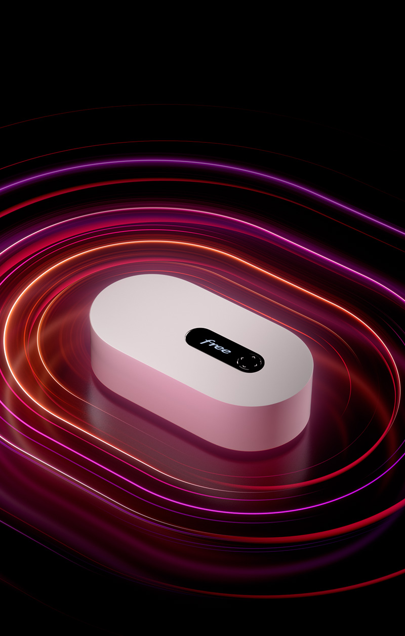
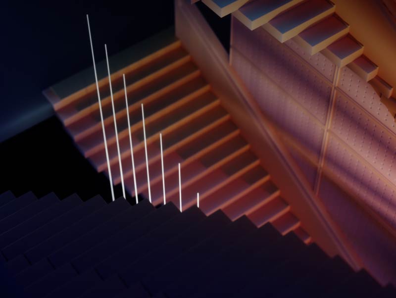
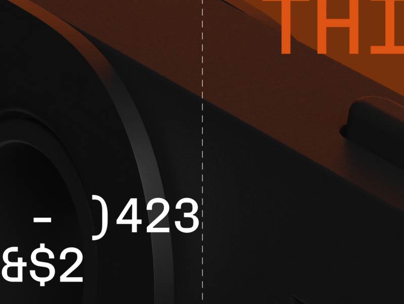
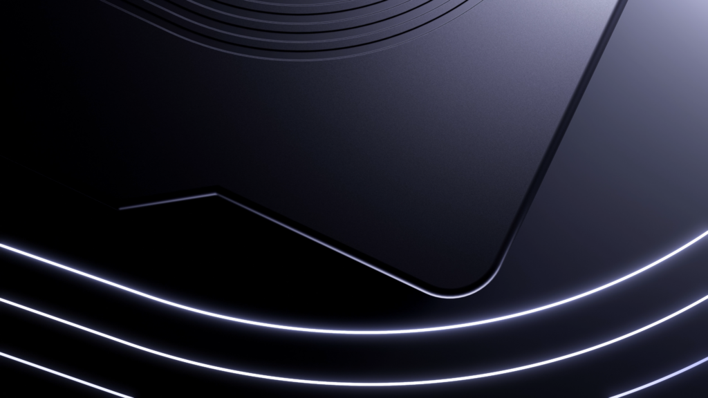
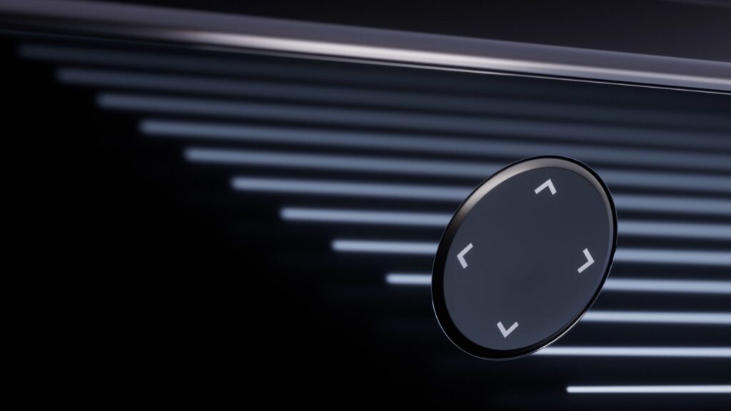
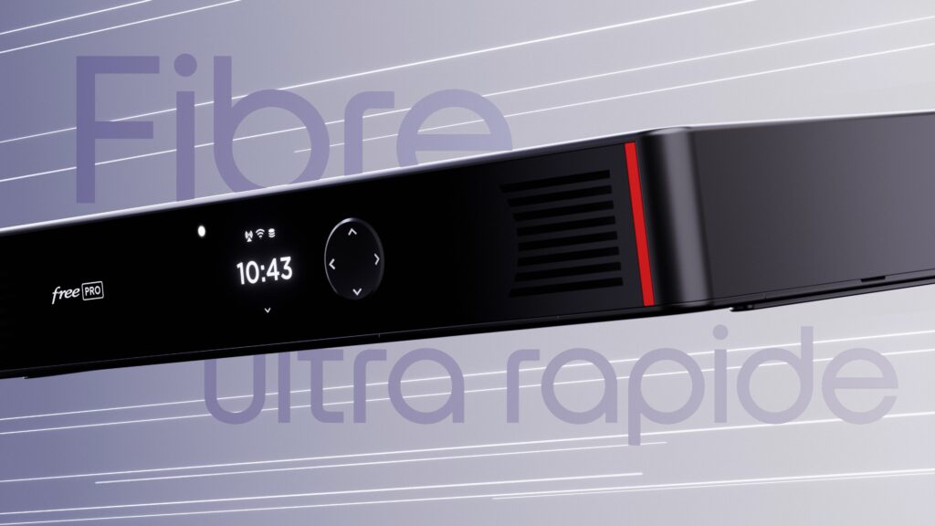
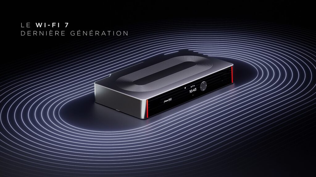
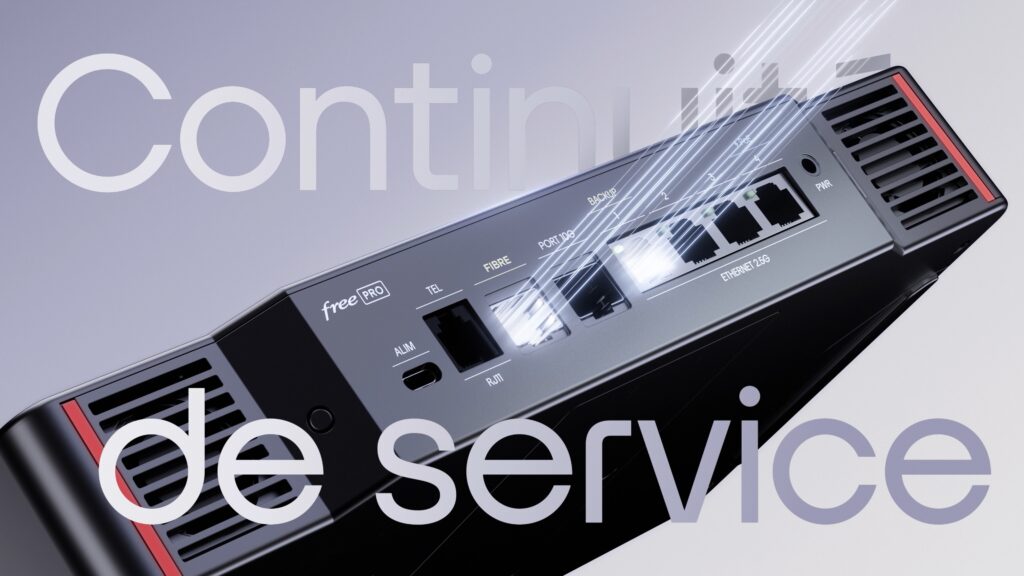
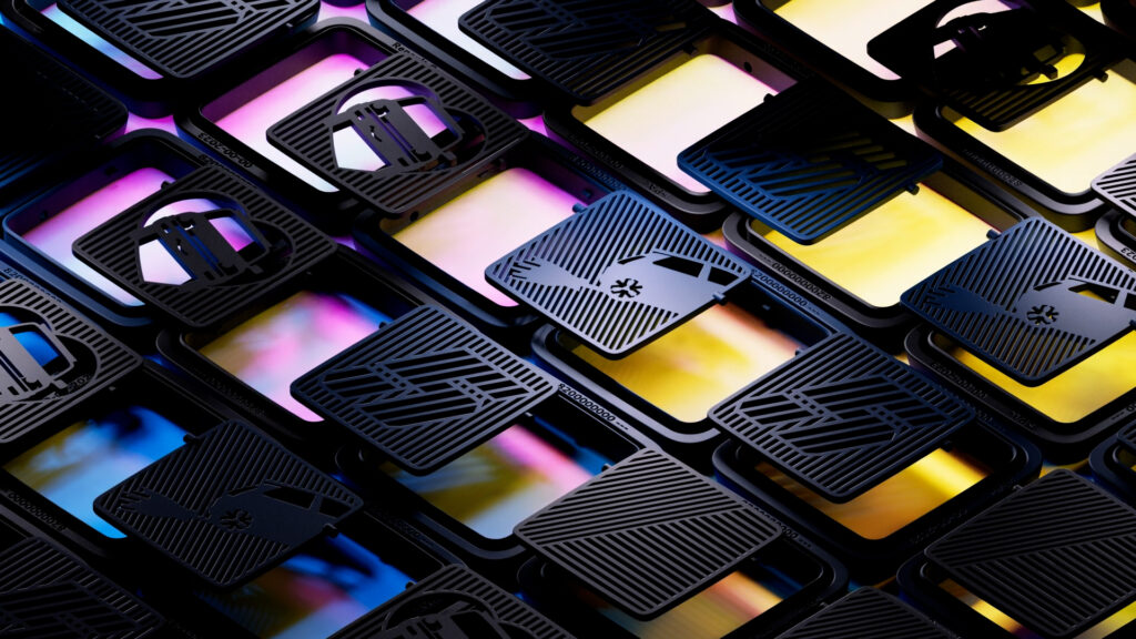
We chose to capitalize on the box’s main design feature: the track & field on top of it. We’ve created a language that continues the luminous lines already present on the Freebox Ultra (consumer box), but this time in a dominant black & white. This way, we’ve magnified the object and ensured consistency with the other products in the Free range.
REVEAL FILM
PRODUCT FILM

ARTE GREETING CARD
CONTEXT
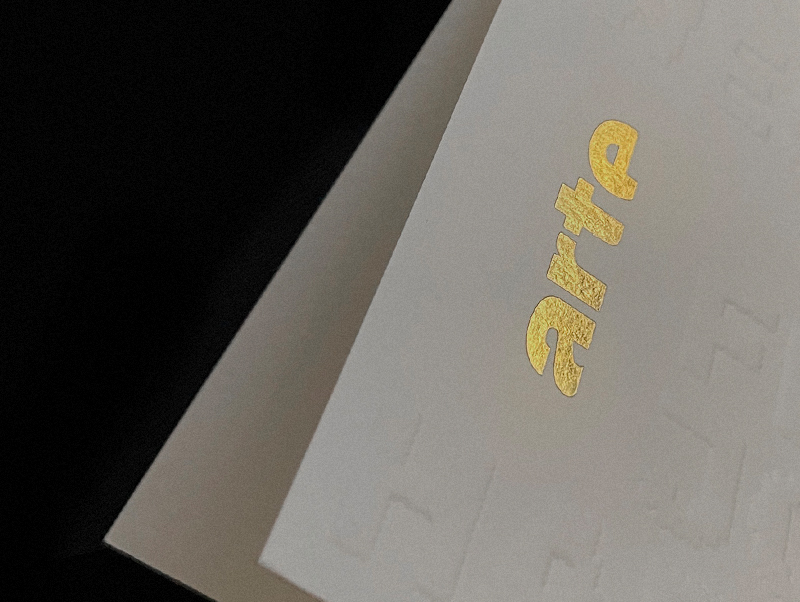
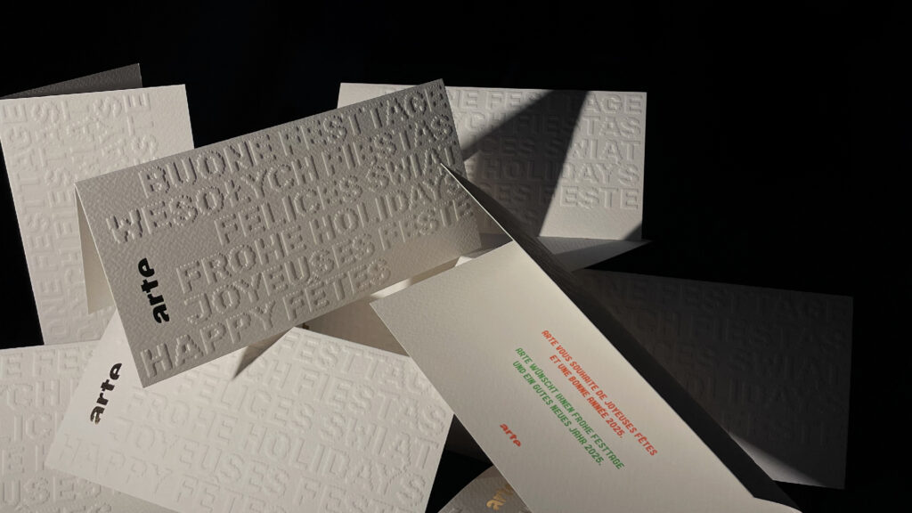
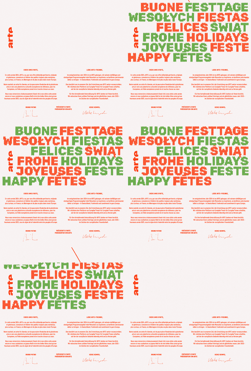
As we were developing their Christmas TV idents, Arte reached out to design their greeting card as well, both in printed and digital versions.
CHALLENGE
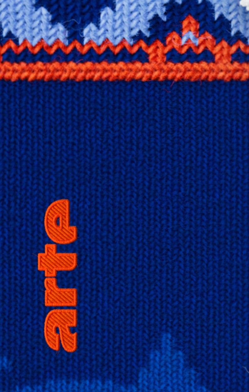
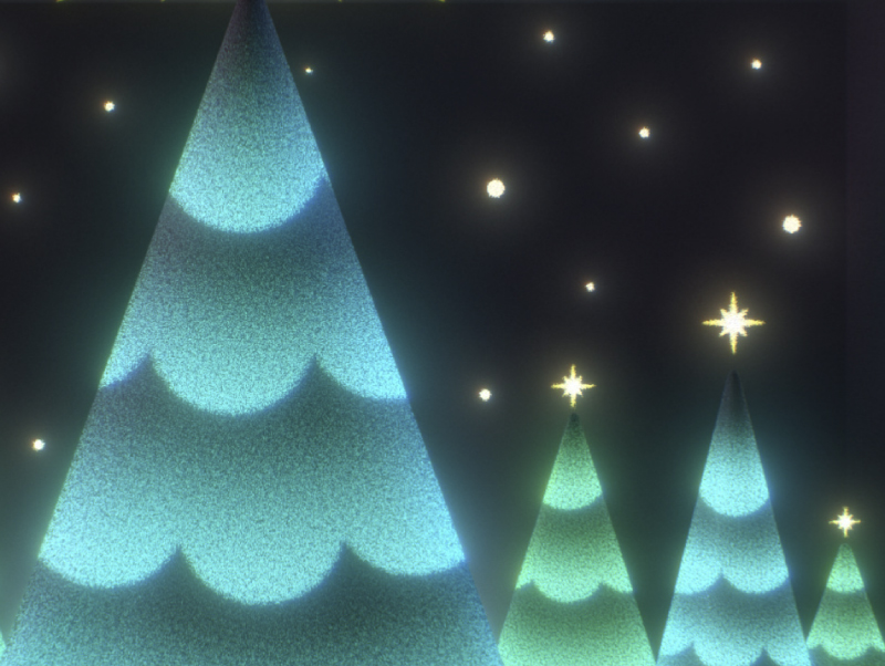
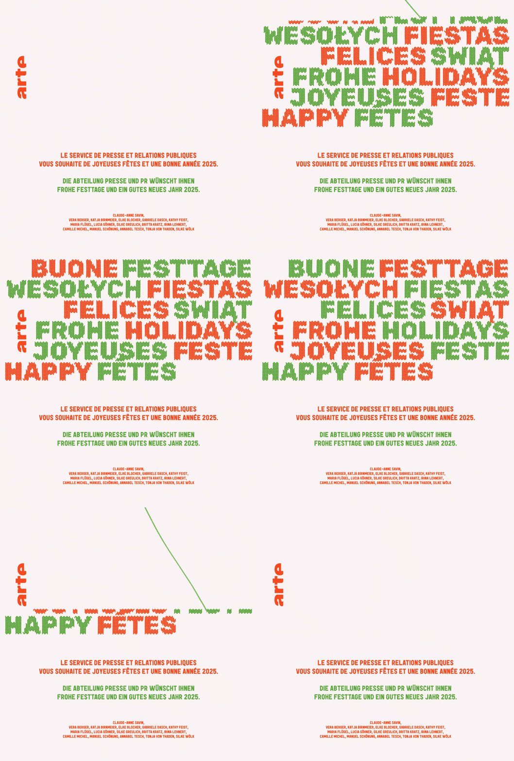
Create a beautiful object that matches the concept we initially developed for broadcast purposes : knitting.
SOLUTION
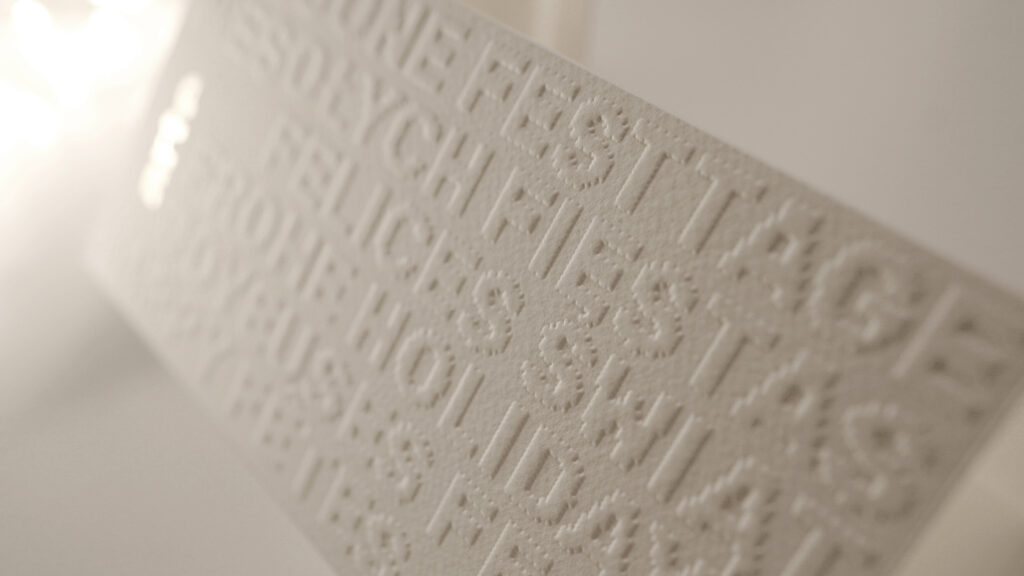
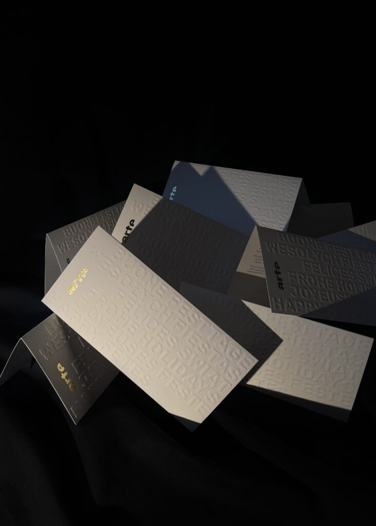
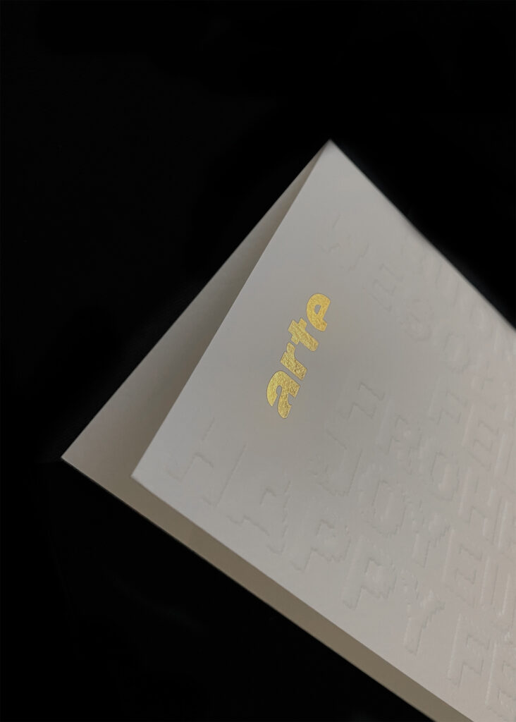
We picked a typographic approach, writing the greetings in each language in which Arte is available. We designed each letter with indented outlines and decided to embrace the embossing technique, reminiscent of the wool’s materiality. The overall effect contrasts elegantly with the foiled stamping of the Arte logo on the front and the two Pantone colors on the back.
DIGITAL VERSION
TWINGO
CONTEXT
At the Brussels Motor Show 2025, Renault is showcasing its brand new Twingo E-tech electric prototype.
CHALLENGE
Design a vibrant signature for the new logo of the famous compact city car.
SOLUTION
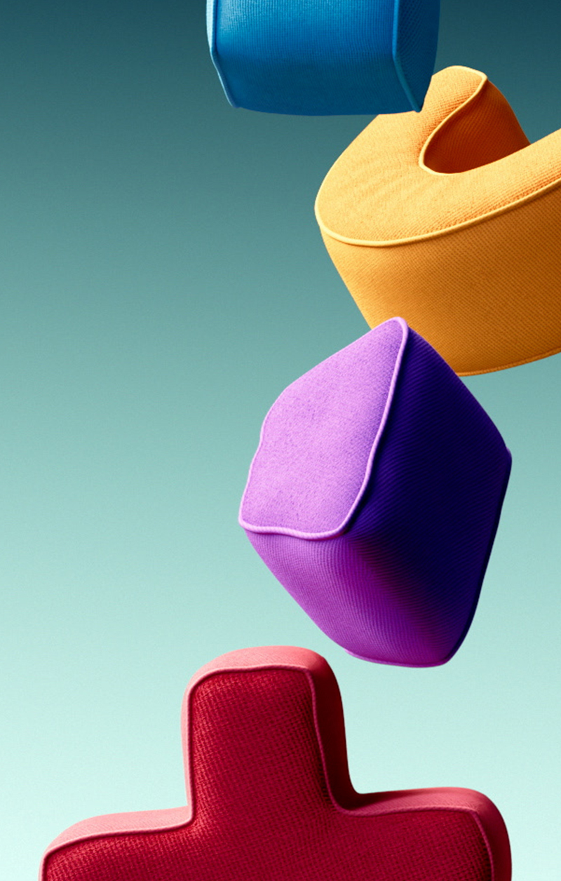
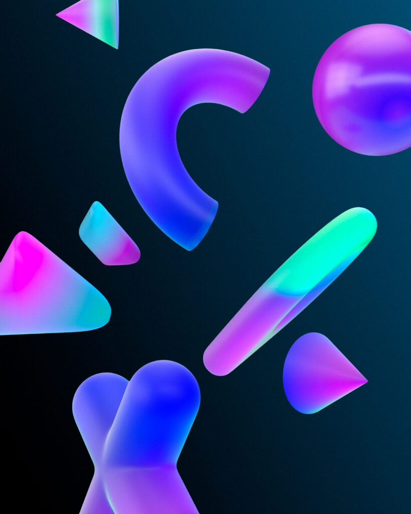
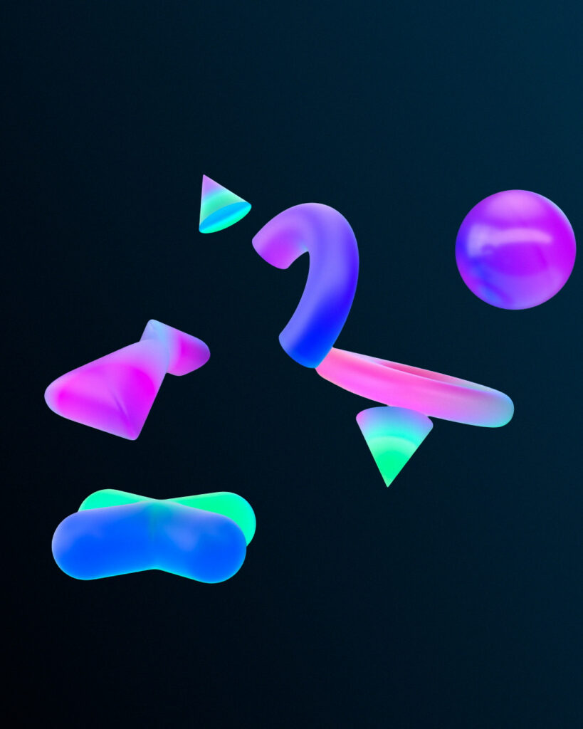
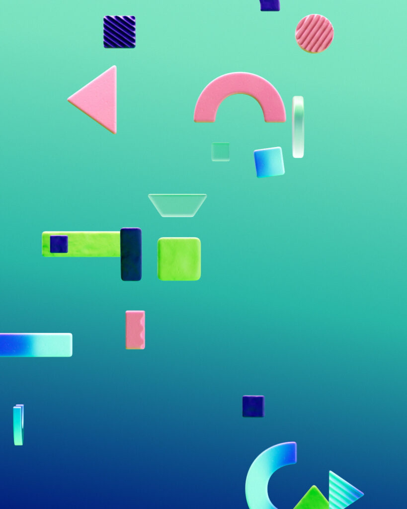
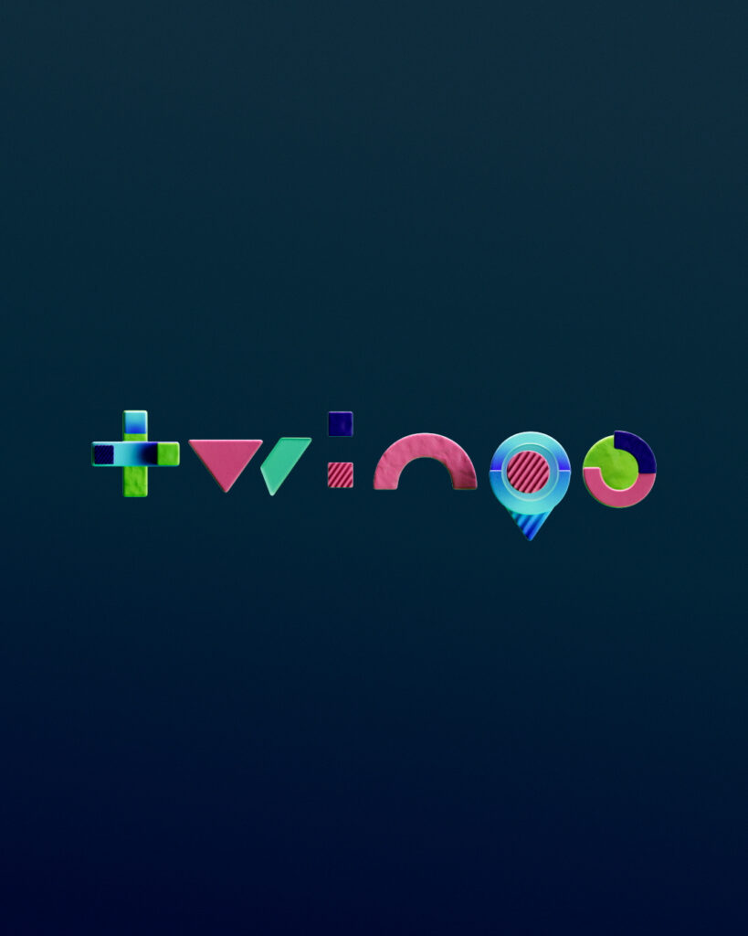
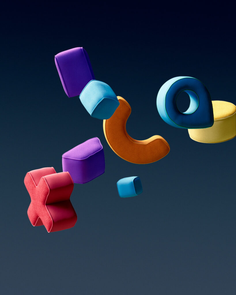
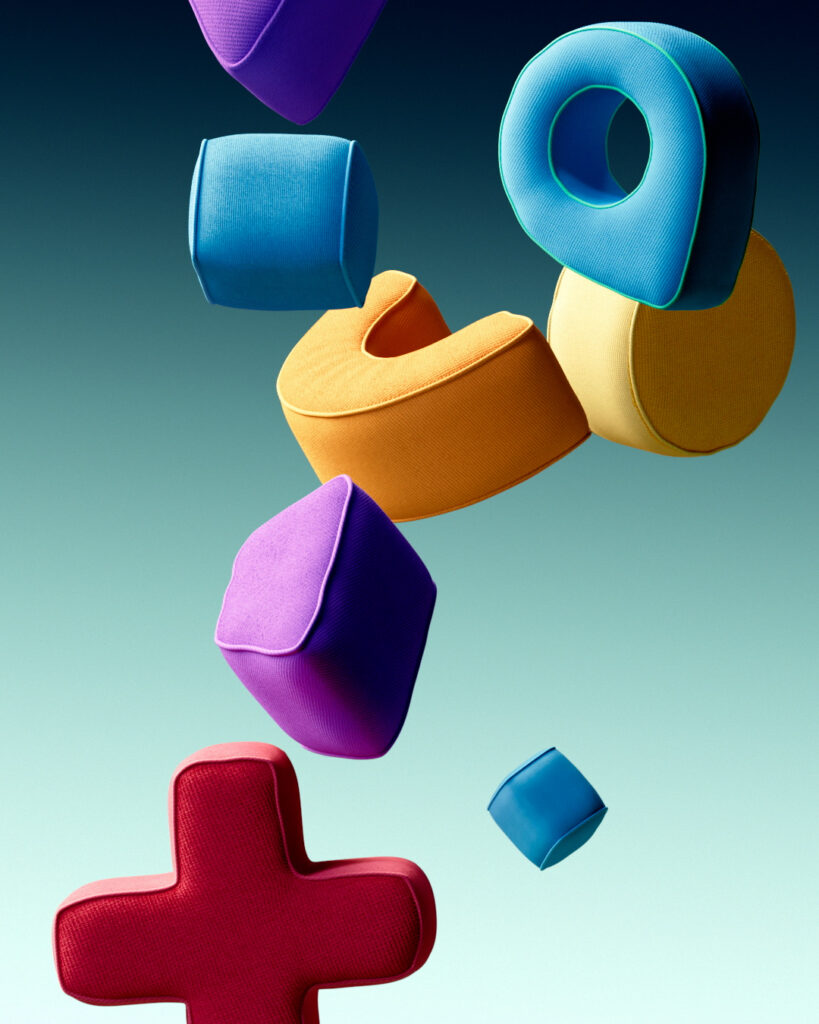
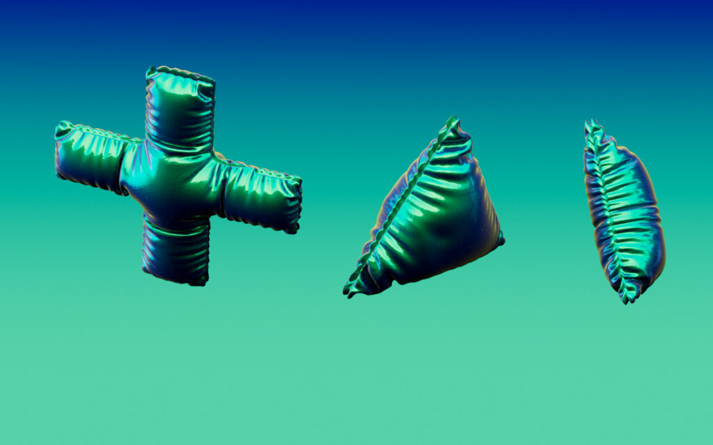
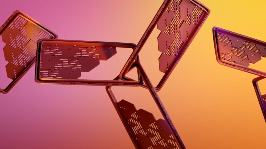
We designed a graphic animation illustrating the three facets of Twingo.
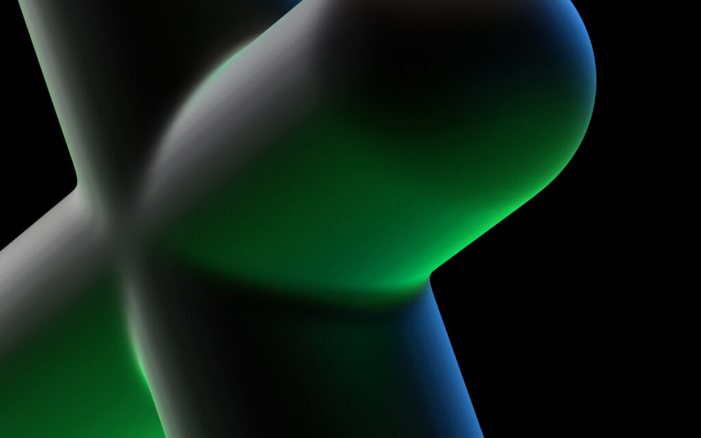
The first, entitled ‘Gradient’, is a play of lights evoking its E-tech particularity.
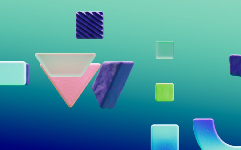
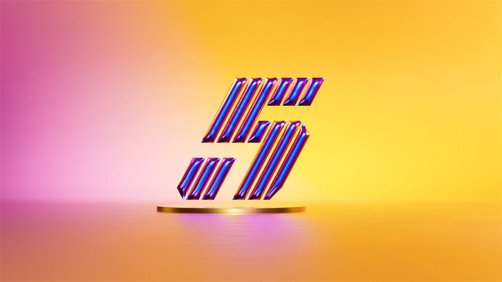
The second, ‘Block’, refers to the vehicle’s modularity.
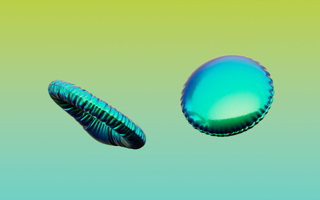
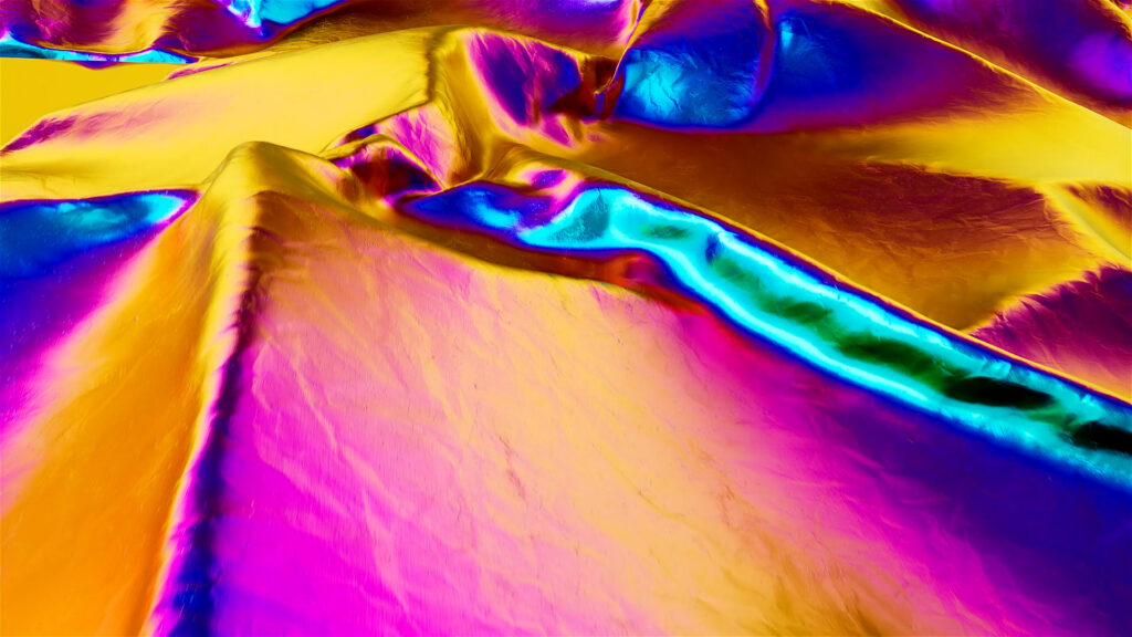
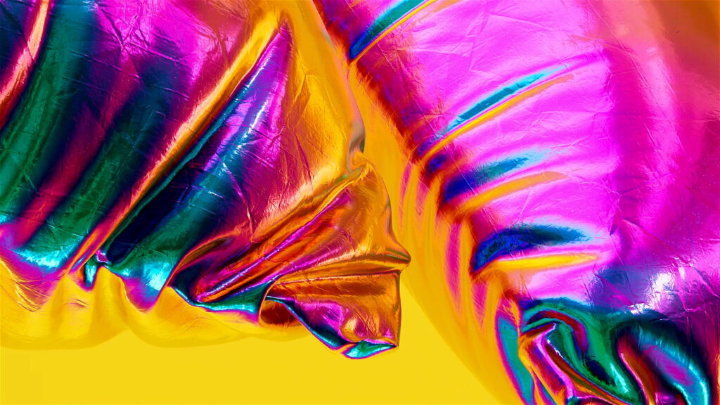
The third, ‘Balloon’, is pop and textured, inviting you to discover the vehicle’s interior comfort.
PROCESSUS






FINANCIAL EXPLORERS
CONTEXT
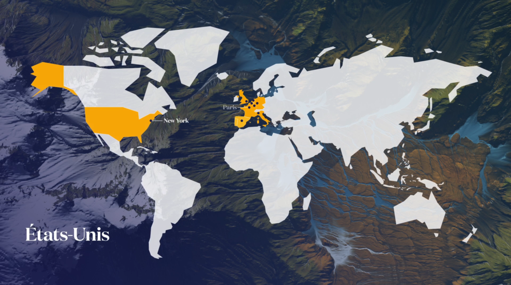
Following the redesign of its brand platform, Tikehau Capital asked the agency to design its very first brand film. We provided communications strategy advice, defining the film’s objectives and the message to be conveyed.
CHALLENGE
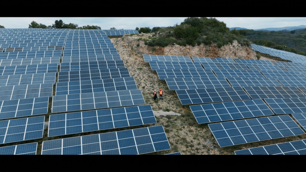
To create an impactful film that unites the company’s employees and trigger brand preference. Imagine a powerful storytelling that reflects Tikehau Capital’s visionary approach: sustainable, “on-the-ground” finance.
SOLUTION
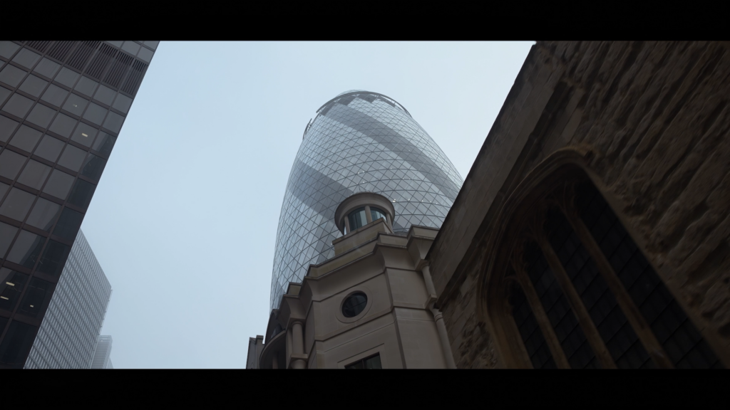
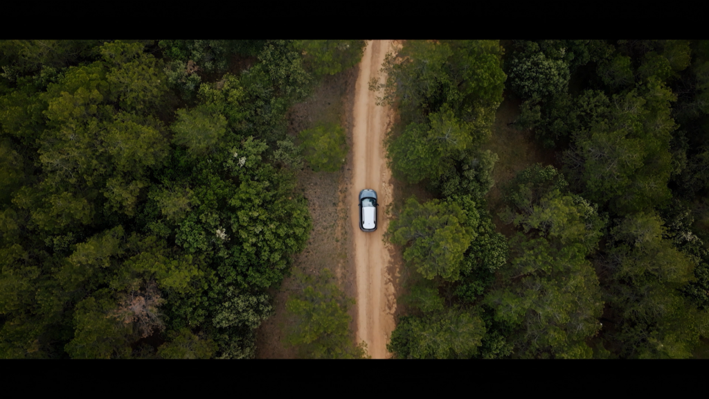
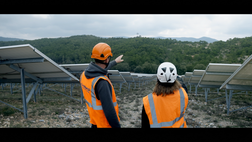
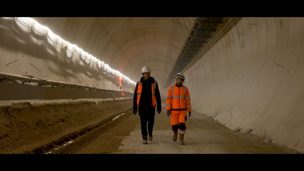
We chose the figure of the ‘explorers’ to tell the story of Tikehau Capital’s pioneering spirit and played on the parallel with the world of sailing (Tikehau is the name of a Polynesian atoll).
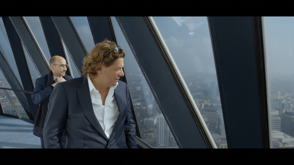
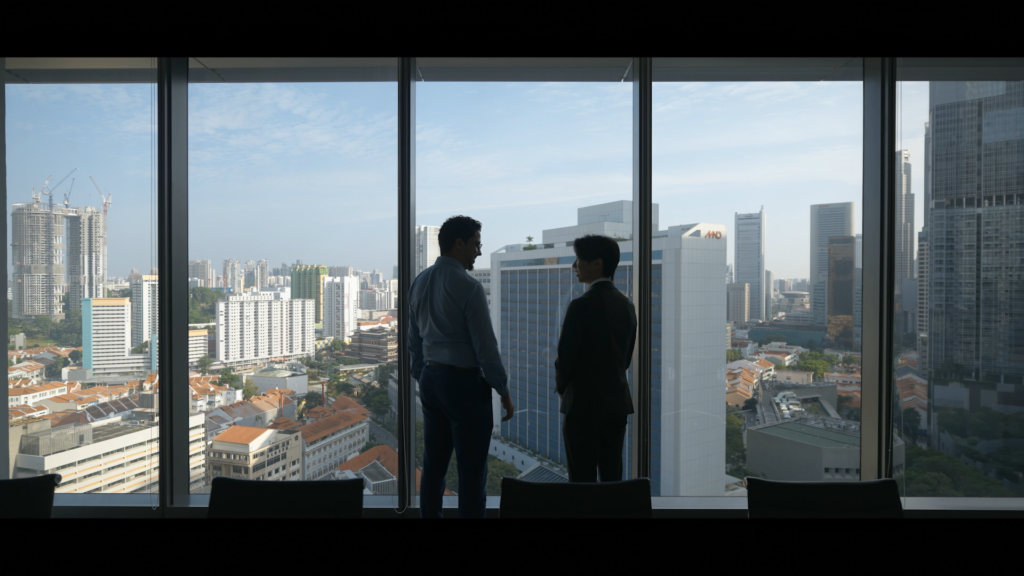
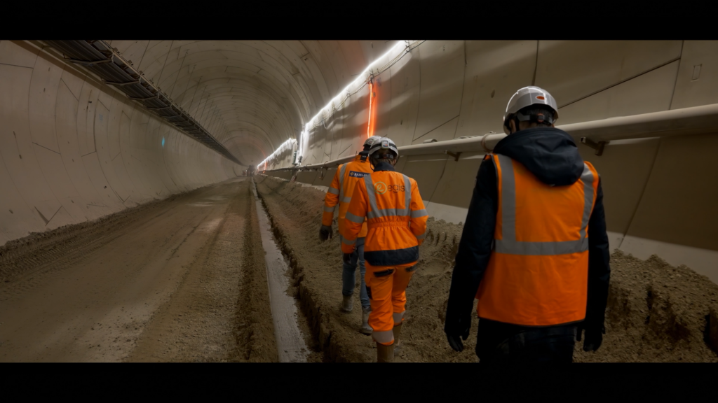
We went to Paris, London, New York and Singapore to film the founders Mathieu Chabran and Antoine Flamarion, as well as various employees.
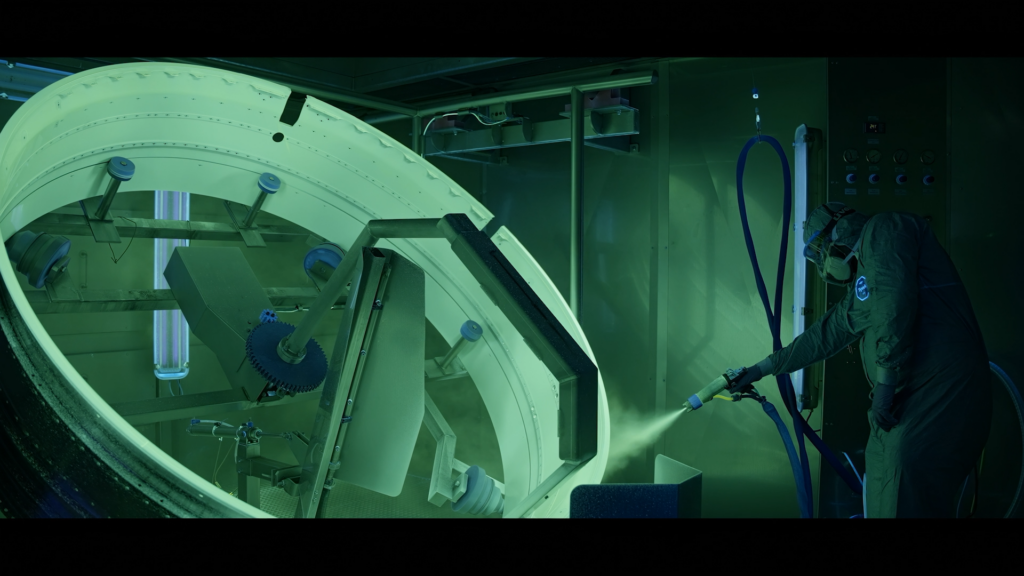
The film recounts the day-to-day life of the firm and its quest for innovative financing solutions.
It highlights the encounters with companies, the investment fund’s taste for exchange and concrete issues.
The editing, supported by breathless music, is epic. It reflects the exciting dimension of adventure, evoking travel and the discovery of new horizons through both image and and the lexical field of the narration.
A KNITTED CHRISTMAS
CONTEXT
The agency’s first collaboration with ARTE, which always takes an offbeat look at the festive season.
CHALLENGE
Designing an original on-air package, as well as a series of three idents. To appeal to the part of childhood that remains in every adult, with a hint of impertinence.
SOLUTION
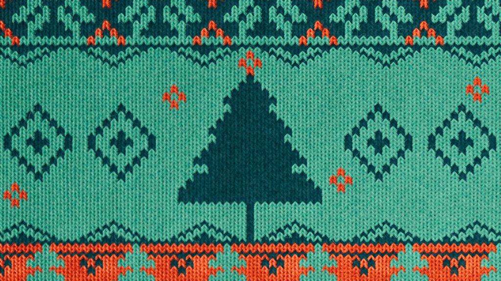
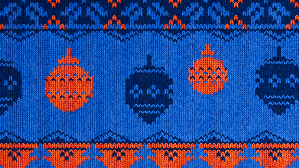
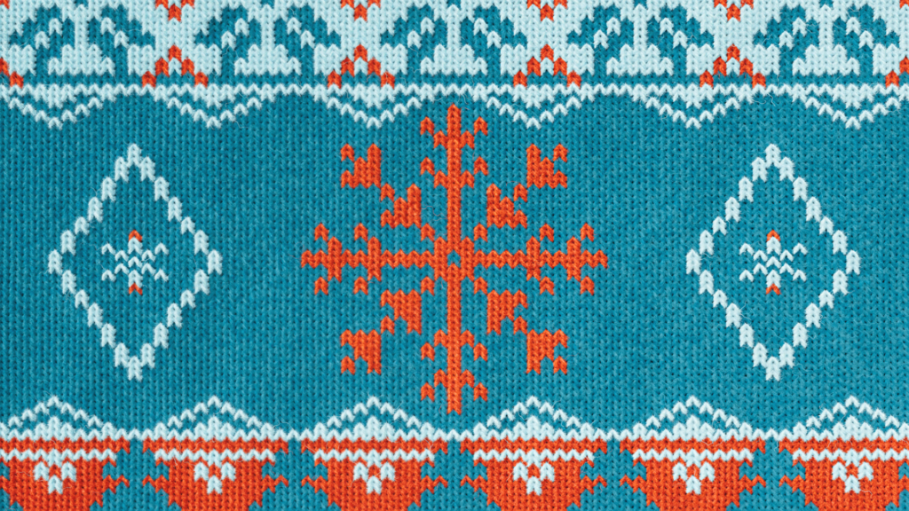
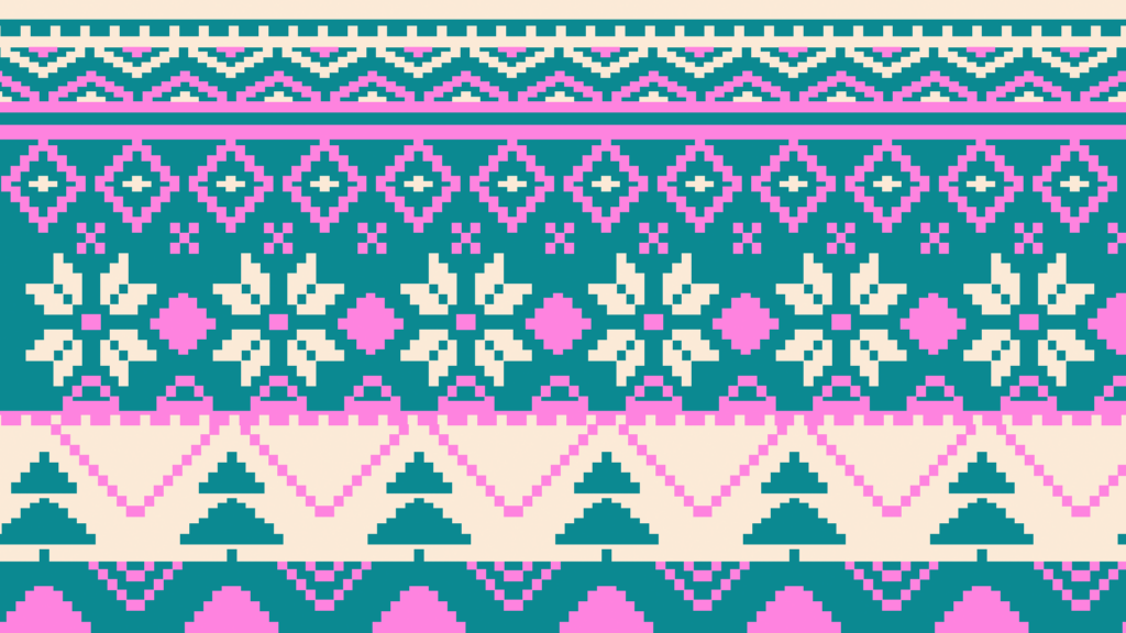
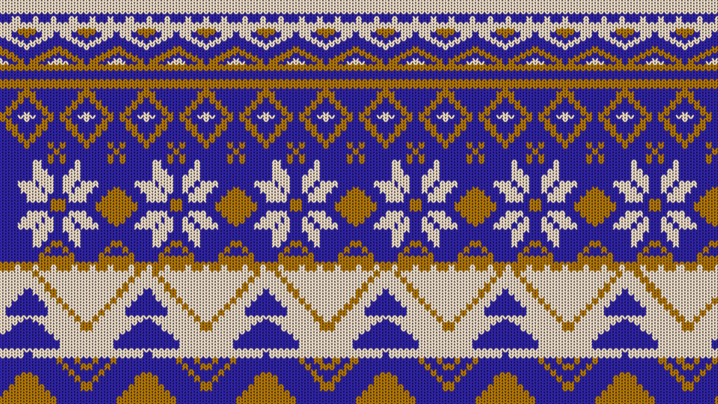
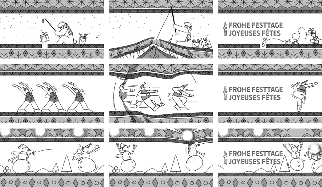
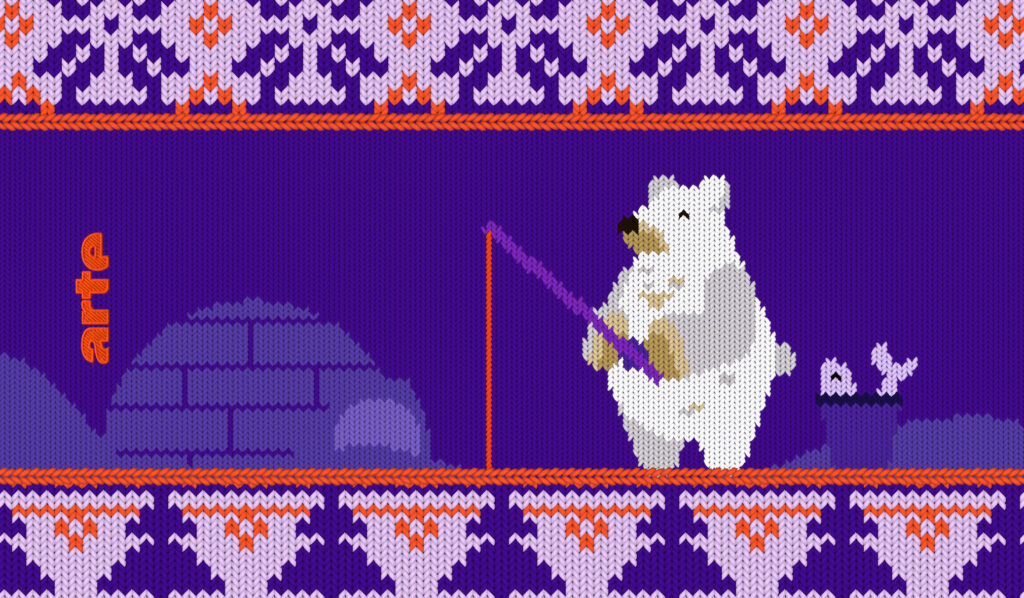
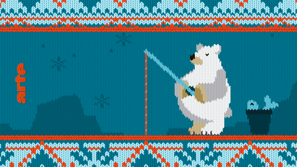
We’re capitalising on the essential Christmas jumper. Using a realistic stop-motion approach, we wanted to make the jumper almost tangible, with all its fur and little flaws. On the aerial it unravels, in the idents it deforms, pulls and gets holes. The 3 idents revisit traditional Christmas figures in a series of comical settings.
ON-AIR DESIGN
IDENTS
PROCESS

DUO REVEAL
CONTEXT
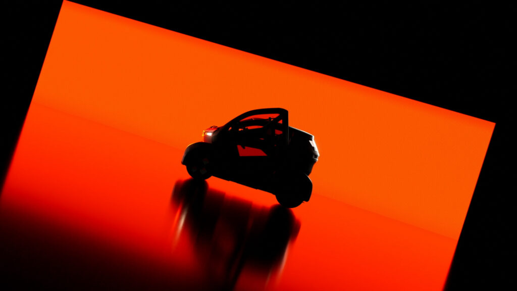
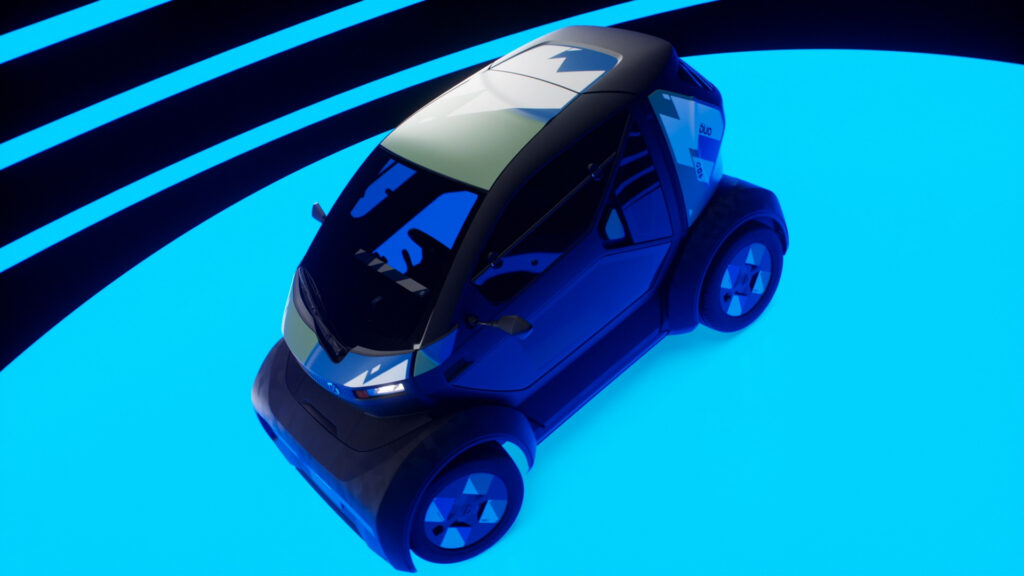
Mobilize, the Renault Group brand committed to sustainable urban mobility, has asked the agency to produce the reveal film for its ‘Mobilize Duo’ electric micro-city car.
CHALLENGE
Sublimate the vehicle, highlighting its features through an aesthetic and exhaustive approach, combining exterior and interior views. Transcend the brand’s urban positioning.
SOLUTION
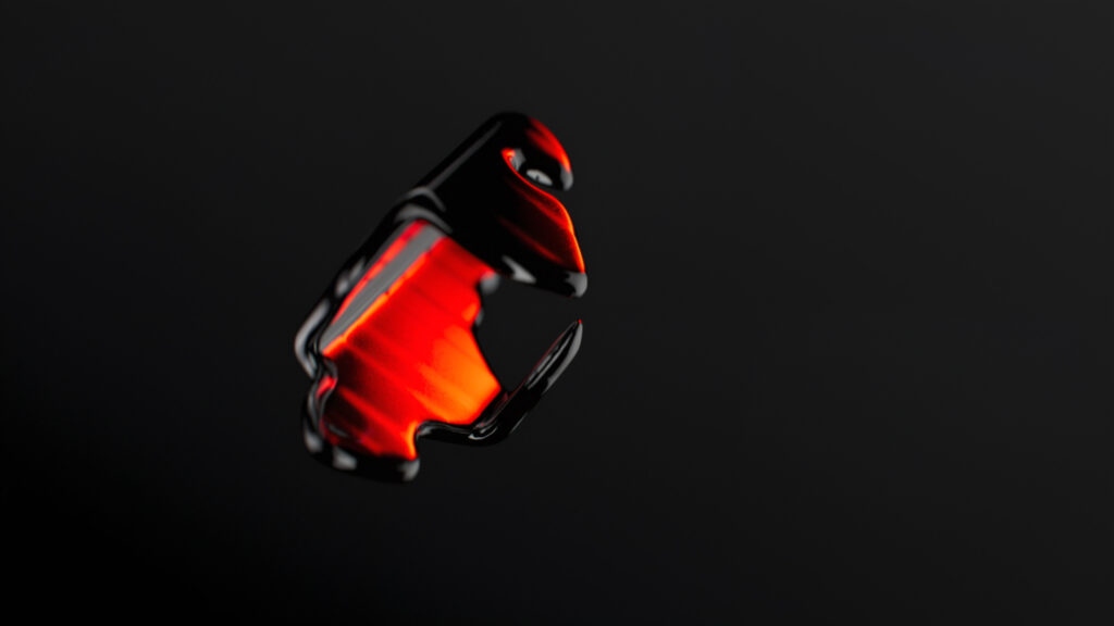
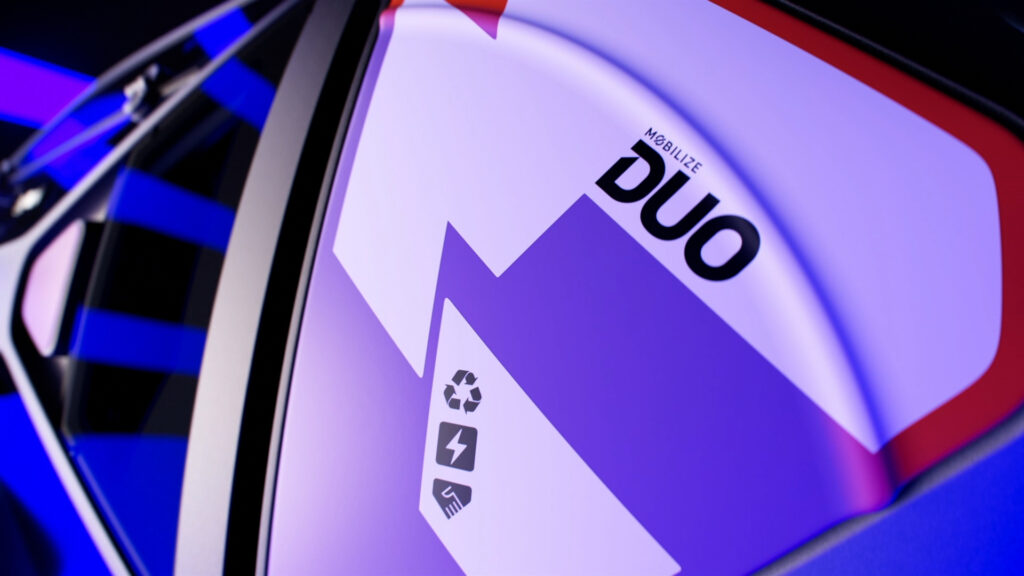
Our production approach combines continuous rotary camera movement with colored lighting effects. The recycled materials, camouflage pattern, elytra doors as well as the vehicle’s dashboard are all highlighted in turn. Tight, abstract shots and enigmatic backlighting add to the film’s reveal effect.
BOOMBOX FOCUS
FREEBOX ULTRA LIMITED EDITION
CONTEXT
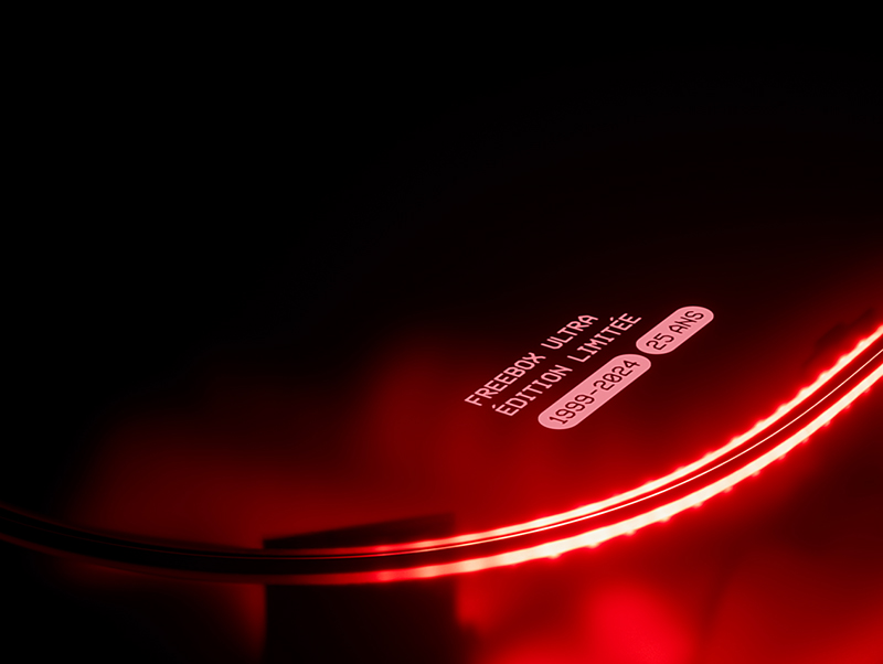
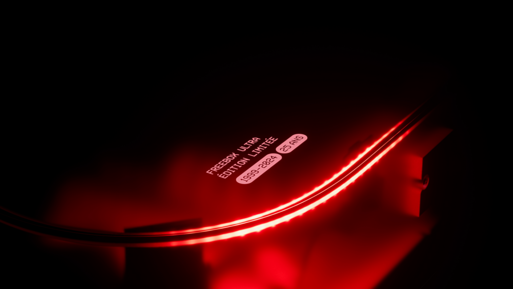
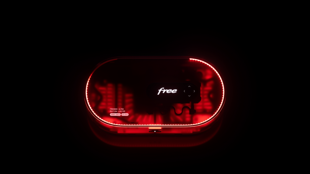
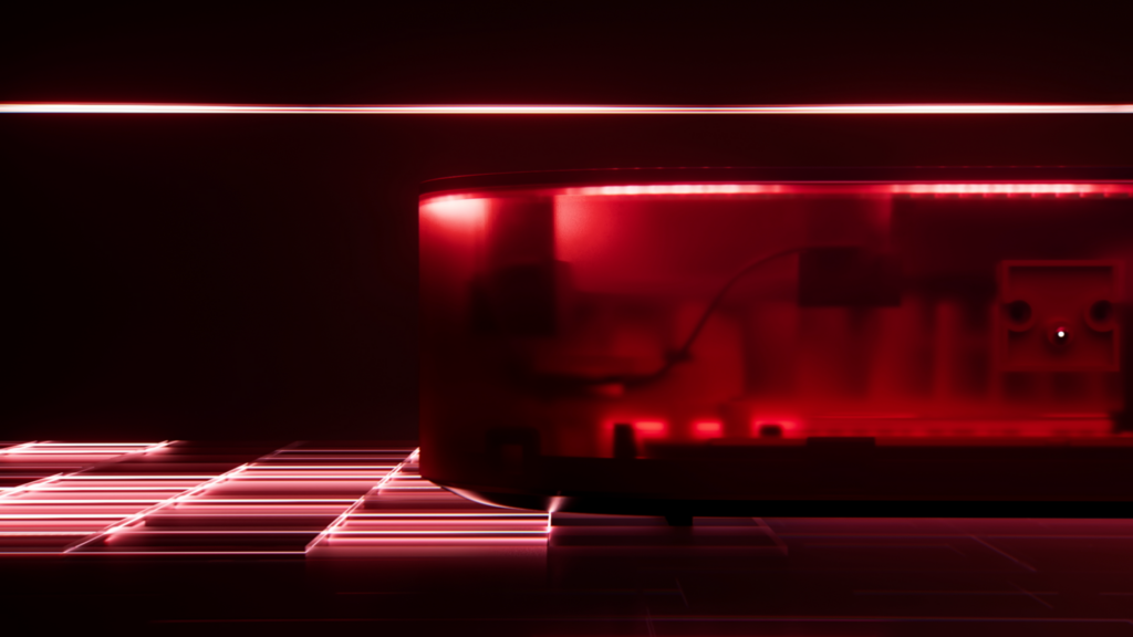
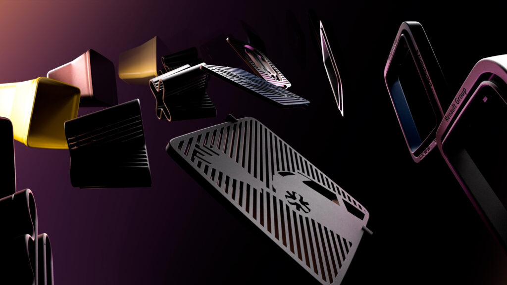
To celebrate its 25th birthday, Free is launching a limited edition of its Freebox Ultra device, entirely redesigned for this special occasion.
CHALLENGE
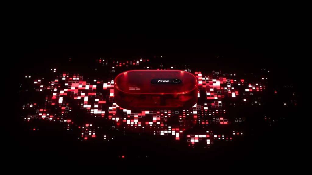
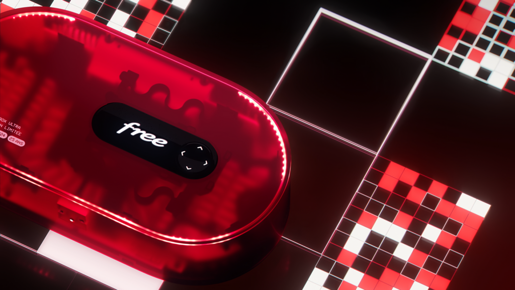
Place this Freebox Ultra, with its resolutely gaming design, into a powerful, high-end environment that will appeal to both the general public and fans of the brand.
SOLUTION
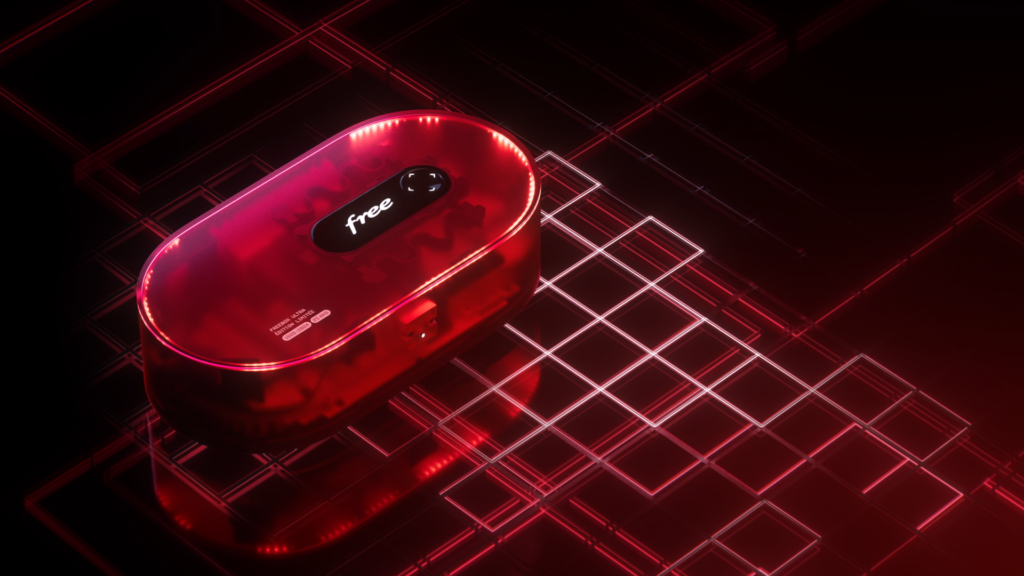
We took inspiration from certain gaming references such as pixels and light grids to create the device’s environment. We placed it at the heart of a play of chiaroscuro in order to enhance its red color, translucent surface and the lighting effects that characterize its new design.
REVEAL FILM
TEASER
LEDGER LIVE DIGITAL CAMPAIGN
CONTEXT
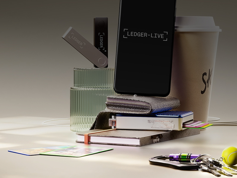
Ledger commissioned 17mars to create assets for a campaign to drive awareness and as well as the adoption of its Ledger Live app. Ledger Live allows users to securely buy, store, send and trade cryptos.
CHALLENGE
Define an educational approach aimed at physical wallet owners who are unfamiliar with the app or do not take full advantage of the features it offers. Create a story that puts the object in the user’s everyday life.
SOLUTION
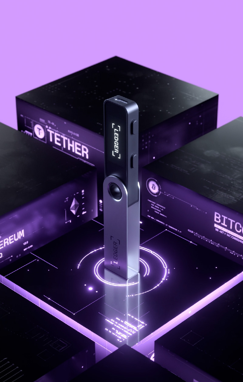
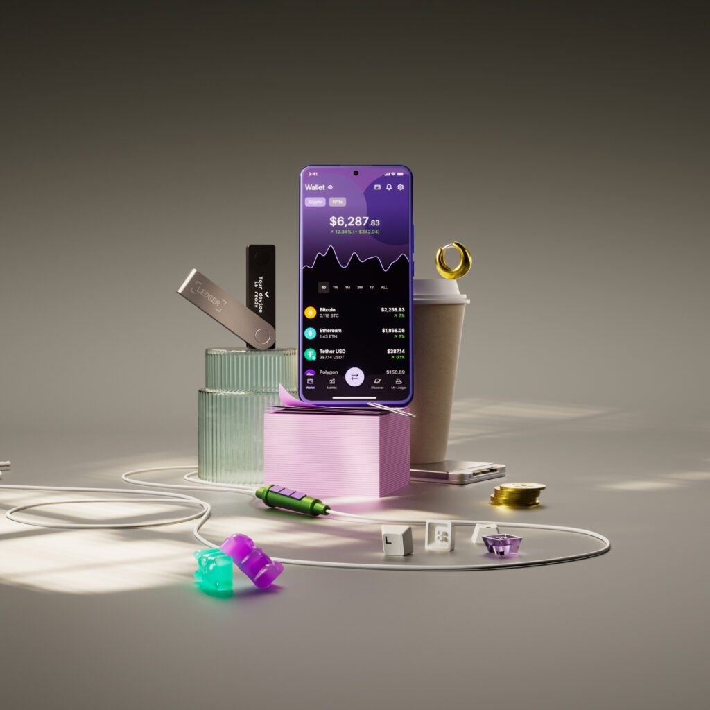
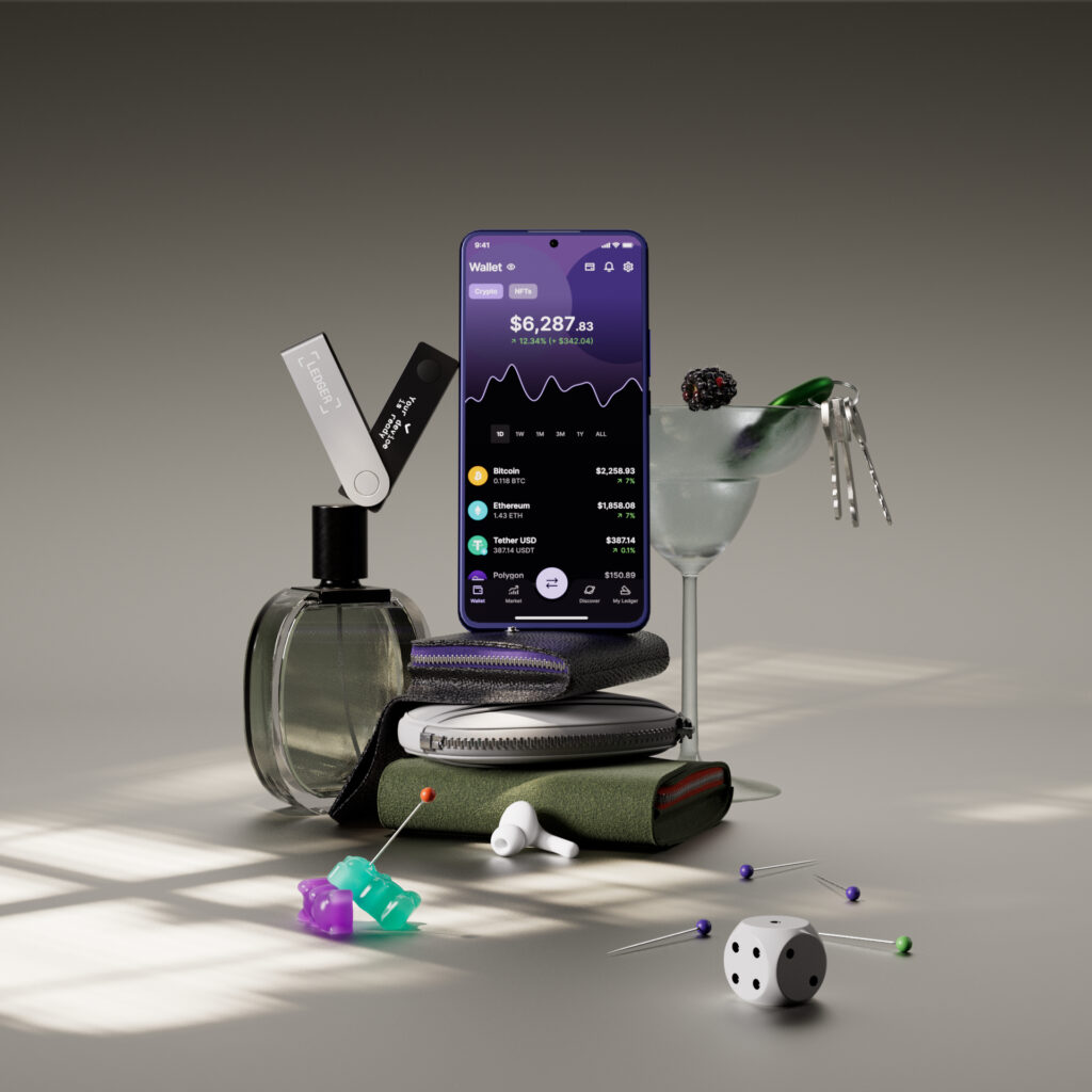
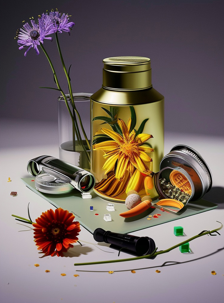
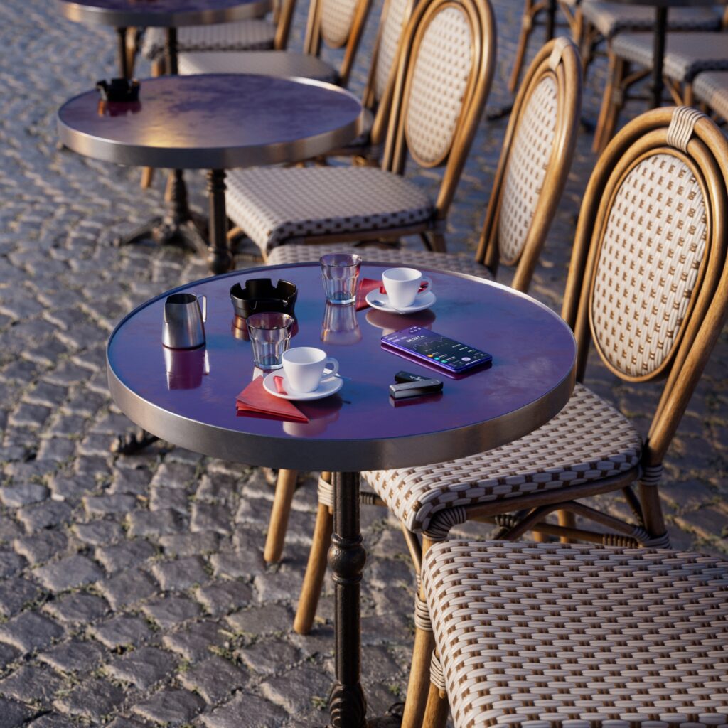
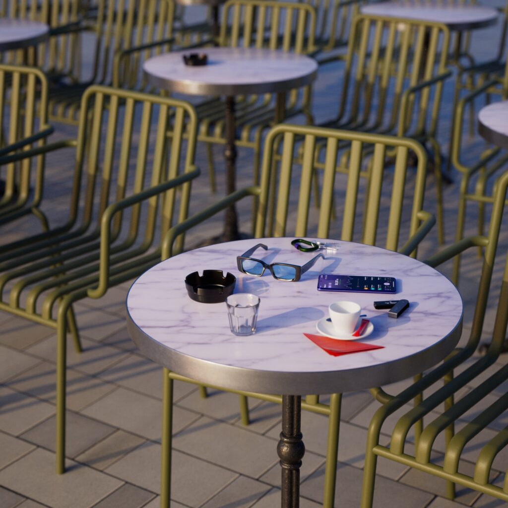
We based our films on a composition of objects reflecting the personality of the typical Ledger wallet holder. This photo-realistic, highly aesthetic setting makes it easier to grasp the educational aspect of each module.
PROCESS
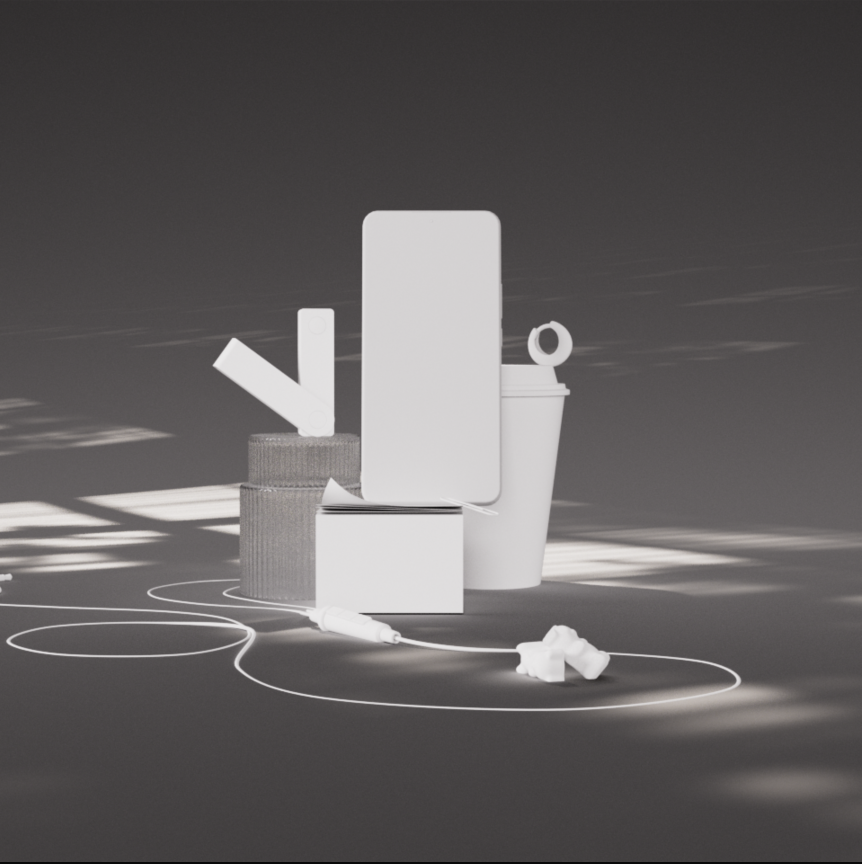
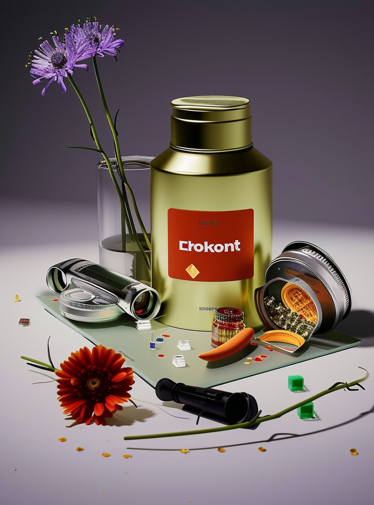
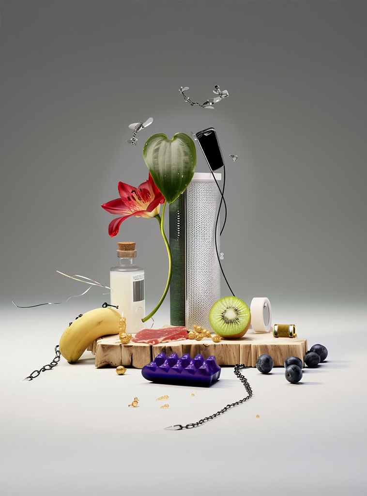
We used AI to design this composition. By providing it with visual references, we guided it to generate harmonious stacks of various objects. These proposals were then tested and refined in 3D.
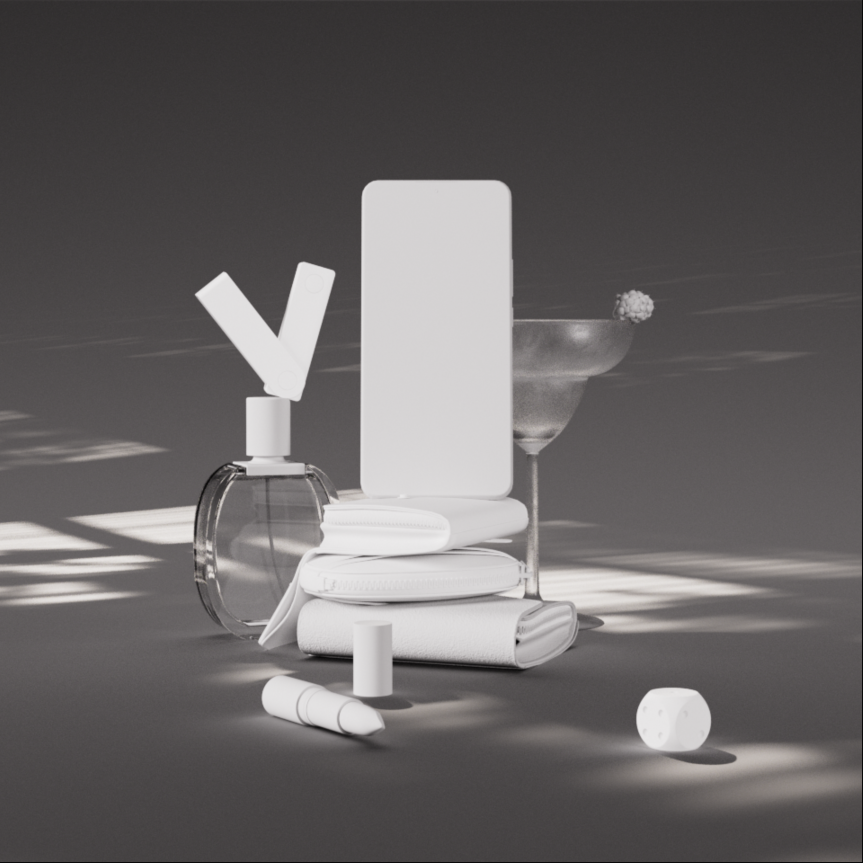
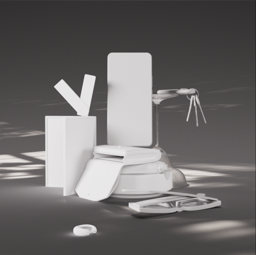
Finally, the application’s main functionalities (BUY, SWAP, STAKE) are highlighted using very fine graphics, inspired by video game interfaces and now one of Ledger’s communication fundamentals.
NISSAN PATROL
CONTEXT
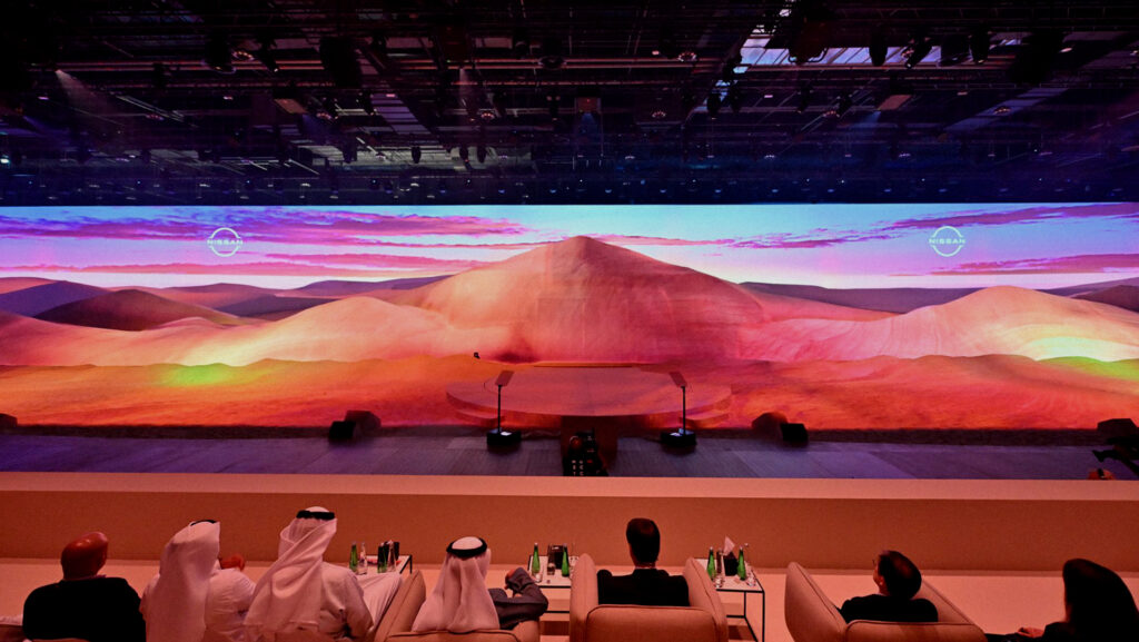
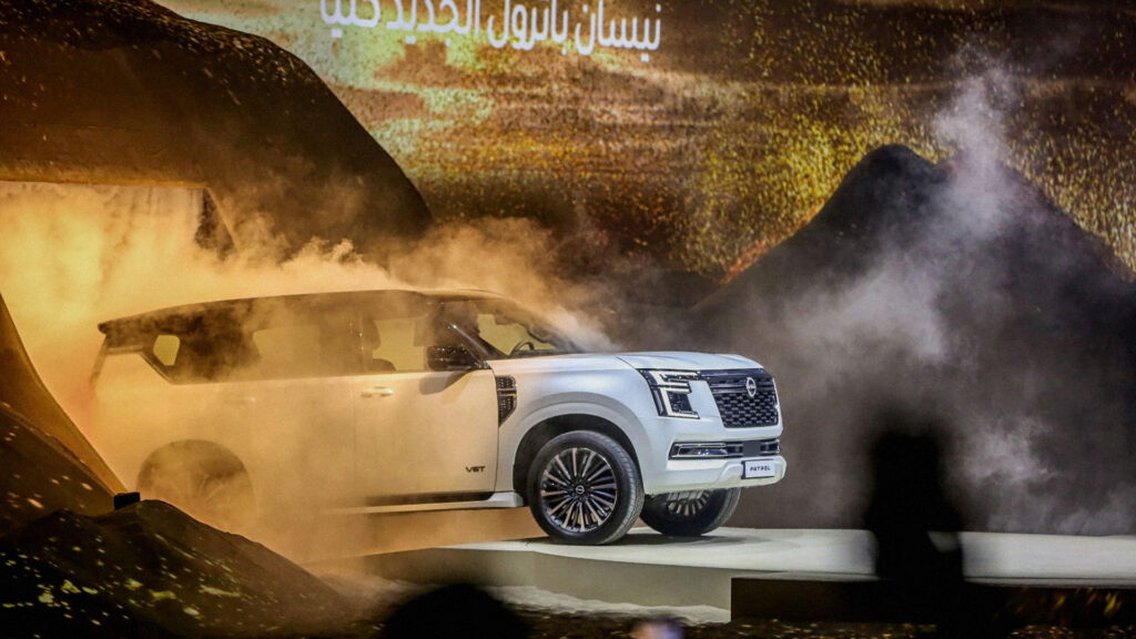
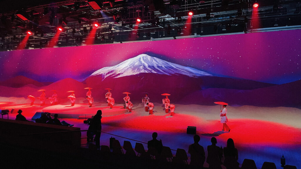
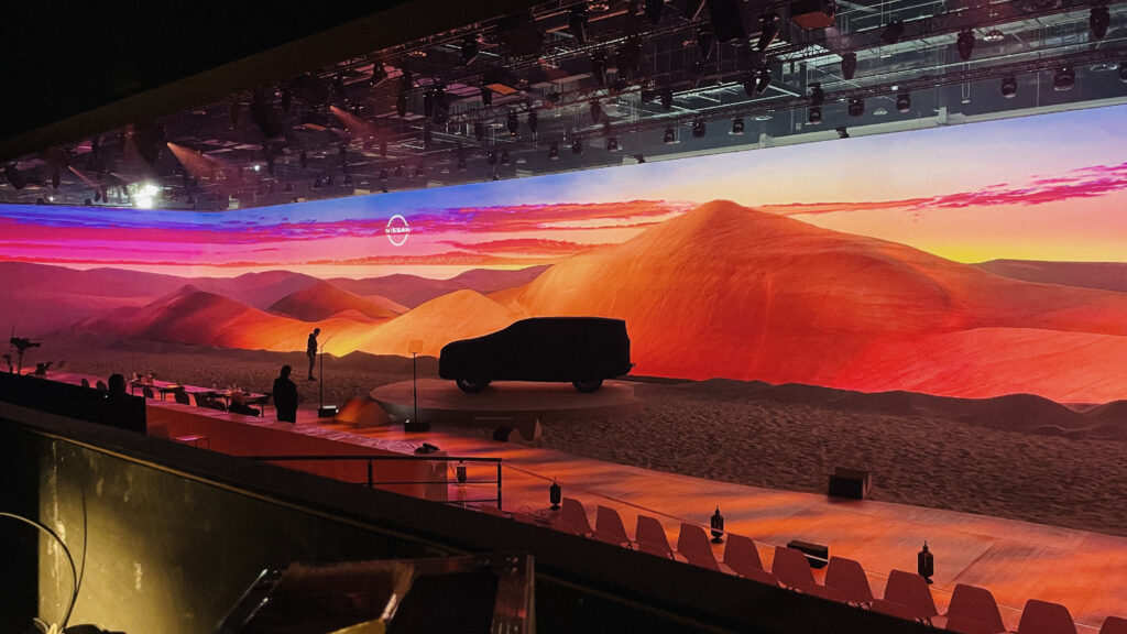
Nissan is making a statement in Abu Dhabi with the launch of the new Nissan Patrol. The model was showcased in a spectacular display on an 8 meter high artificial dune covering an area of more than 2,000 m².
CHALLENGE
Design over 40 minutes of large-format video content, adapted to a complex and irregular projection surface, integrating the volume of the dunes and the screens surrounding the stage. Adopt a cutting-edge technology to meet constantly-challenged visual requirements.
SOLUTION
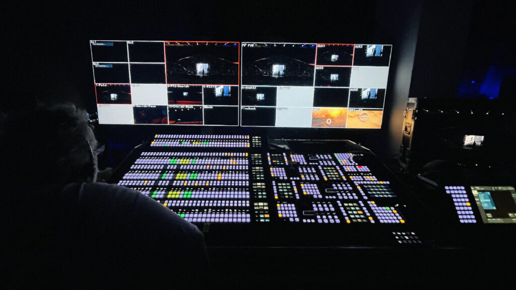
We developed 7 immersive sequences, each with its own aesthetic, illustrating the epic storytelling of the show. We alternated realistic worlds with more graphic ones, always playing with optical illusions, perspective and animation, drawing the spectator into a whirlwind of emotions and sensations. For this performance, we chose the SMODE software, adapted to the constraints of responsiveness and broadcasting, on 31 UHD and 43,840×2400 video projectors, at 50 frames per second.
AUDIENCE ENTRANCE

THE POET


MOMENTUM


SPEECHES


PARIS MOTOR SHOW ‘24
CONTEXT
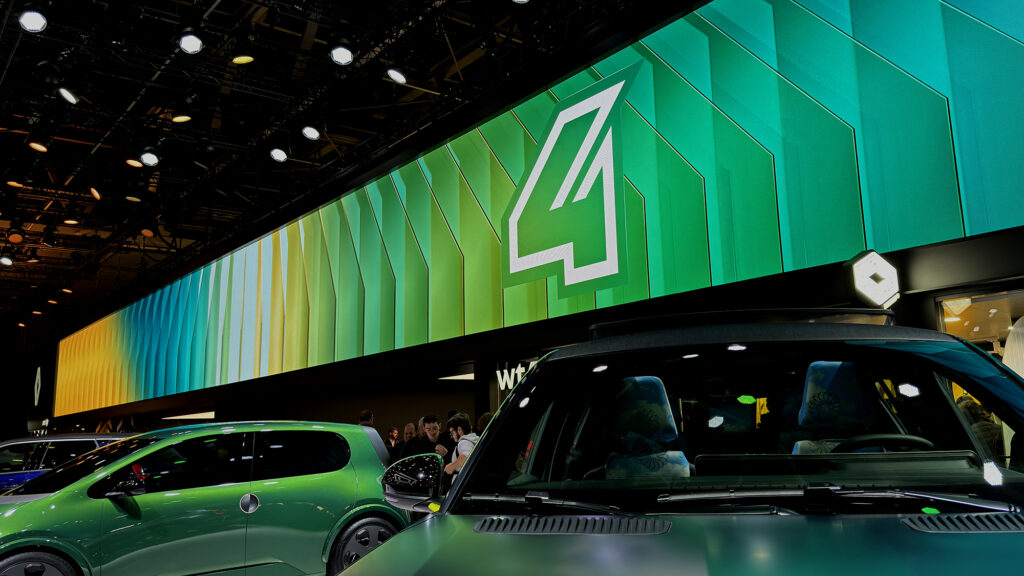
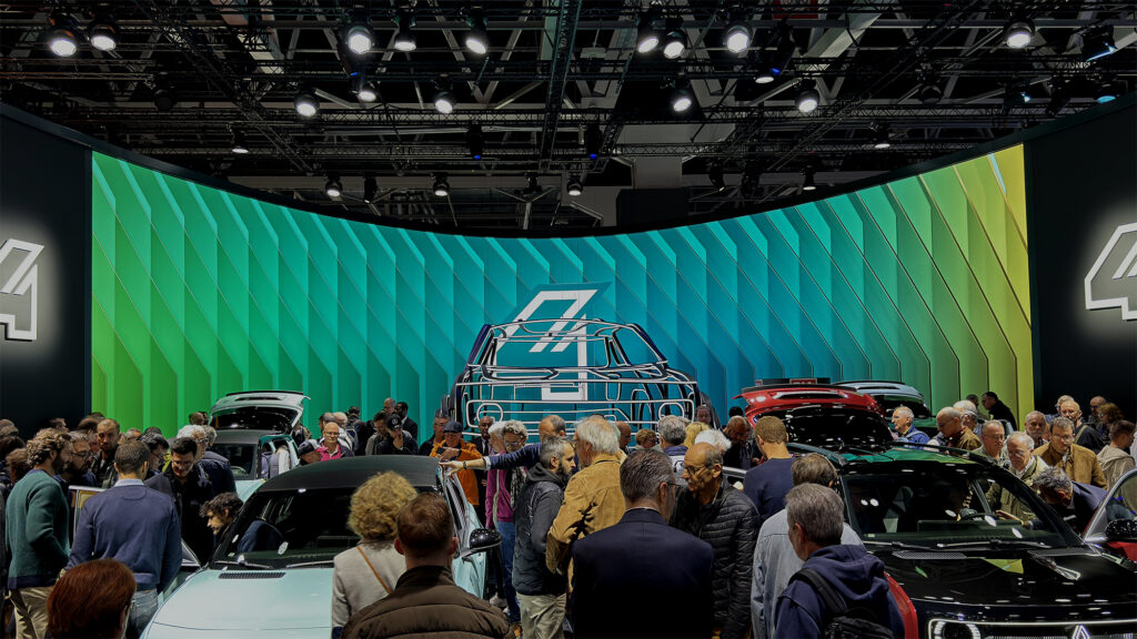
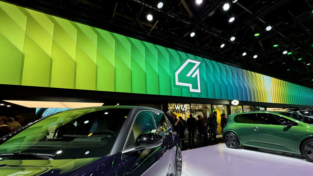
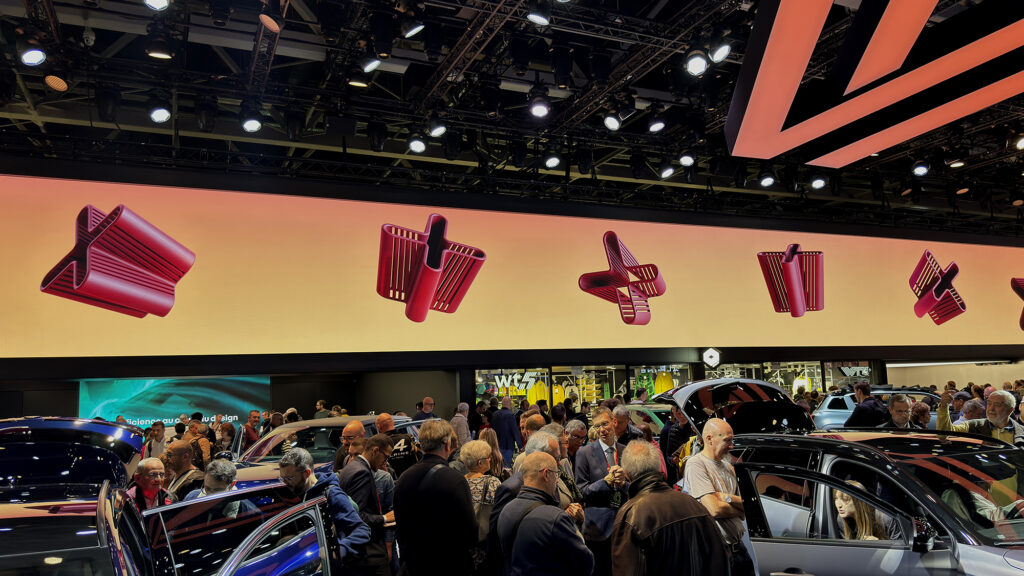
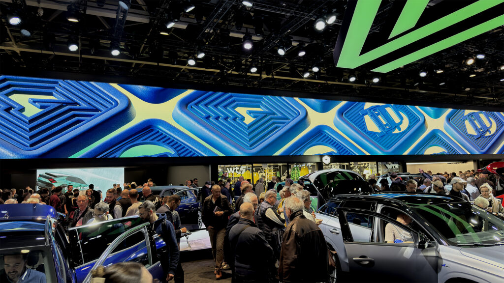
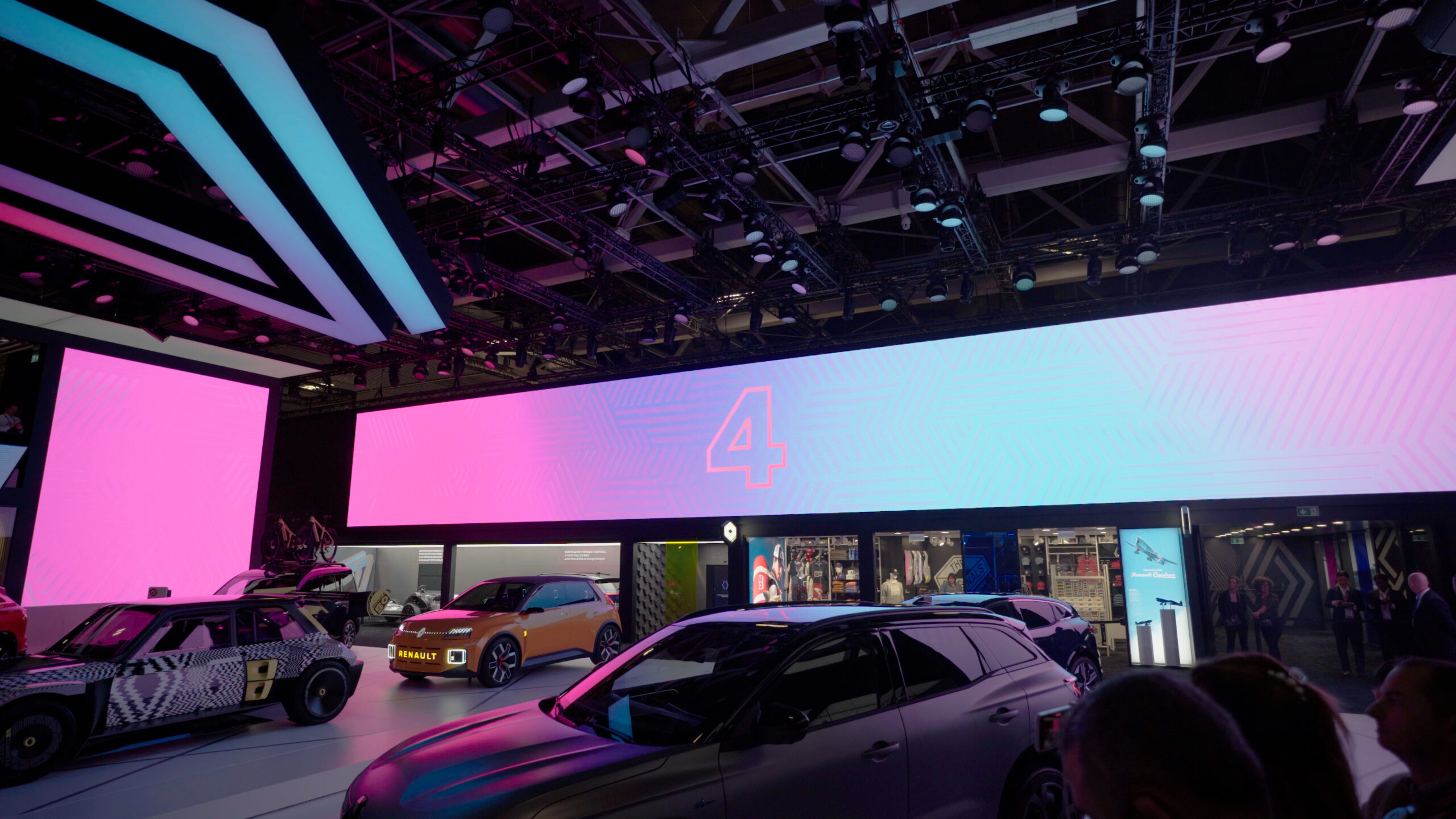
Once again, the Renault Group is making its presence known at the Paris Motor Show. Taking over an area of more than 2,500 m2, the brand is unveiling 3 new vehicules, including the new R4. 17mars was tasked with audio-visual artistic direction of the event as well as the production of the media broadcast on a set of screens of unprecedented size.
CHALLENGE
Design immersive video content adapted to these unusual screen formats (60m x 3m and 22m x 5m). Generate a buzz at the press conferences for the reveal, and make the stand feel lively for the duration of the show. Ensure consistency between all broadcast media, deliver more than 100 assets.
SOLUTION
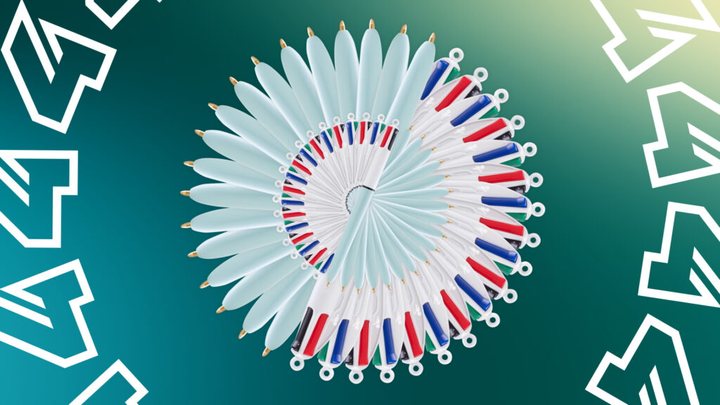
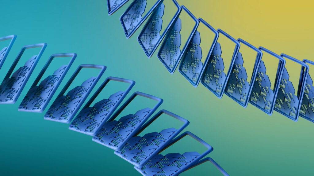
The agency developed 3 graphic universes specific to each of the vehicle models revealed. For R4, we worked on a coloured crystal kinetic effect, for Emblème on caustic effects reminiscent of the seabed, and for the Fl4wer Power concept car, which evokes the hippie era, a grained graphic animation. We have also created several films presenting the brand’s merchandising and accessories collections. In addition, we ensure that the media are seamlessly integrated on site with the technical broadcast teams.
R4 MOMENTUM
EMBLEM MOMENTUM

HIPPIE CHIC MOMENTUM


COUNTDOWN
SLOW LOOP
SLIDESHOW FILM


MERCHANDISING FILM

ACCESSORIES FILM
STADE 2
CONTEXT
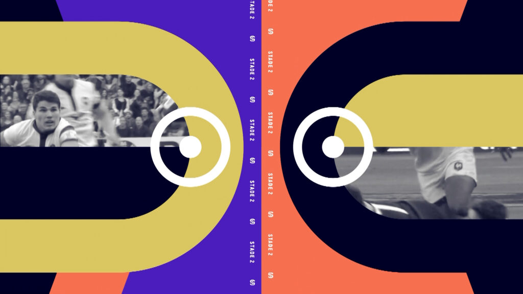
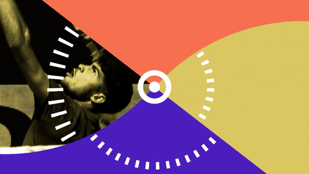
Stade 2, a sports-focused talk show, is almost 50 years old and getting a makeover in the wake of the Olympics, which saw broadcast channel France Televisions break audience records.
CHALLENGE
Renew the show’s design, which has been airing on France 3 since 2019, and give more space to image.
SOLUTION
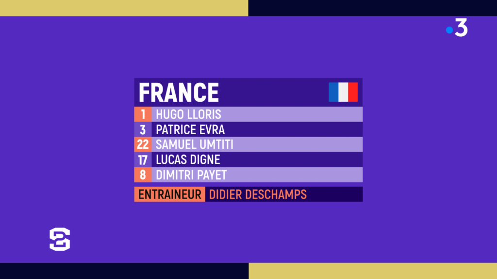
Keeping the fundamentals of the identity designed by the agency in 2017, we are continuing to cultivate a refined 2D approach to which we are associating a new, warmer colour range.
Opening credits
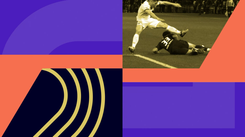

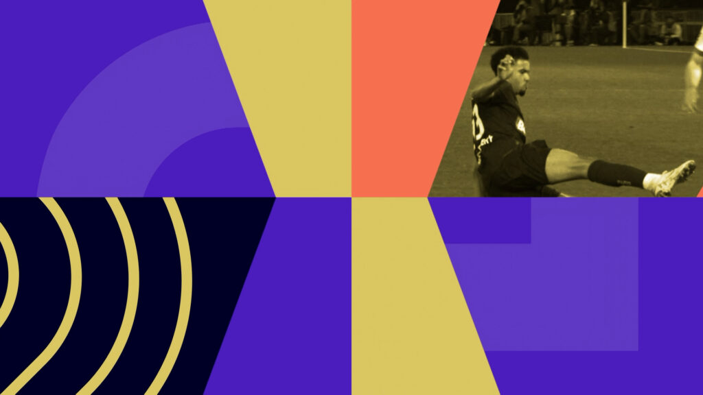
Sections
R4
CONTEXT
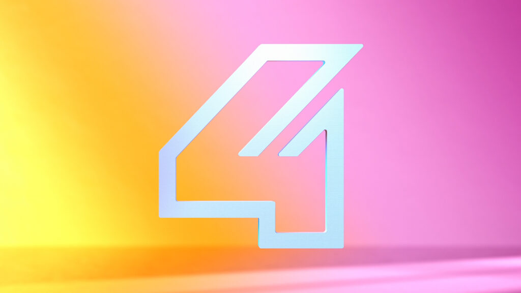
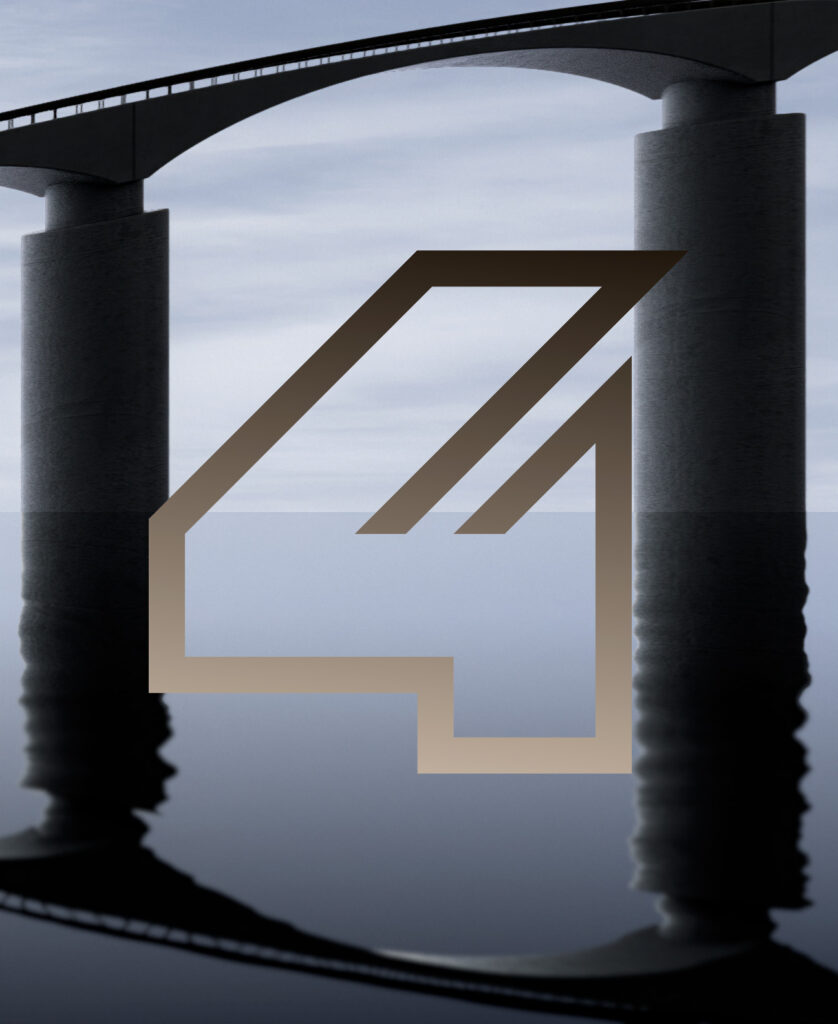
As part of the launch of the 100% electric Renault E-Tech, the brand tasked 17mars with creating a film featuring the ‘4’ emblem.
CHALLENGE
Just as we did for R5, we created an iconic film transcending the brand’s new identity. We defined directing principles allowing us to explore exceptional territories in terms of creativity.
SOLUTION
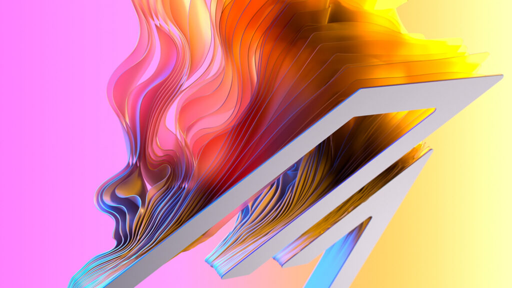
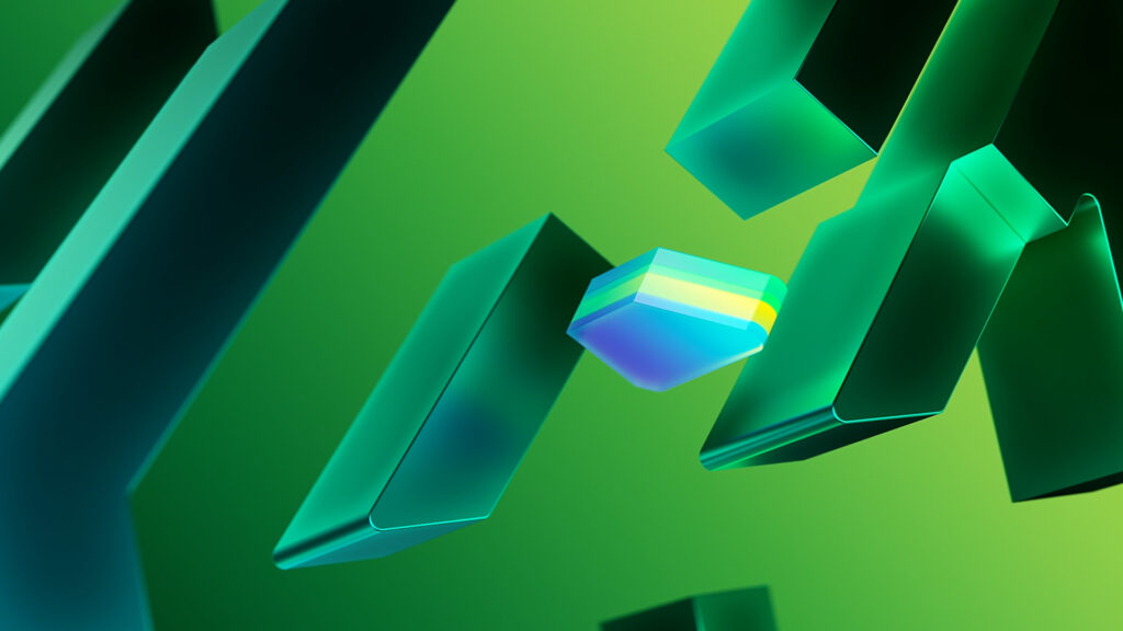
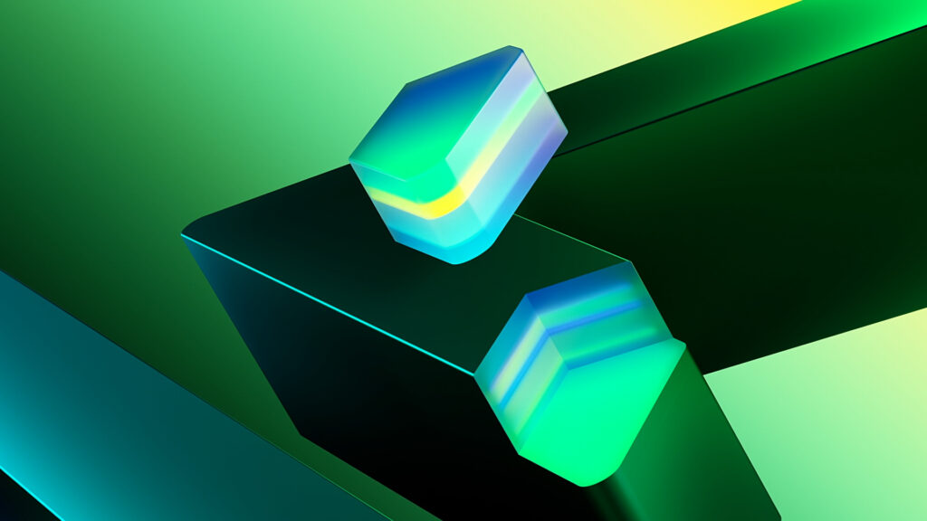
The film has been thought out as a loop made of 4 sequences showing different logo volumes. Each sequence starts with an impulse revealing a specific environment, beyond the graphic sign, which always comes back to its initial shape. This dynamic marks the film’s tempo, as a metronome. It illustrates the new dimension of the vehicle, its versatility and its faithfulness to the original model’s functionalities.
TÉLÉFOOT 2024
CONTEXT
For its 48th season, Telefoot, TF1’s iconic soccer program, sees its visual identity renewed for the third time by the agency. This collaboration coincides with a key moment, as Telefoot officially becomes the news outlet of the Ligue 1, reinforcing its anchorage in French soccer news.
CHALLENGE
Modernize the program’s image while delivering a powerful and dynamic visual experience for soccer fans. Conceptualize the artistic direction of the design alongside the virtual set.
SOLUTION
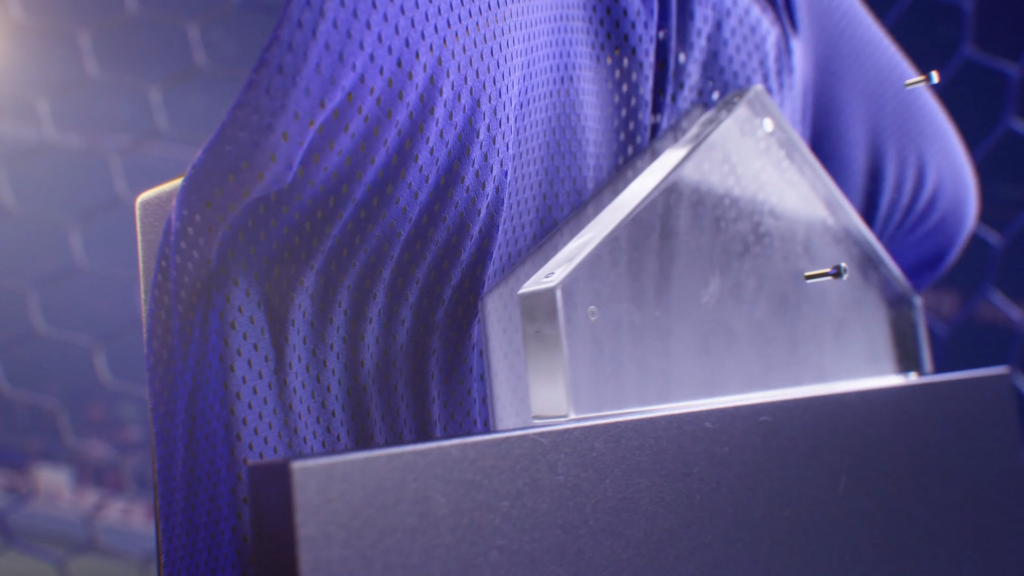
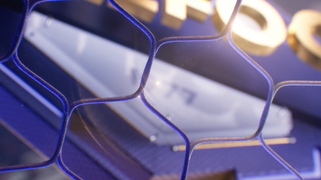
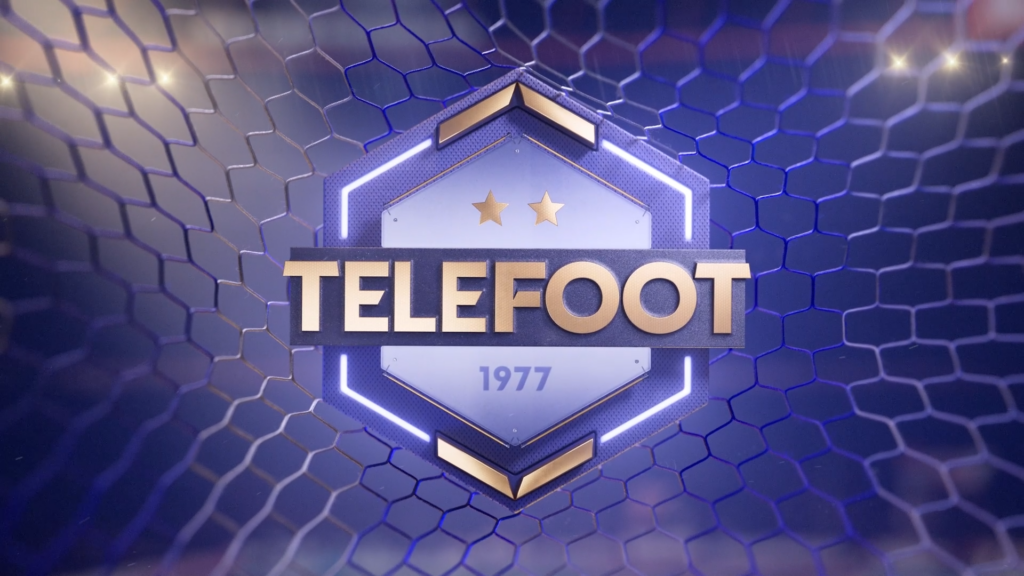
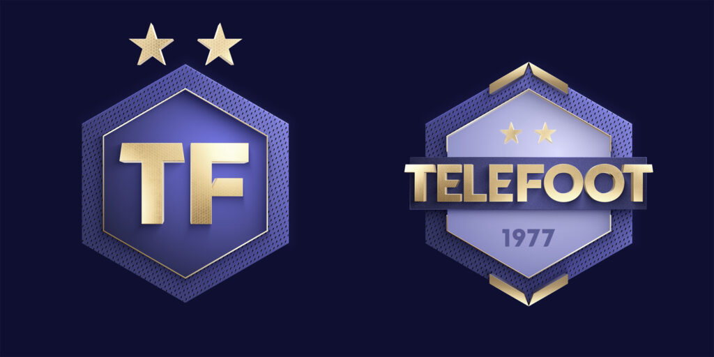
While preserving the Telefoot brand codes, we gave the logo, its variations and all the graphic elements a resolutely premium 3D treatment, to propel this sporting event into a new dimension. As for the set, we imagined a “football city”, which would serve as the main backdrop for the show, drawing on the latest creative technologies in terms of virtual environments to ensure total immersion.
Opening credits
Logo
Sections
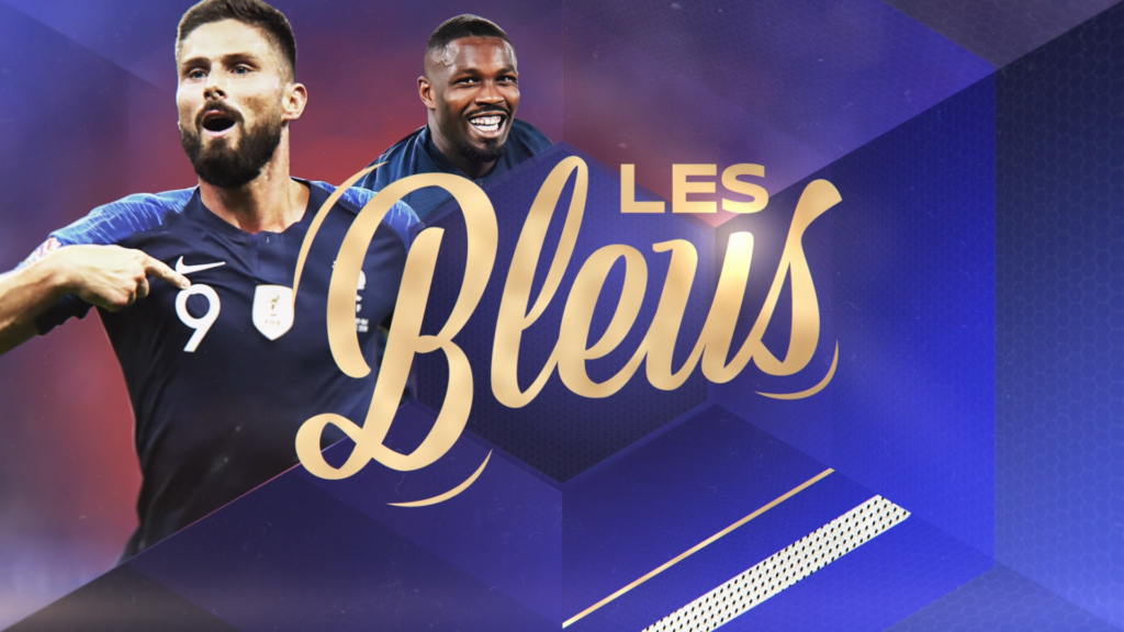
On-air broadcast design
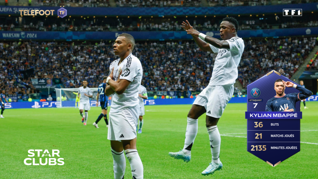
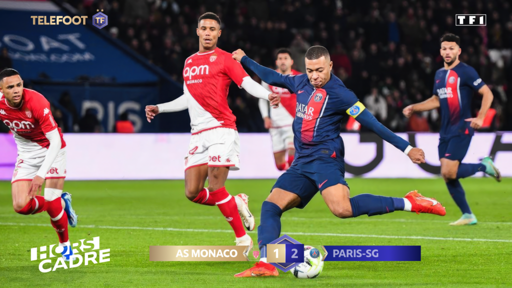
On-set broadcast design

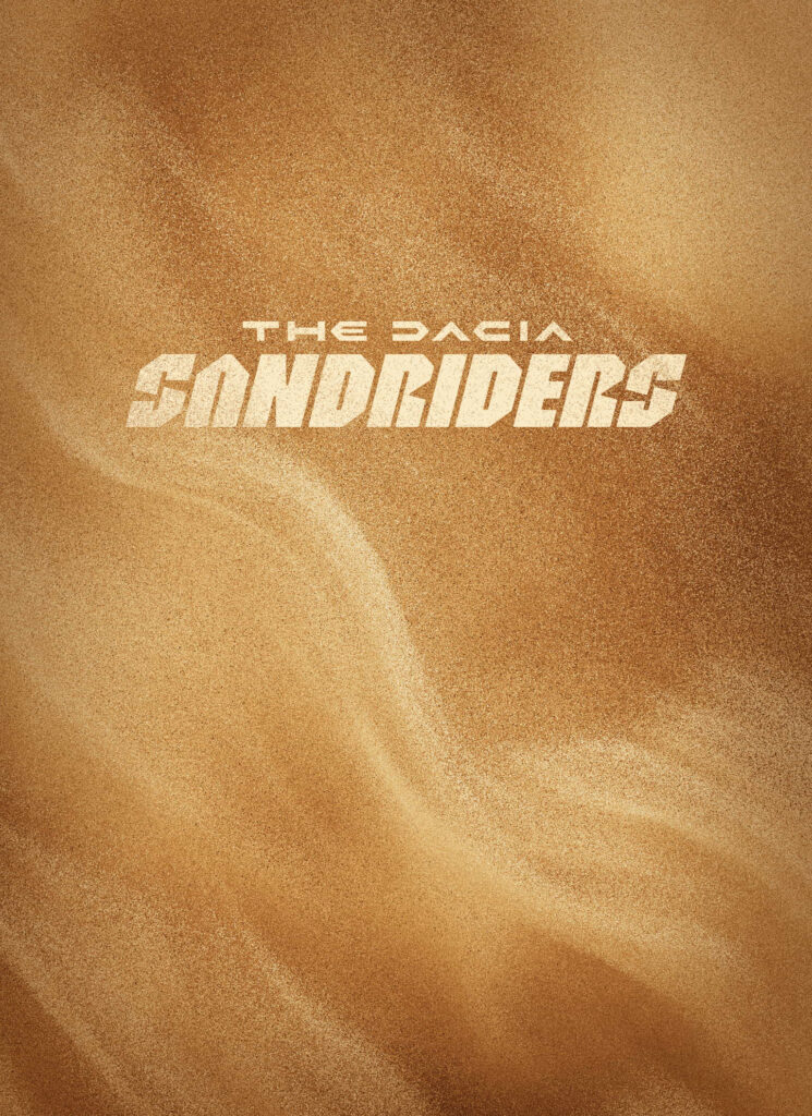
THE DACIA SANDRIDERS
CONTEXT
At the Geneva ’24 Motor Show, Dacia presented the competition prototype in which driver Sébastien Loeb will compete in the 46th Dakar Rally.
CHALLENGE
Create a film reminiscent of the Saudi Arabia dunes.
SOLUTION
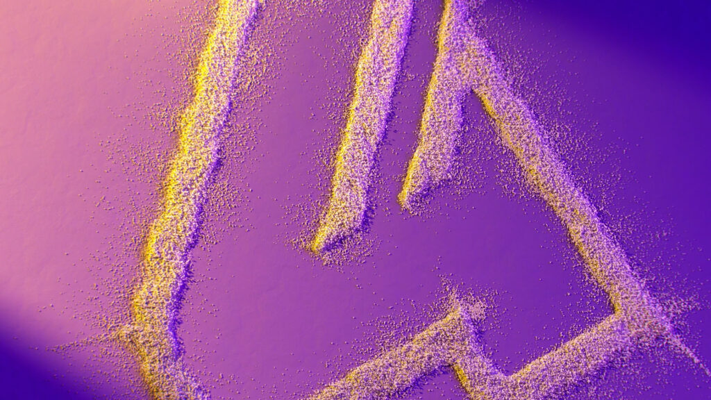
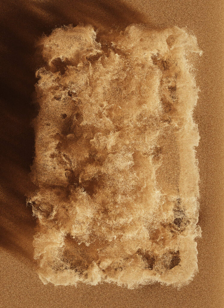
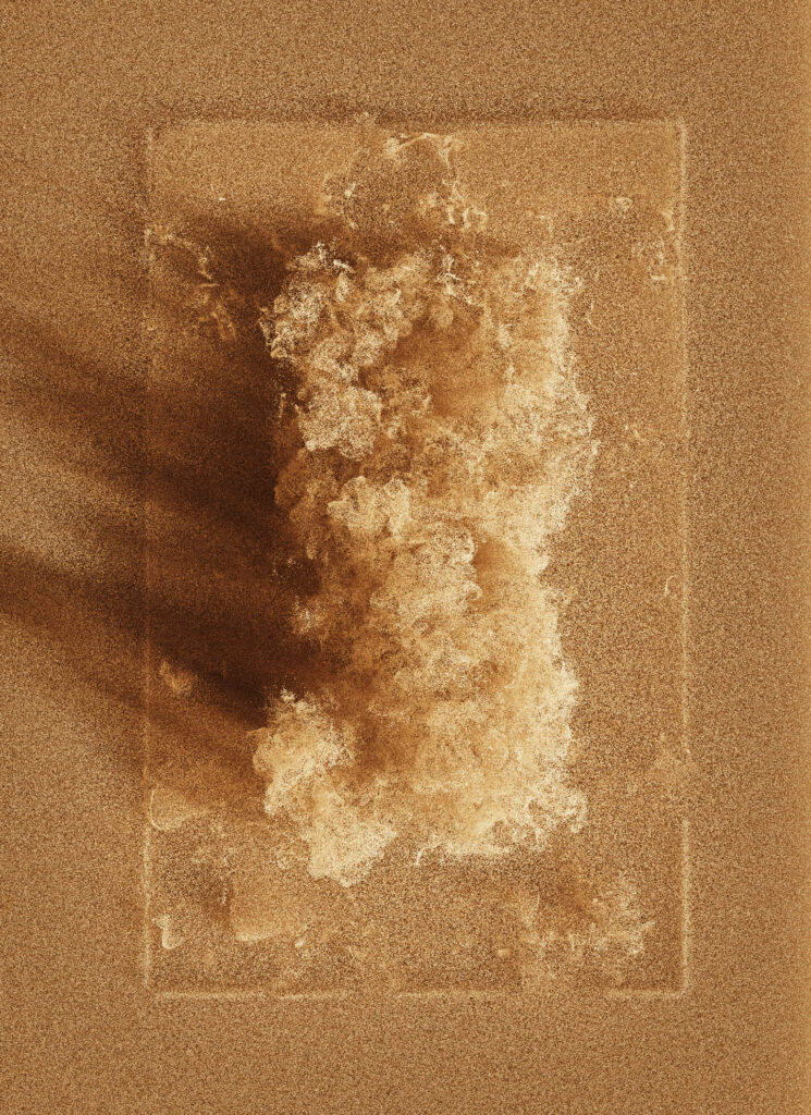
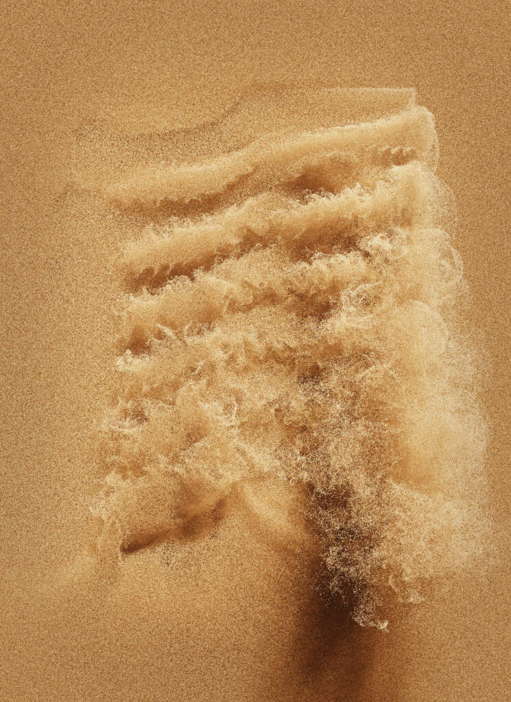
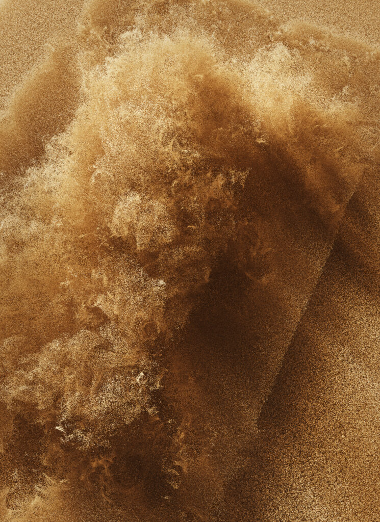
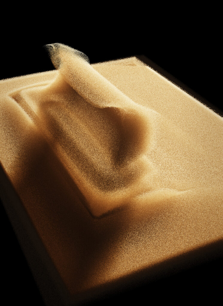
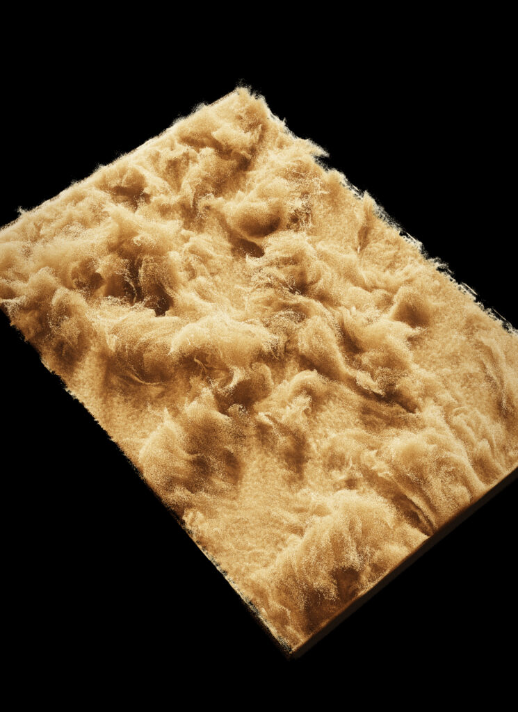
The video loop we imagined is a choreography based around the element of sand, with each sequence symbolising a key moment in the race.
No fewer than 18 million grains of sand come to life, creating a hypnotic experience in which each grain interacts with its immediate environment.


GENEVA INTERNATIONAL MOTOR SHOW ‘24
CONTEXT
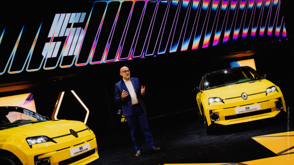
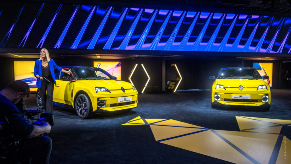
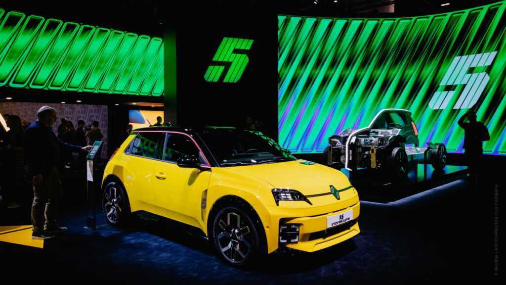
Renault chose the Geneva Motor Show for the launch of their 100% electric vehicule, Renault 5 E-Tech. The brand entrusted us with the audiovisual artistic direction of the event and the production of the media broadcast on an immersive screen system.
CHALLENGE
Create video content that captures the retro-futuristic essence of this iconic vehicle in the electric age.
Make a splash the day of the reveal, and broadcast dynamic visuals during the event.
The challenge was amplified by the size of the screens: 36m x 2.5m and 13.5m x 5m.
SOLUTION
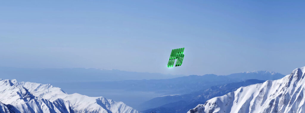
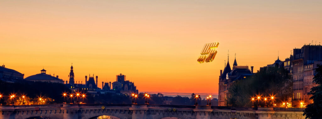
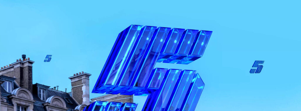
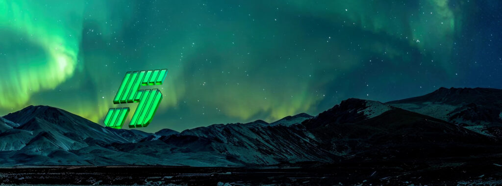
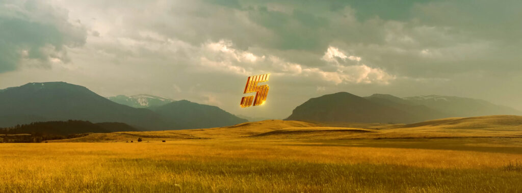
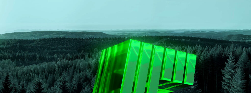
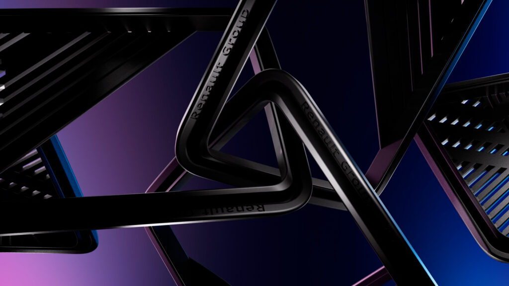
For the vehicle reveal, we opted for a spectacular approach, showing a multitude of ‘5s’ travelling through a wide variety of landscapes before arriving in Geneva. The concept was designed to echo the campaign broadcast on social networks.
Our overall artistic direction (press conference and stall loops) was based on a bold electropop style, using contrasting bright colours borrowed directly from R5’s distinctive colours.
MOMENTUM
COUNTDOWN
SLOW LOOPS

MERCHANDISING FILMS
ACCESSORIES FILM

REVEAL VISUALS
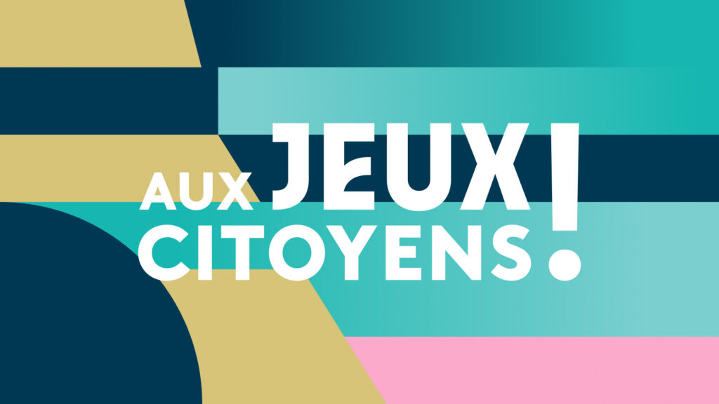
AUX JEUX CITOYENS!
CONTEXT
A year before the Paris Olympic Games, France Télévisions launches a daily program taking a behind-the-scenes look at the preparations for the Olympic and Paralympic Games.
CHALLENGE
Design an identity and branding system fully in line with the graphic charter established by the Olympic Committee, guaranteeing a total immersion in the world of the Olympic Games. Add the France Télévisions branding codes.
SOLUTION
We designed an identity associating the Paris 2024 and FTV Brown typefaces. We put together a design mecanism based on linear movements and symmetry play, highlighting the design toolbox of the existing branding guidelines for print. The whole is reused by the on-set screen and AR setup, allowing for various shots and effects.
PLATEAU

MÉDIACLUB’ELLES
CONTEXT
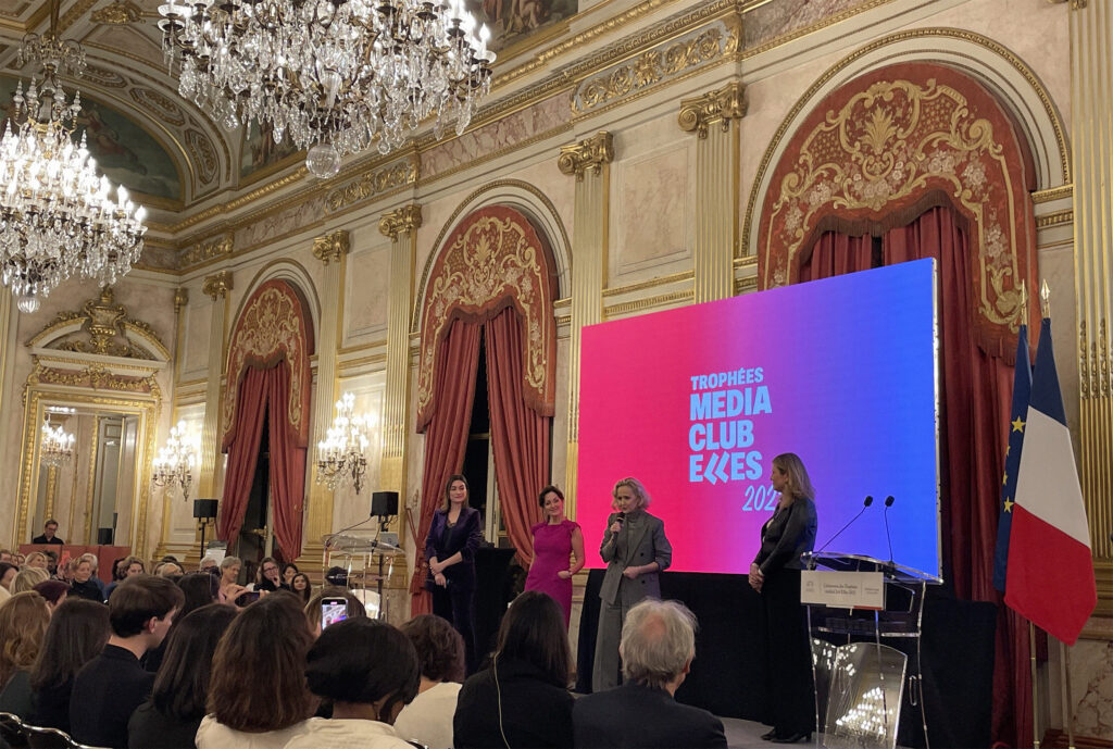
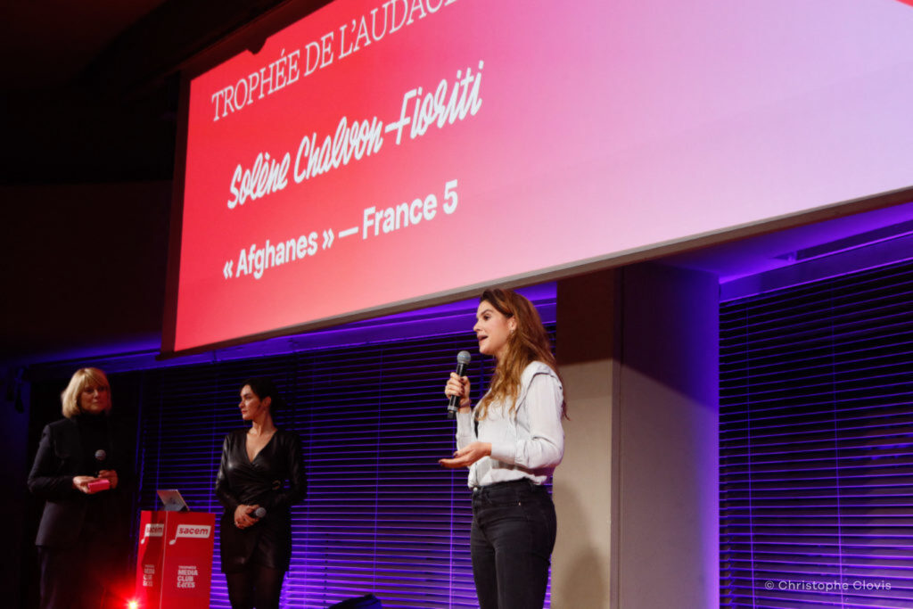
médiaClub’Elles is a network of professionals promoting parity and gender equality in the media sector. As an active member of the organisation, 17mars offered to modernise its identity.
CHALLENGE
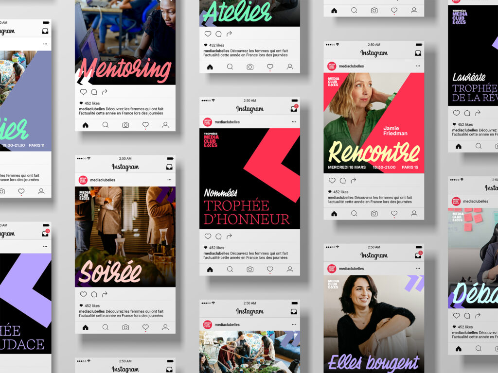
Strengthen the statutory dimension of the organisation and increase its visibility. Create a genuine brand, designing a system that can be easily deployed on social networks and communication media.
SOLUTION
We have kept the idea of inverted commas, distinctive elements of the existing identity, referring to speeches. Keystones of the logo’s reveal dynamic, they are set at the heart of a more massive typographic block, capable of effectively labelling content and media.
The typefaces chosen for the project, Chaumont Script and Apfel Grotesk, complement each other and help convey the positive energy of the organisation, amplified by a palette of bright, contrasting colours.
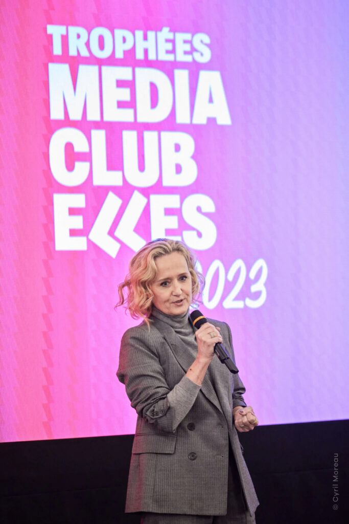
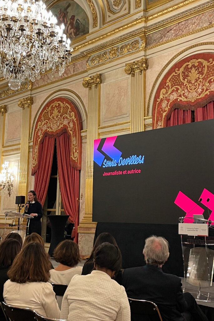
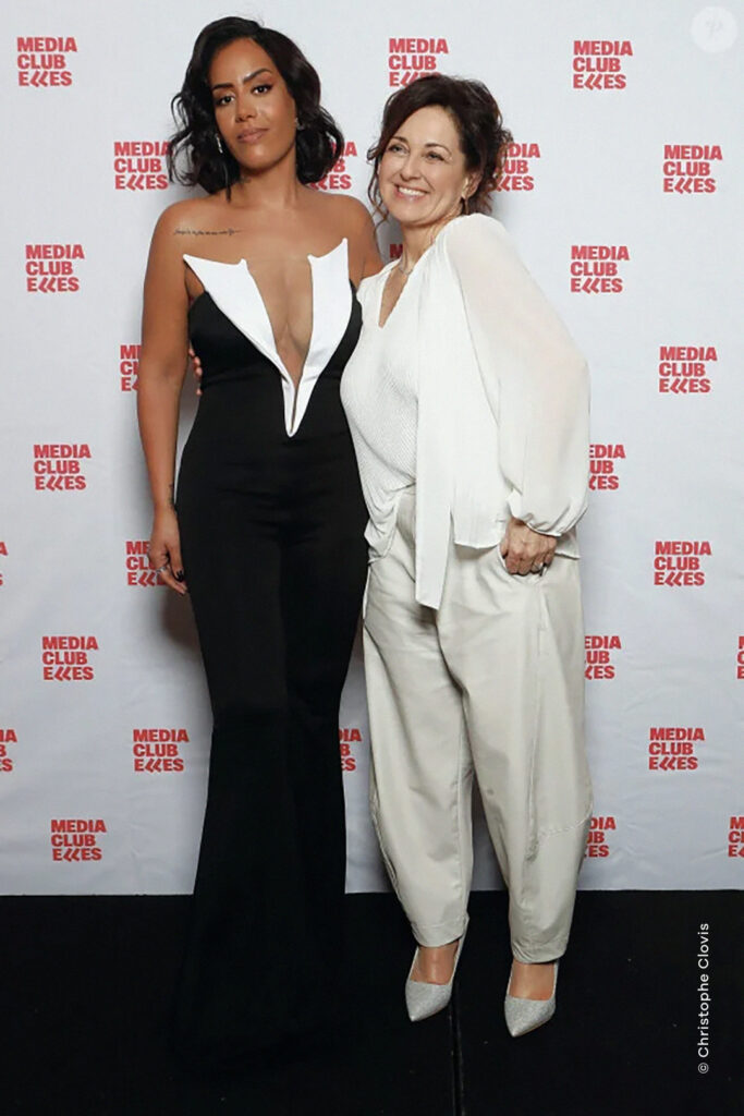
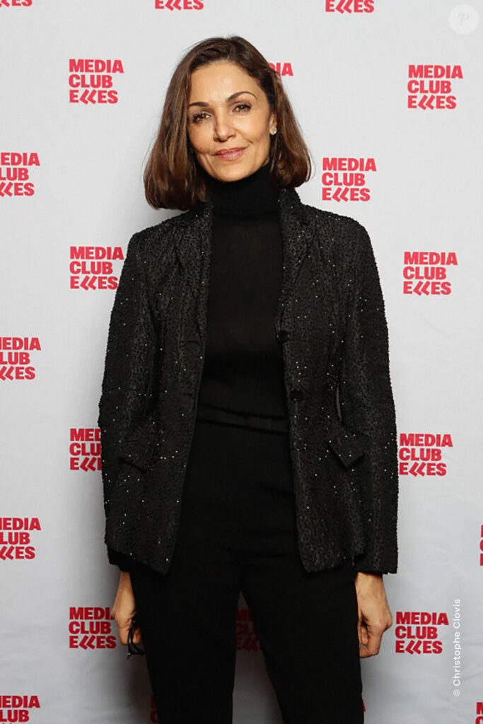
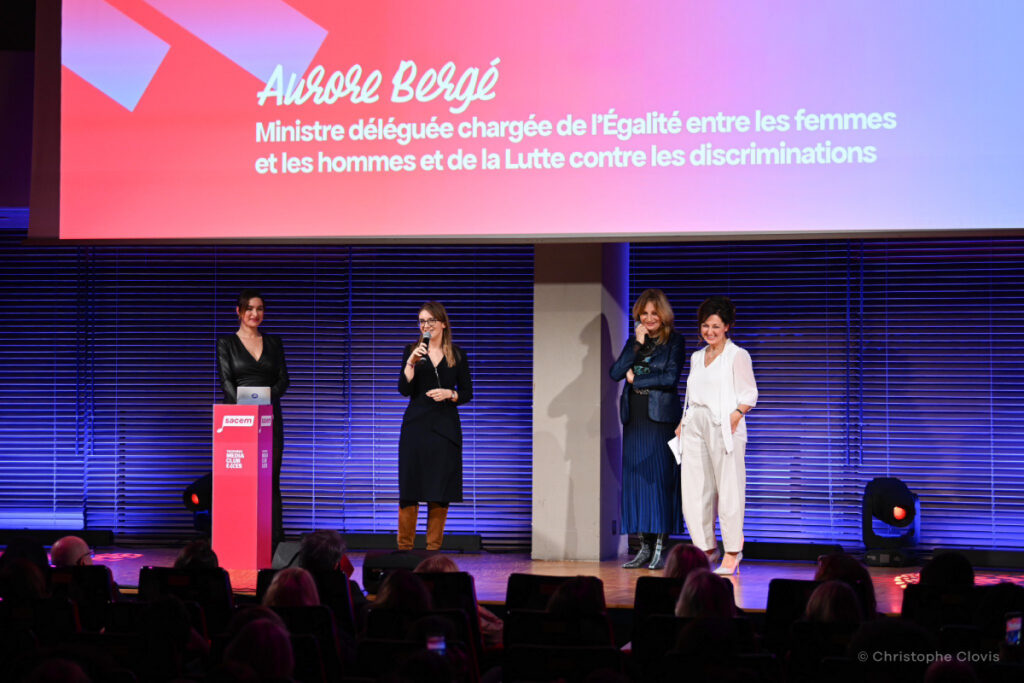
The extent of this identity is fully displayed during of the annual médiaClub’elles Awards ceremony.
TROPHÉES MÉDIACLUB’ELLES
PREMIÈRE SAISON
CONTEXT
Première Saison is a production company aiming at telling stories through different commitments and projects.
CHALLENGE
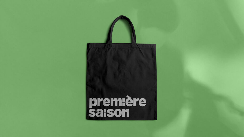
Create a compelling wordmark embodying the promise of a long journey’s starting point.
SOLUTION
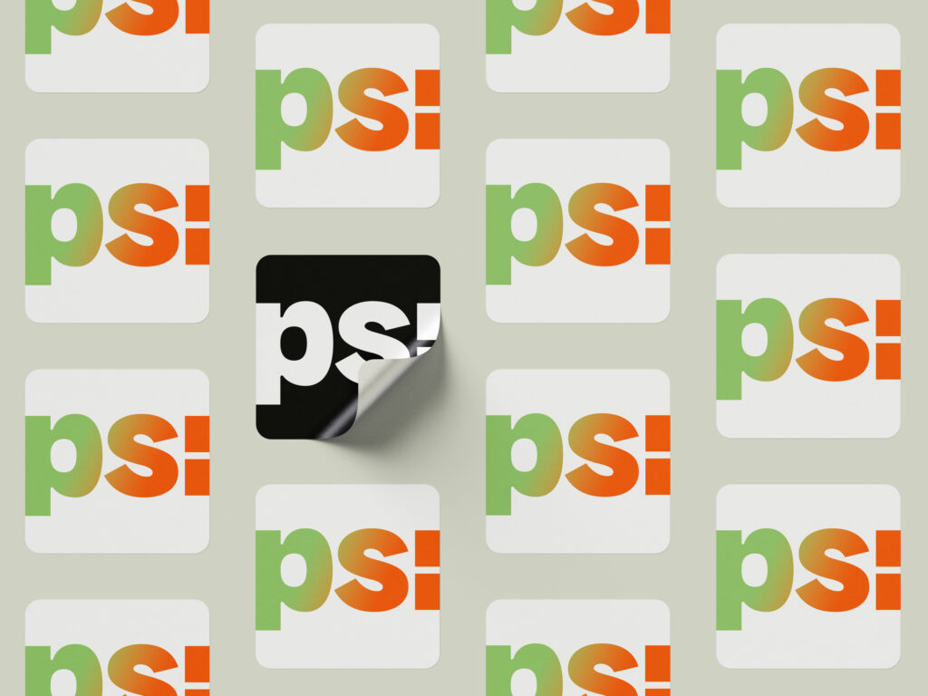
We gave meaning to the identity by playing on the custom-made typography. Both of the letters ‘i’ have been replaced by colons, illustrating a beginning. The sturdy composition was softened in the rounded corners, and the logo is available in a version in which only the colon appears, making it the brand’s shortened signature.


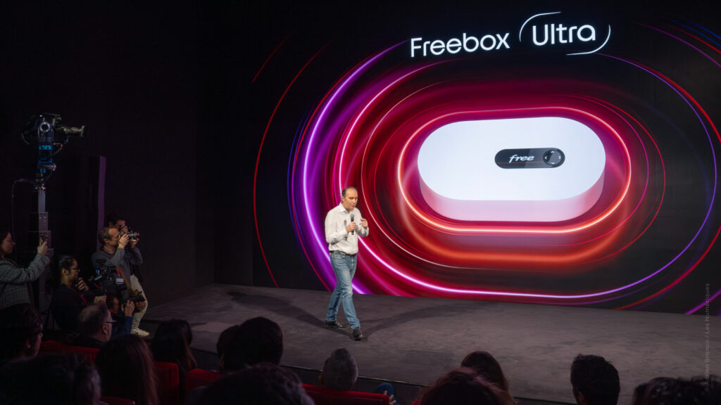
FREEBOX ULTRA
CONTEXTE
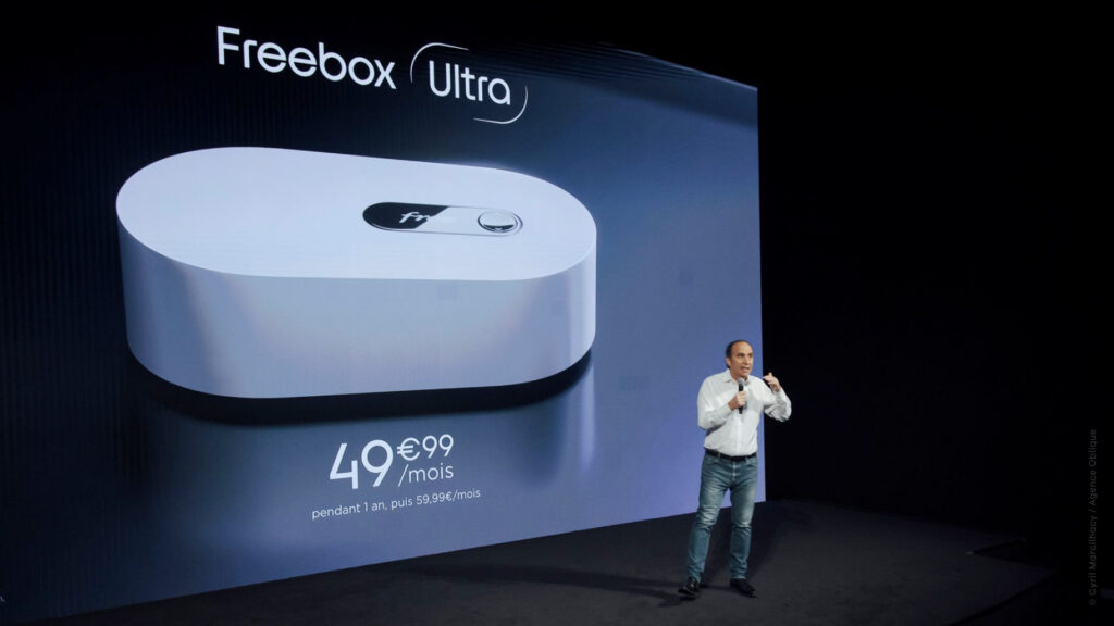
In 2024, Free is once again shaking up the telecom landscape with the launch of its brand-new high-end router: the Freebox Ultra.
CHALLENGE
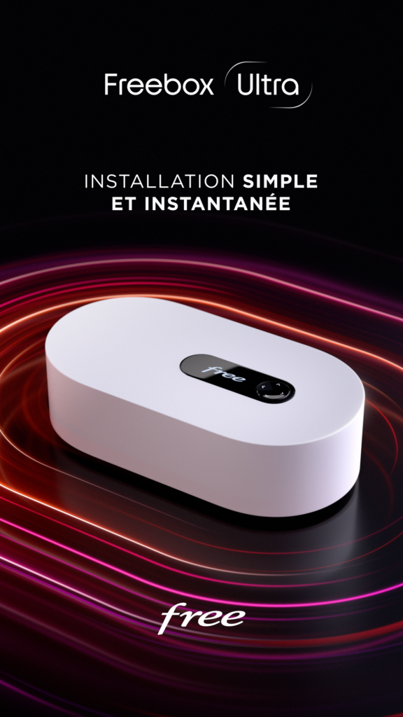
Conceive a powerful brand universe, resolutely high-end, reflecting this exceptional box.
SOLUTION
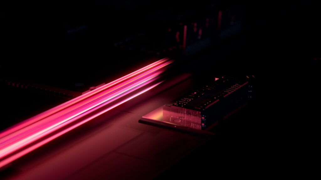
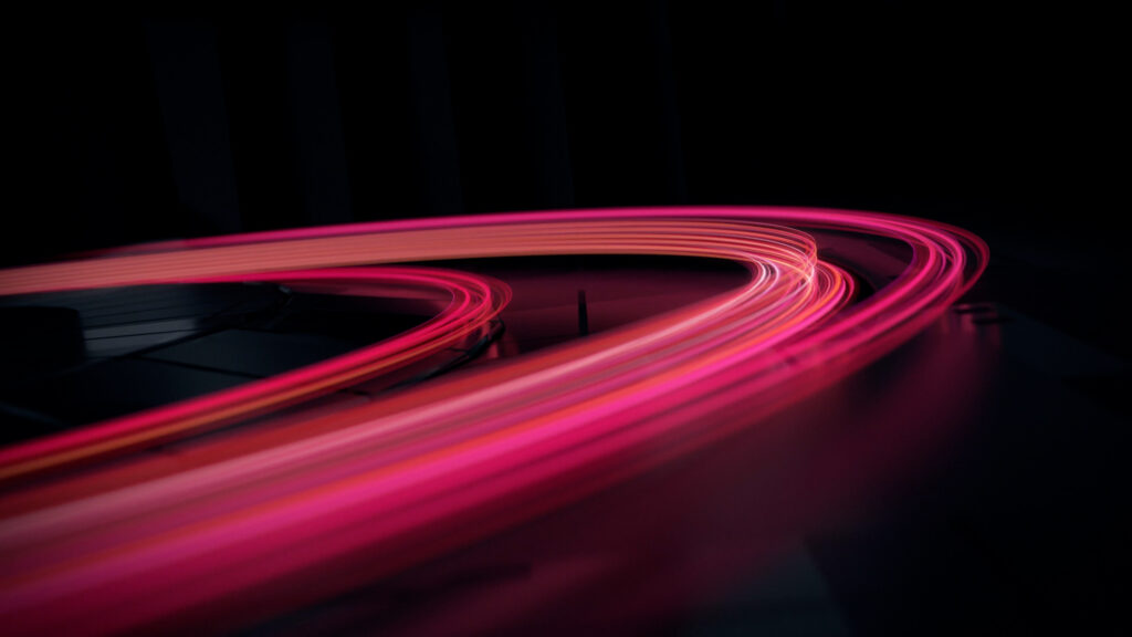
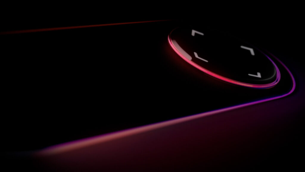
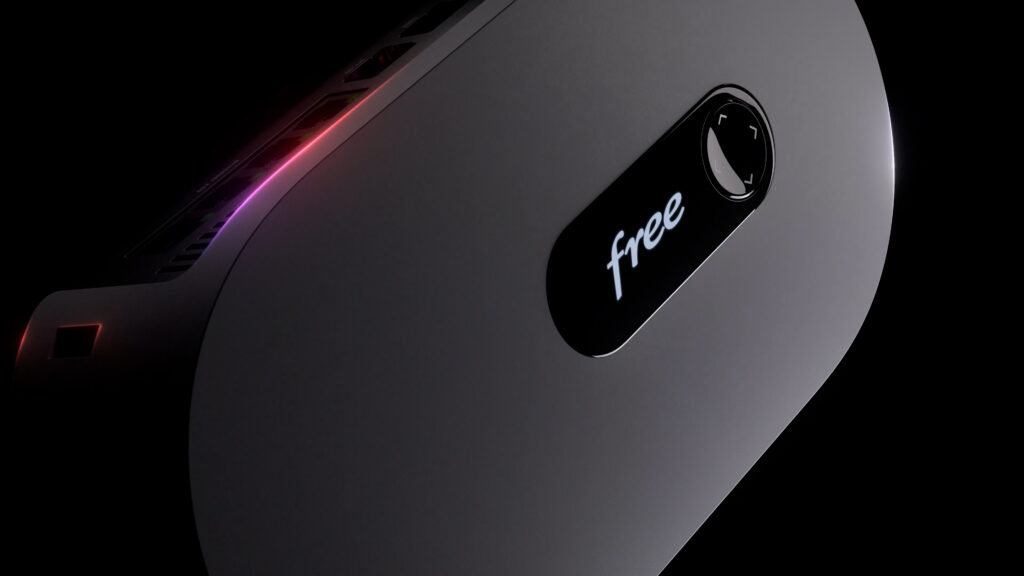
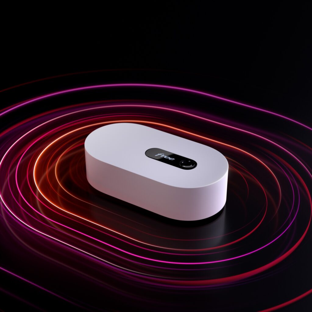
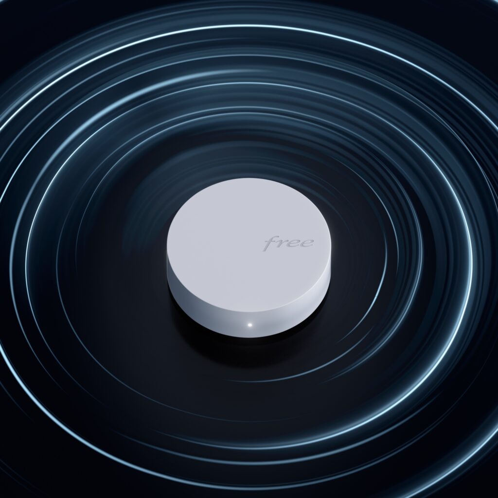
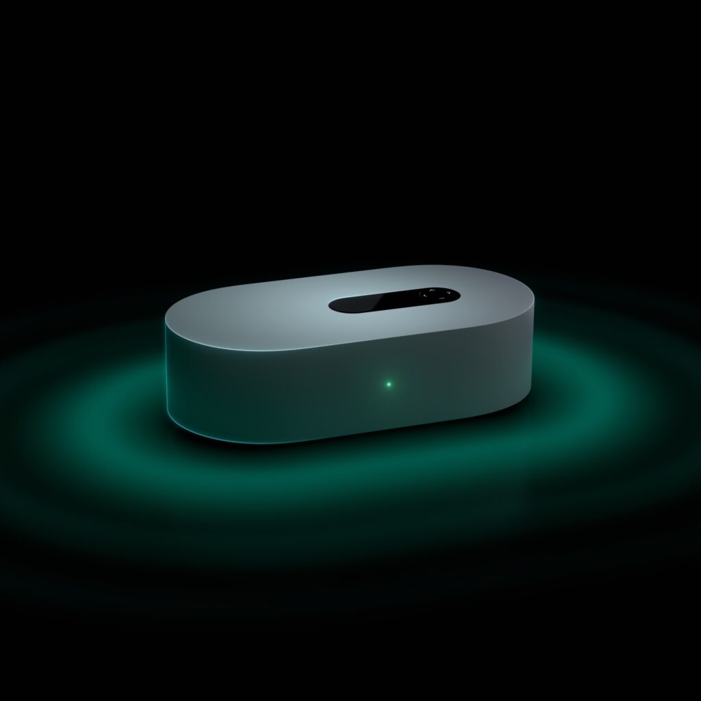
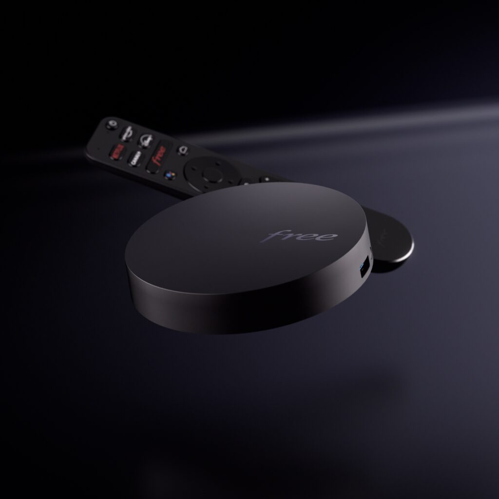
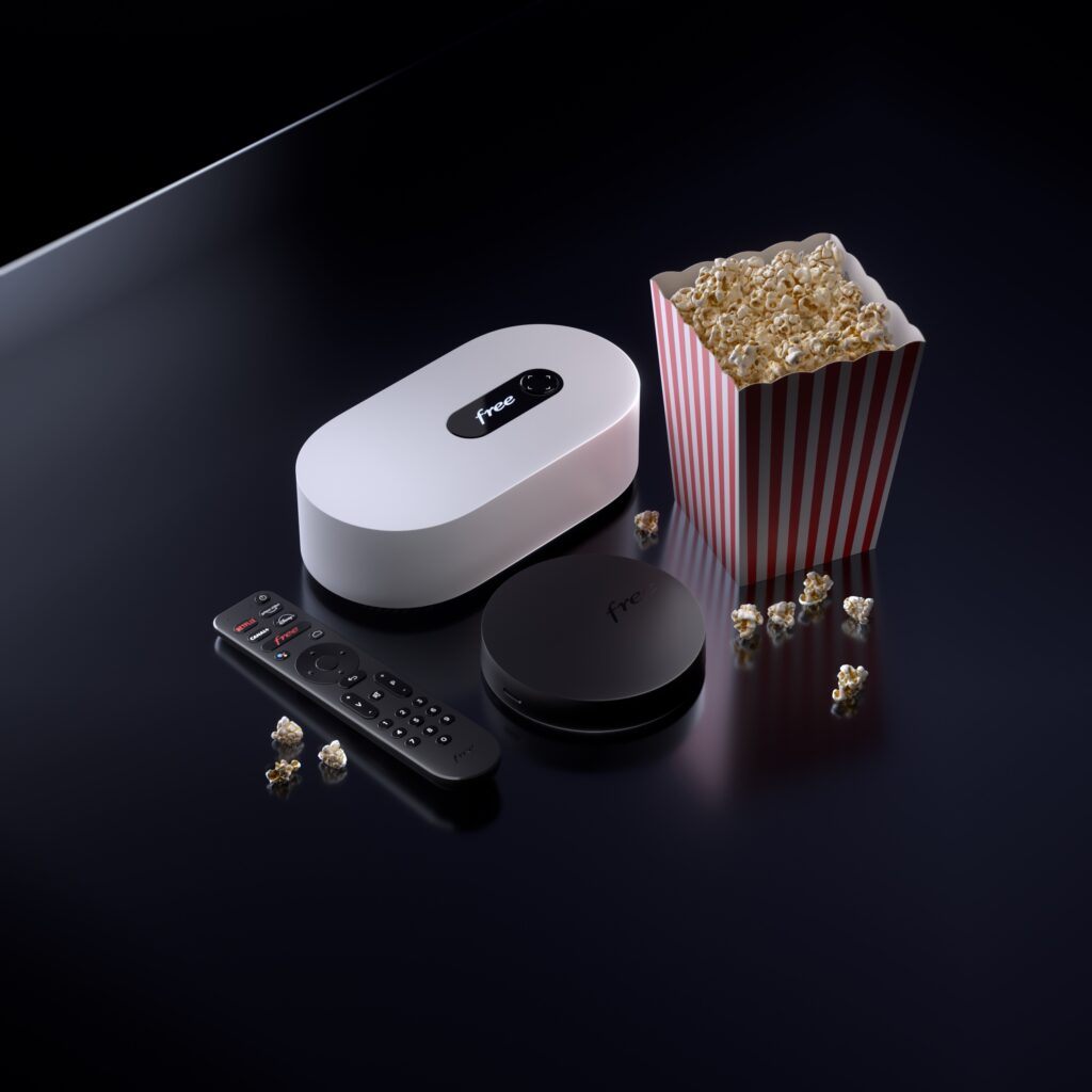
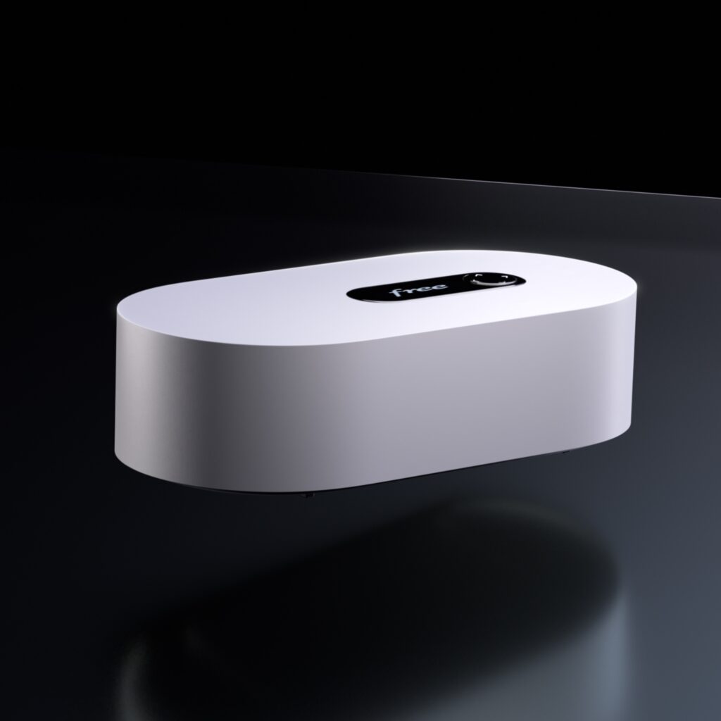
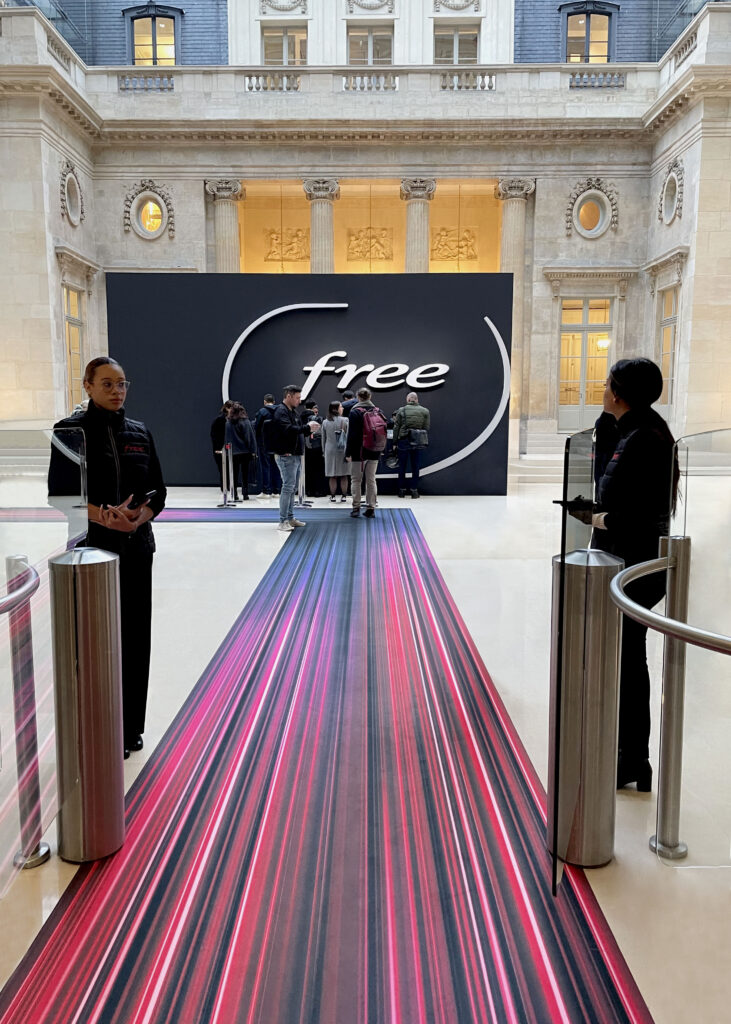
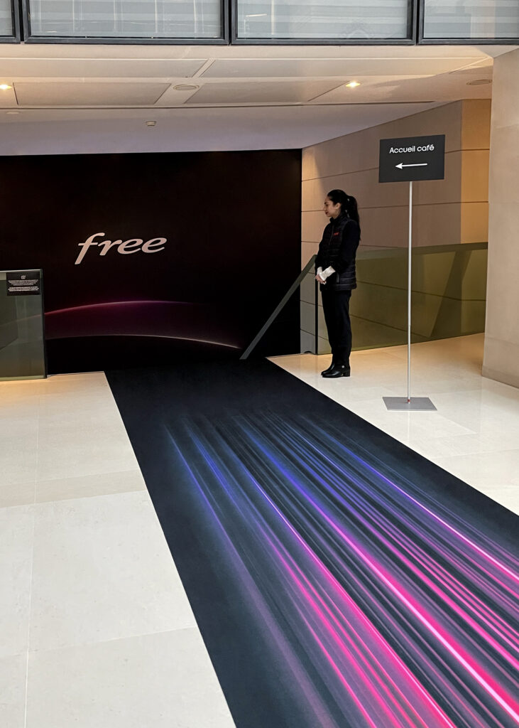
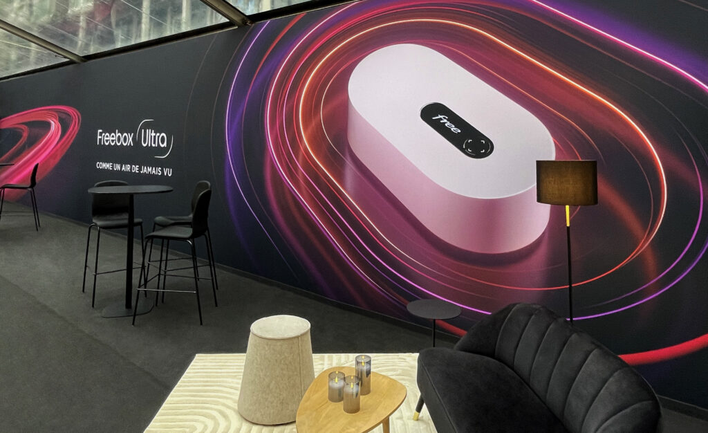
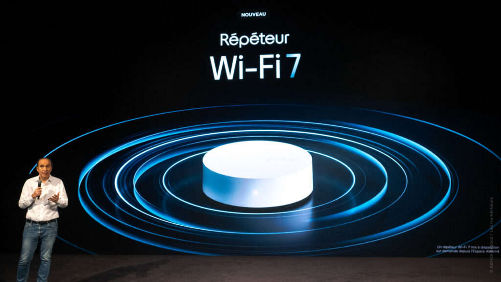
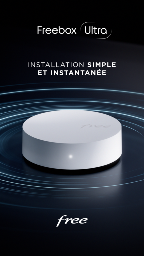
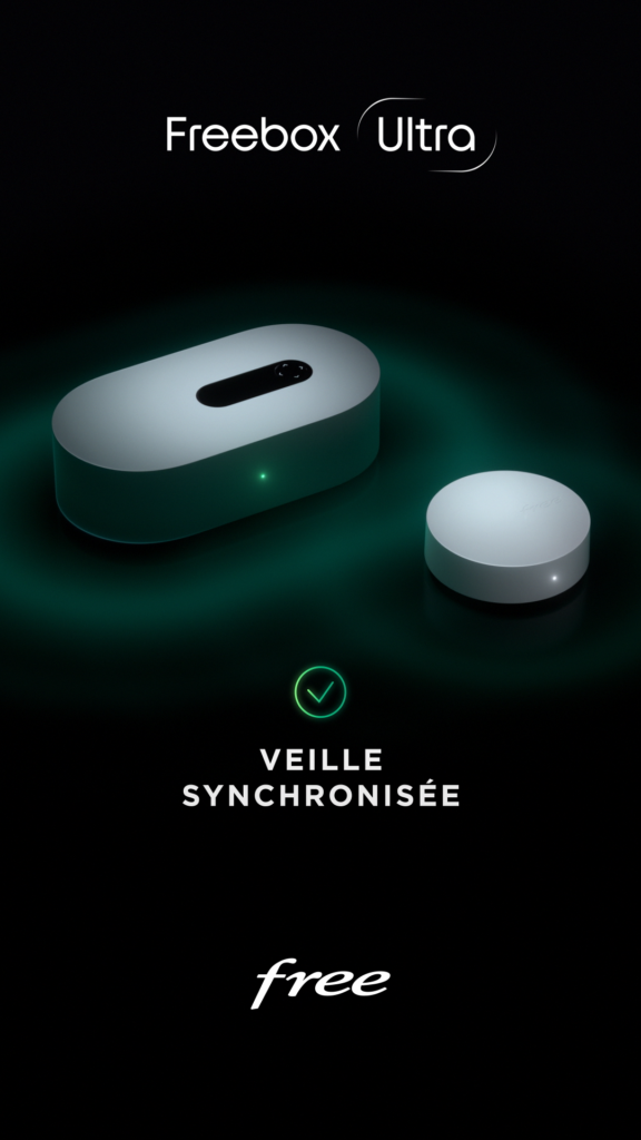
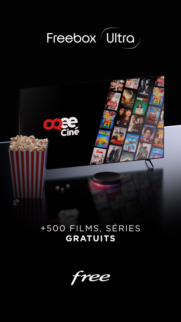
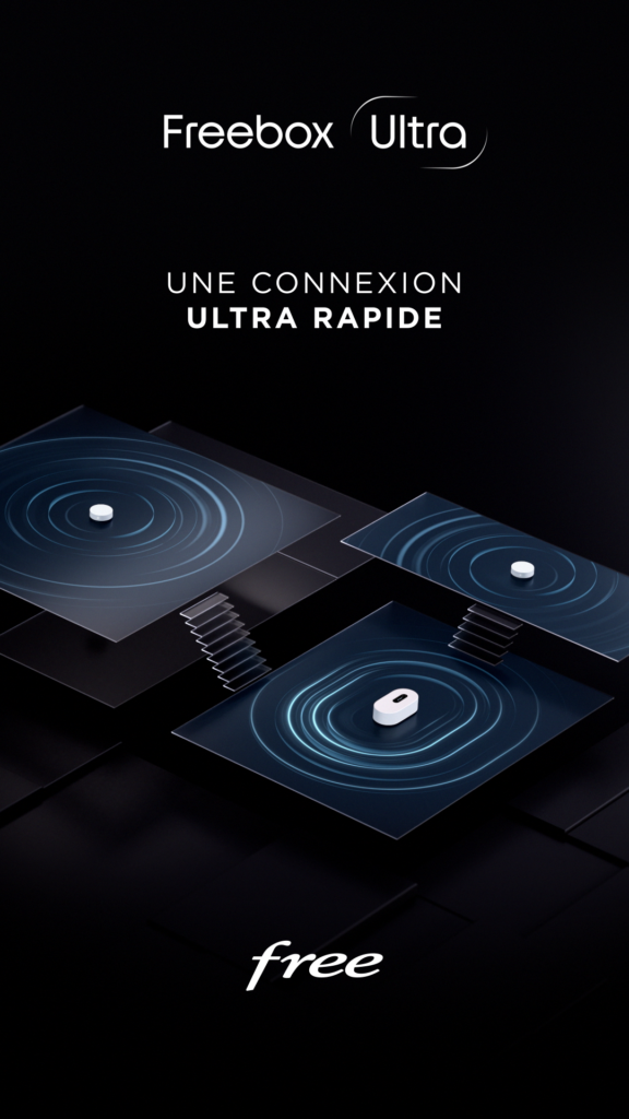
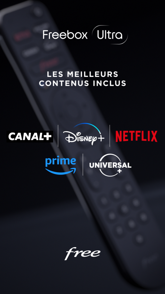
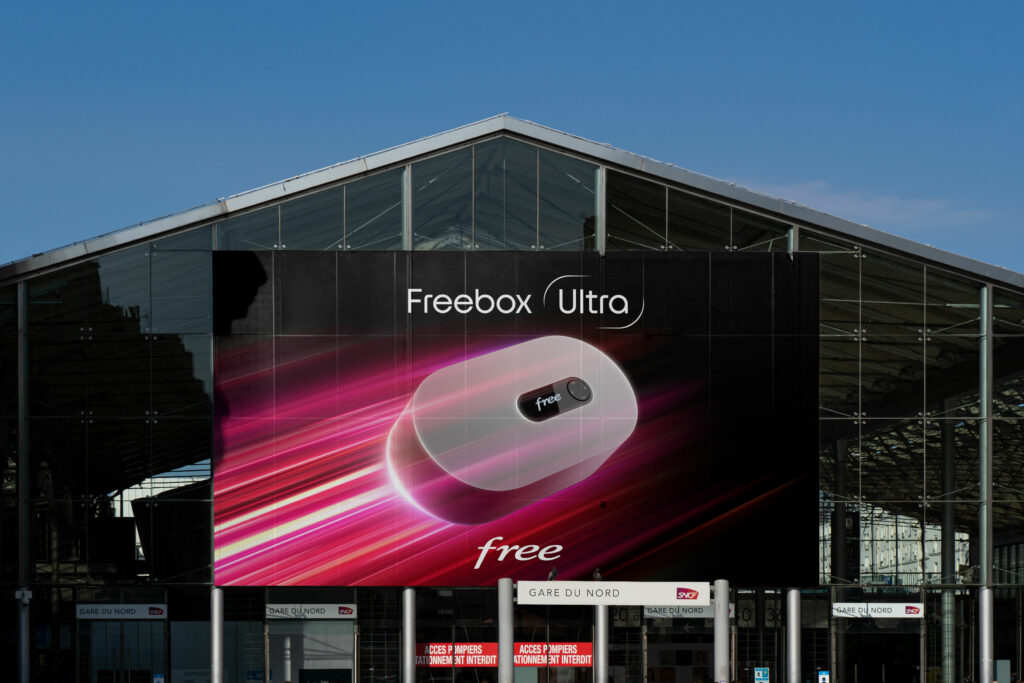
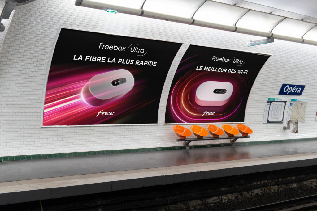
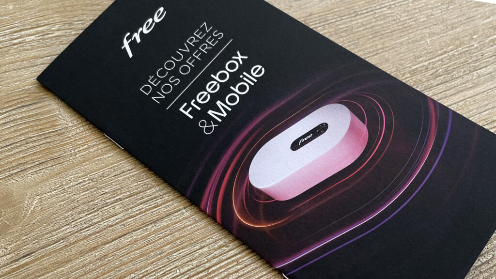
We created a brand territory capable of sublimating this box with its stunning, refined design. A minimalist approach that uses beams of colored light to capture the very essence of the product, revealing its velocity, its power and the richness of its offer.
REVEAL FILM
TEASER
LAUNCH KEYNOTE
CAMPAIGN
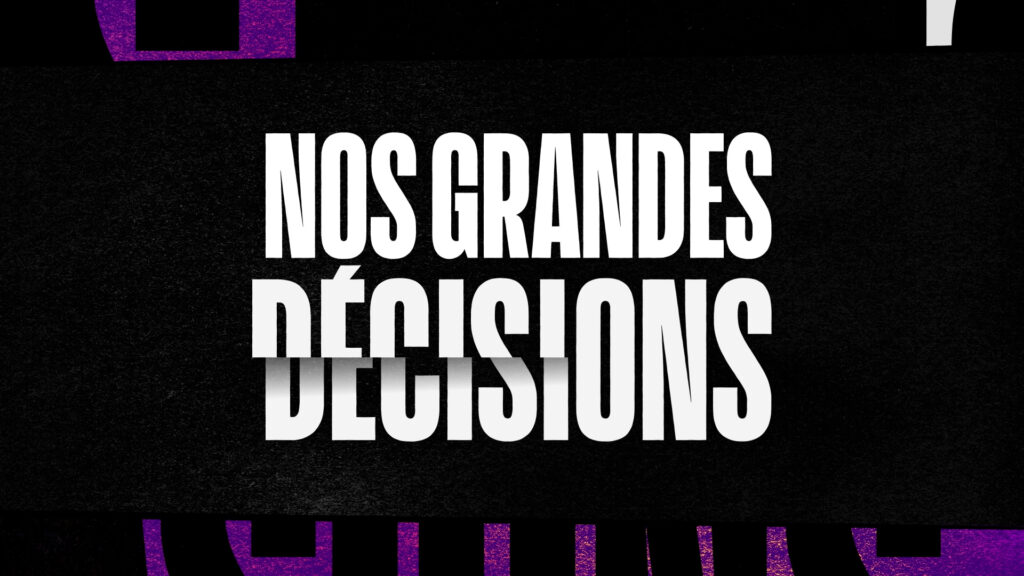
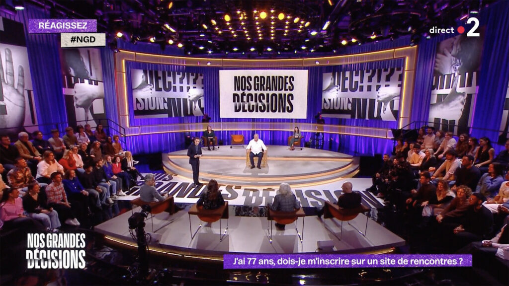
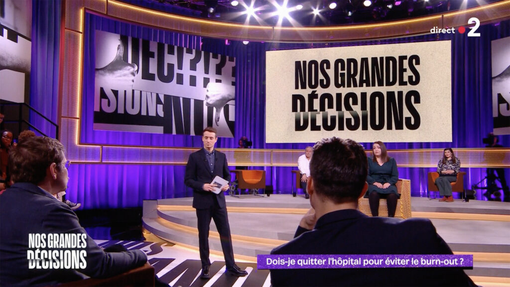
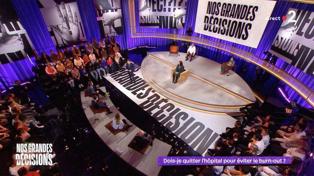
NOS GRANDES DÉCISIONS
CONTEXT
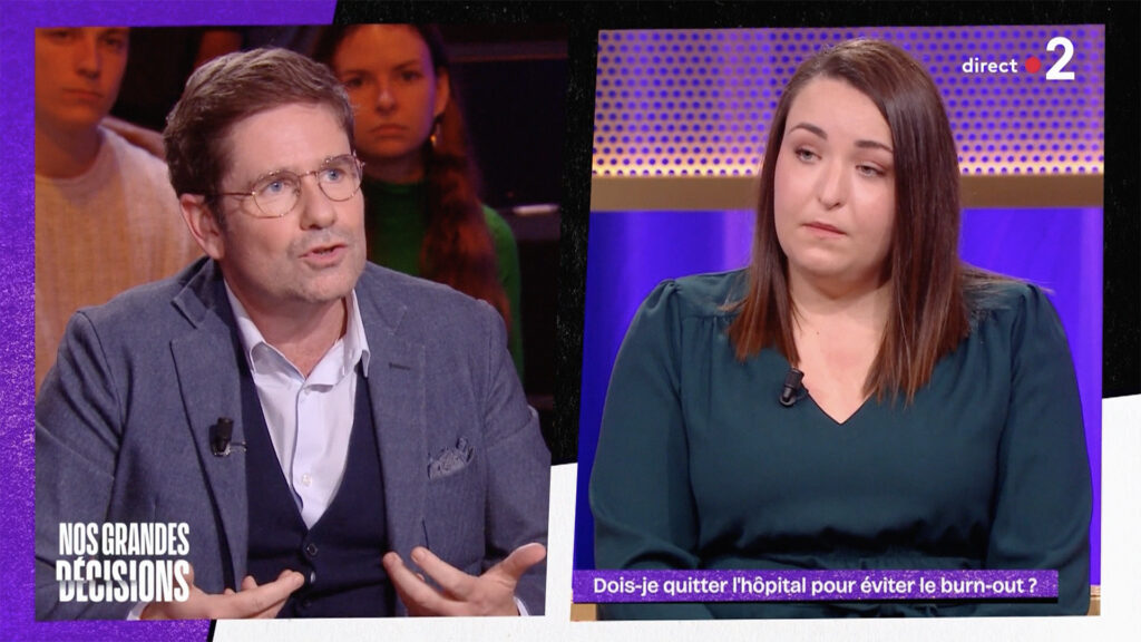
Winter Productions is launching a new late night talk-show on France 2, in which journalist Hugo Clément exchanges with his guests about their societal case of conscience and involves the audience to help guests reach a decision.
CHALLENGE
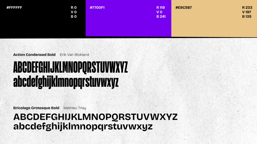
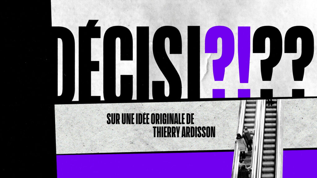
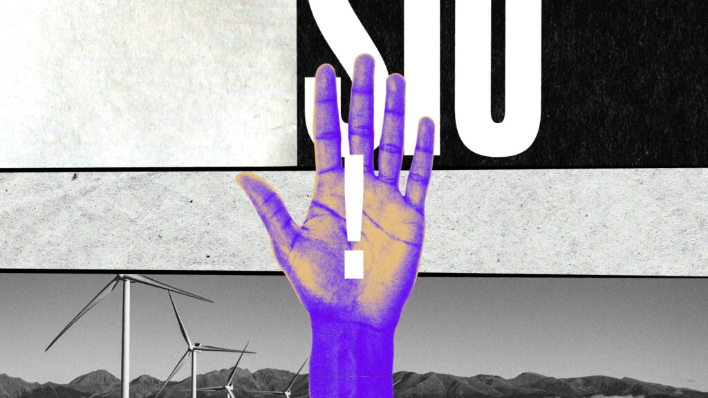
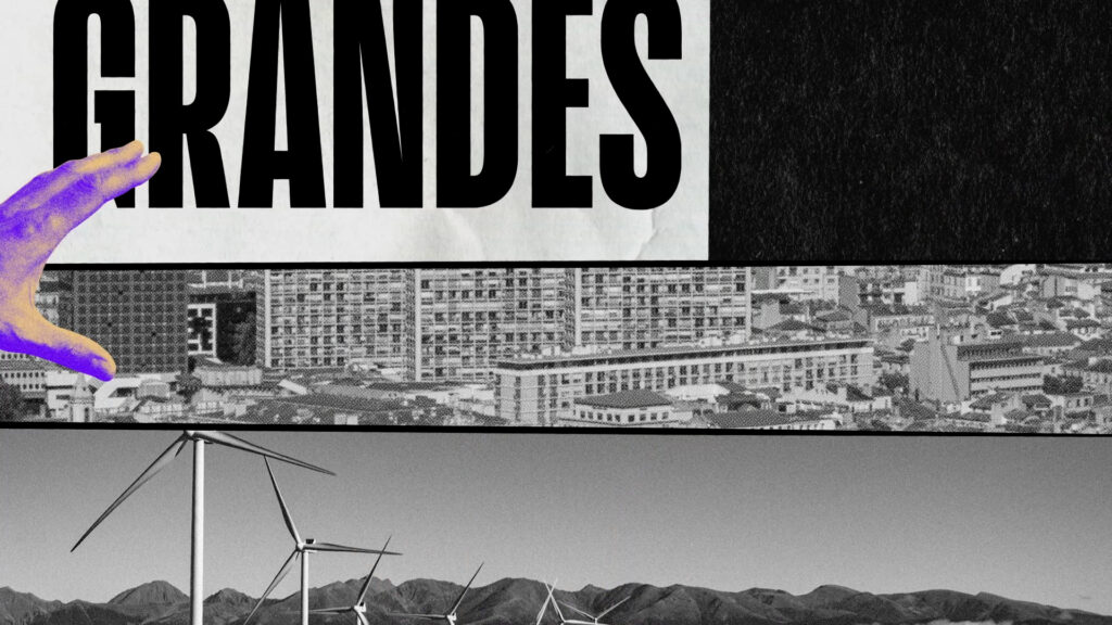
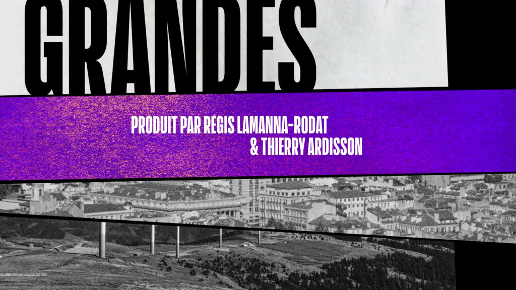
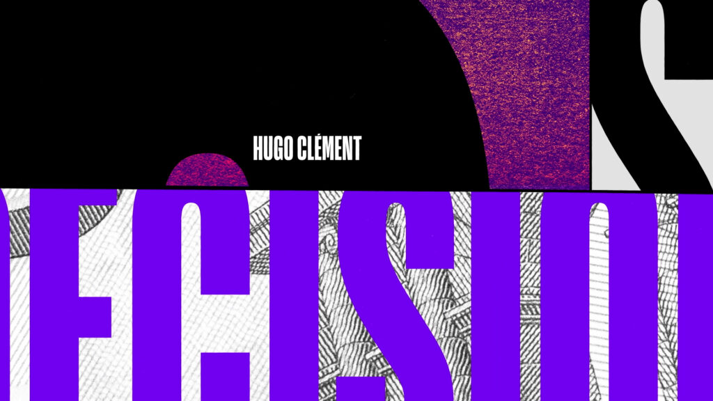
Imagine a singular graphic territory, giving prominence to typography and collage. Develop a graphic identity that embodies its content offer, as informative as it is entertaining.
SOLUTION
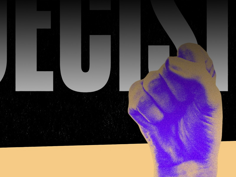
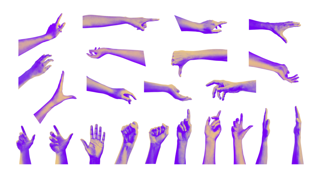
We used graphic tricks (split screens, cut-outs, black and white frames) to express opinion, complicity, debate and division. The hands animating the typographic compositions throughout the credits symbolise the collaboration and involvement of the audience.
VISUAL IDENTITY


OPENING CREDITS
BROADCAST DESIGN
TV SET
R5
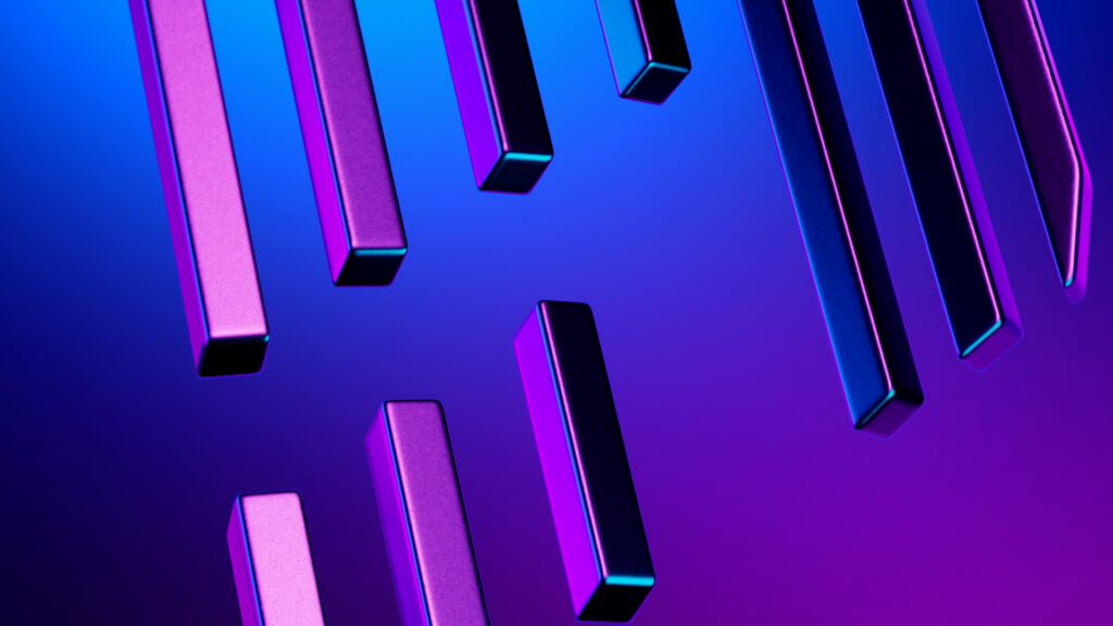
CONTEXT
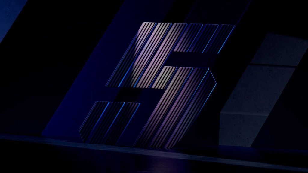
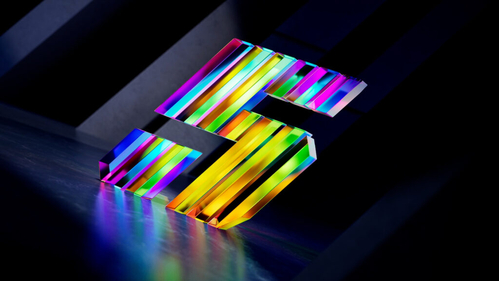
As part of the launch of the Renault 5 E-Tech 100% electric, the brand called on 17mars to create a film featuring the ‘5’ emblem.
CHALLENGE
Design an iconic film that transcends the new brand identity. Define a directing principle that allows for the exploration of exceptional territories of graphic expression.
SOLUTION
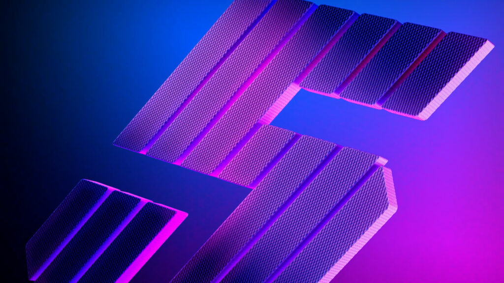
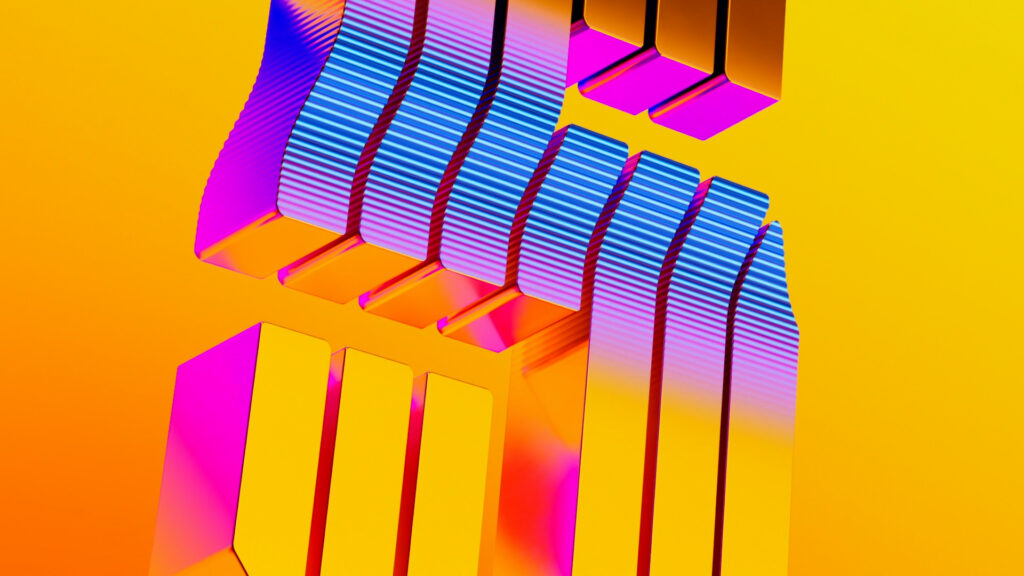
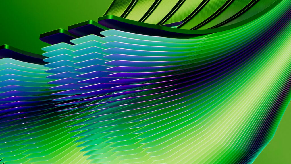
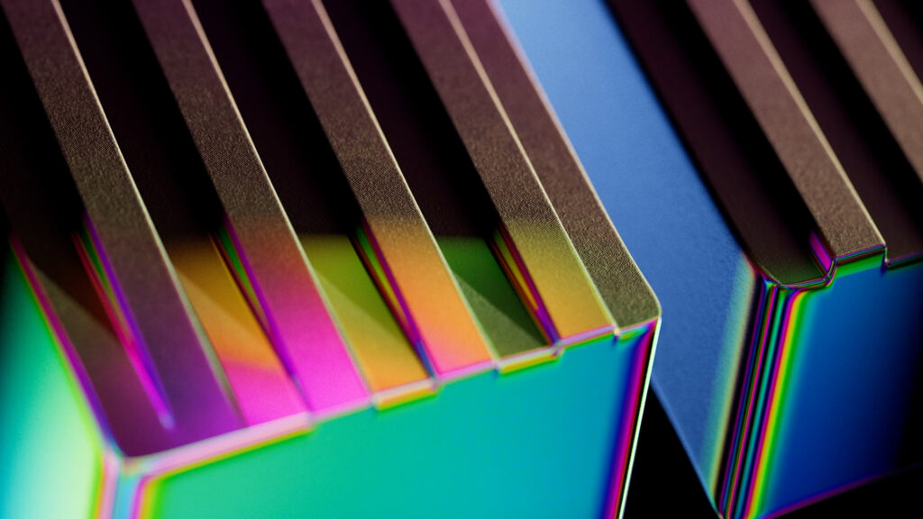
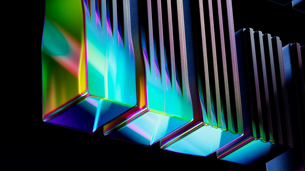
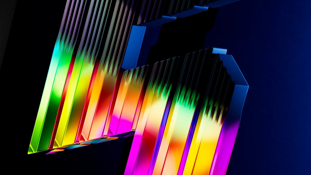
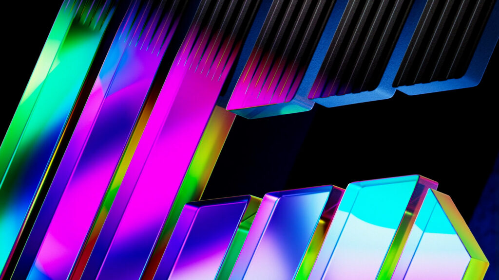
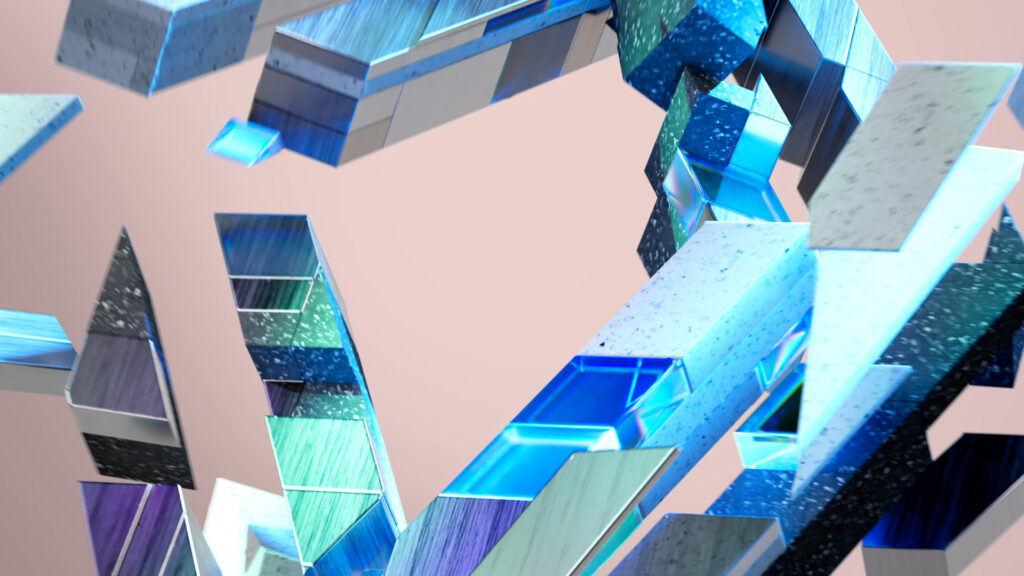
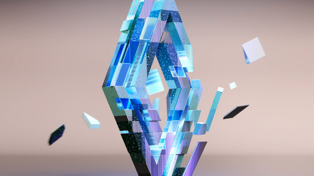
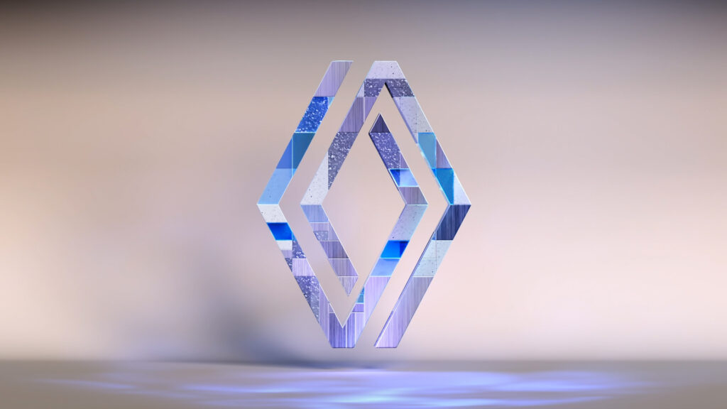
We chose to reinterpret the vehicle’s technological characteristics and celebrate its revival by capitalizing on various logo metamorphosis mechanisms. Thus, each dynamic, texture and dominant color refers to the circular economy, electrification and digitalization, before the film concludes with a reveal playing with crystalline iridescence, echoing the electro-pop codants specific to Renault 5.
IDENTS
CONTEXT
As part of its prospective research, Renault is looking for new graphic expressions for its emblem and the brand new R5 logo.
CHALLENGE
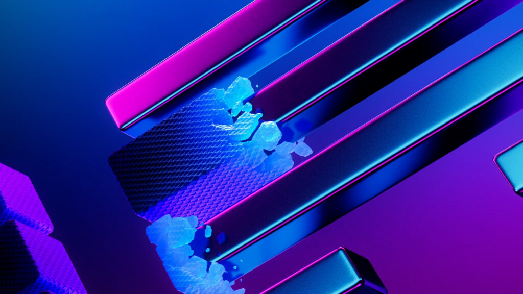
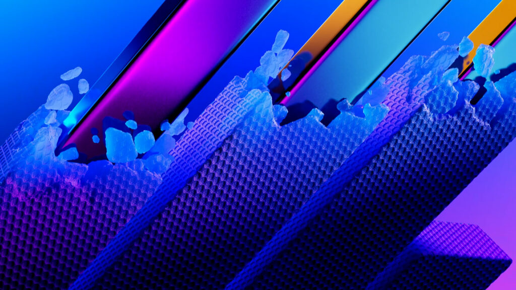
Design 4 idents. Explore several visual territories and animation principles. Assert the brand’s electro-pop and tech positioning.
SOLUTION
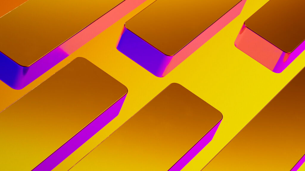
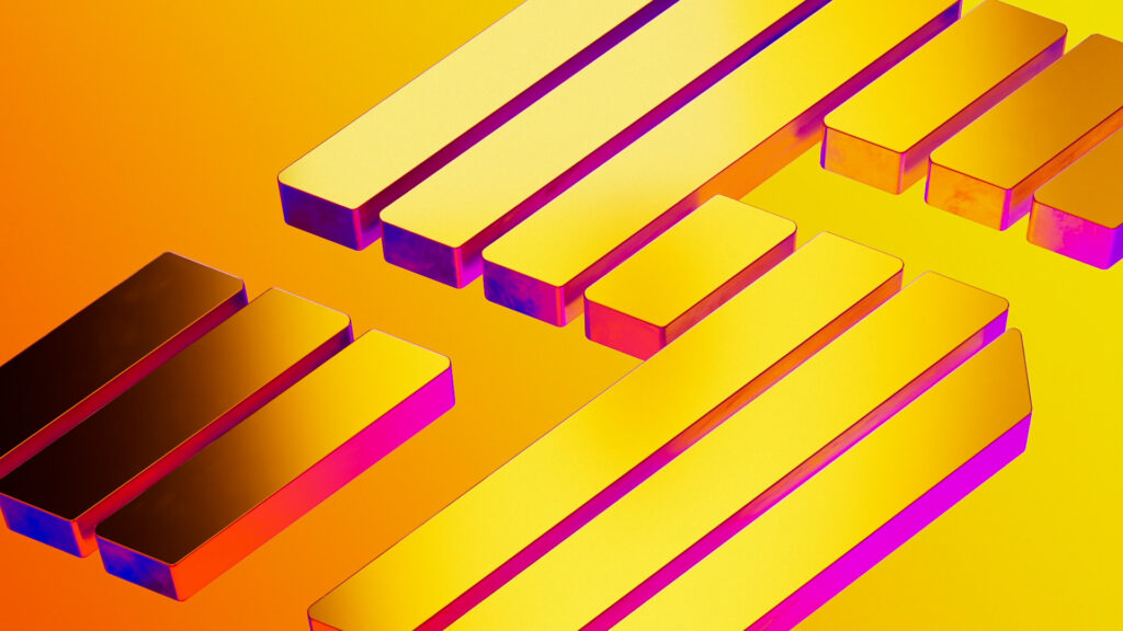
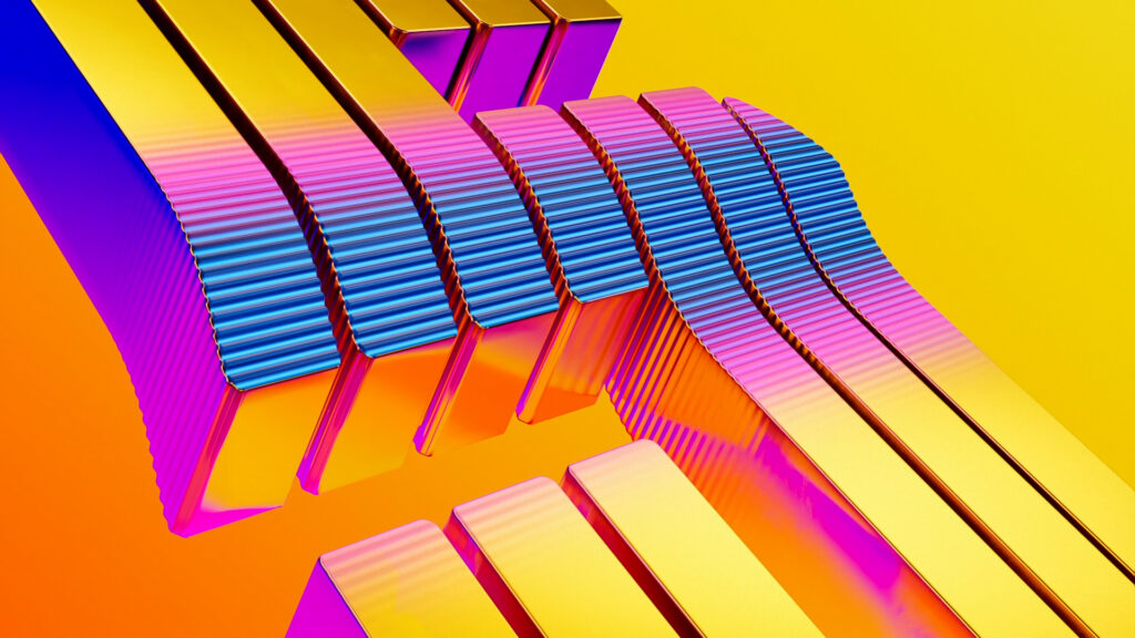
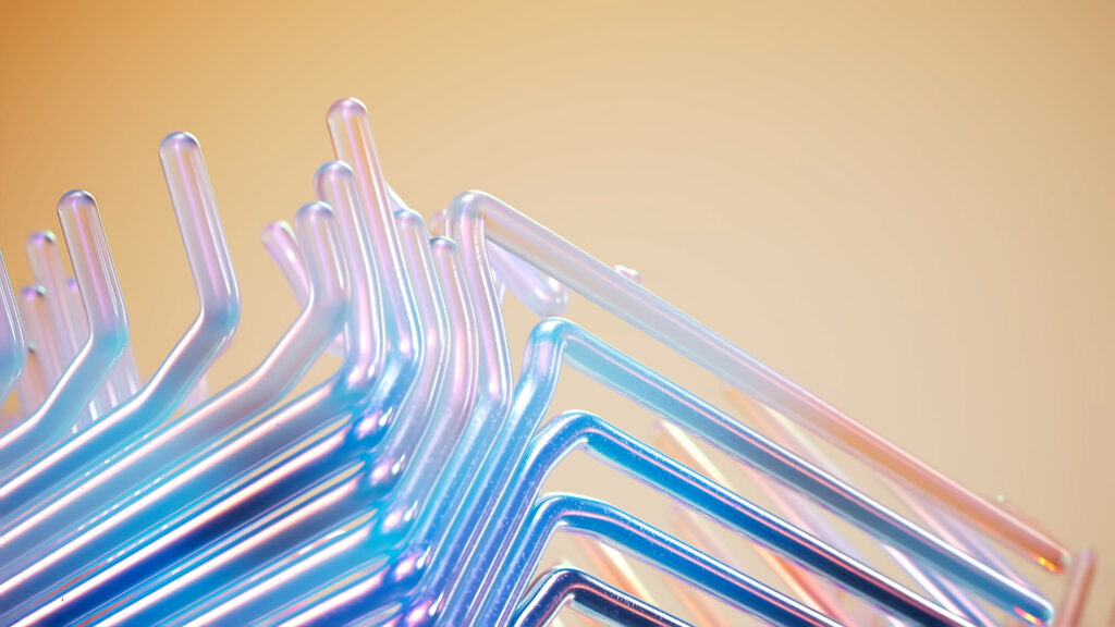
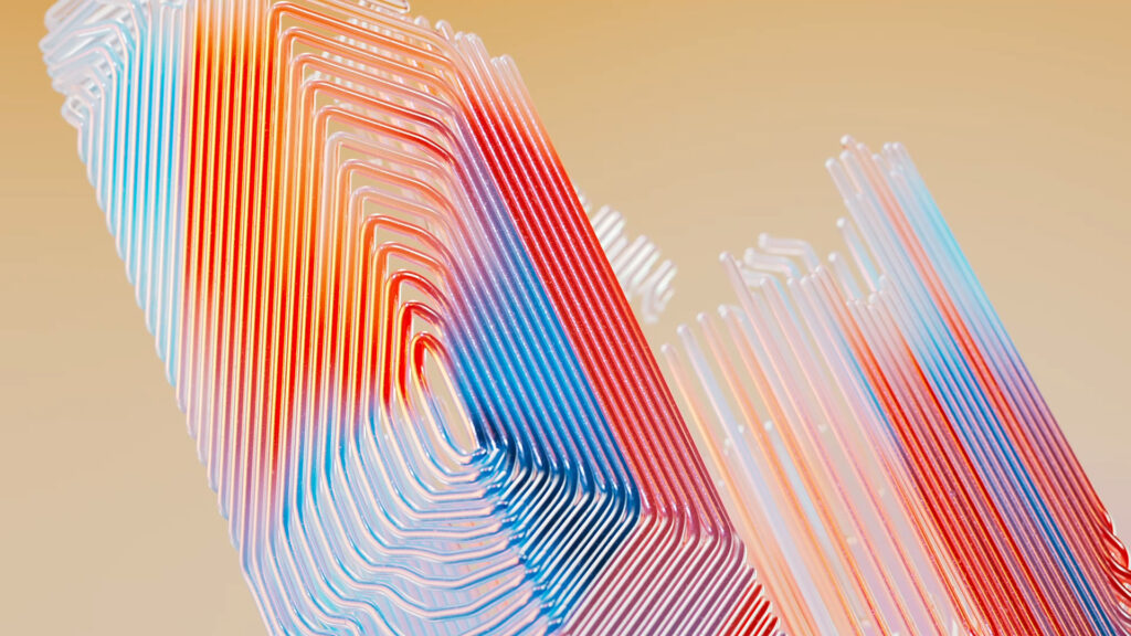
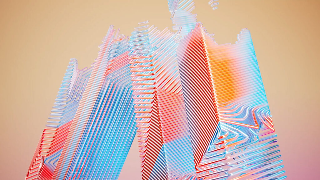
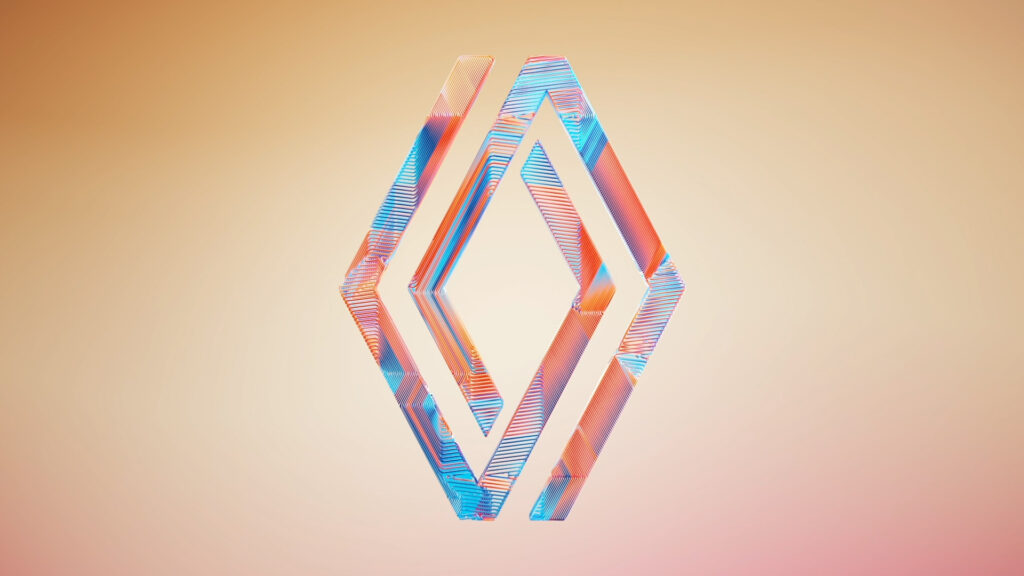
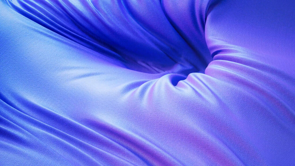
We have chosen to link each ident to a manufacturing process from the automotive industry: embossing, magnetism, 3D printing and inflating. This approach offers a range of different ways of revealing the car, amplified by the generosity of the 3D rendering and the colours used. All this is in keeping with Renault’s resolutely premium approach.
TADAMM!
CONTEXT
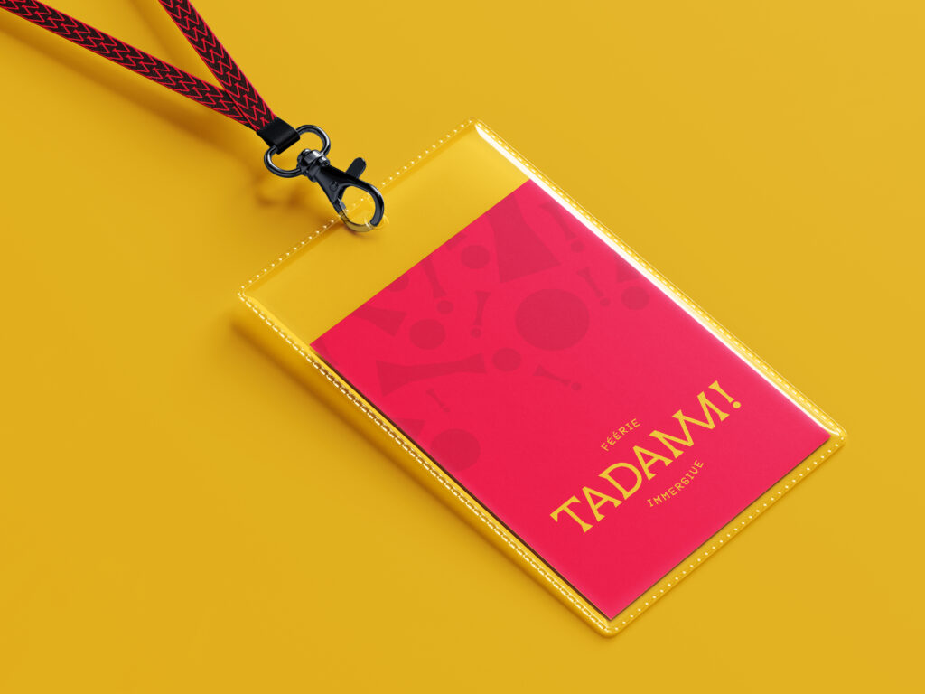
Big Incredible is launching the first traveling venue offering immersive experiences. On tour, TADAMM! will set up in city-center squares for several weeks, with a diverse offer. The agency is working alongside Big Incredible to develop a global strategic thinking on the launch of its offer and the definition of its visual identity.
CHALLENGE
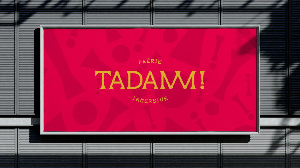
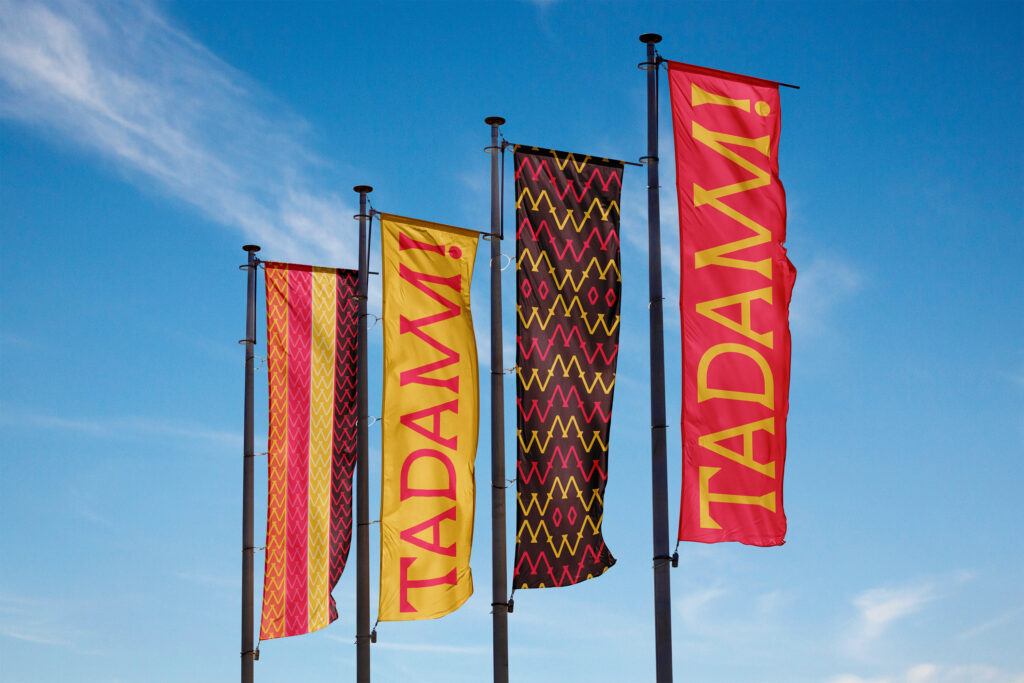
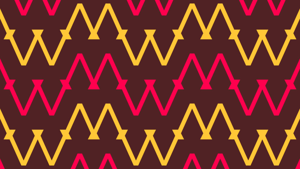
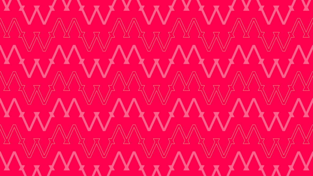
Create a visual identity that takes inspiration from the circus codes, as a nod to showmen who, during their time, contributed to the democratization of cinema. Imagine a singular sign that evokes mobility and wonder, as an invitation to performance. Define a modular system fit to adapt to various formats : screen, architecture, signage, communication.
SOLUTION
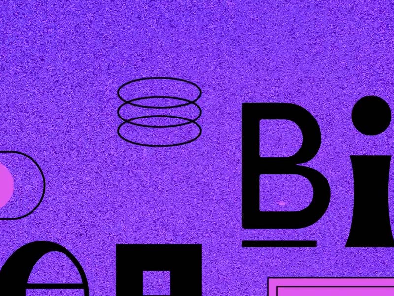
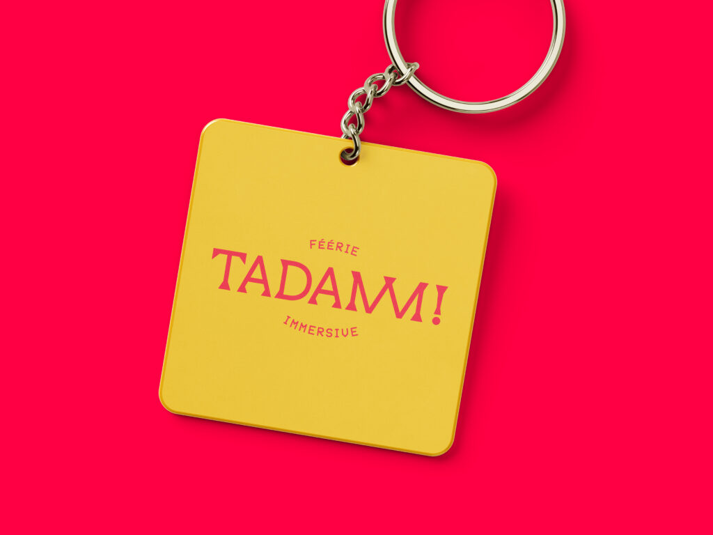
We created the typographic bloc of the TADAMM! logo from a lineal base, on which straight geometrical serifs were added, giving the wordmark sturdiness. These shapes are evocative of a circus tent structure. The double M, a letter-object, alludes to the majestic opening of a stage curtain. This glyph becomes the emblematic monogram of the brand.
The digital dimension is visible in the pixellised lettering used for the baseline. The distinctive color palette of the circus world was revisited, enriched with fluorescent tints, in order to create a more contemporary whole.
PATTERNS

R5 – ADAS
CONTEXT
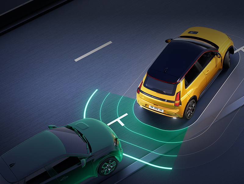
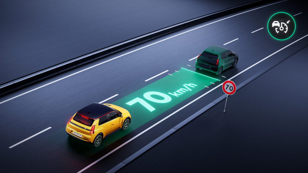
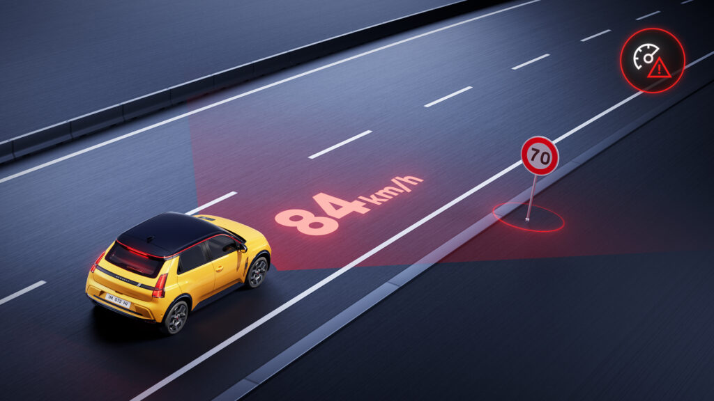
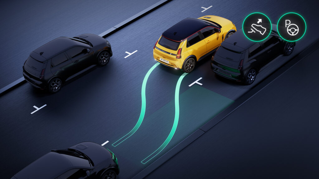
To coincide with the launch of the 100% electric Renault 5 E-Tech, Renault wanted to modernise the look of its driver assistance presentation modules (ADAS): animations and still images.
CHALLENGE
Bring a cinematographic and spectacular dimension to educational communication.
Define a procedure capable of industrializing production.
SOLUTION
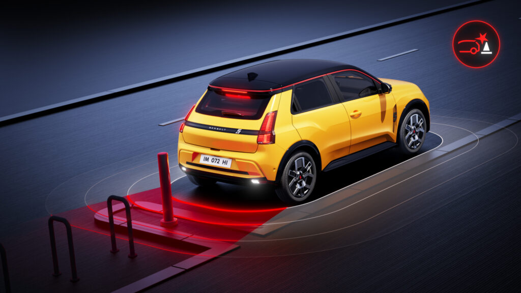
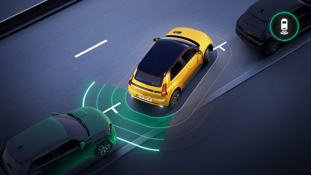
We developed a photo-realistic rendering, playing with the contrast between the scenery and the vehicle. Magnified by the lighting, we placed it at the heart of a staging that multiplies camera movements, axes and frame values.
Beyond the demonstration, our aim was to echo the visual territory developed around R5: colourful and generous. A particular attention was paid to detail: vehicle conformity as well as realism of situations.
We produced more than four minutes of 3D animation and around thirty still images.

IN-STORE BRAND DESIGN
CONTEXT
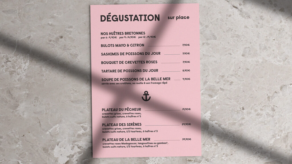
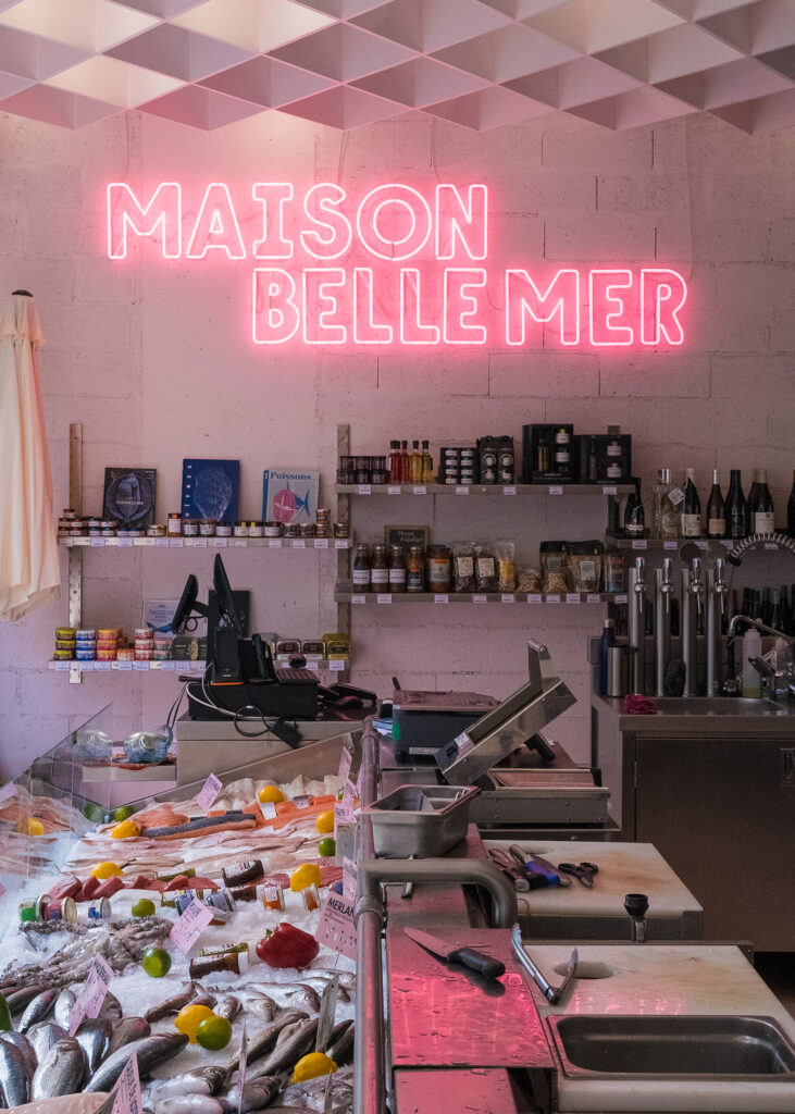
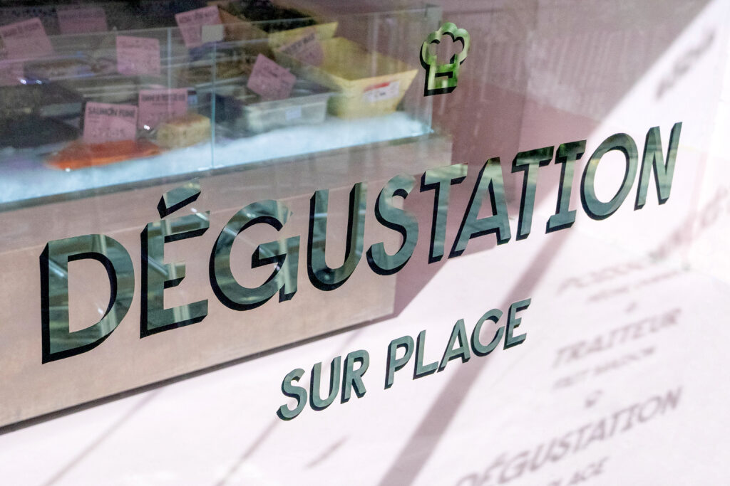
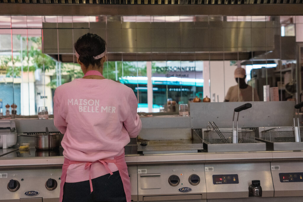
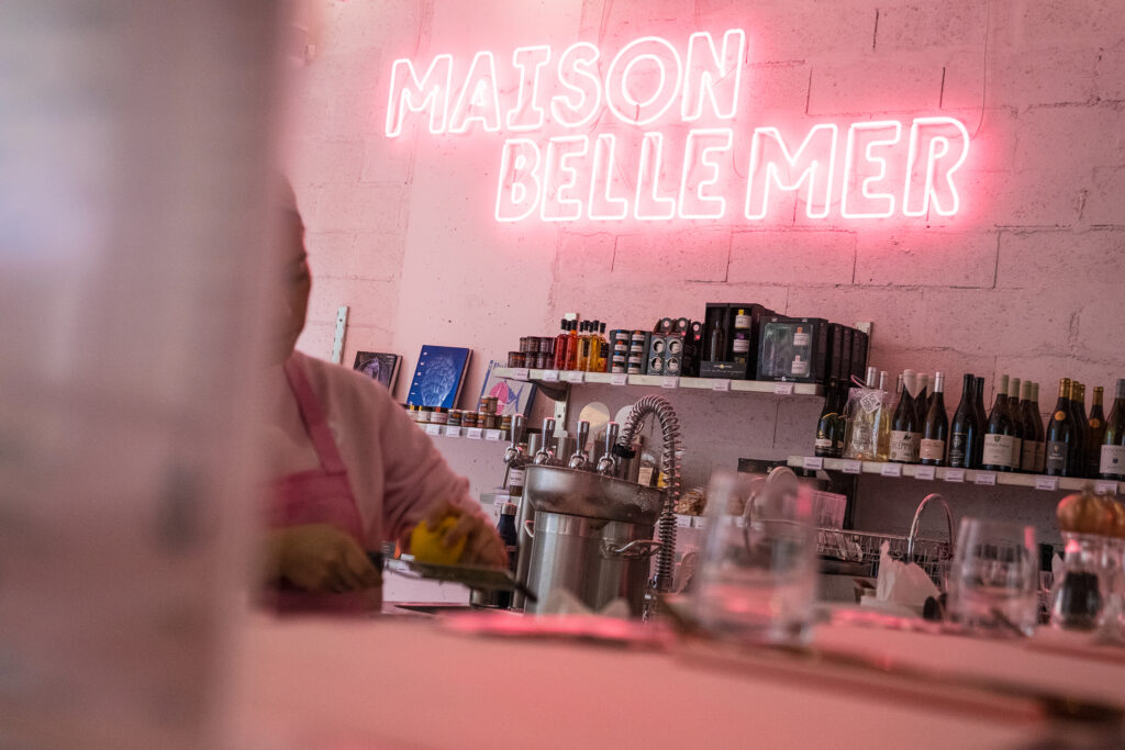
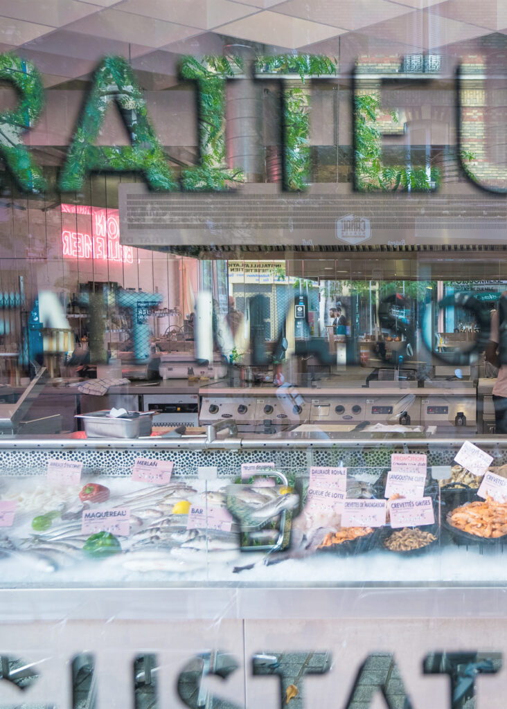
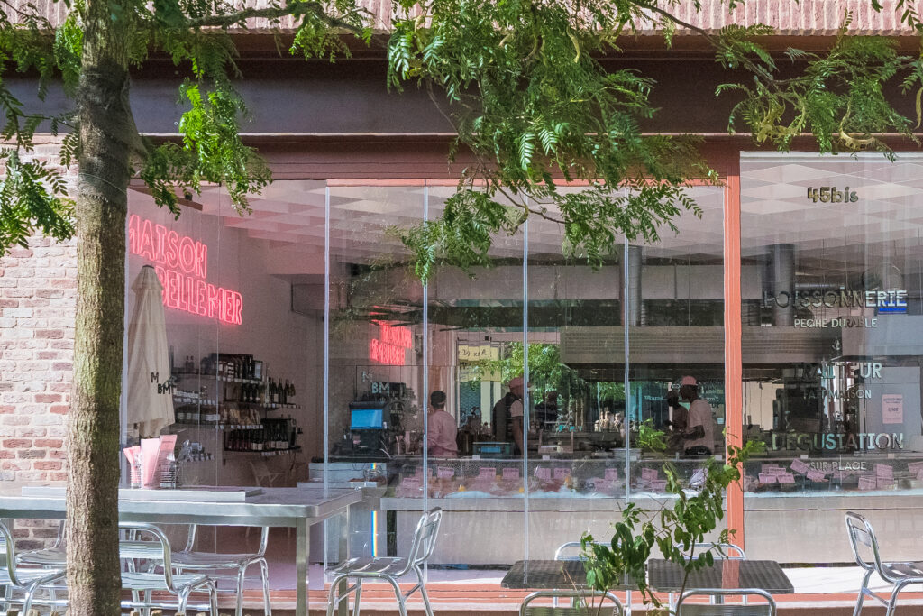
Maison Belle Mer, a fishmonger recently established in Pantin, called on 17MARS to design its entire visual identity.
CHALLENGE
Turn this fishmonger’s into a recognised establishment with a strong pop identity, by breaking with this type of business’ traditional codes.
SOLUTION
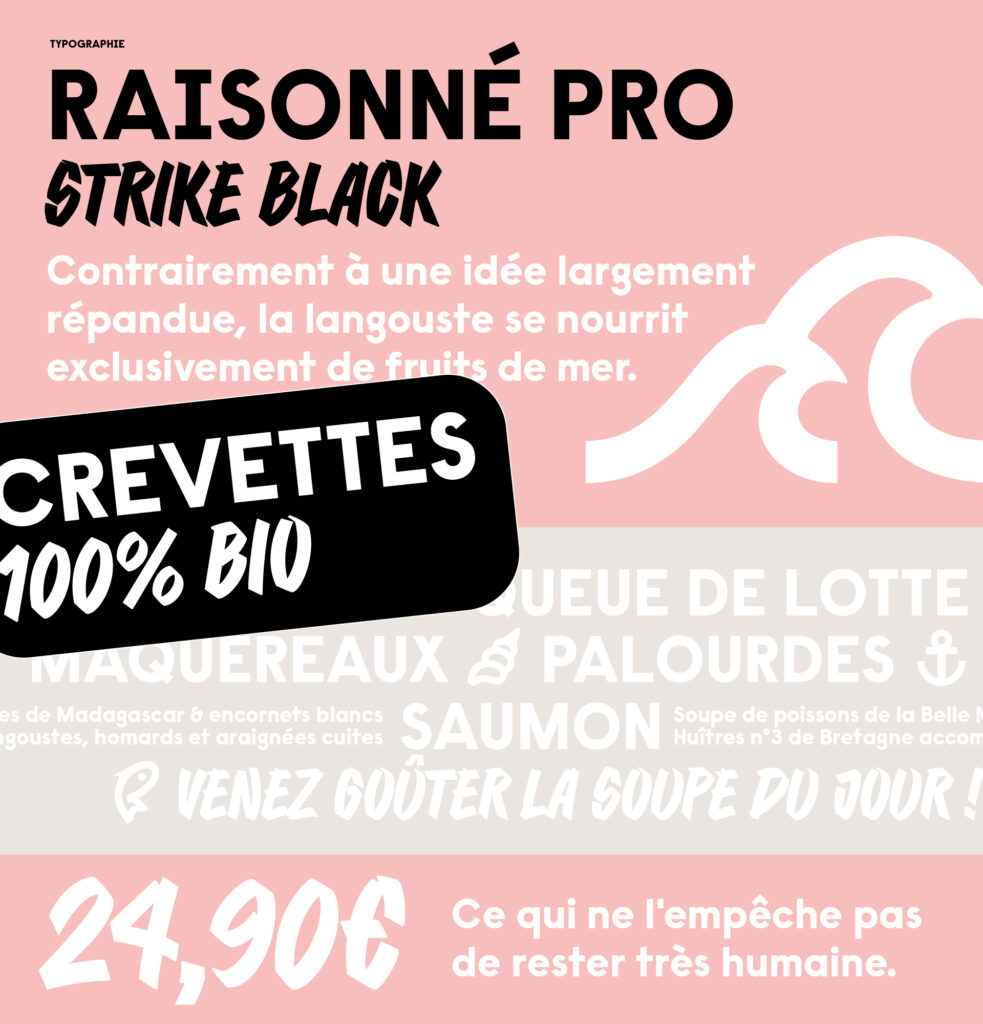
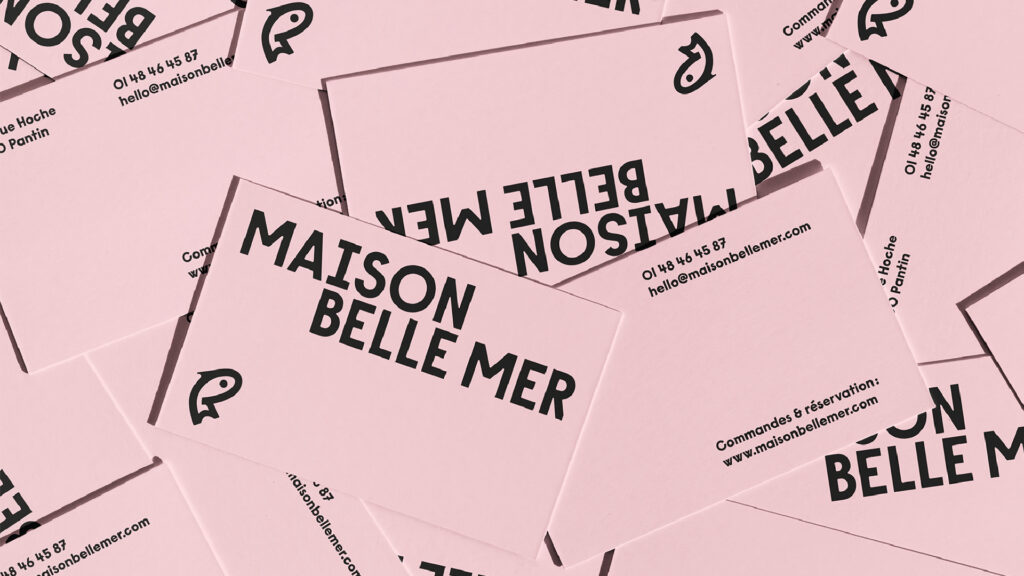
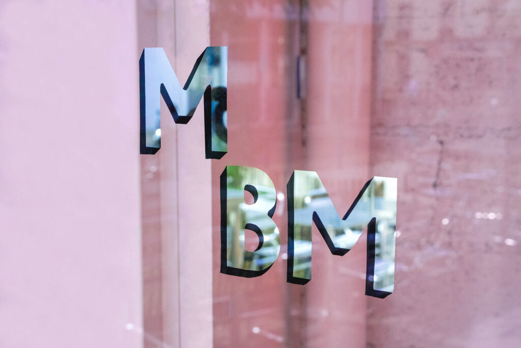
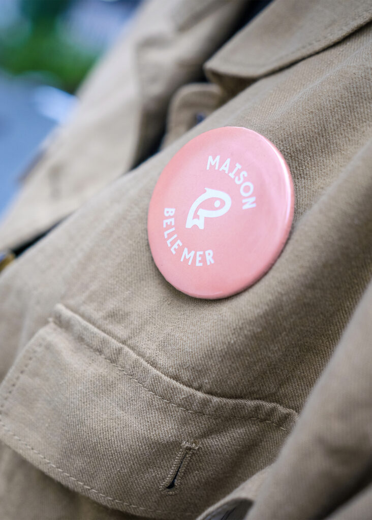
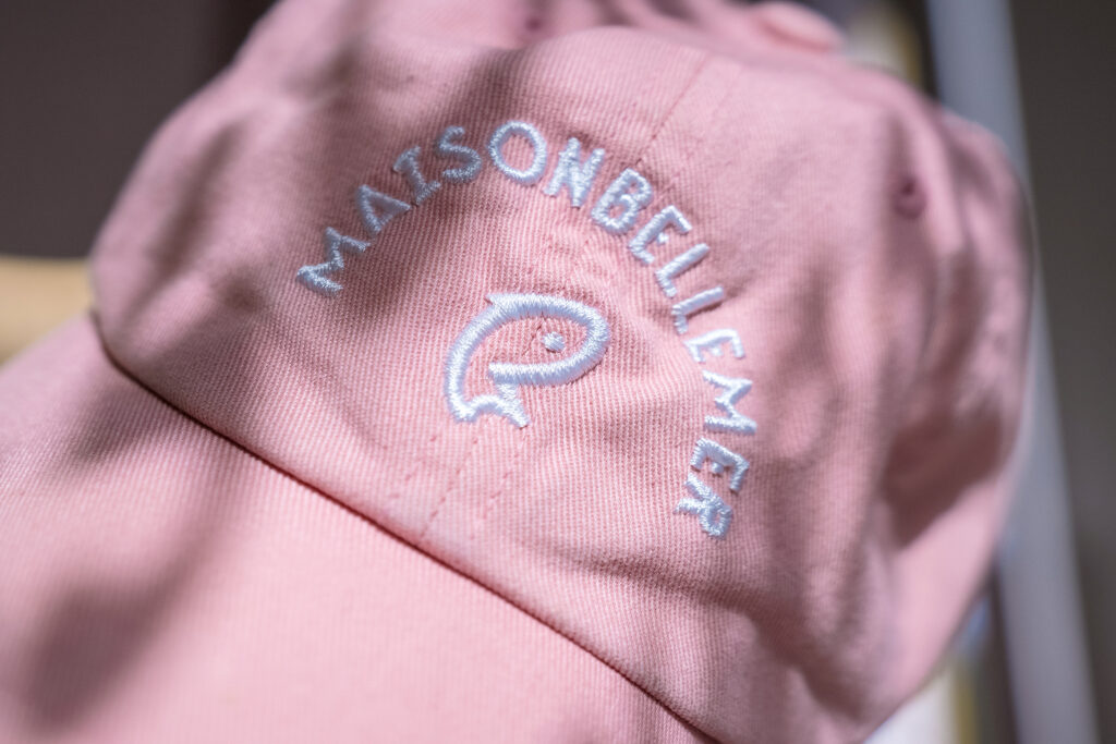
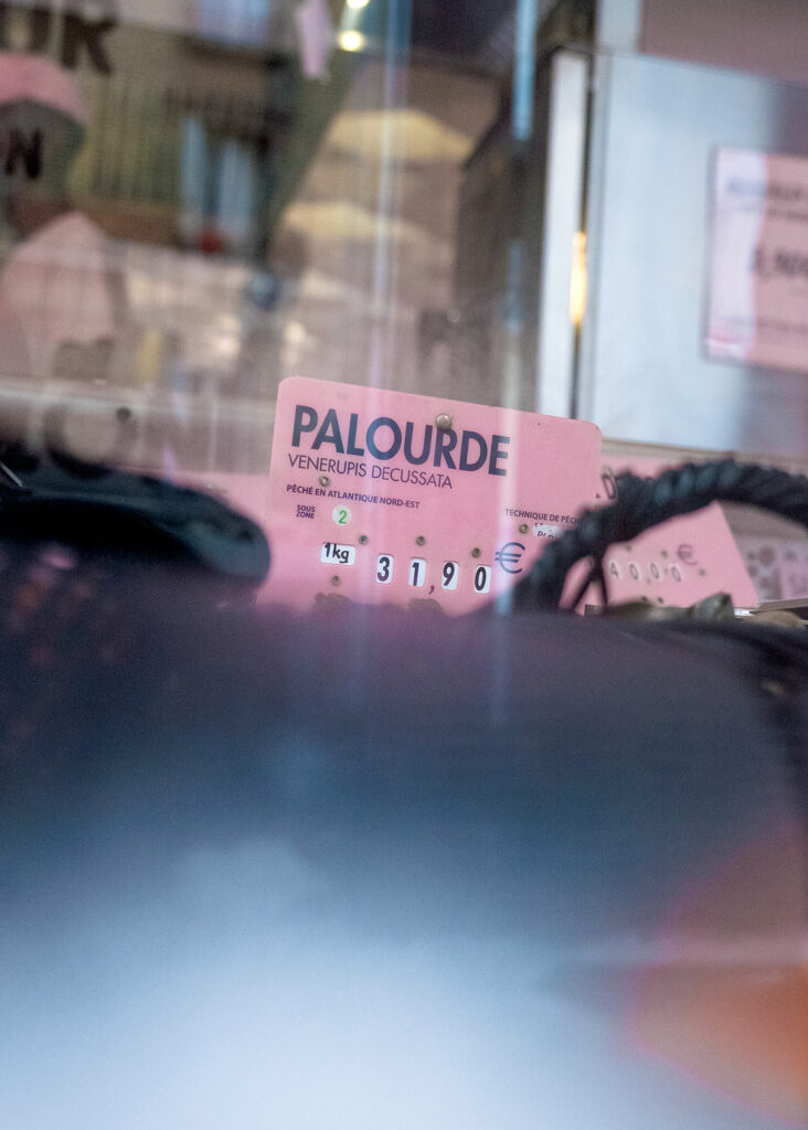
In order to break away from the classic representation of the fishmonger, we combined traditional aspects such as the logo lettering, inspired by ships’ nameplates, with modern design elements using pop colours, textures and pictograms. The colour palette of pink, beige paper shades and shiny stainless steel creates a play of contrasts and harmonies, designed to evoke the shop’s architecture and equipment.
We developed a complete visual identity including logo design, menus, marine pictograms, templates for publications on social media, brand identity film, merchandising and product labels.

CHRISTMAS ELVES
CONTEXT
Every year, France 2 gathers its viewers around its Christmas packaging, a moment of communion between the channel and its audiences.
CHALLENGE
Depict the holiday spirit while preserving the strong visual and musical identity of the channel. The aim is to reinforce the special bond between France 2 and its audience during that time of year.
SOLUTION
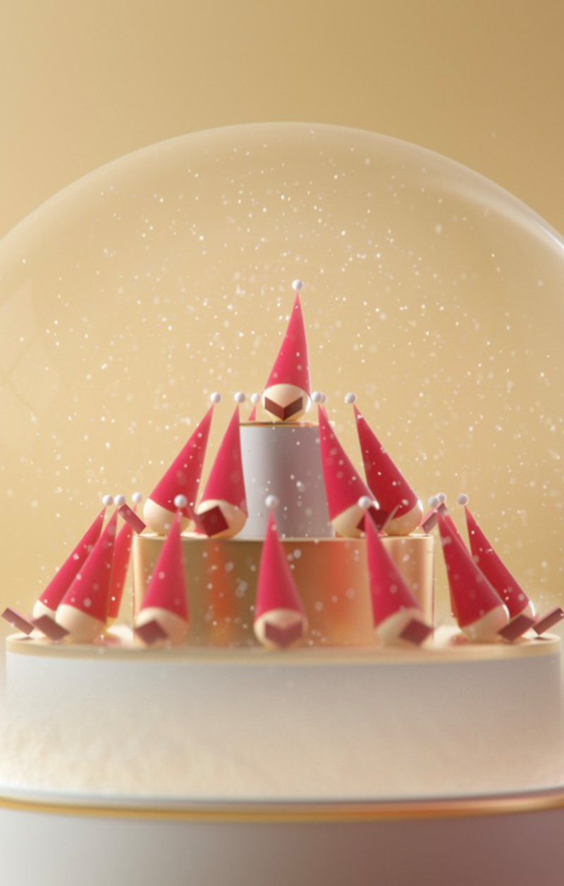
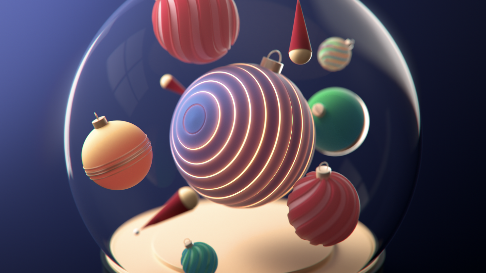
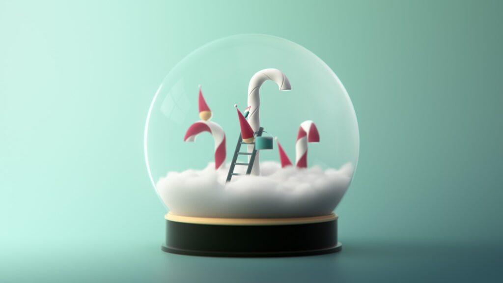
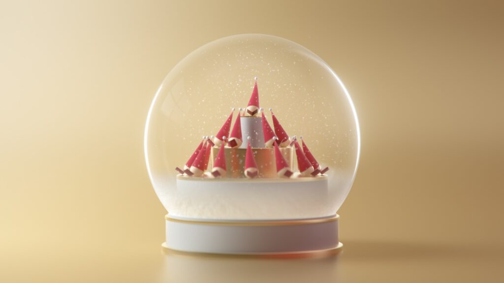
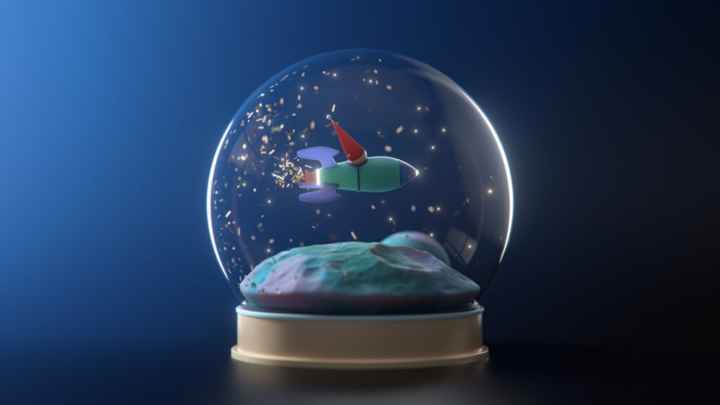
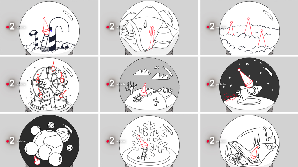
We chose the snowball as a symbol for the Christmas spirit, embodied by cheeky little elves with red hats. Each scene is a small world full of poetry and always tinged with a touch of surrealism. The snowball takes us back to our childhood, rekindling our love for Christmas.


PROCESS
QUELLE ÉPOQUE !
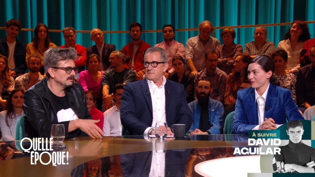
CONTEXT
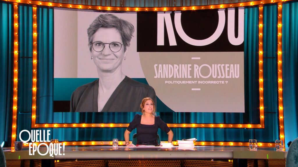
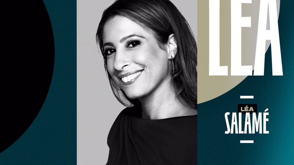
France 2 puts on the air its new Saturday night talk show, orchestrated by Léa Salamé who receives personalities from all backgrounds and all ages. The show is produced by Winter Productions.
CHALLENGE
Revive a strategic program slot for France 2, traditionally centered around talking and debating about social issues.
SOLUTION
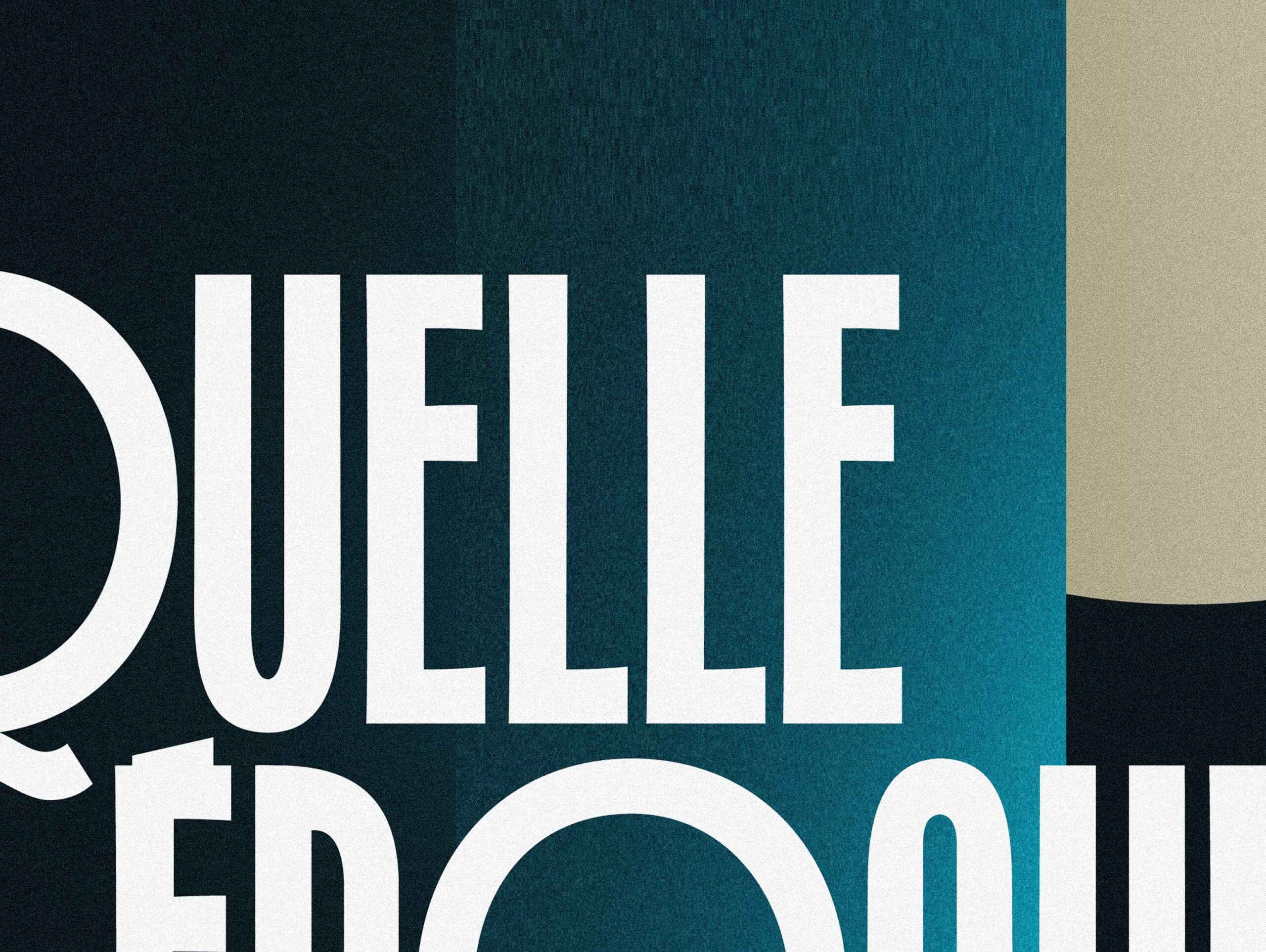
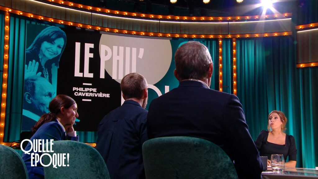
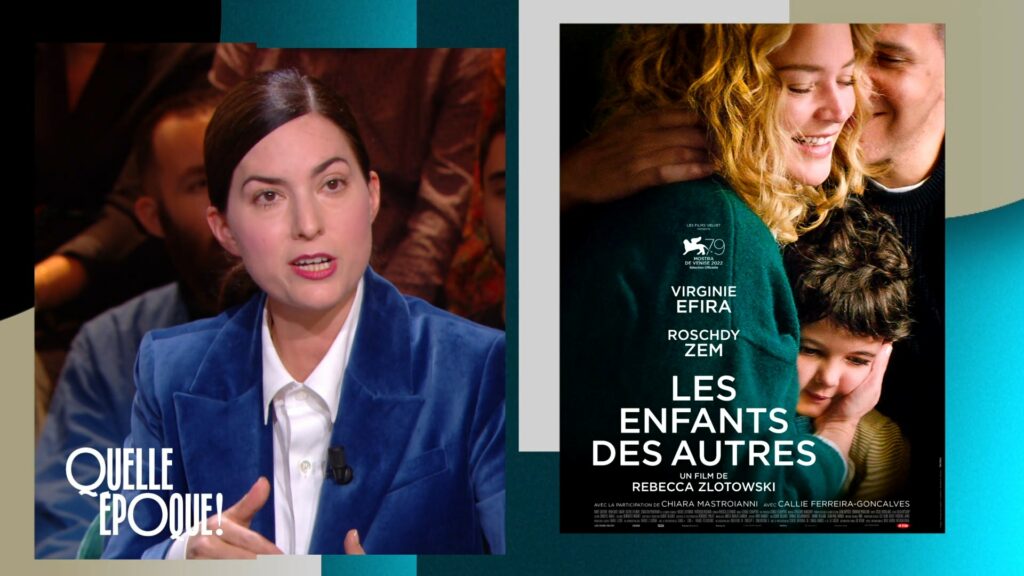
We conceived an identity borrowed from the codes of the American-style cabaret, a reflection of the stage designed as an elegant and intimate setting.
SPIN-OFFS
As the talk-show grew in popularity, Winter Productions and France 2 developed several spin-offs. This was the case for the end of year festivities as well as for the Paris Olympics and Paralympics. The logo was thus re-imagined for these events, though keeping its emblematic DNA.

IAA MOBILITY ’23
CONTEXT
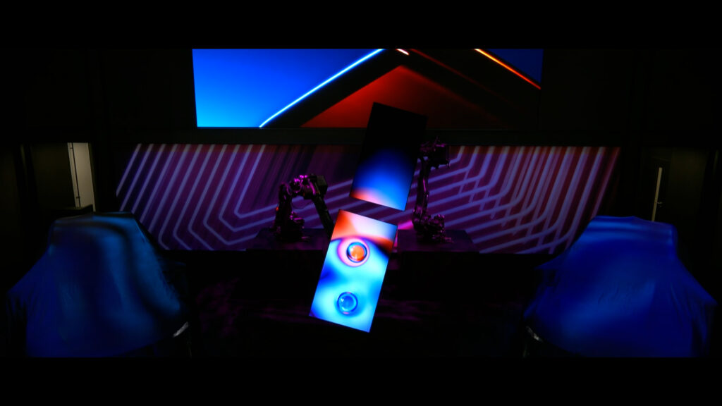
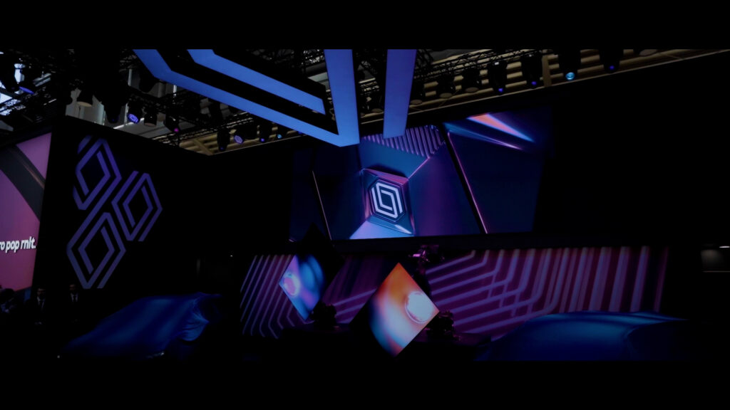
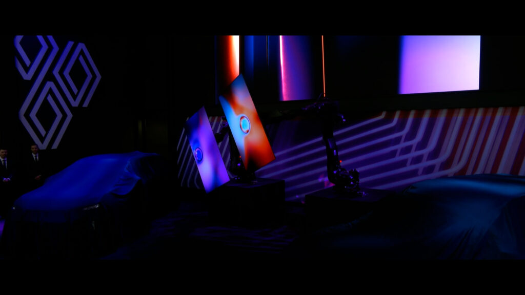
For the Munich Motor Show, Renault entrusted the agency with the production of a reveal film for their new vehicule shown on its stand, as well as video content for an immersive space set up in the heart of the city. Two spaces that aim to offer innovative experiences : the Summit for professionals and the Openspace for the general public.
CHALLENGE
Create engaging video content, meet the technical challenges associated with each device. For the Summit, synchronize three screens, two of which are attached to robotic arms. For the Openspace, create audio-reactive modules.
SOLUTION
For the new Scenic reveal film, we imagined an orb symbolizing the vehicule’s energy and waking up each screen alternately, giving them a human dimension and participating in a surprising choreography. For the Openspace, using the TouchDesigner software, we developed various graphic compositions around the Renault emblem, reacting in real-time to the tempo of the music.
SLOW LOOP
AUDIO-REACTIVE MODULES
THE PORTRAIT
CONTEXT
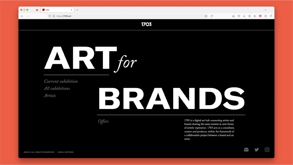
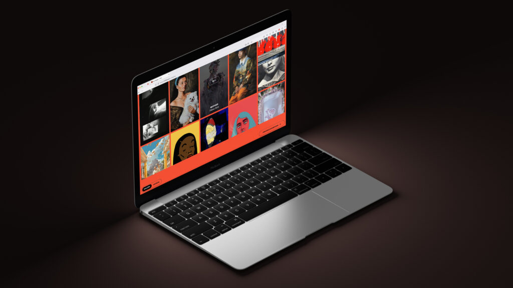
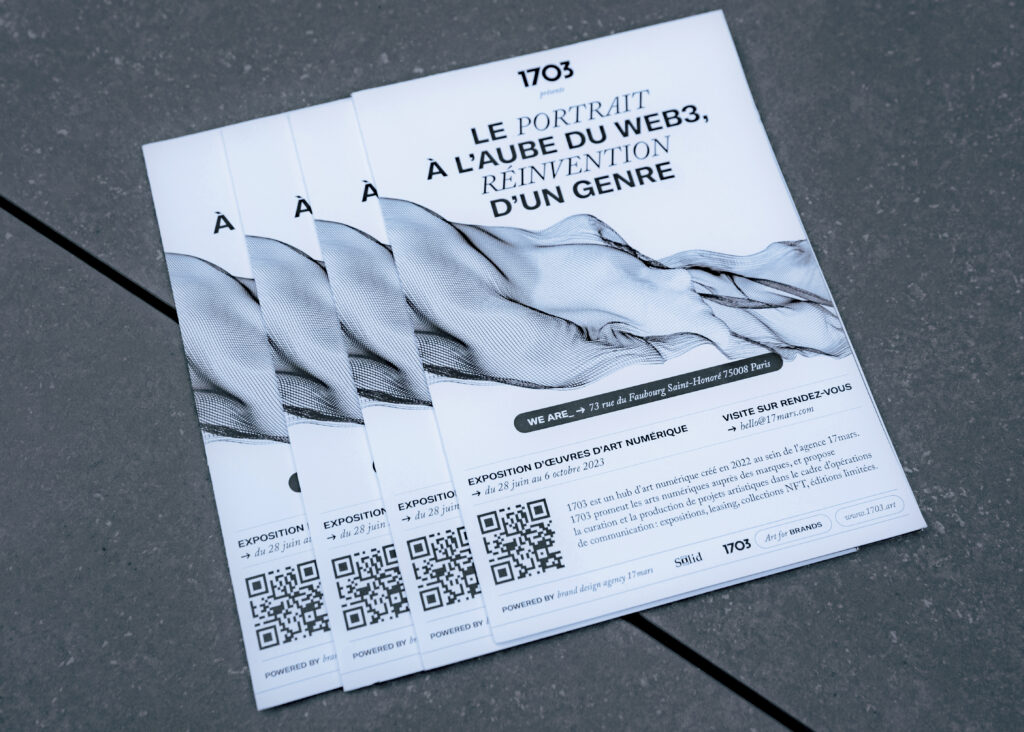
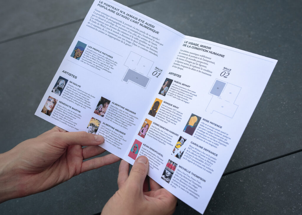
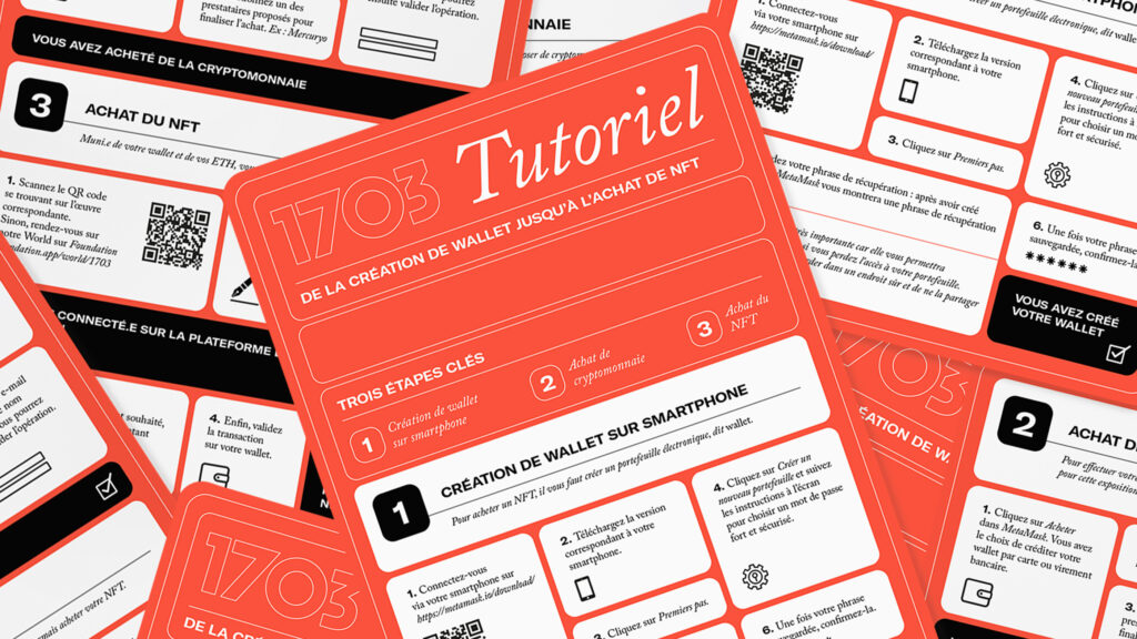
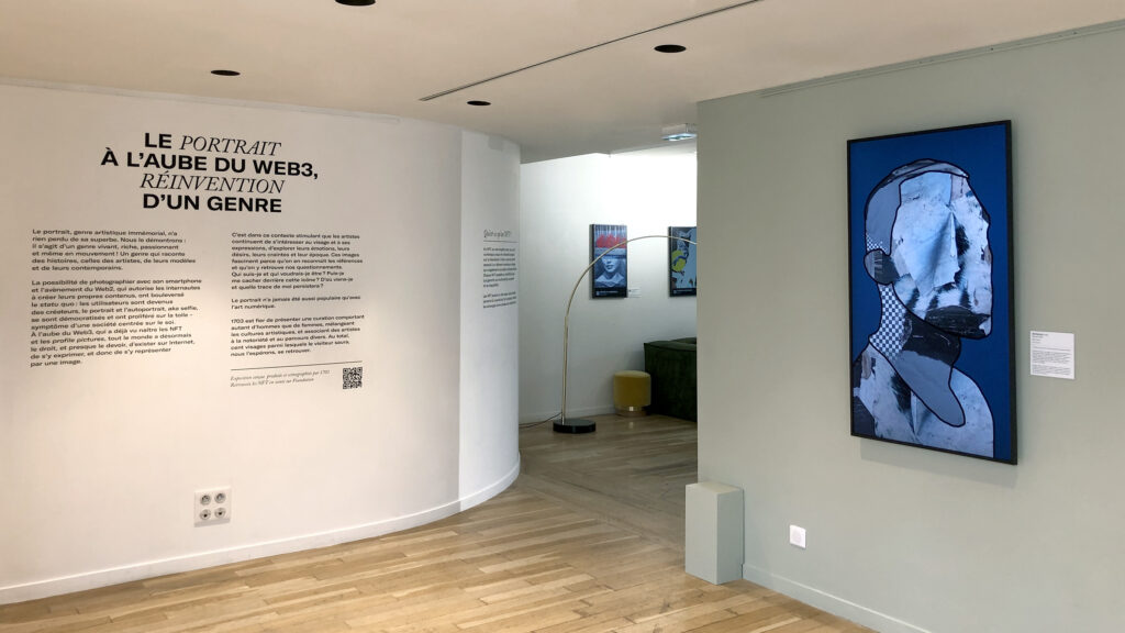
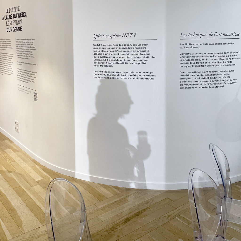
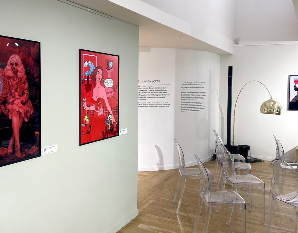
1703 presents the digital art exhibition “The Portrait at the Dawn of Web3, Reinventing a Genre”, in the gallery of the private club we are_, in Paris, from June 28th to October 6th, 2023. A majority of the artworks are NFTs for sale on the Foundation platform.
CHALLENGE
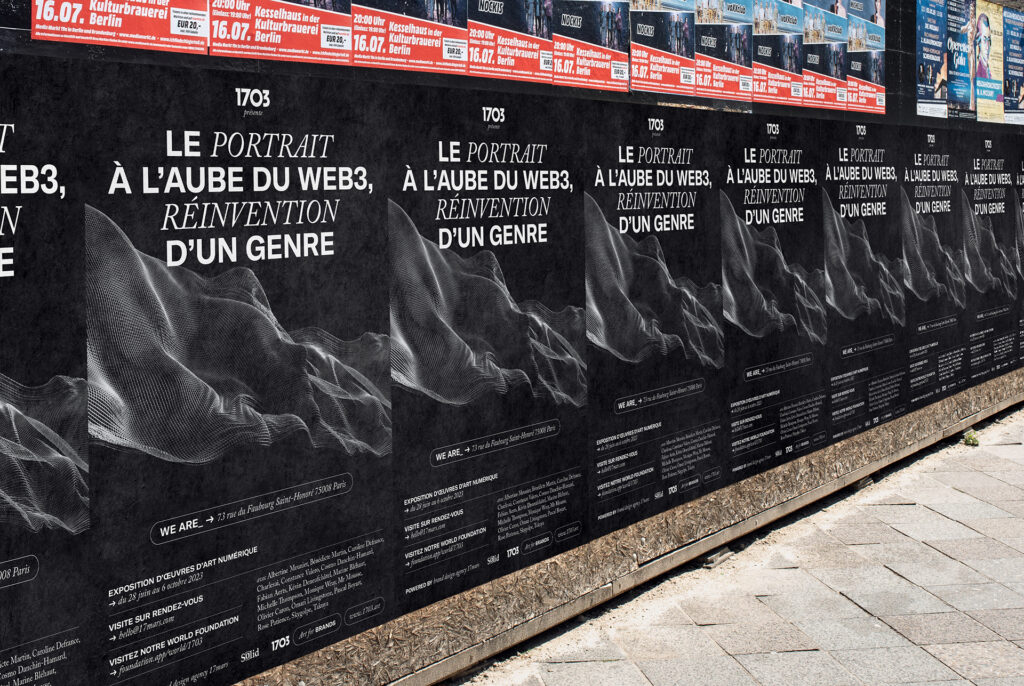
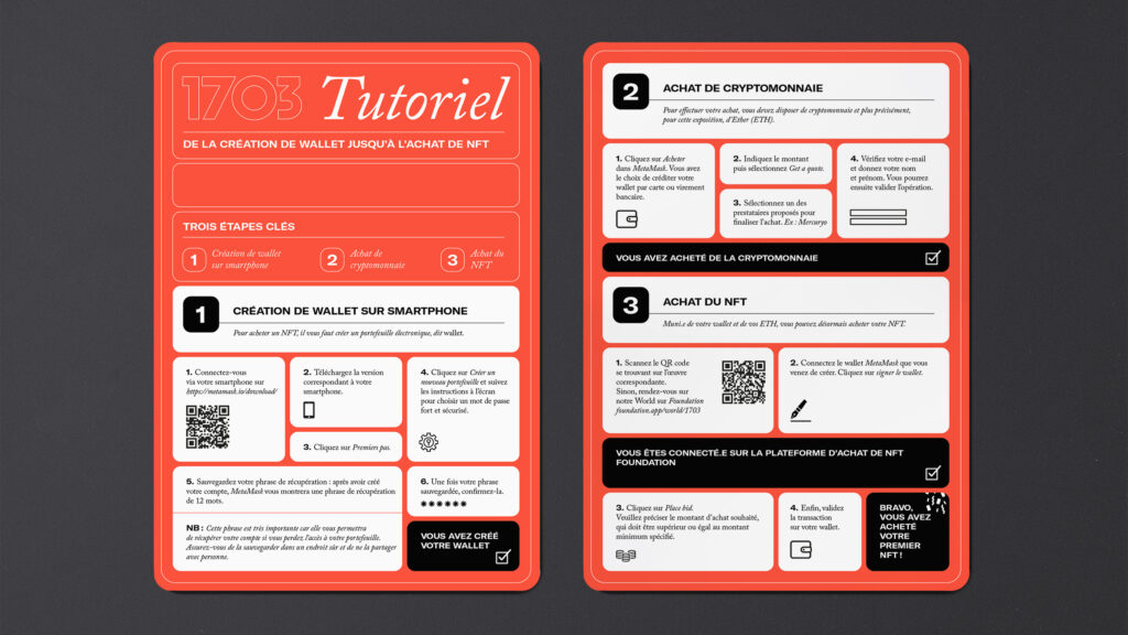
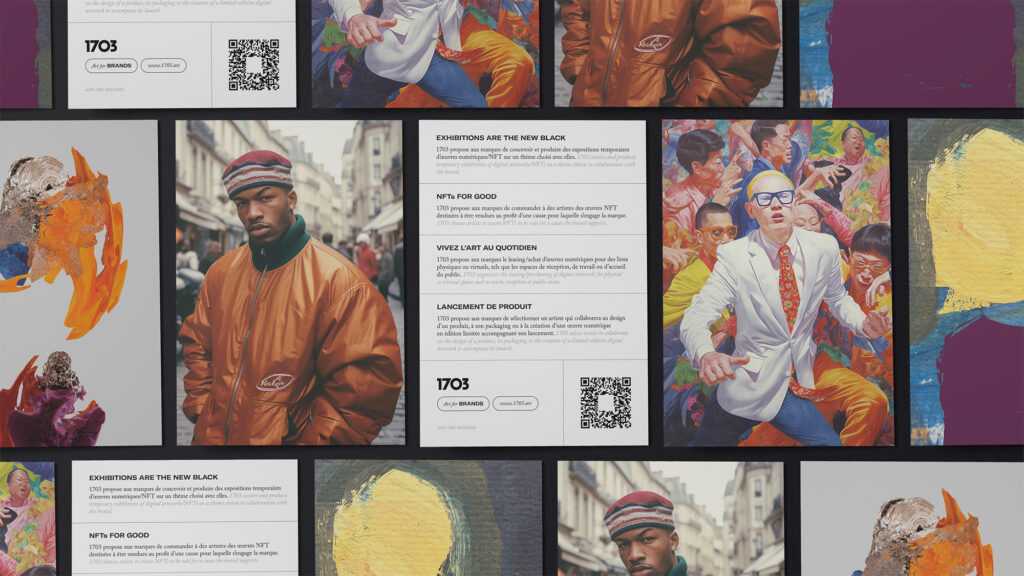
Create the exhibition’s visual identity and determine the space’s signage. Design all physical and digital communication media, as well as mediation documents.
SOLUTION
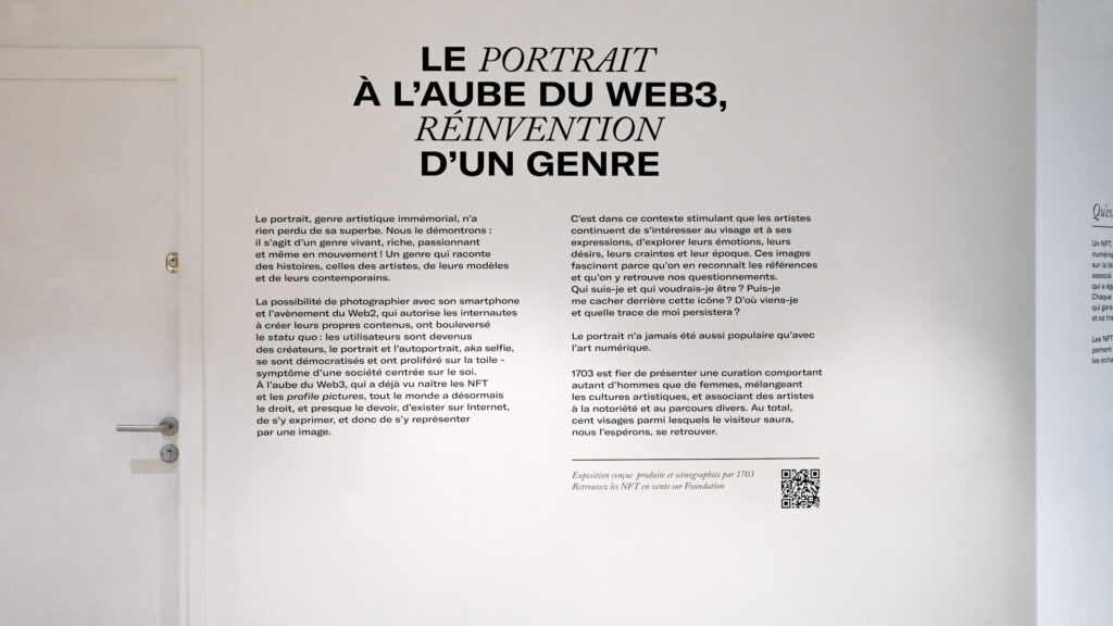
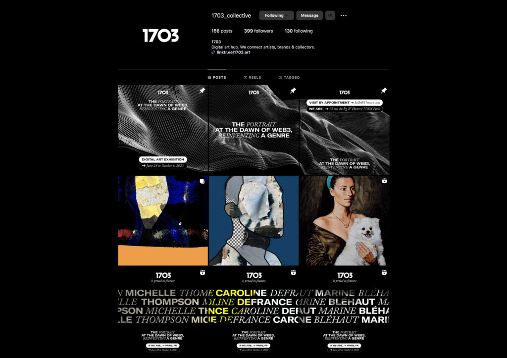
We opted for a sober, uncluttered artistic direction, capable of highlighting the work of the eighteen artists on display. Wall stickers provide information for visitors, and an explanatory cartel bearing a QR code is fixed next to each screen. A folded A3 format reproduces the exhibition poster and details the exhibition itinerary. The whole has been adapted for 1703’s socials.
PRINT ELEMENTS
EVENT
DIGITAL COMMUNICATION
PARIS AIR SHOW
CONTEXT
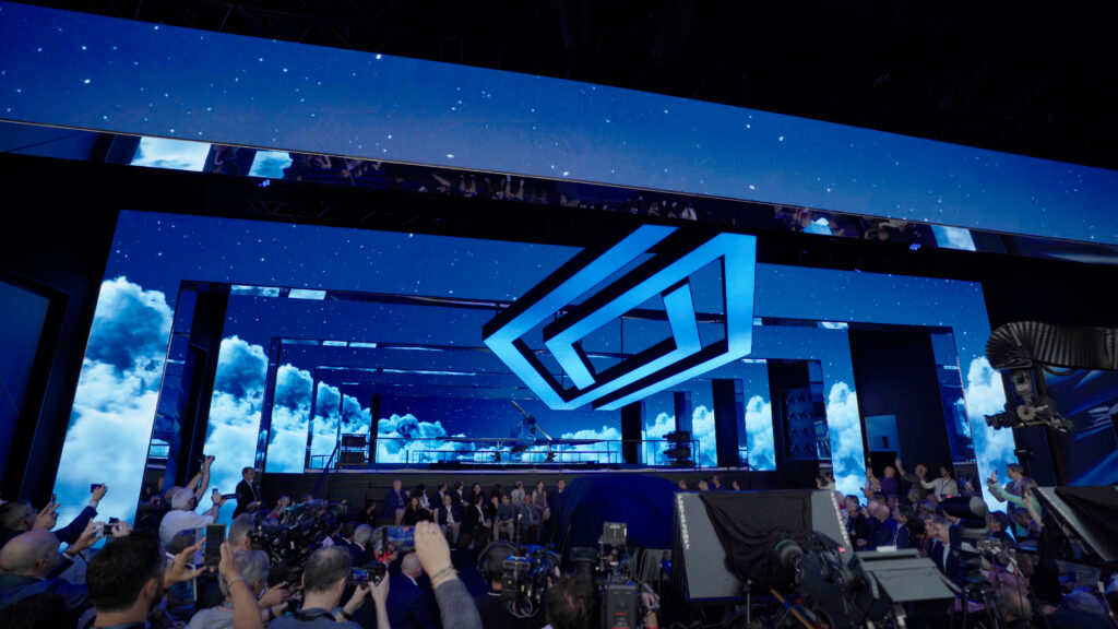
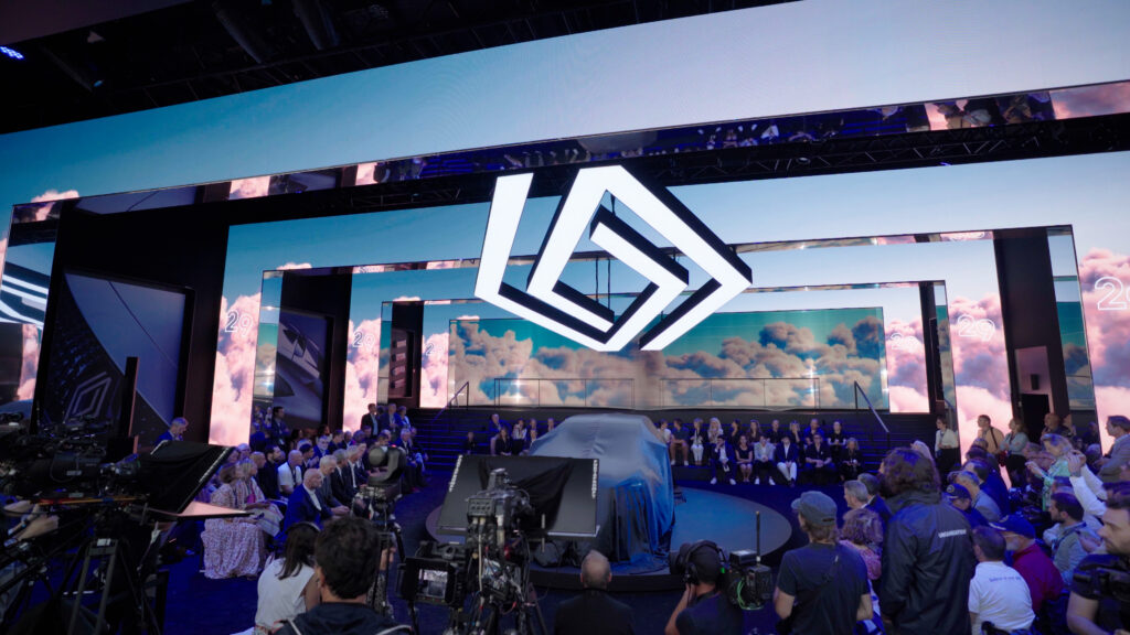
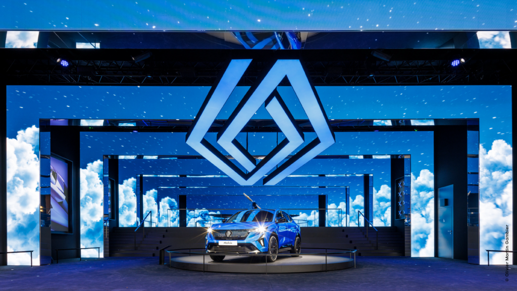
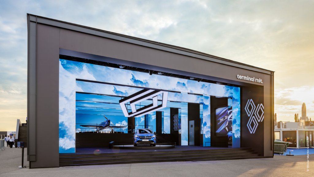
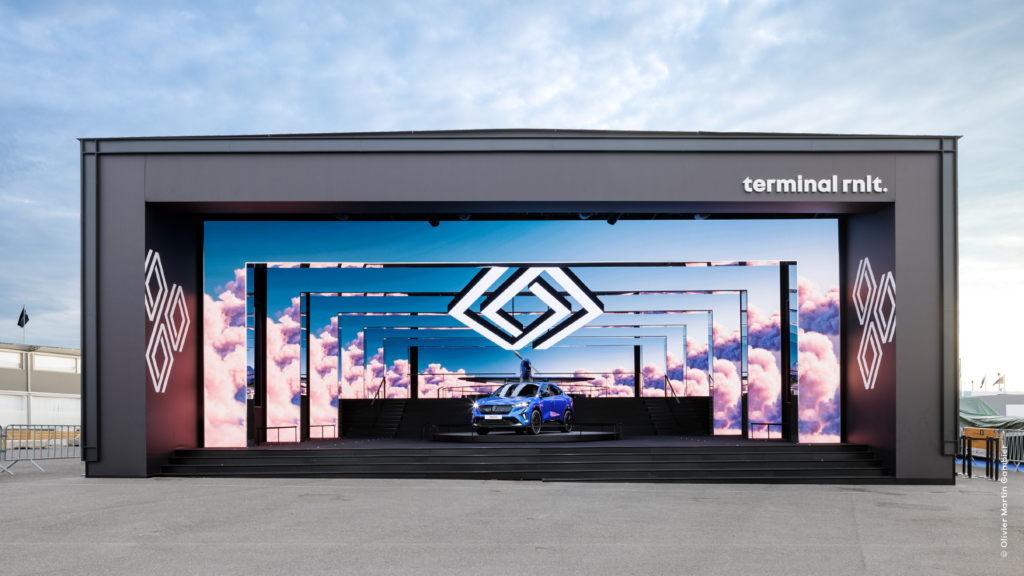
Renault is unveiling its Rafale SUV at the Paris Air Show, in tribute to the carmaker’s pioneering role in the early days of aviation.
CHALLENGE
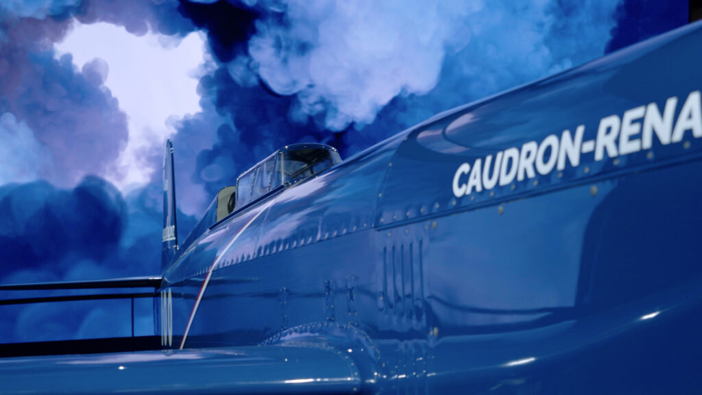
The stand’s video sets serve as a reminder of the heritage of the famous C460 racing aircraft, renamed the Caudron Rafale in 1934, and its link with French aviatrix Hélène Boucher, who used it to win several speed records.
SOLUTION
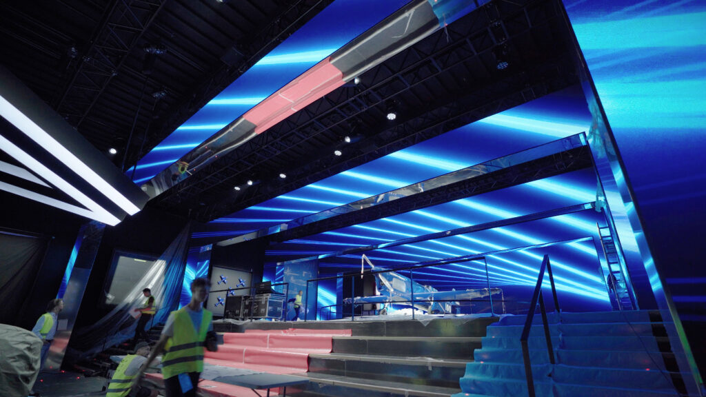
The agency has created a truly immersive experience that propels visitors above the clouds during a simulated flight, from take-off in the early hours of the morning to landing at dusk. Capitalising on an impressive stage set-up that plays on perspective through giant arch-shaped screens, the sequence closes with a crescendo that reveals the new vehicle.

MAKING-OF
VIDEO ASSETS
CONTEXT
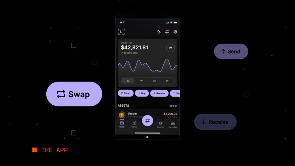
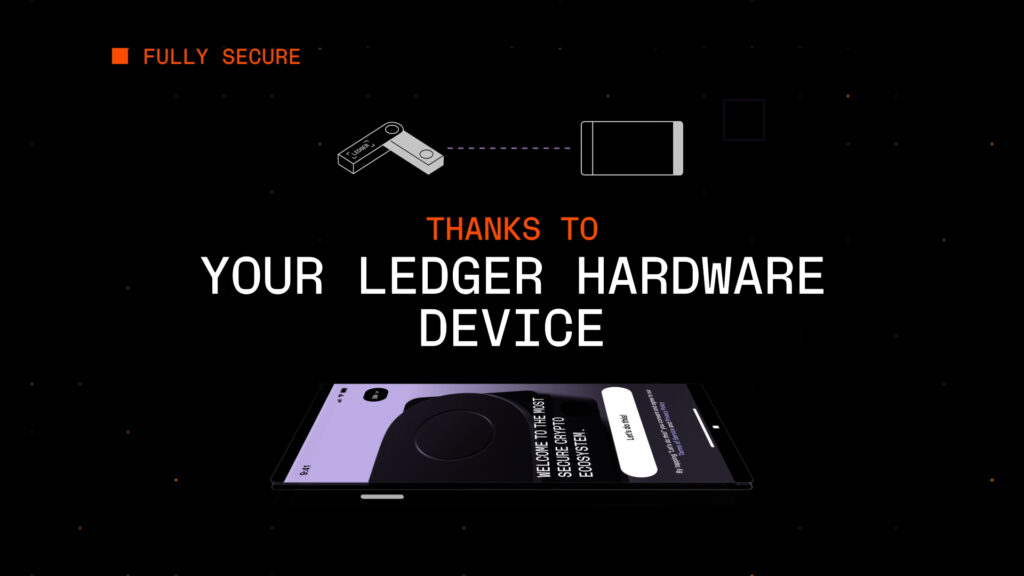
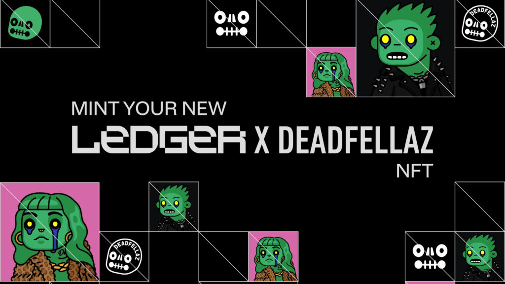
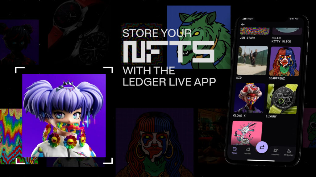
As part of its brand communications, Ledger has asked the agency to create several video series for social media, promoting its various services: the Ledger Live application, the Ledger Market NFT platform and the Ledger Quest web3 e-learning platform.
CHALLENGE
Put a brand identity into motion in a series of assets for social networks.
SOLUTION
Based on the brand identity, we have created three distinct video packages for Ledger Live, Ledger Market and Ledger Quest, which can be adapted according to the partnerships being promoted and the new features on the platforms.
LEDGER LIVE
LEDGER MARKET
LEDGER QUEST
ULTRA AW23Q3
CONTEXT
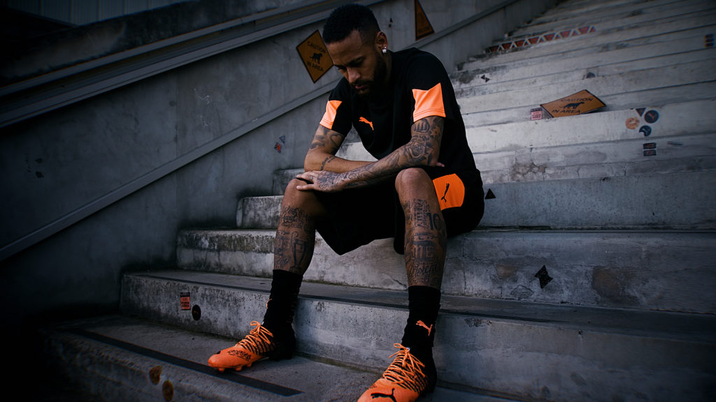
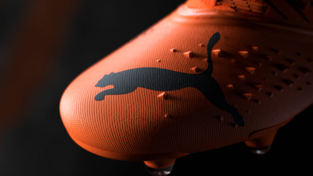
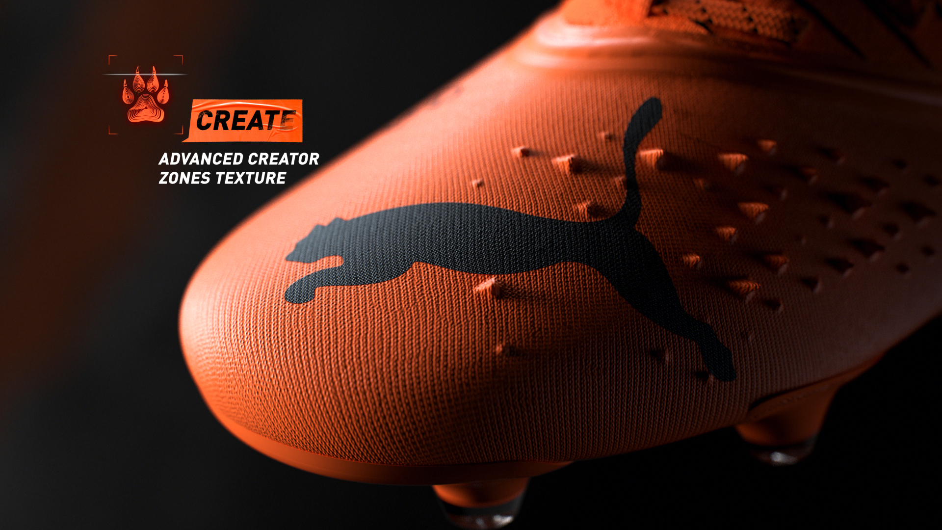
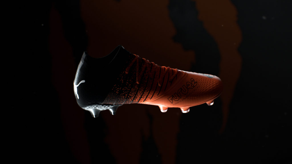
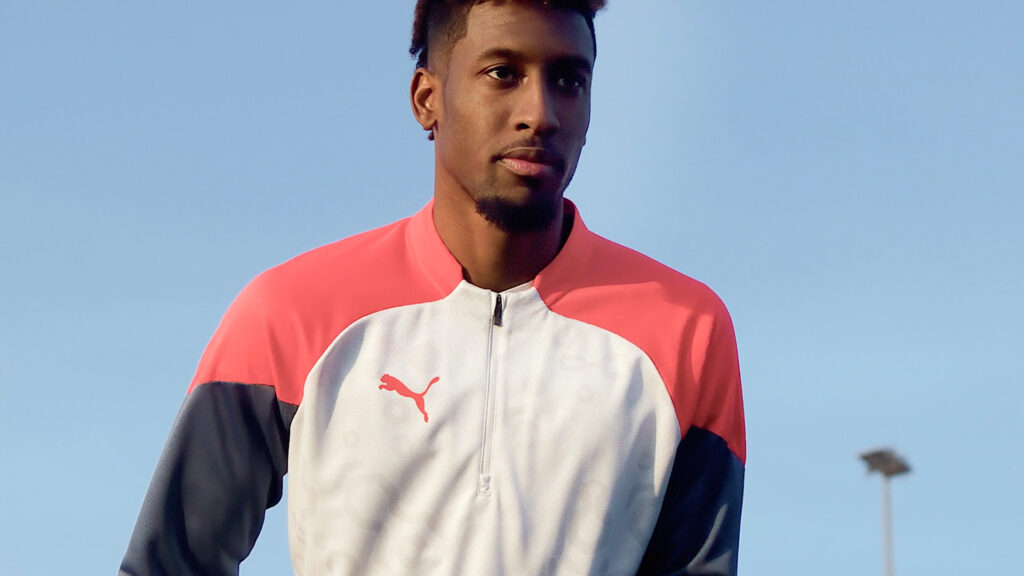
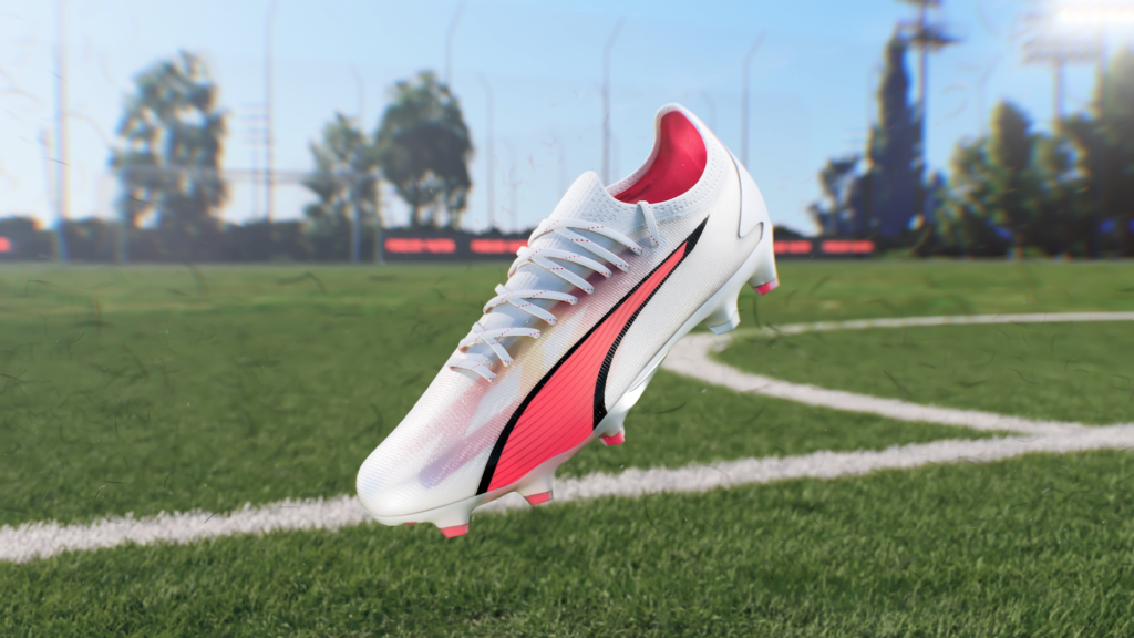
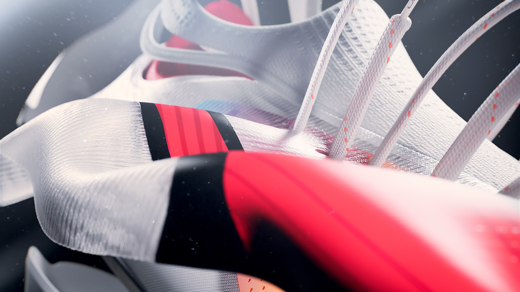
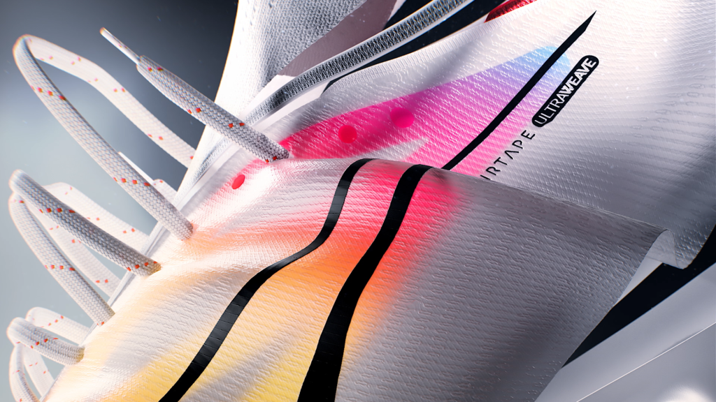
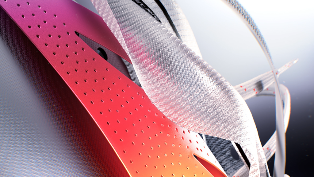
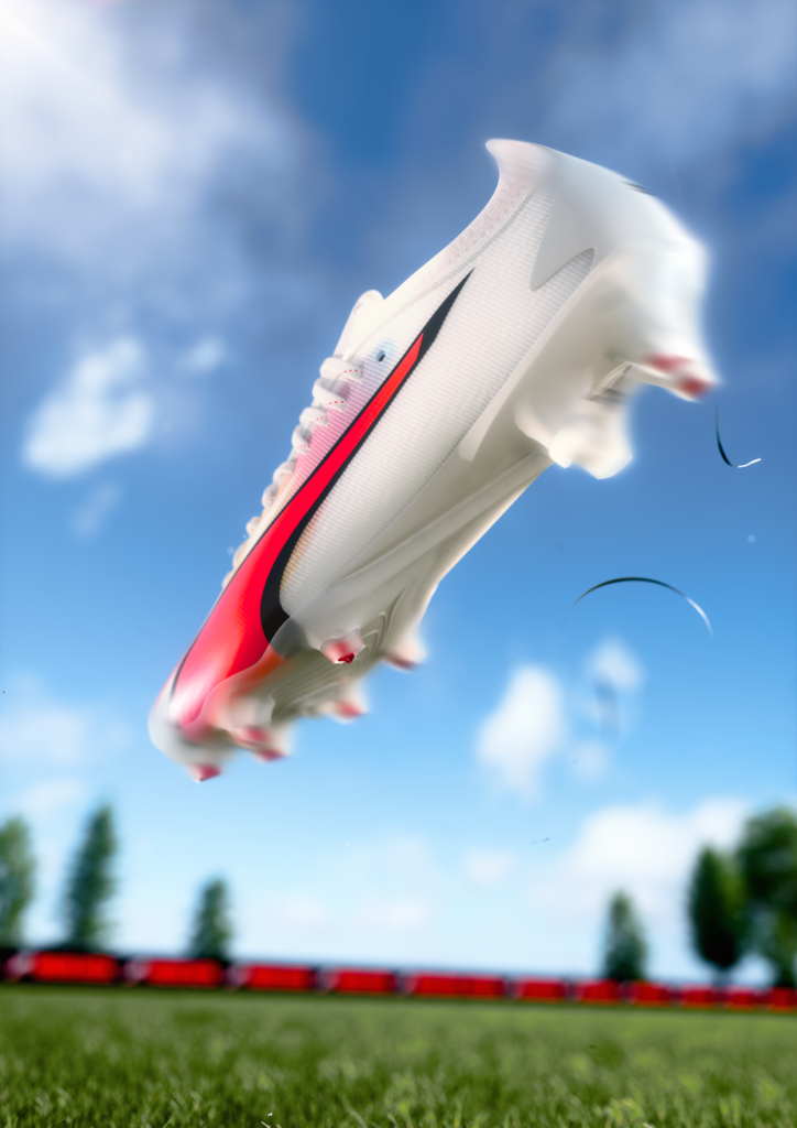
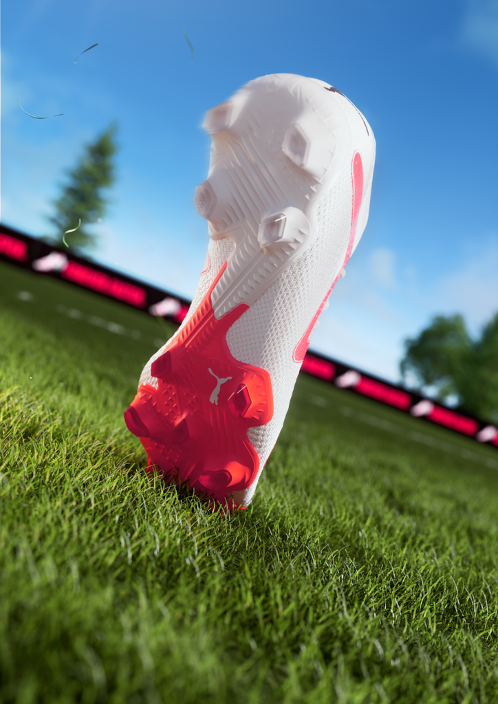
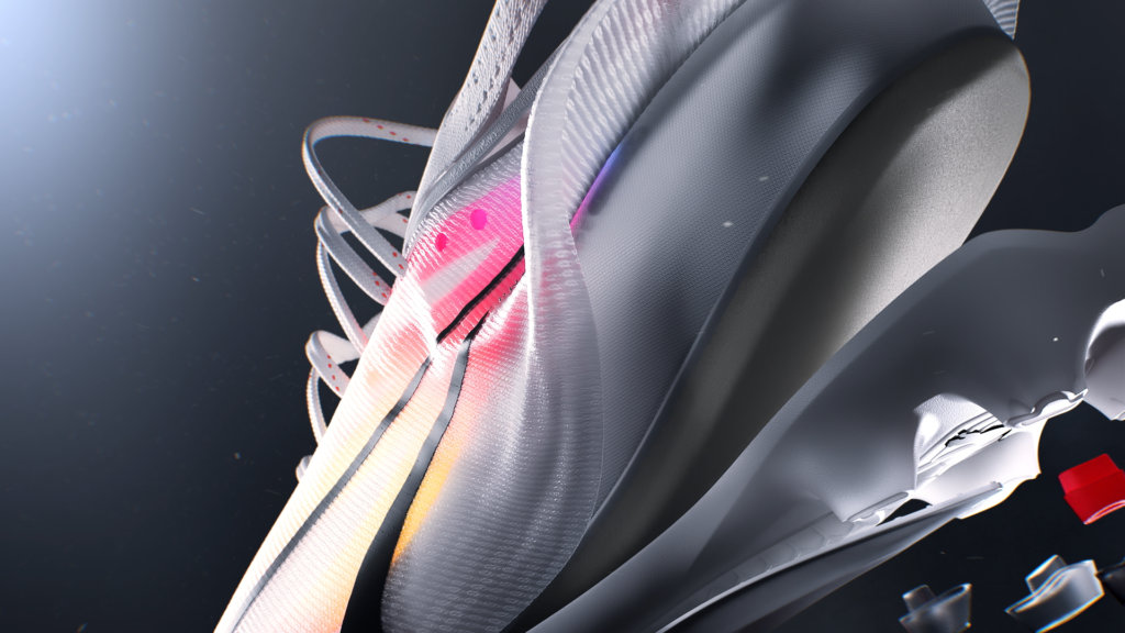
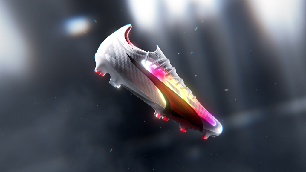
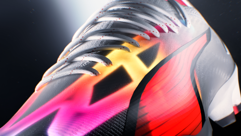
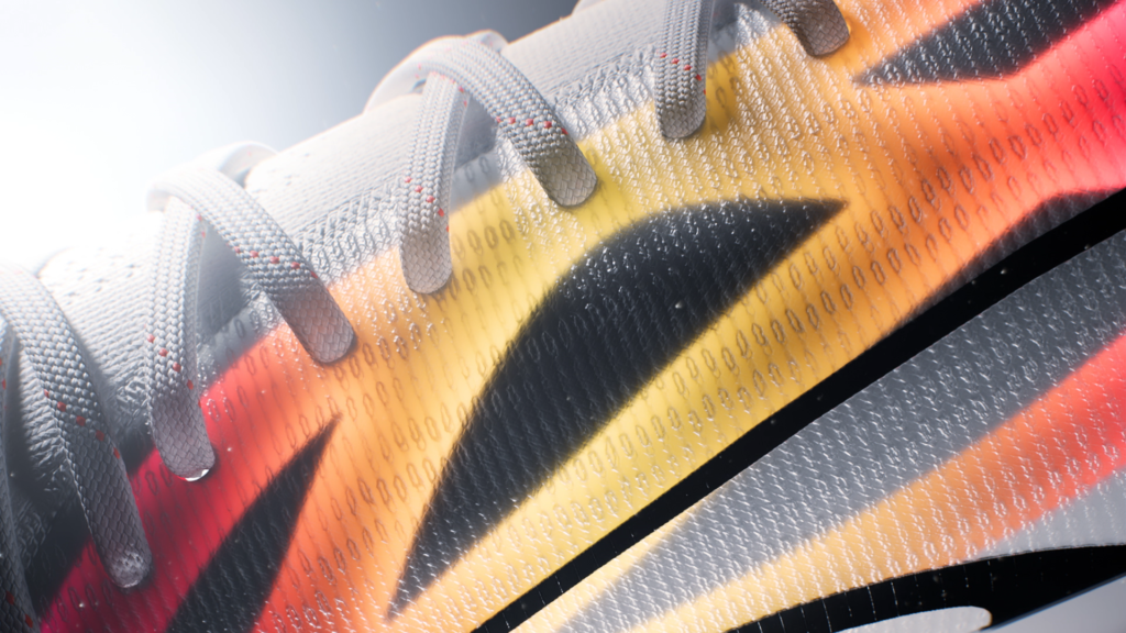
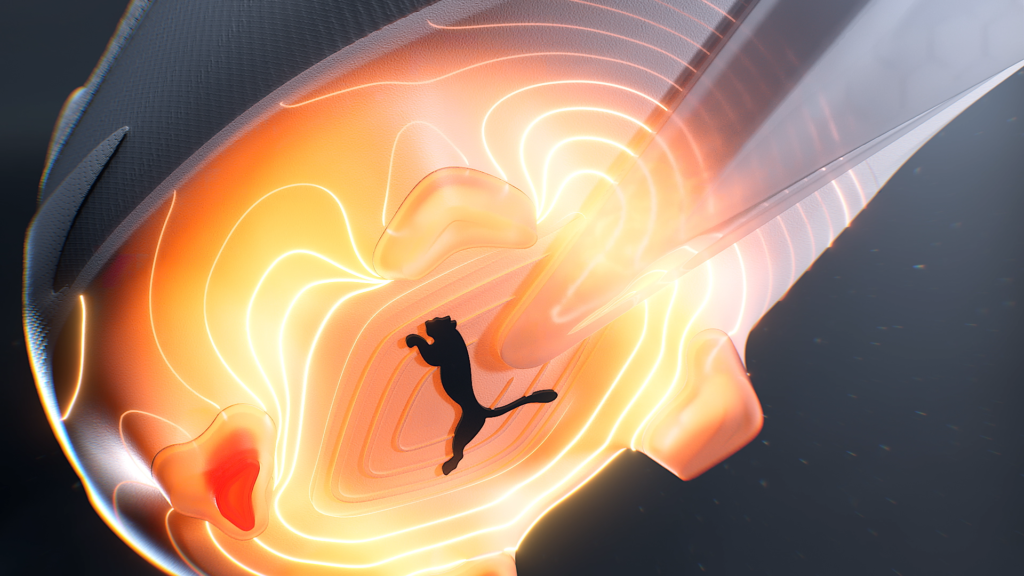
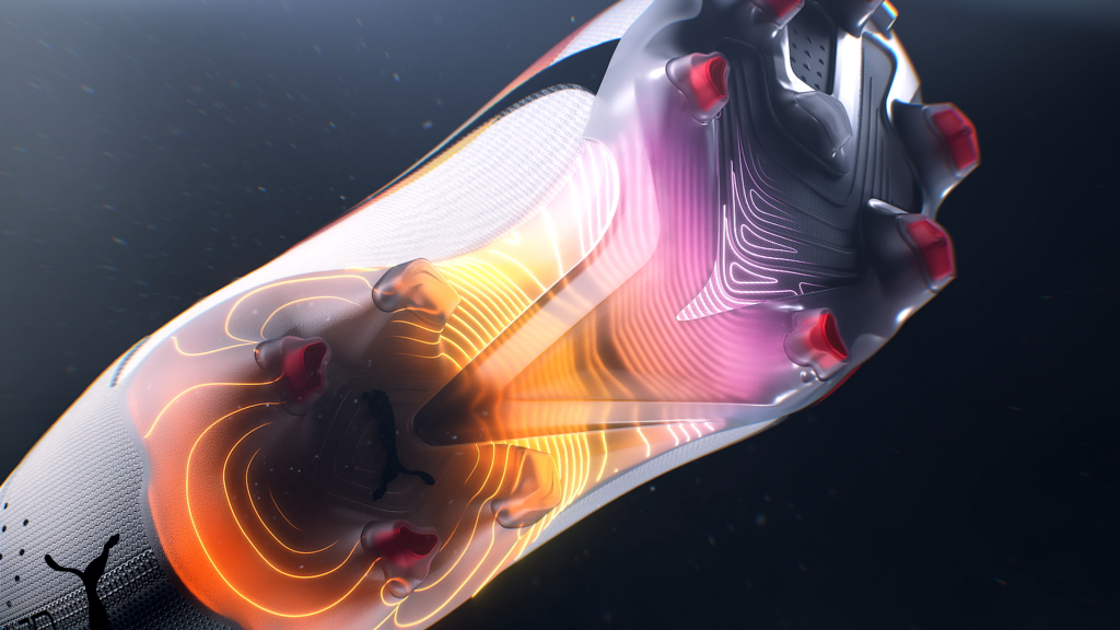
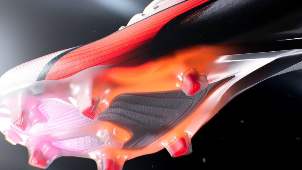
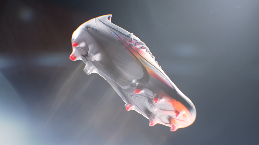
Puma Football launches the 2023 version of its iconic shoe: the Ultra.
CHALLENGE
Present the shoe’s technical features in an environment identical to that of the entire launch campaign.
SOLUTION
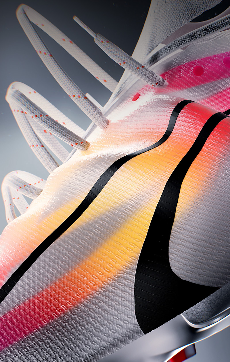
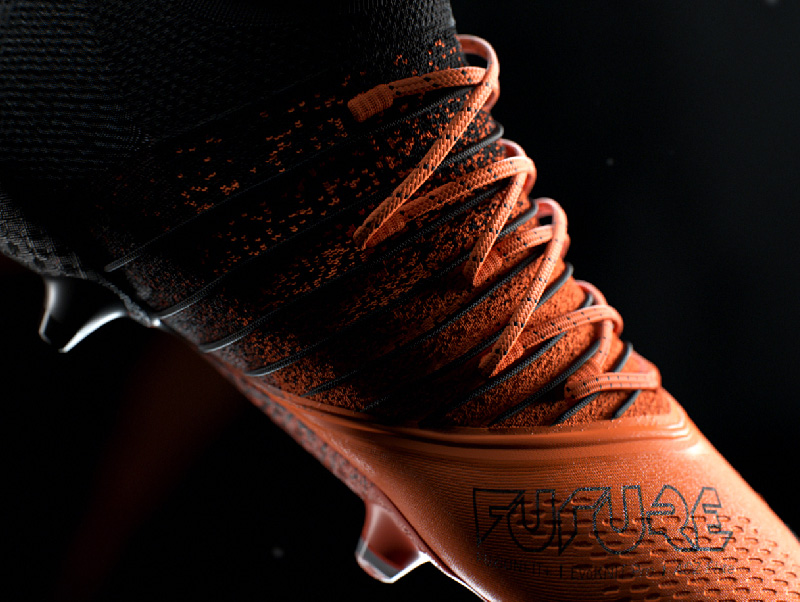
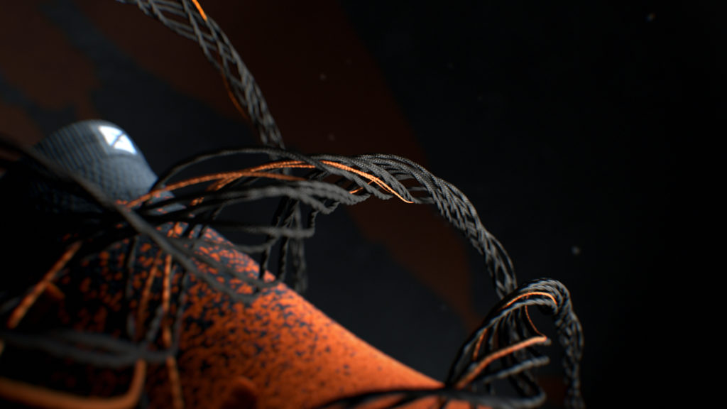
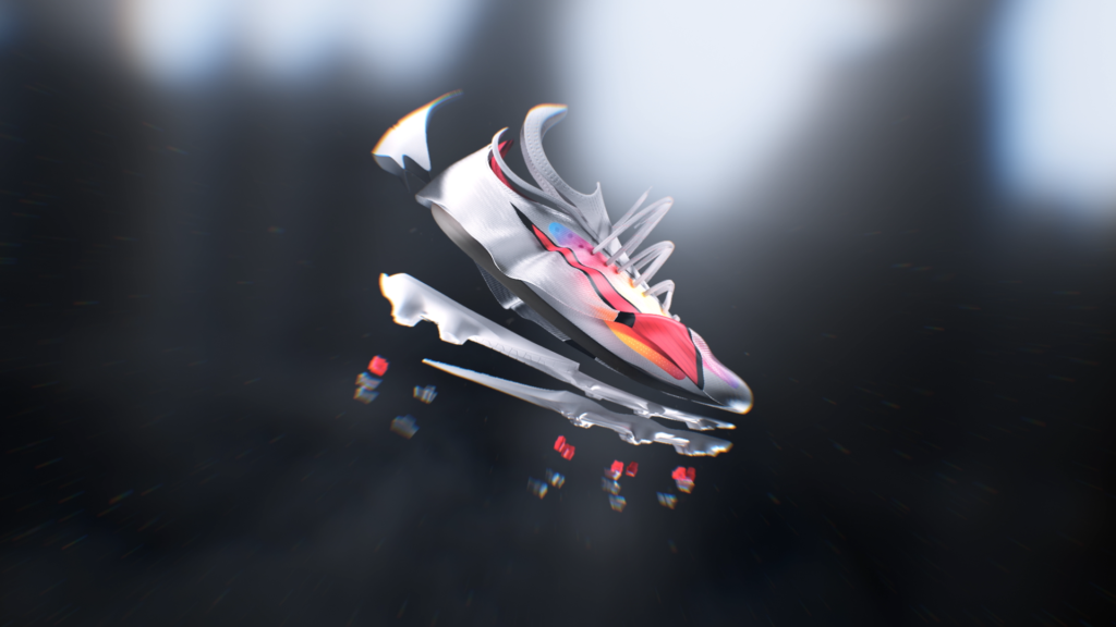
We’ve chosen to offer the shoe a refined setting, out of time and space, in order to focus the attention on the product’s technical specificities. The shoe breaks down and lights up to suggest the imperceptible technology it contains. A first sequence evokes lightness, a second highlights support, and a third underlines the flexibility and propulsion provided by the sole.
The animation of the materials and the sound design have been meticulously crafted.
’23 SUMMER IDENTS
CONTEXT
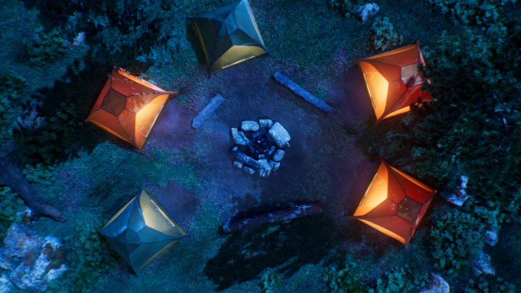
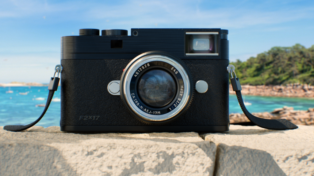
For the summer season of 2023, France 2 commissioned the agency to design a mosaic of advertising idents.
CHALLENGE
Create fun, light-hearted atmospheres that celebrate the summer vacation.
SOLUTION
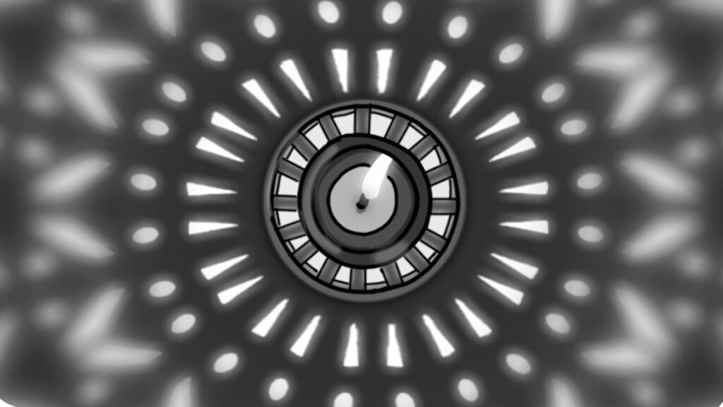
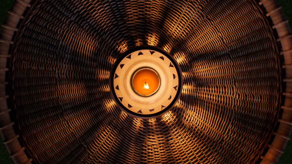
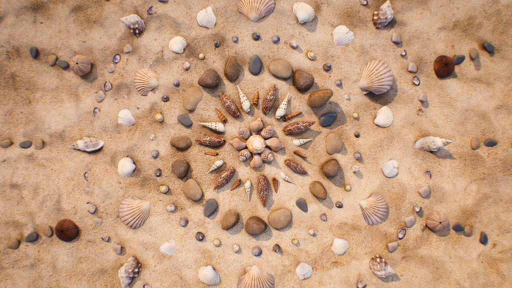
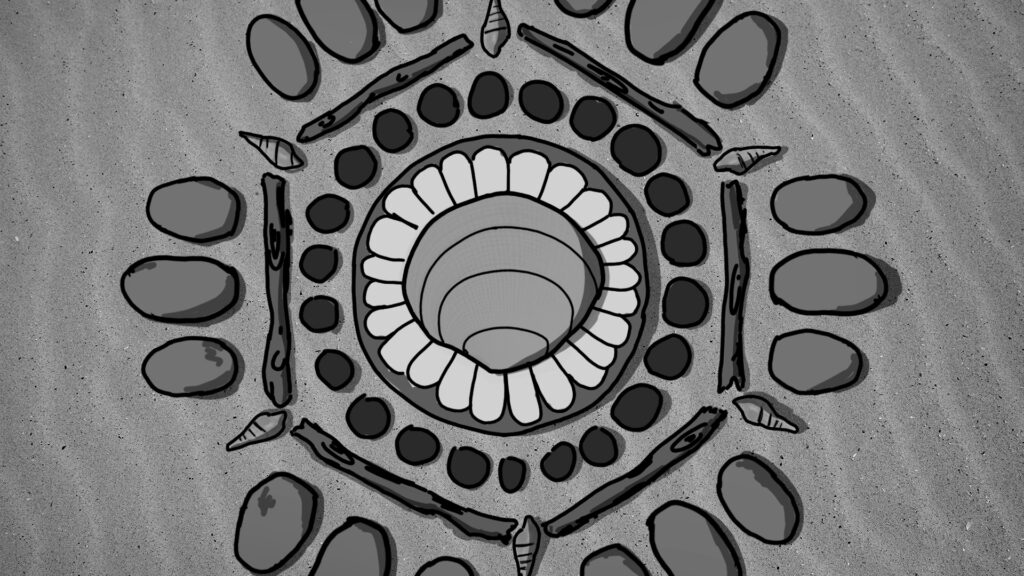
We designed about forty semi-realistic scenes, staging summer atmospheres known to all. For each jingle, shapes and movements are circular, echoing the dynamics of the wave, which is specific to the channel’s design.

STORYBOARD
’22 PARIS MOTOR SHOW
CONTEXT
After 4 years of absence, 2022 marks the return of the Paris Motor Show. The car industry has had time to evolve since then, and its key agents were all there.
CHALLENGE
Staging the visuals of the Renault showroom screens during the press conference at the event’s opening as well as throughout the entire weekend. Transcend the 4L concept car reveal, the 4Ever Trophy Renault.
SOLUTION
We designed visuals by capitalizing on the screens’ unconventional formats. The reveal film immerses the audience into a continuous flow of unstructured landscapes, constantly pushing back the limits of the skyline. The Renault logo is placed at the center of an animated dichroic pattern.




LA NUIT DU GÉNÉRIQUE
CONTEXT
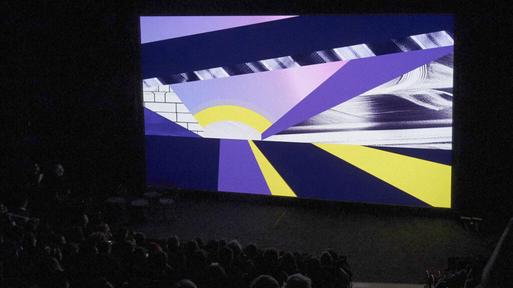
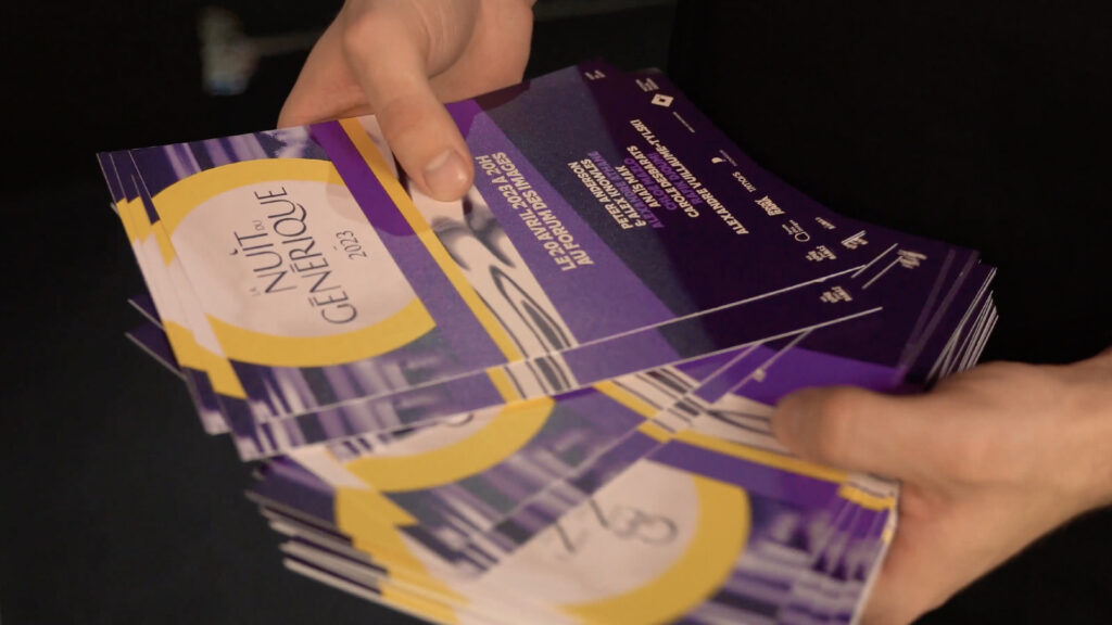
We Love Your Names is an association that promotes the art of film and TV credits. Every year, it organises La Nuit du Générique at the Forum des Images in Paris, for an evening of screenings and discussions bringing together the cream of the profession.
CHALLENGE
Produce the trailer for the 10th edition of La Nuit du Générique, the theme of which is Los Angeles.
SOLUTION
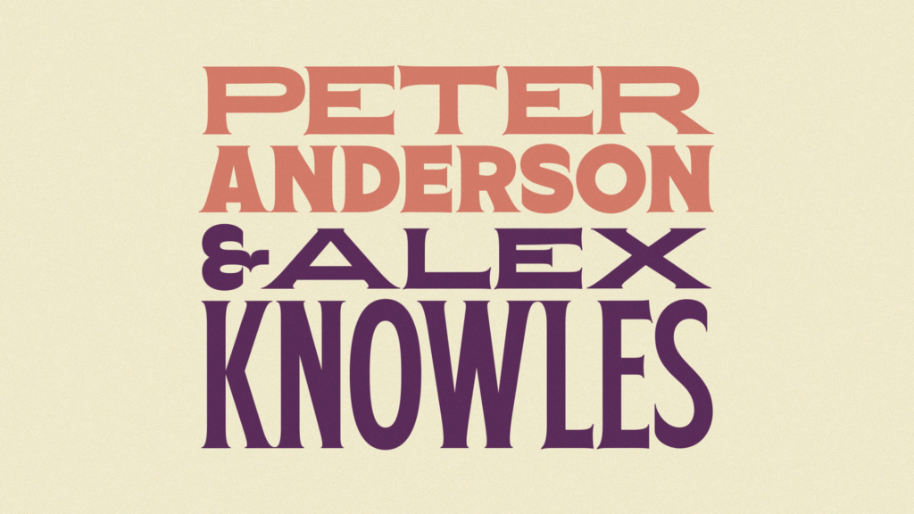
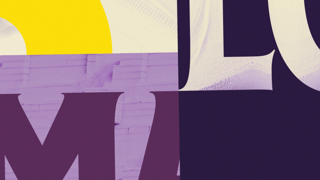
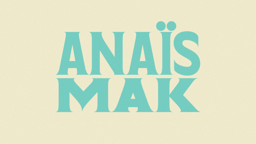
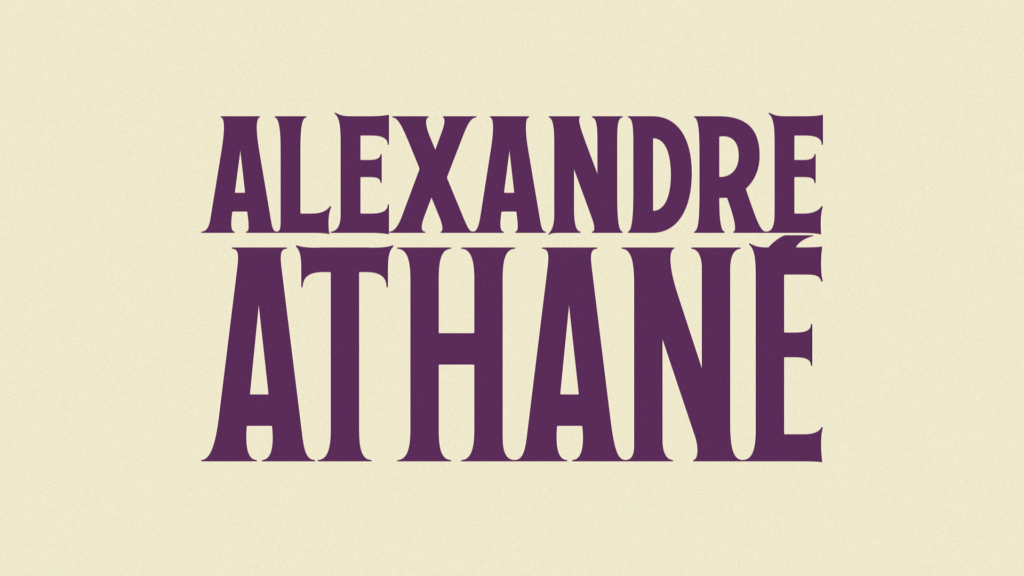
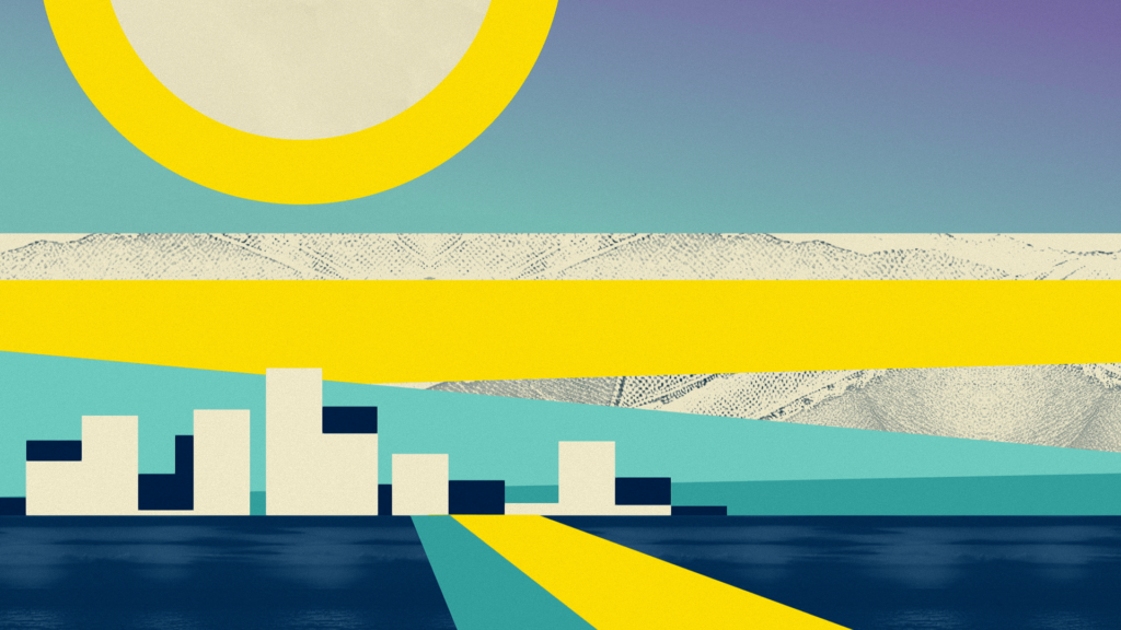
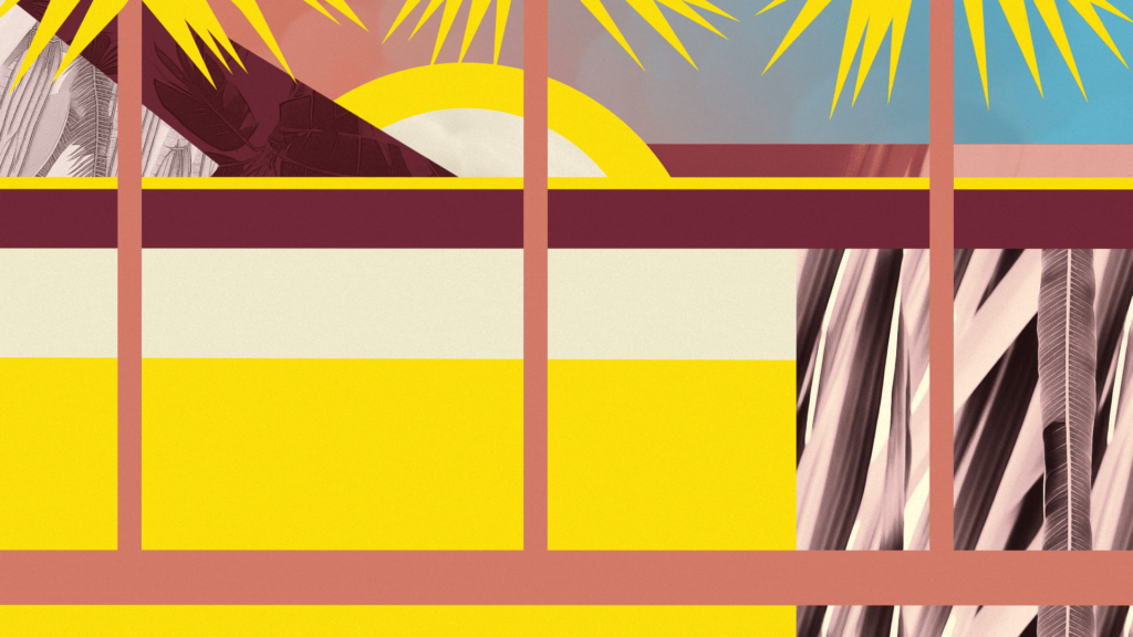
With this exercise, we wanted to tell the story of a day in Los Angeles, from sunrise to sunset, through a succession of stylised sequences. The credits were created as a collage and the textures used were generated using artificial intelligence. We developed an original typeface, with varying widths and heights, to give emphasis to the names of the speakers.
CUSTOM TYPE

THROWBACK TO THE EVENT
BIG BANG STORE
CONTEXT
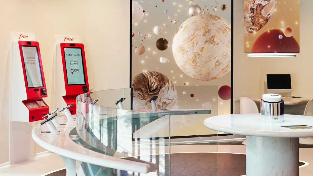
French phone operator Free opened its 200th store in May 2023 at tech hub Station F.
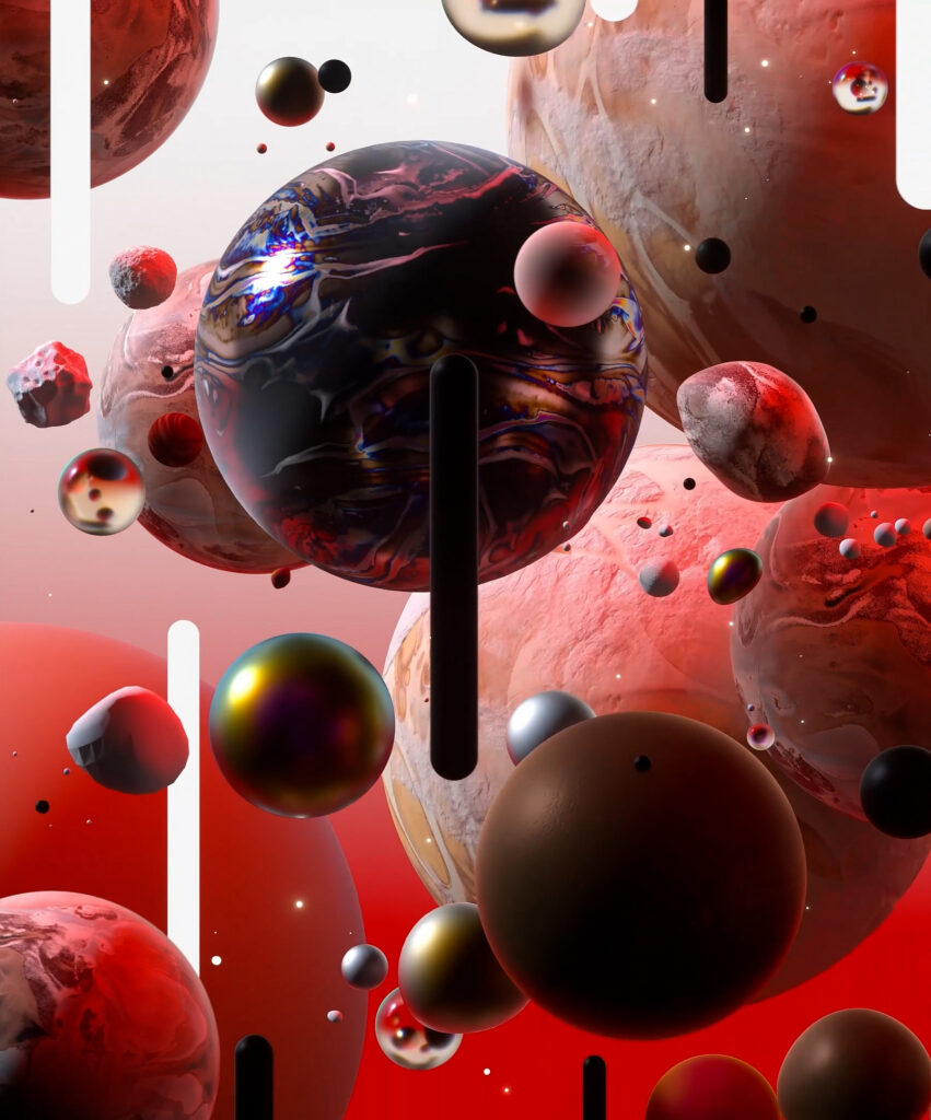
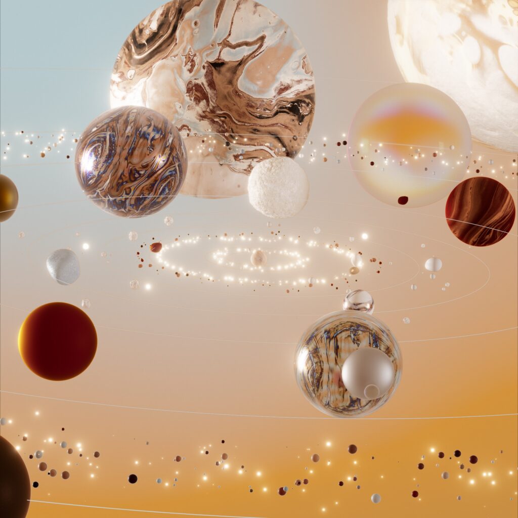
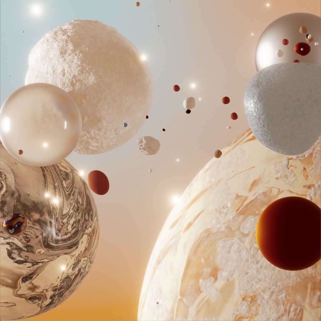
The concept store, named ‘Big Bang Store’, reveals a new side to the operator’s brand universe by offering visitors an immersive experience.
CHALLENGE
Conceive a new visual territory for the brand, stage and integrate video content in the store’s large screens.
SOLUTION
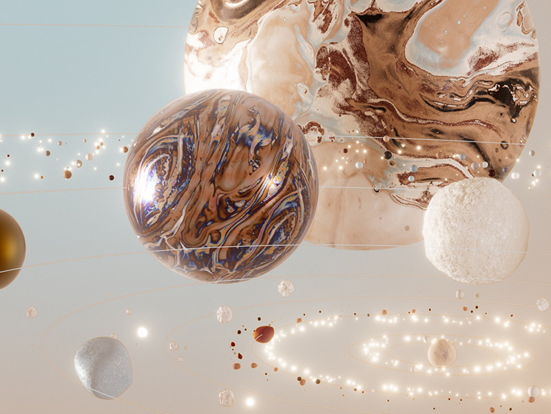
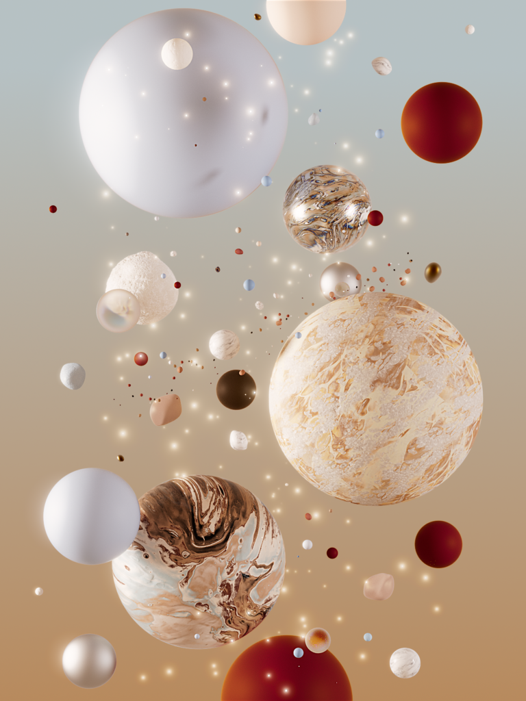
We imagined an hypnotic journey through different planetary systems, in which stars and planets, though each singular, are all interconnected. Free’s branding colors as well as textures echoing the store’s interior design were added to this refined interpretation of space. The overall animations evoke softness while a more energetic scenario was chosen each time the store makes a sale, propelling the environment into a visual Big Bang, with lights and music.
MANIFESTO
CONTEXT
As part of its brand communication, Europe’s largest digital asset investment group entrusted the agency with the design and production of the launch film for its new visual identity.
CHALLENGE
Set the new brand identity in motion,
associate it with a concise and engaging message, as a testimony to the history and the vision of the company.
SOLUTION
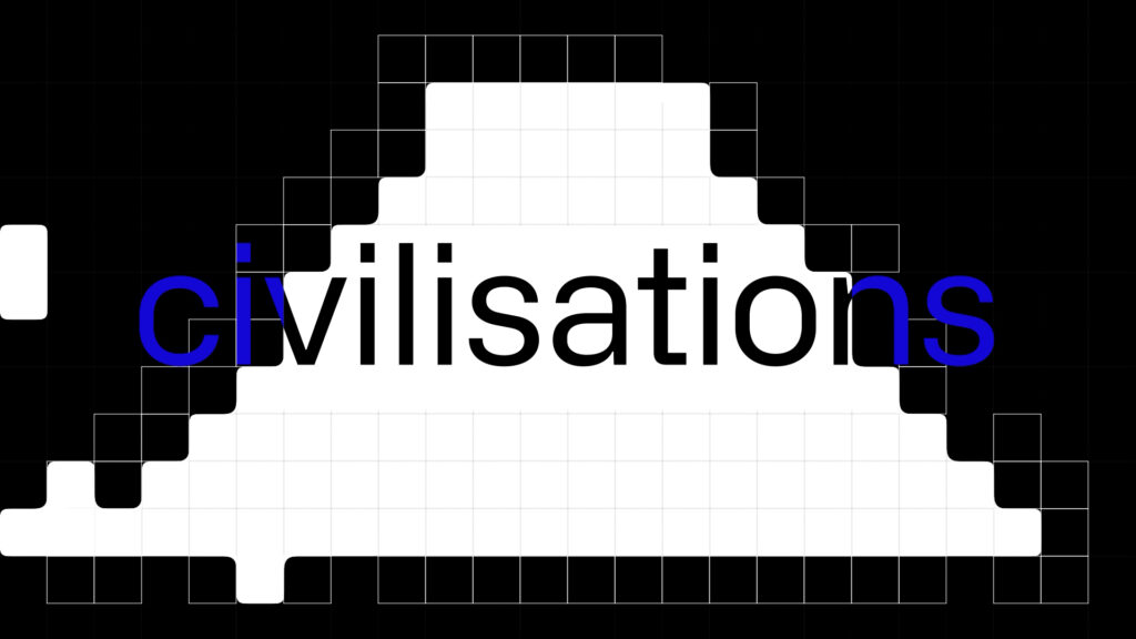
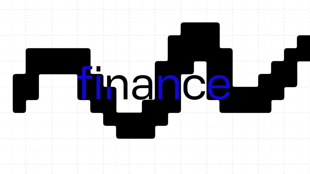
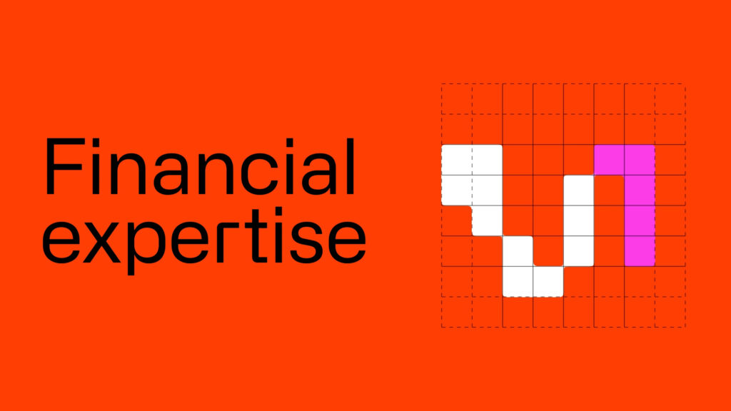
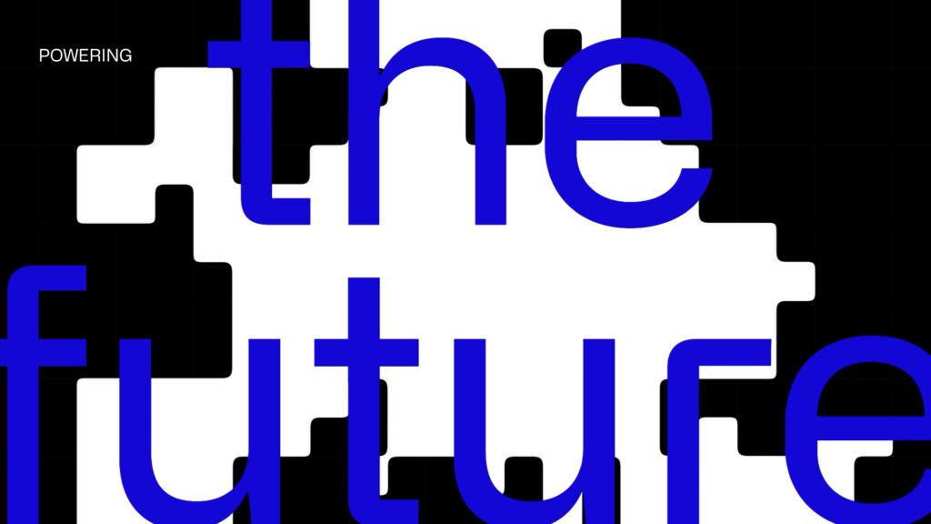
We developed the film through the animation of a pixel pattern and its expressions, more or less figurative, that drive the narrative. The sharp typographic and graphic choices refer to the singularity of the company’s expertise, while the constant evolution of the pattern echoes to the dynamics of the financial sector and cryptocurrencies in particular.
CHRISTMAS WINDOWS
CONTEXT
Every year, France 2 gathers its viewers around its Christmas idents, a moment of communion between the channel and its audiences.
CHALLENGE
Re-enchant the lives of French people at the beginning of winter and share exceptional moments with viewers.
SOLUTION
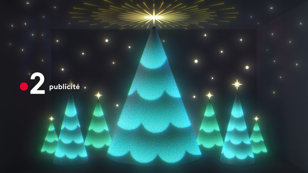
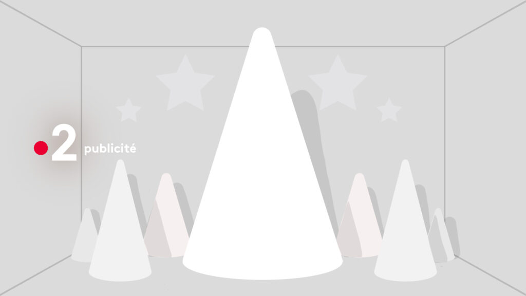
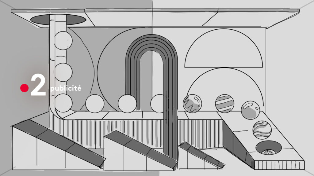
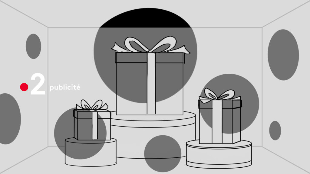
We chose to work on a strong and unifying symbol of the end of year celebrations: the Christmas windows. We created a collection of animations that are more or less figurative, but always a poetic interpretation of the Christmas spirit.
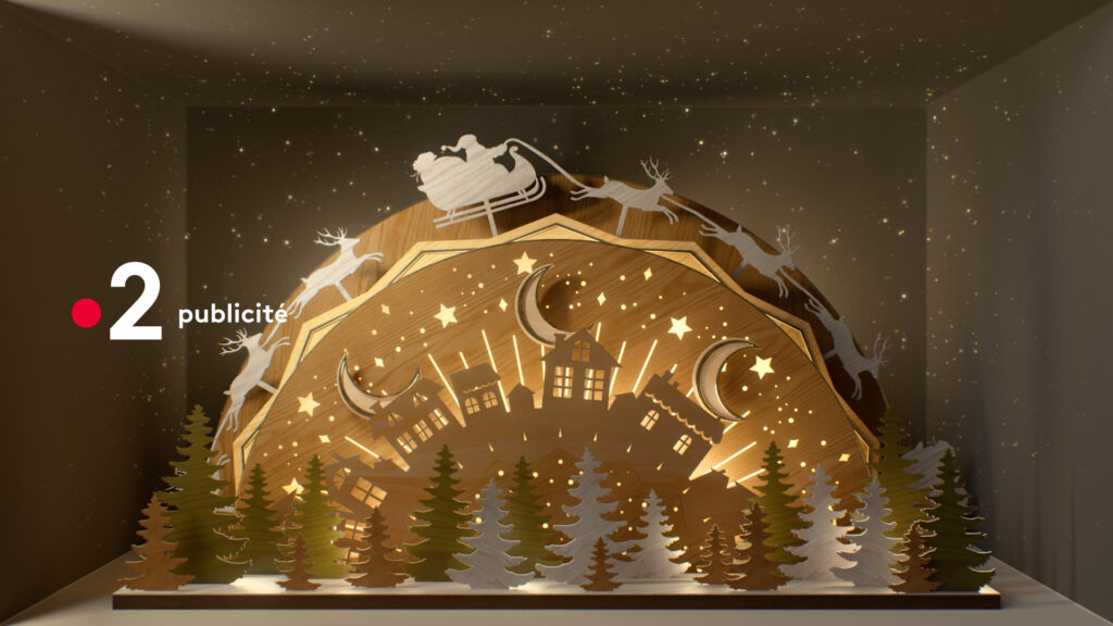
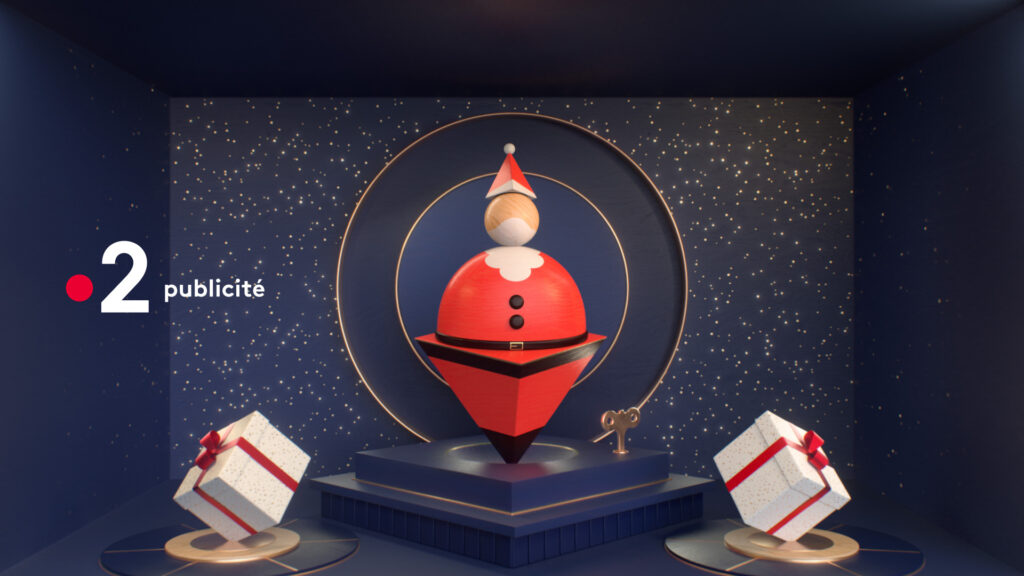
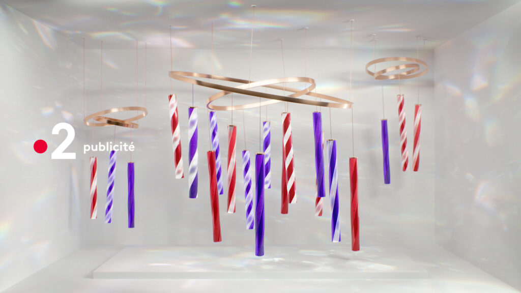
Capitalizing on the strong and unifying symbol of the end of year celebrations that are Christmas windows, we created a collection of 15 scenes, more or less figurative, that strives to poetically convey the Christmas spirit.
PROCESS
FUTURE 2023
CONTEXTE
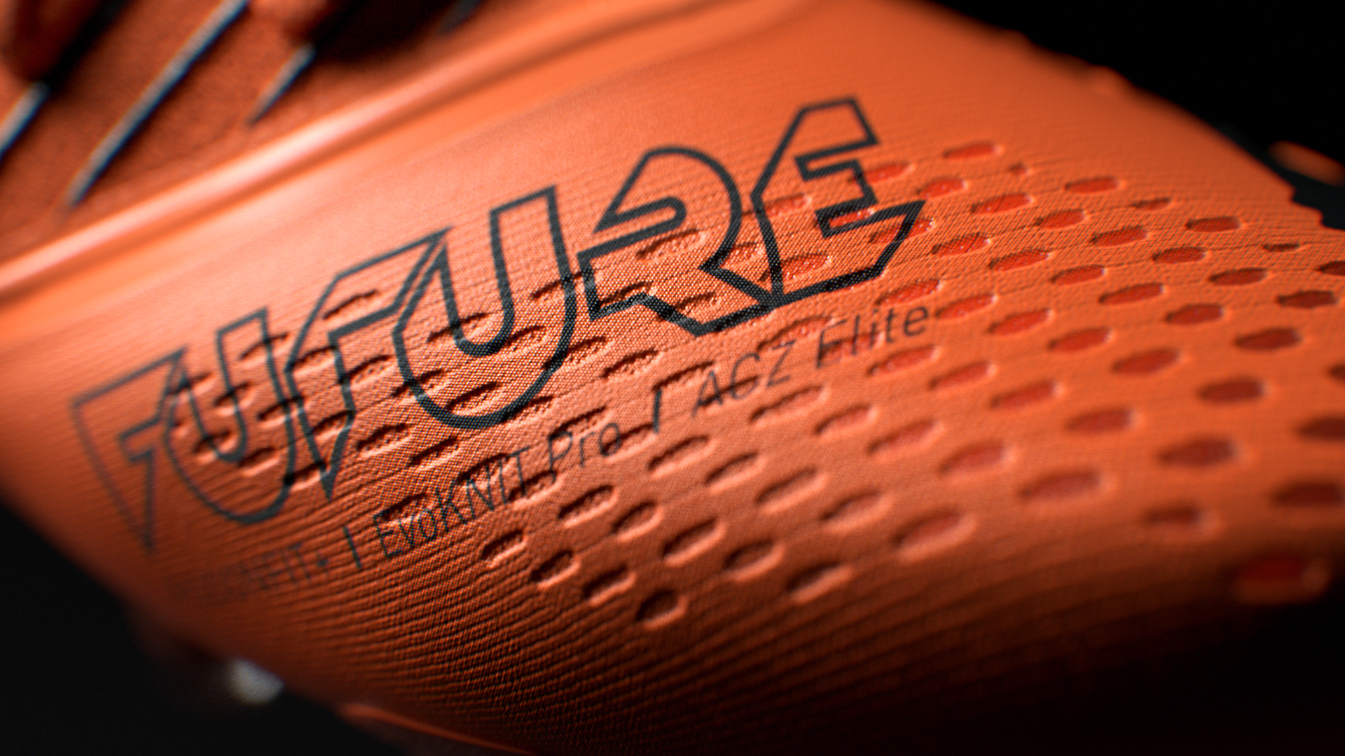
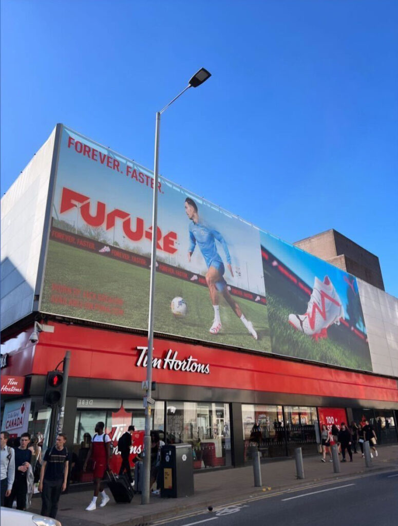
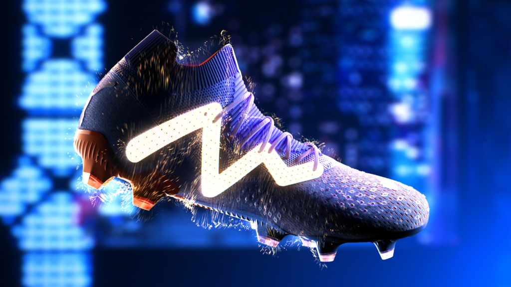
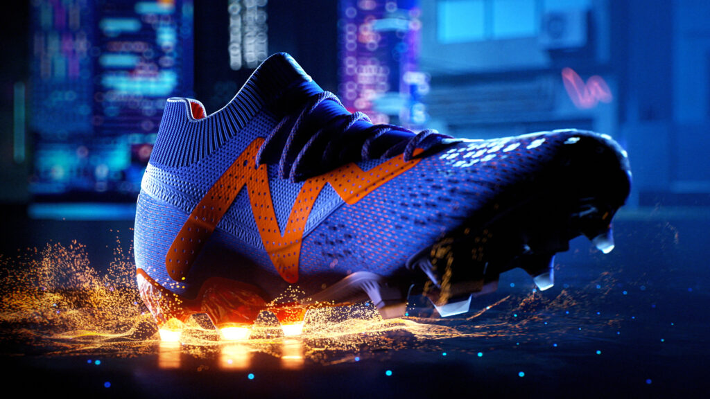
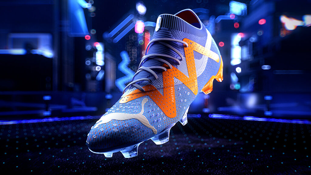
Puma Football launches the new 2023 model of one of its main boot: the Future
CHALLENGE
Highlight the technical features of the product by placing it in the global universe of the launch campaign.
SOLUTION
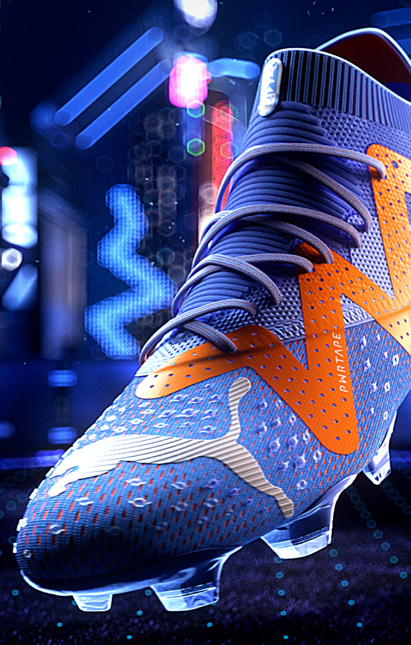
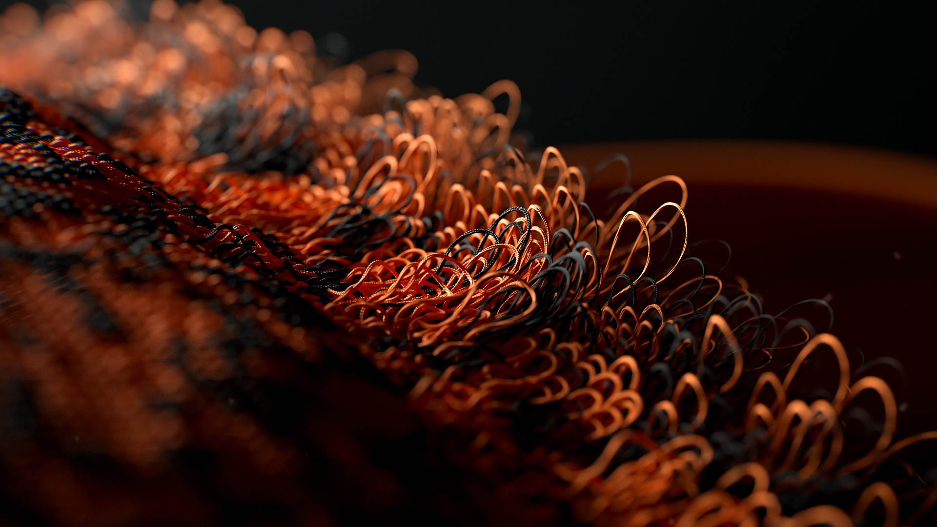
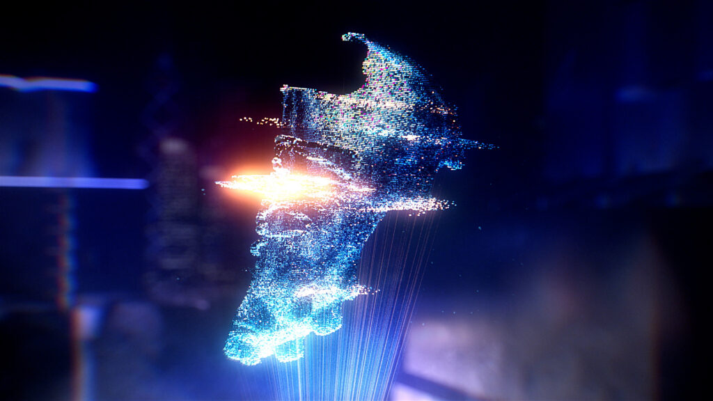
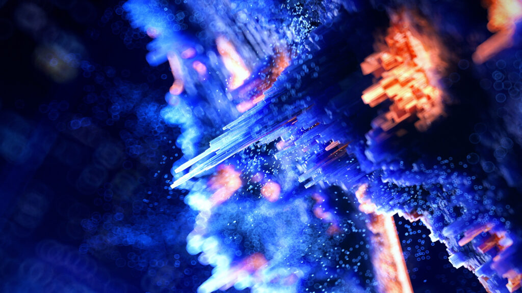
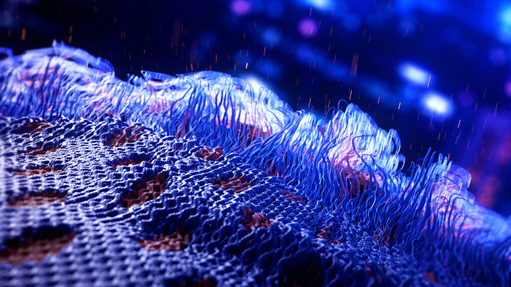
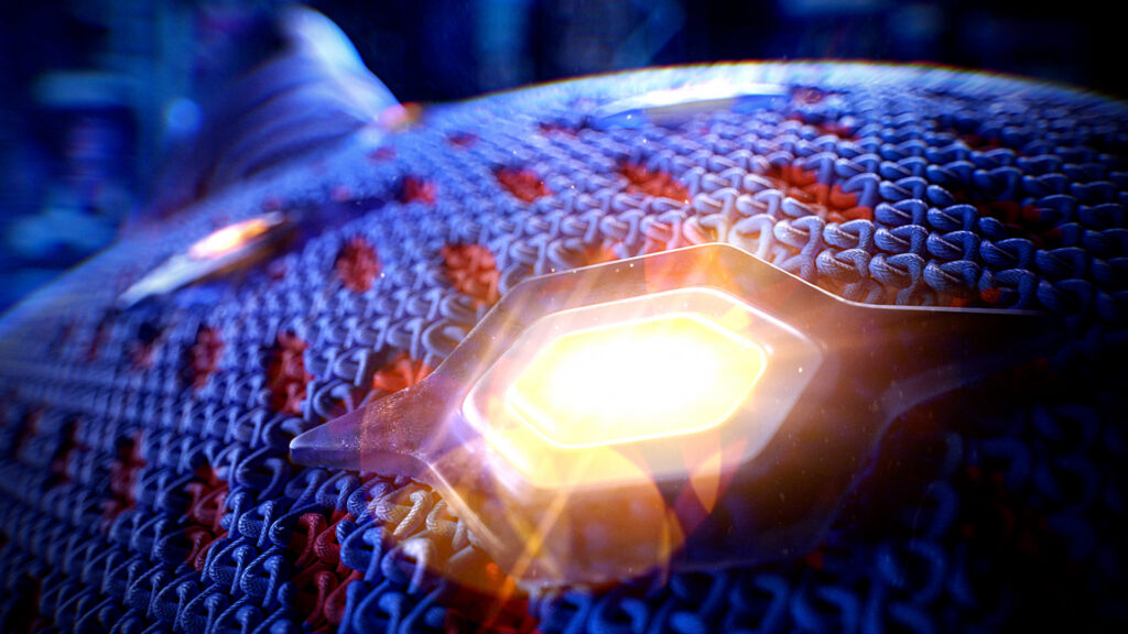
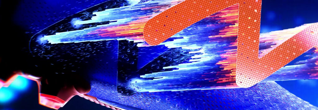
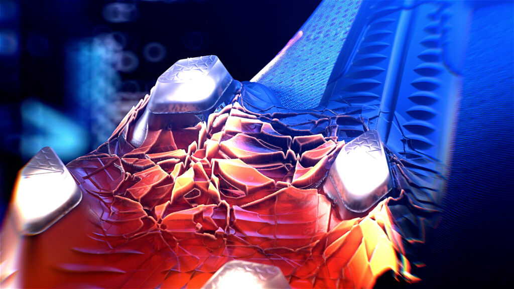
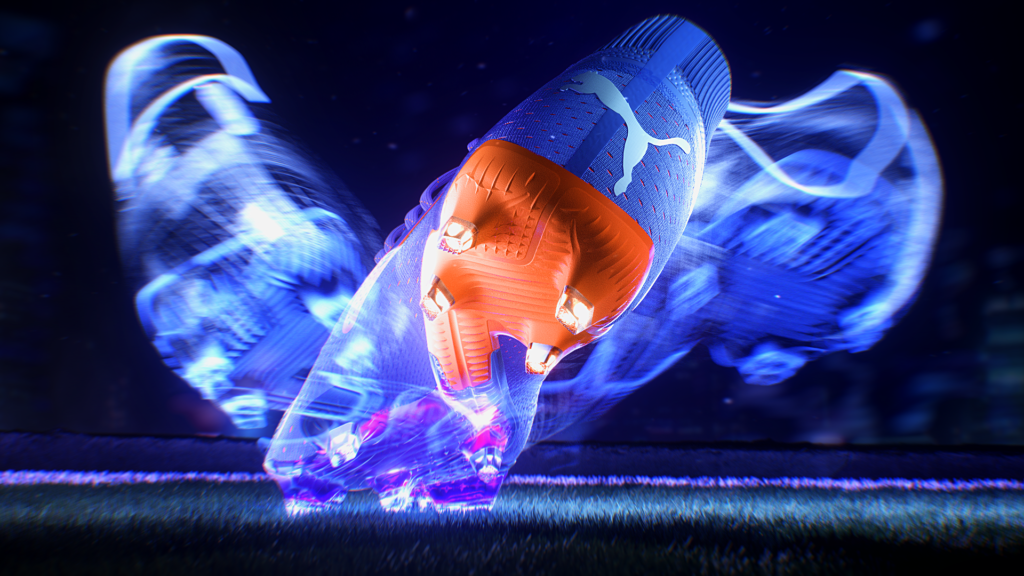
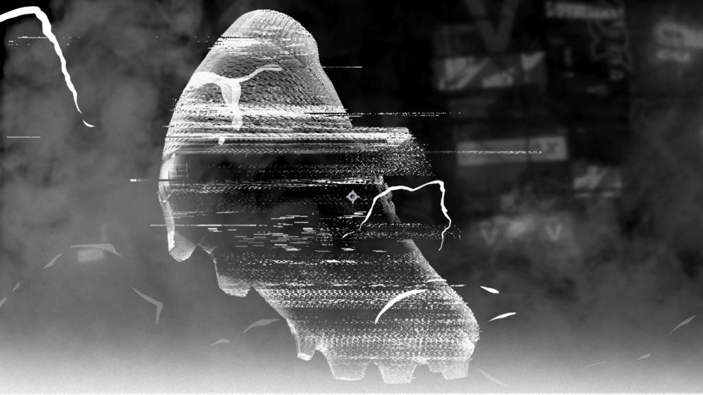
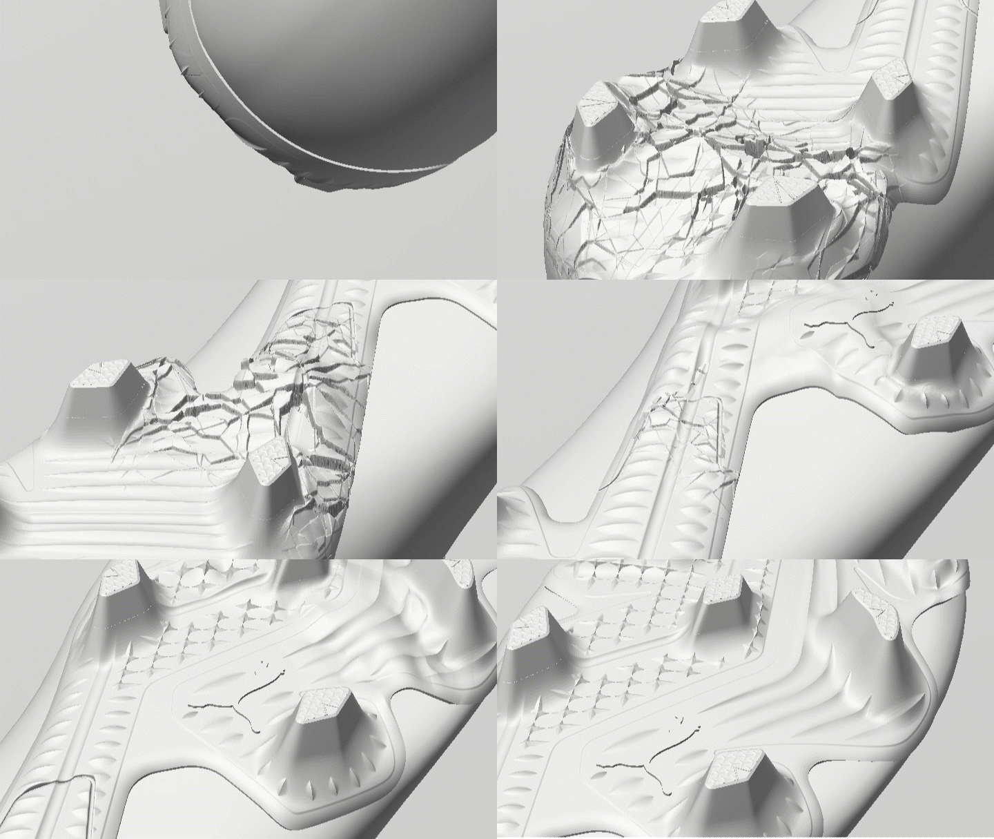
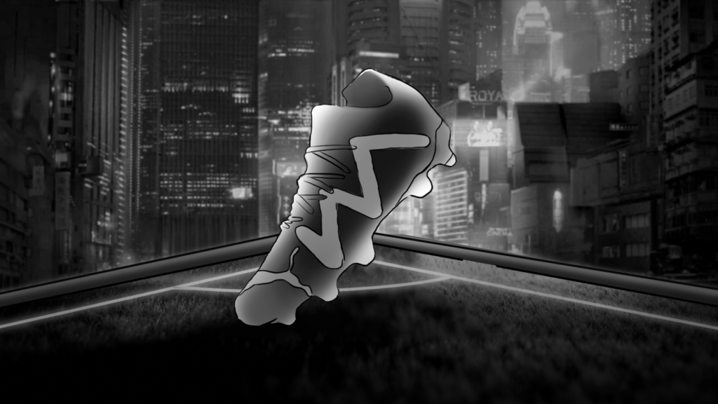
We capitalized on the reimagined design of the Future, to build a new visual territory that embrace innovation and technology, and push the limits of what is achievable on a football field. In a fully 3D-created film, we worked on the idea of immensity by staging a futuristic city, and on way smaller scales, by giving life to the material’s micro-details.
PROCESS
FUTURE Z 1.3
CONTEXT
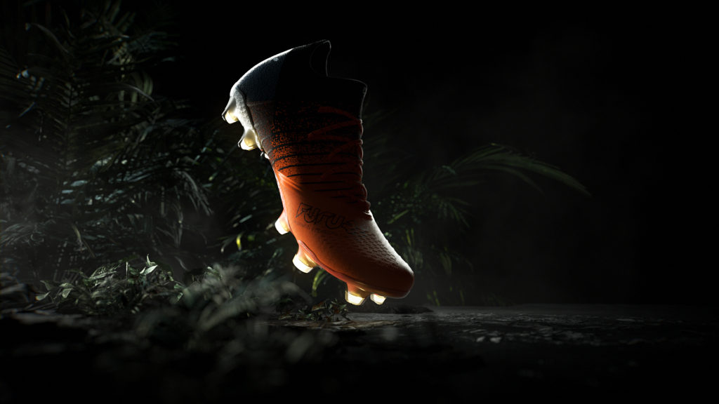
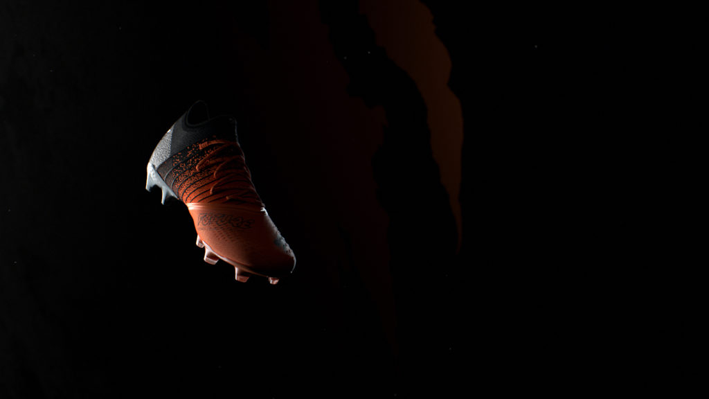
Puma is launching its key football sneaker’s latest model.
CHALLENGE
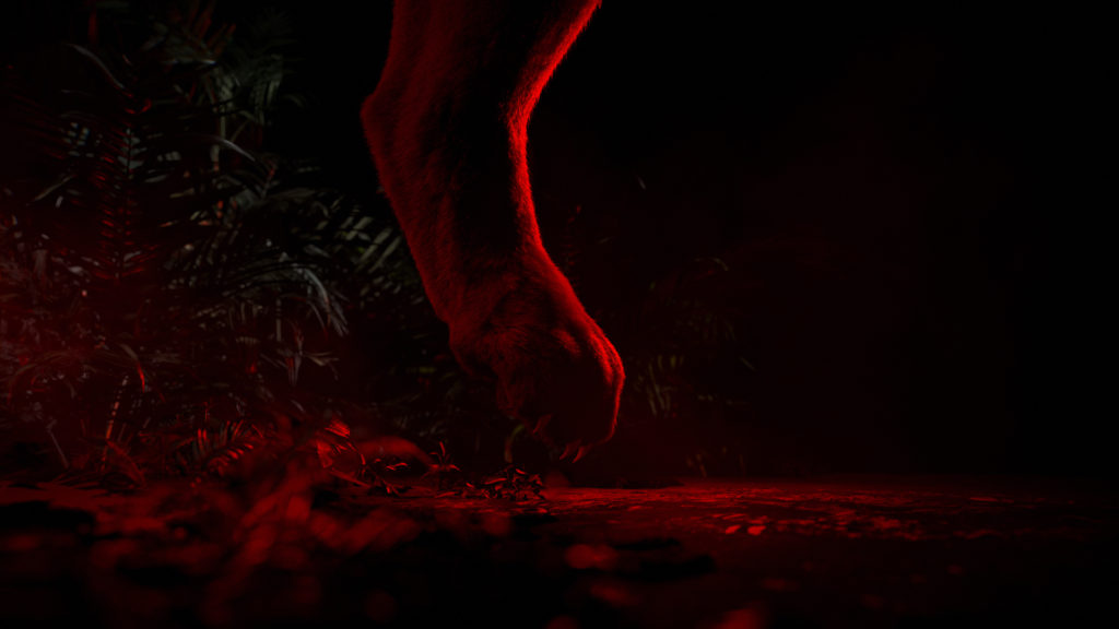
Play with the analogy between man and animal by highlighting the fierceness of the feline attack.
SOLUTION
VAKITA
CONTEXT
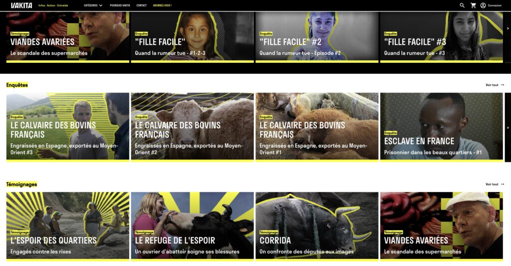
Hugo Clément and Régis Lamanna-Rodat launch an investigative media, whose name refers to an endangered marine mammal. Its promise can be summed up in 3 words: information, action, mutual aid.
CHALLENGE
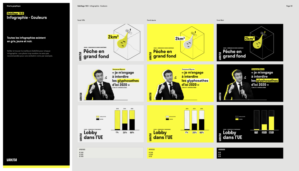
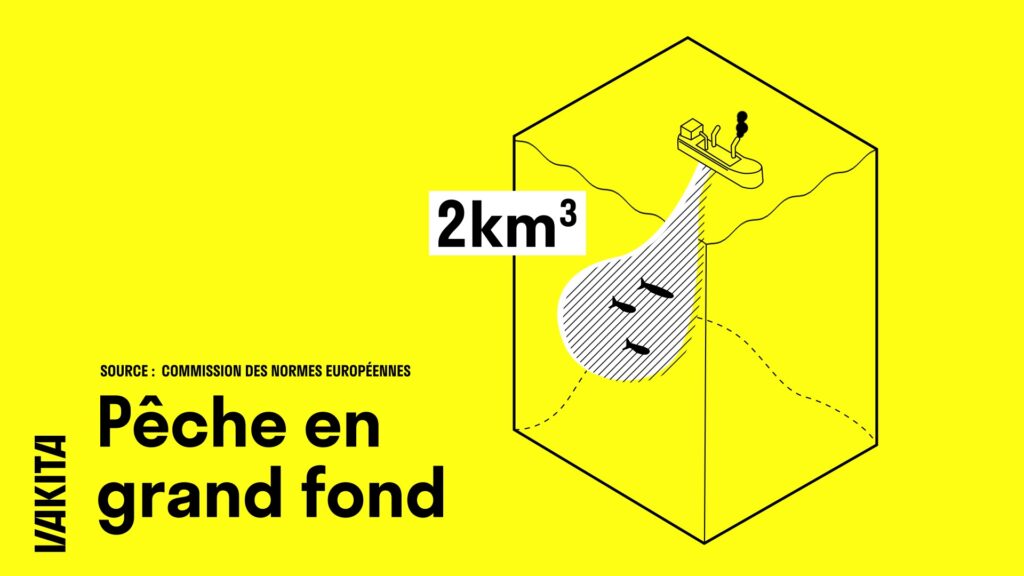
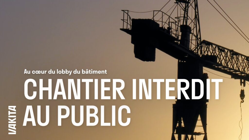
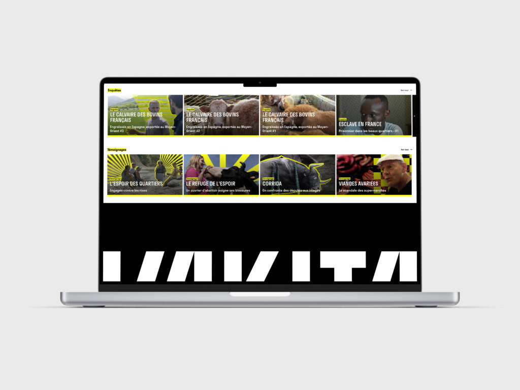
Show a singularity in the independent media landscape by creating a strong identity, symbol of a new type of citizen commitment. Develop a modular system, able to be deployed on a platform, social networks and all audiovisual content.
SOLUTION
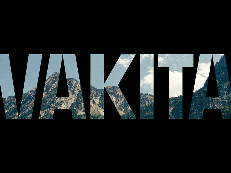
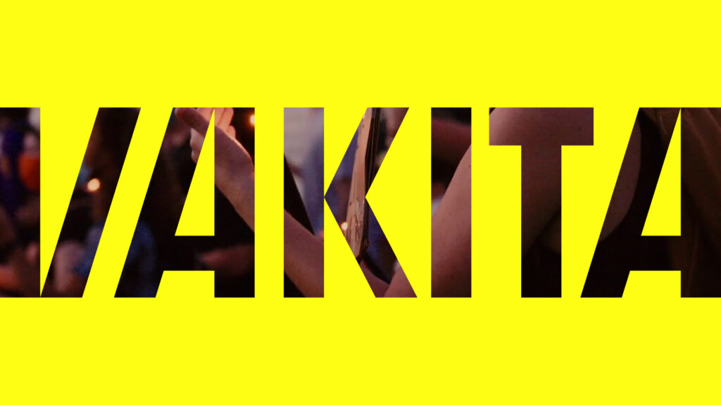
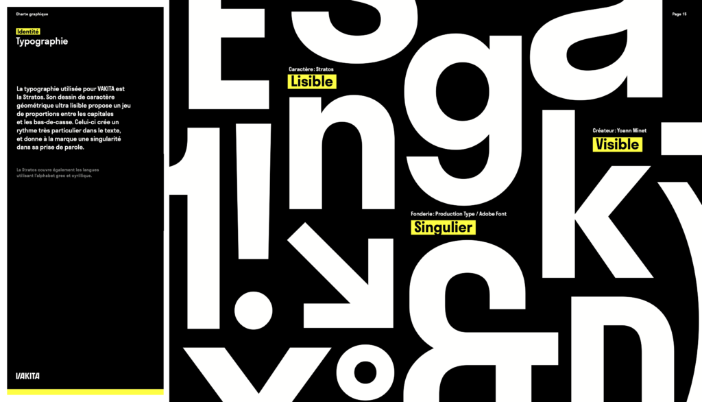
Vakita sounds like a cry, a warning sign, so we designed a logo that follows the structure and rhythm of the word’s syllables: a typographic block that draws strokes of the same thickness and plays with symmetry and contrasts. The design system is part of a tonic and striking dynamic, in the image of the brand’s positioning.
PLATFORM
’21 & ’22 SUMMER IDENTS
CONTEXT
For the summer season of 2021 and 2022, France 2 commissioned the agency to design a mosaic of advertising idents.
CHALLENGE
Create fun, light-hearted atmospheres that celebrate the summer vacation.
SOLUTION
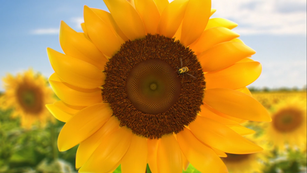
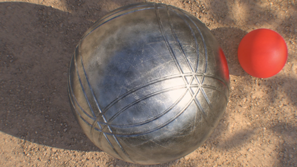
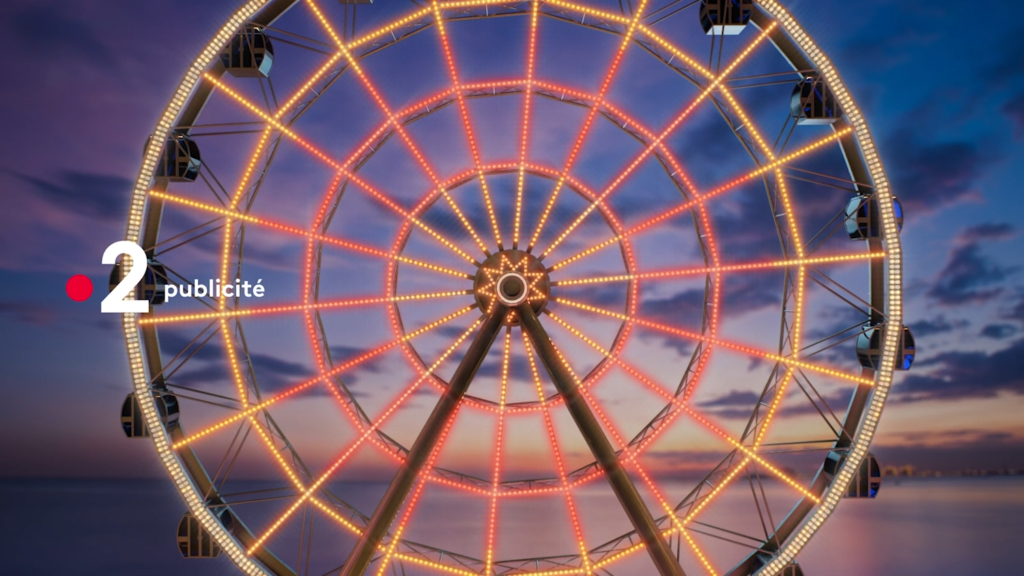
We designed about forty semi-realistic scenes, staging summer atmospheres known to all. For each ident, shapes and movements are circular, echoing the dynamics of the wave, which is specific to the channel’s design.

PROCESS
IAA MOBILITY ’21
CONTEXT
While the car manufacturer has just renewed its visual identity, Renault is taking part in its first motor show since the Covid-19 lockdown.
CHALLENGE
Develop new visual territories in order to bring more visibility to the brand when showcasing their new vehicules during international fairs.
SOLUTION
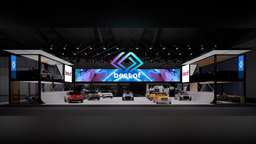
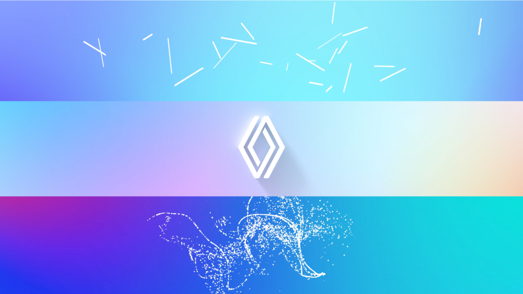
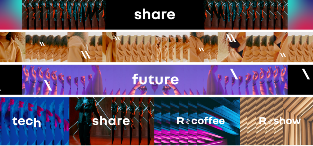
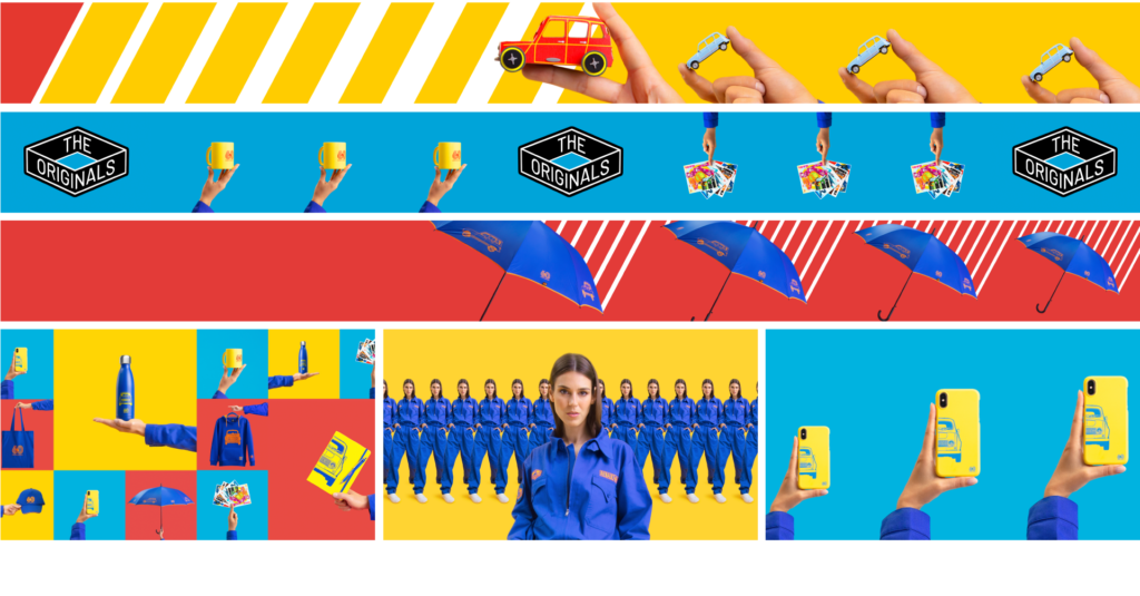
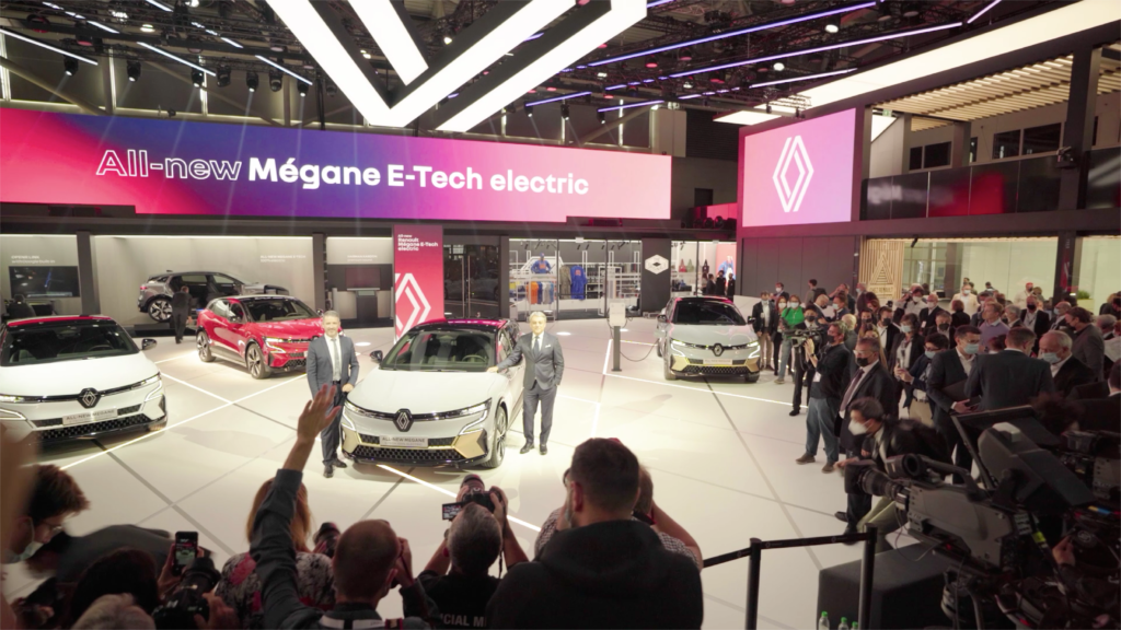
As part of the new brand identity, the assets created by the agency include a series of video loops, webcast design and coming next. The agency’s creative teams deconstructed and reconstructed the new Renault logo through a series of 2D graphic animations. For the reveal of the new R5 prototype, we celebrated with Renault the 50th anniversary of the French cult model from the ’70s and ’80s. In the age of phygital, we have customised the 3 daily programmes recorded on the stand and streamed live on the Internet. We finally promoted The Originals collection, which was available in the stand shop.

LEDGER RECOVER
CONTEXT
For the launch of its new security service that enables the recovery of one’s wallet without using a recovery phrase, Ledger asked 17MARS to create a short film putting in context the need for this service and its simplicity of use.
CHALLENGE
Develop Ledger’s new artistic direction in a 3D environment, more fashion-oriented. Show how useful this service is through case-studies introducing the video.
SOLUTION
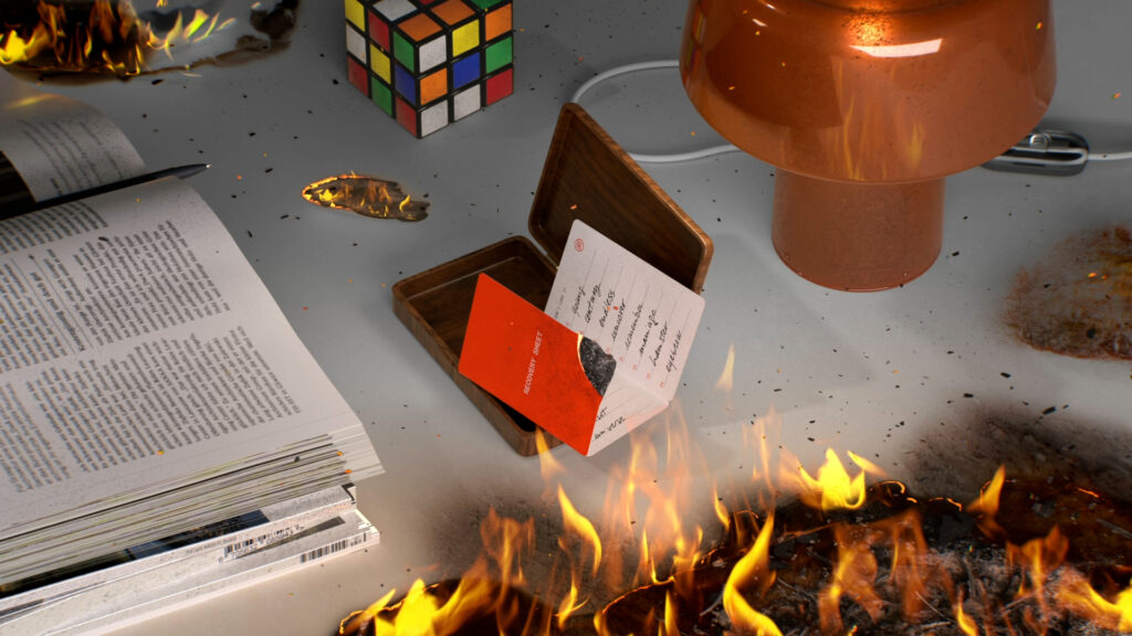
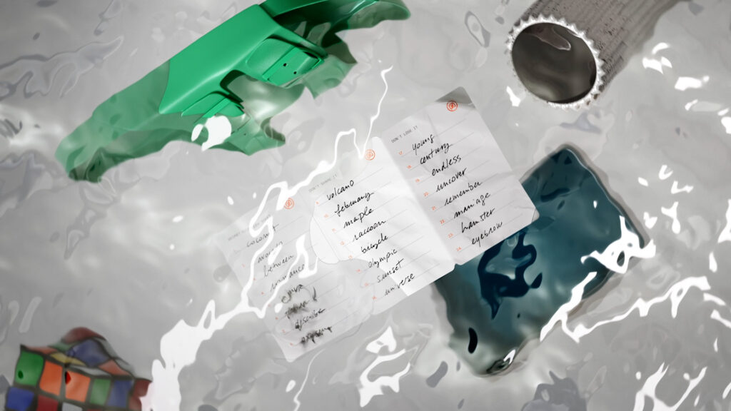
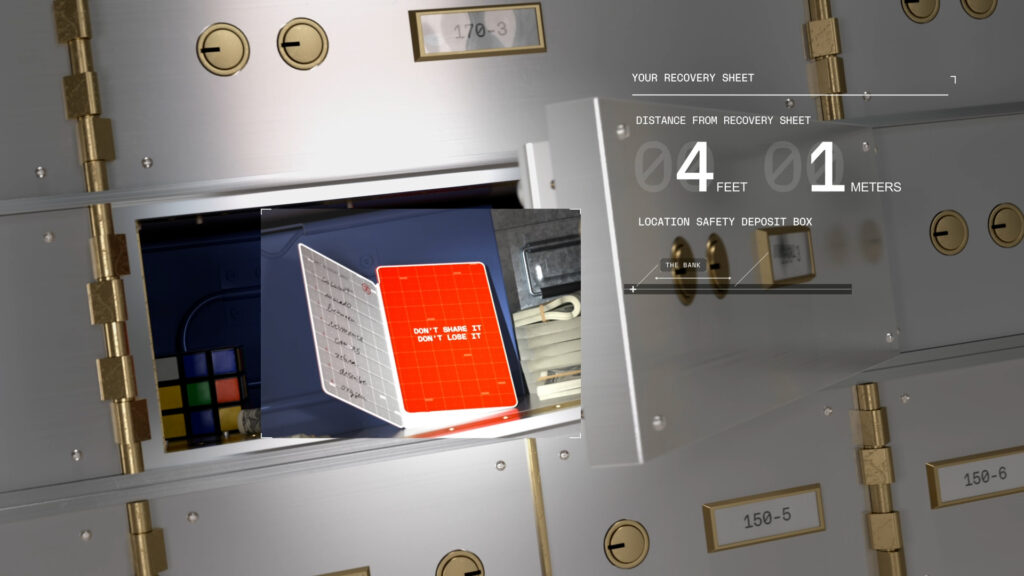
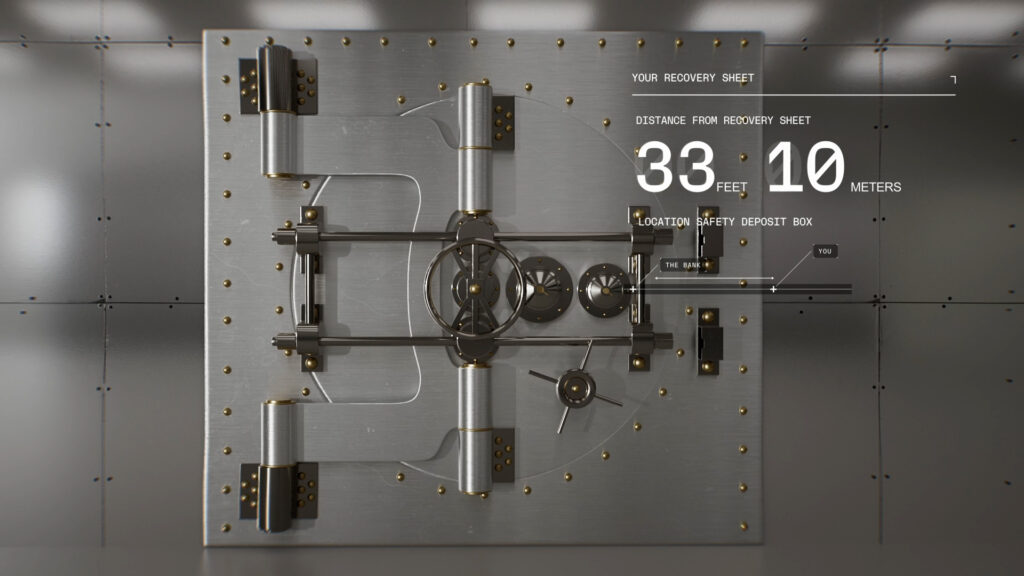
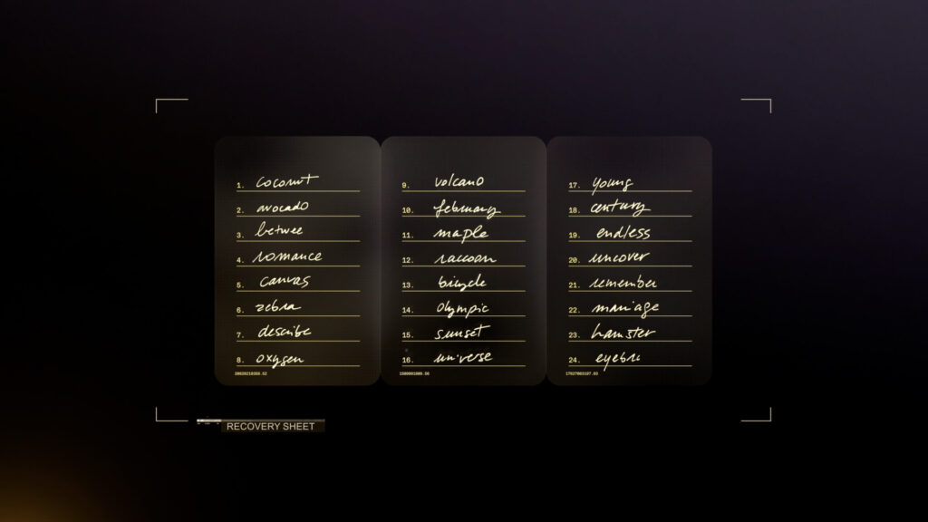
We imagined two very distinct environments in order to visually distinguish the rooted in reality case-studies from technology, anchored in a more digital world. Reality is embodied by a series of 3D still-lifes on light grey surroundings, while technology is represented on a black background with a fine design inspired by video games interfaces.
The first part of the film calls on a bullet-time visual effect, providing us with the clear representation of the tension of an event about to happen. All three scenes are almost frozen in time, allowing for the visualisation in which Ledger Recover would’ve proved useful…
NANO S+
CONTEXT
French unicorn Ledger launches a new version of its physical digital asset wallet.
CHALLENGE
Upgrade the object to the icon status.
SOLUTION
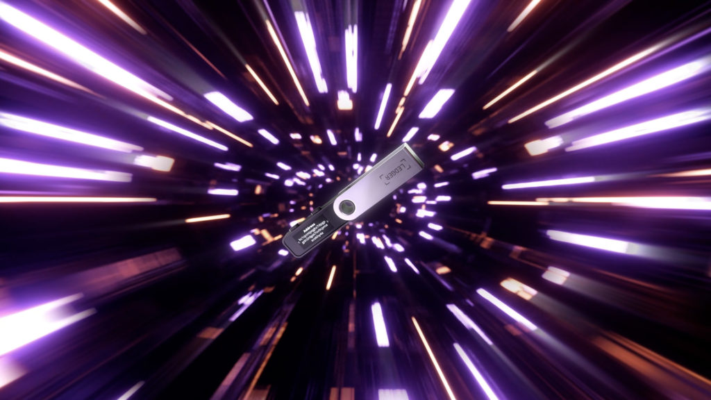
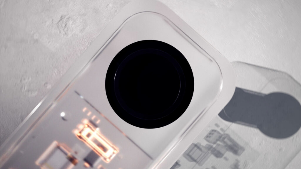
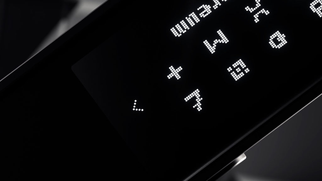
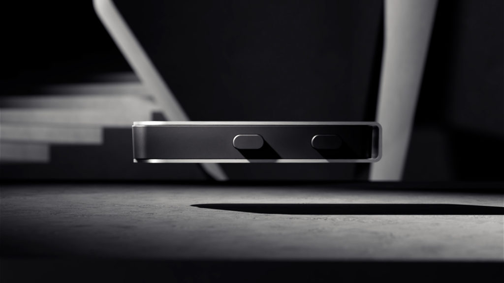
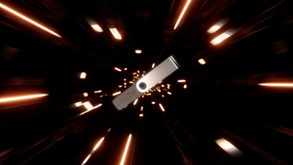
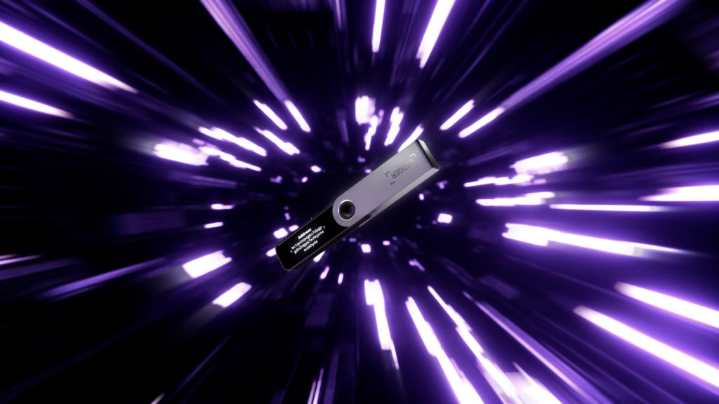
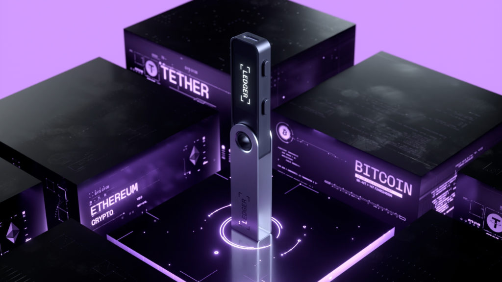
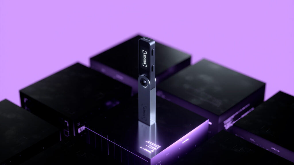
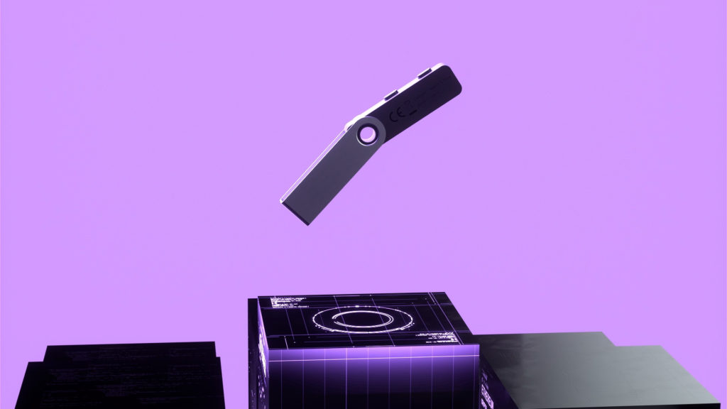
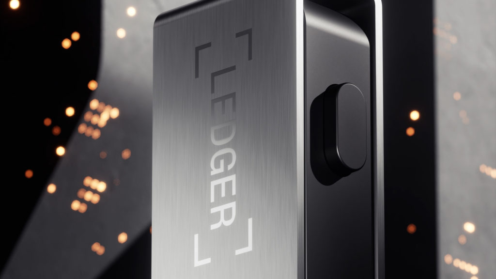
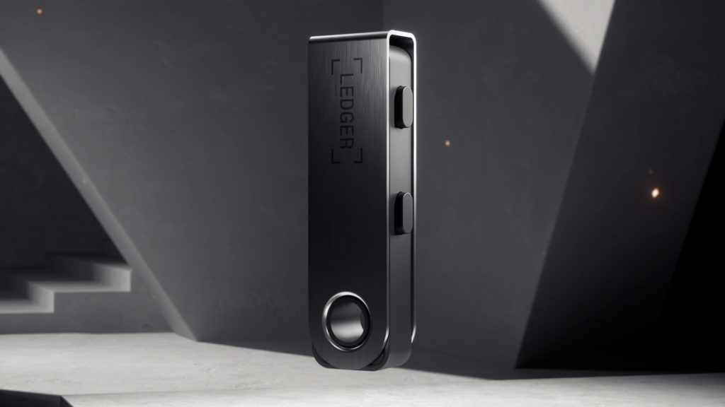
The agency created a film that uses macro shots and fine lighting to magnify the design of the product set in a minimalist architectural structure. At the crossroads of the real and the virtual, the mineral and the digital blend together to better anchor the object in its universe.

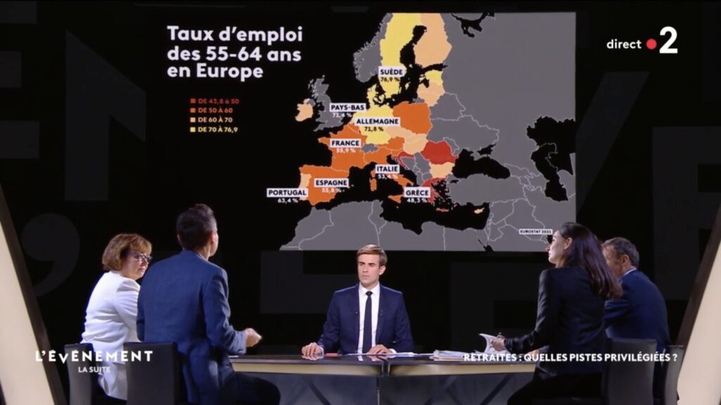
L’ÉVÉNEMENT
CONTEXT
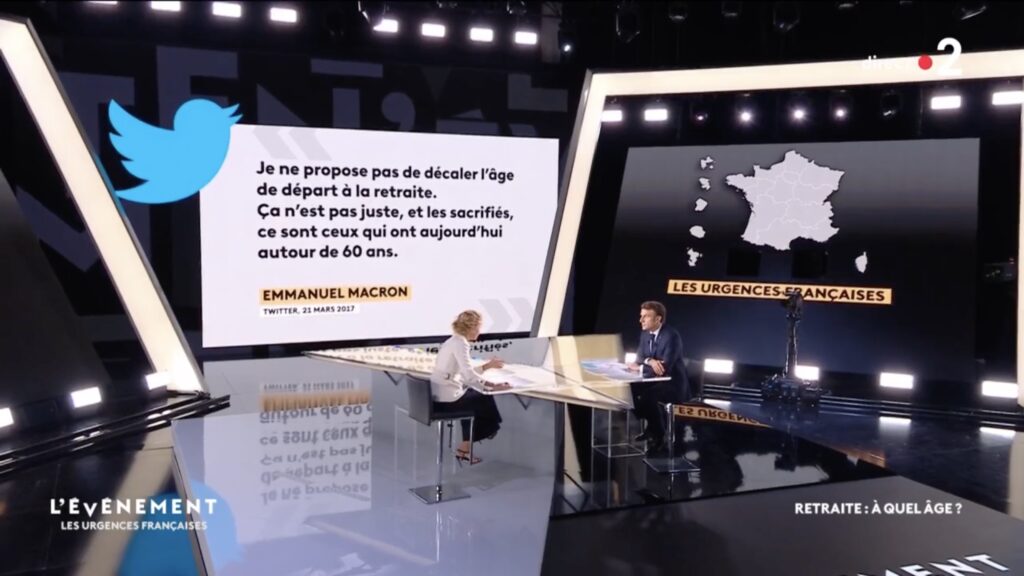
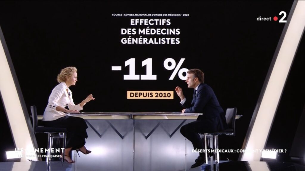
The head of the France Télévisions news department is launching a new political program on France 2. Particularity of the concept: the program is divided into two parts. The interview of a political personality by Caroline Roux, followed by a second set to explore an issue.
CHALLENGE
Reaffirm the leading position of the public service in terms of political talk shows.
Allow the editorial staff the greatest agility in the treatment of current affairs, while capitalizing on the typographic look of the antennas.
SOLUTION
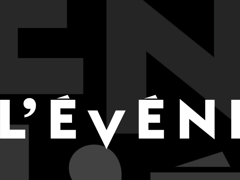
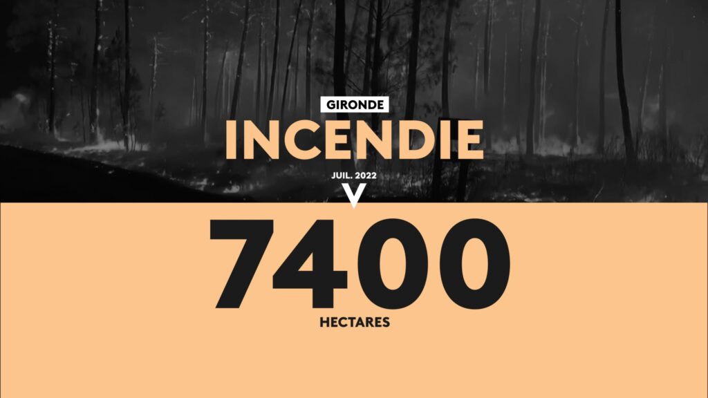
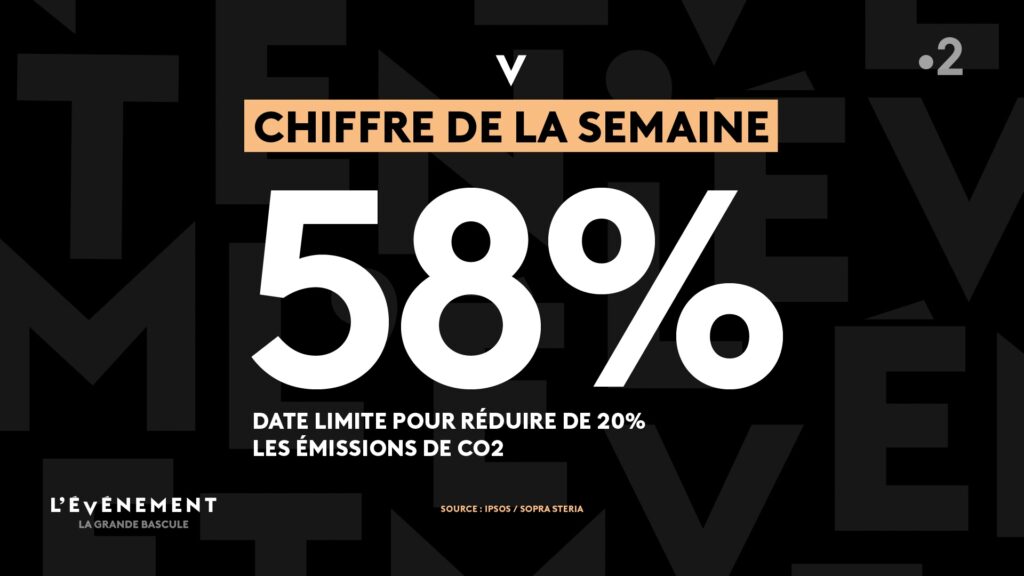
We designed a meaningful identity by reworking the letter ‘v’ in the word “événement” as a cursor that targets news events in a timeline. A sober and structuring system, very modular, which puts the information in its context and values the objectivity of its treatment.
CLASH FOR FUTURE
CONTEXT
For the 6th edition of its annual event dedicated to luxury, the leading magazine of communication, CB News, puts the spotlight on the punk movement and let the agency have free rein.
CHALLENGE
Through the conception of an opening film, show how luxury occupies the field of culture by mesmerizing the targeted audience with striking visuals.
SOLUTION
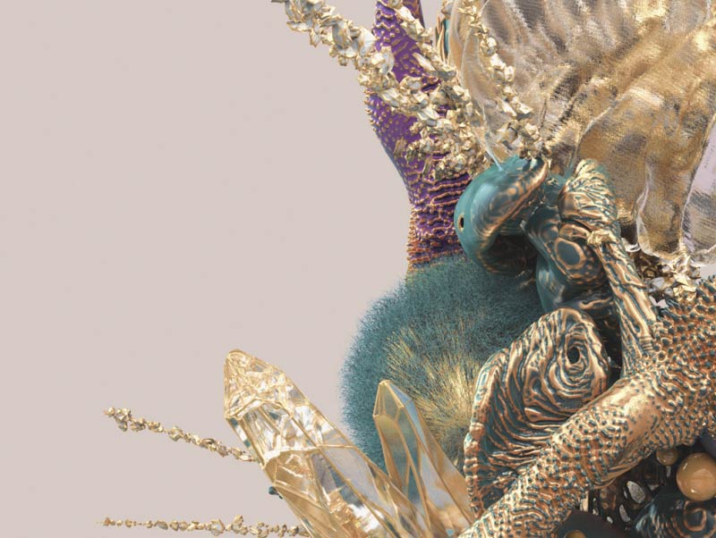
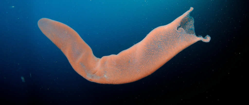
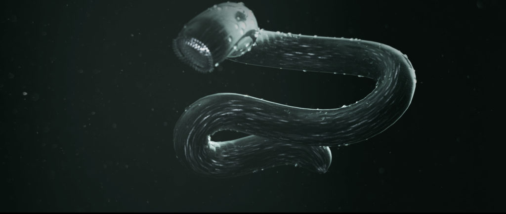
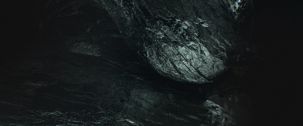
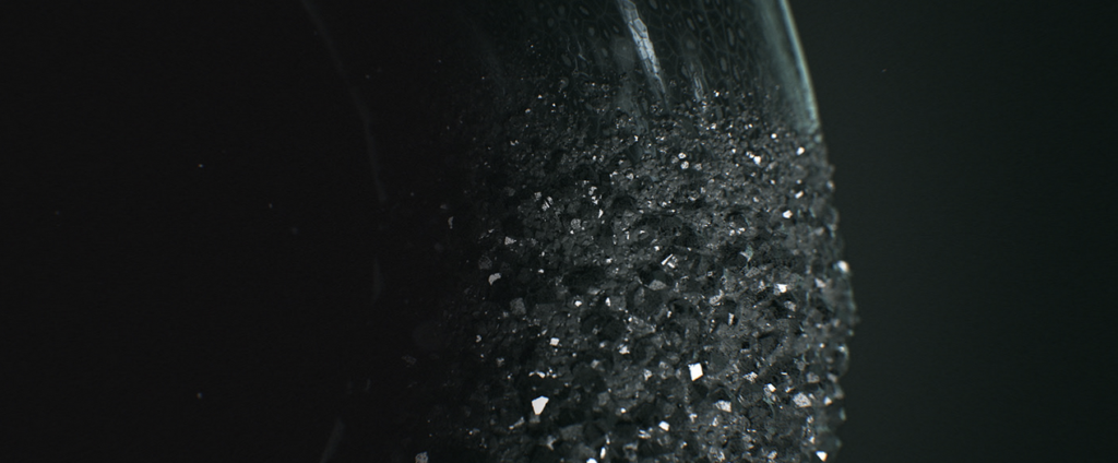
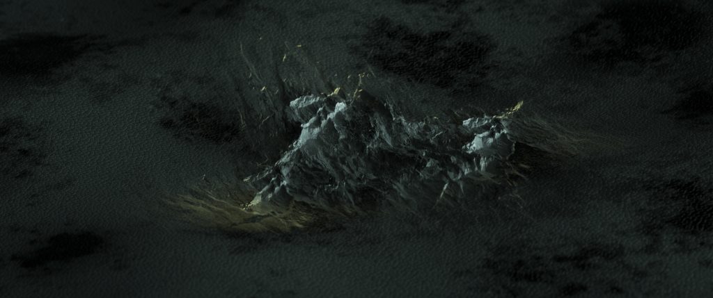
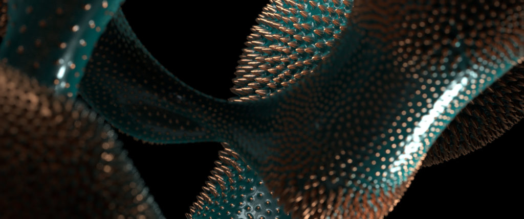
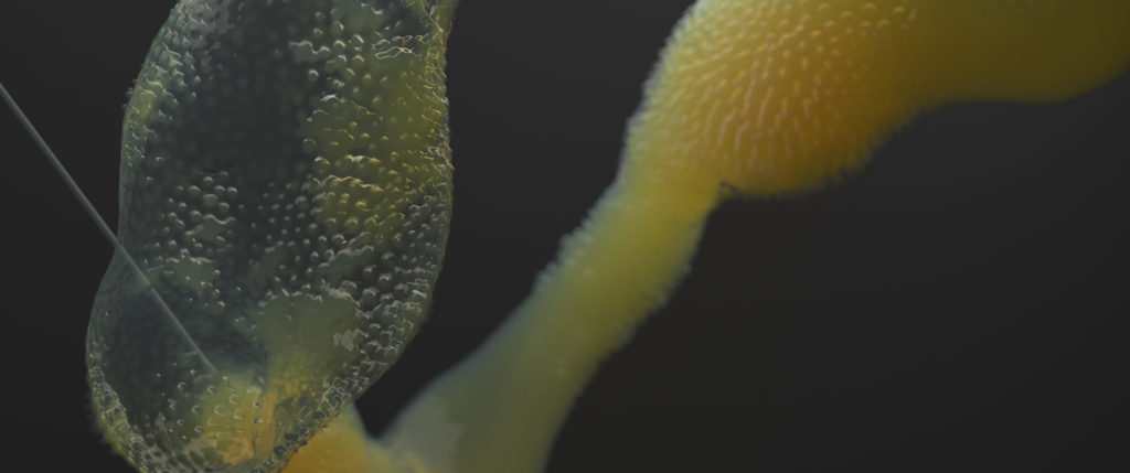
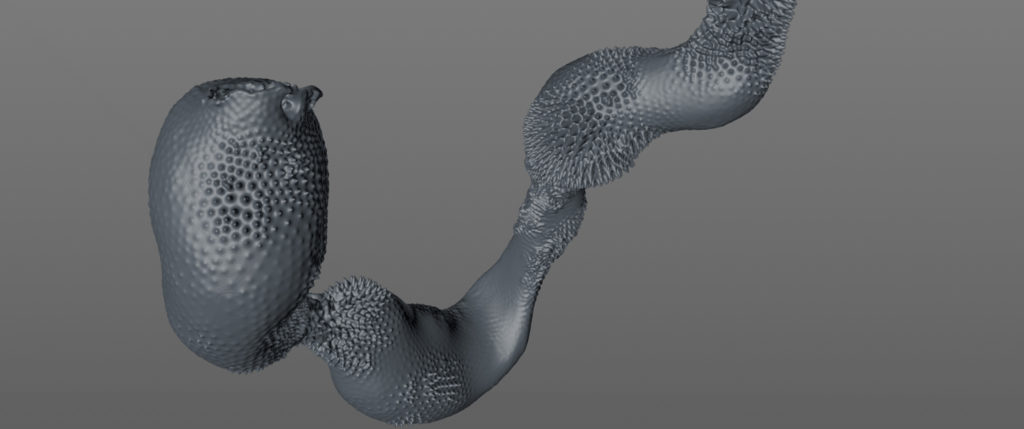
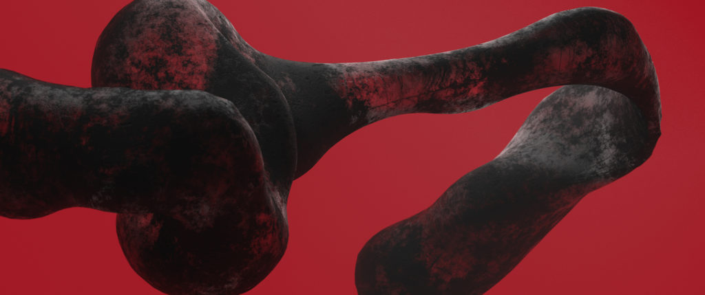
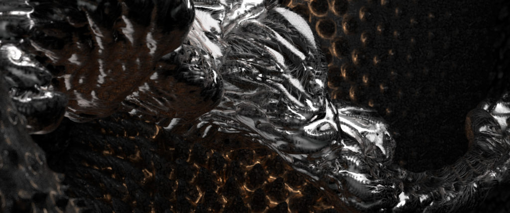
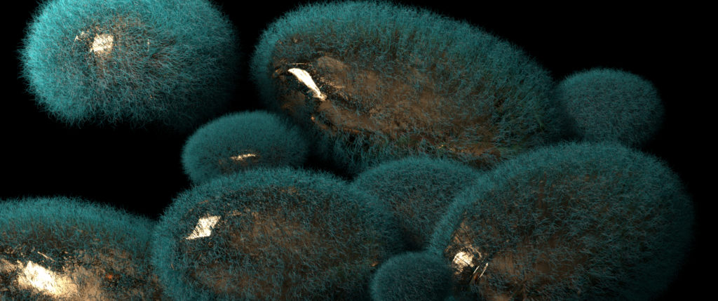
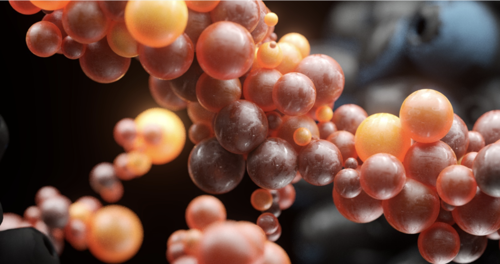
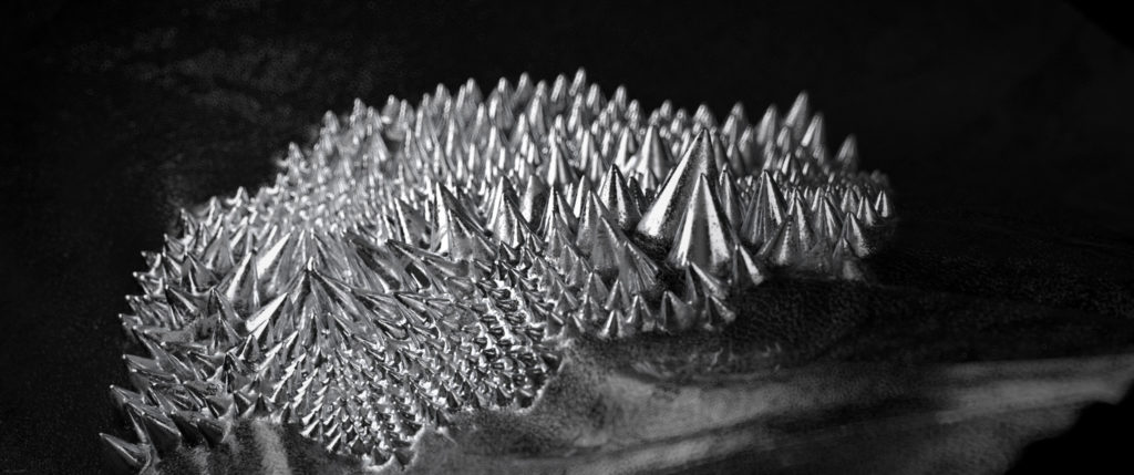
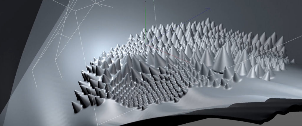
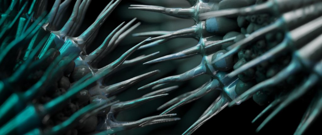
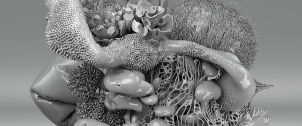
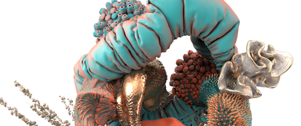
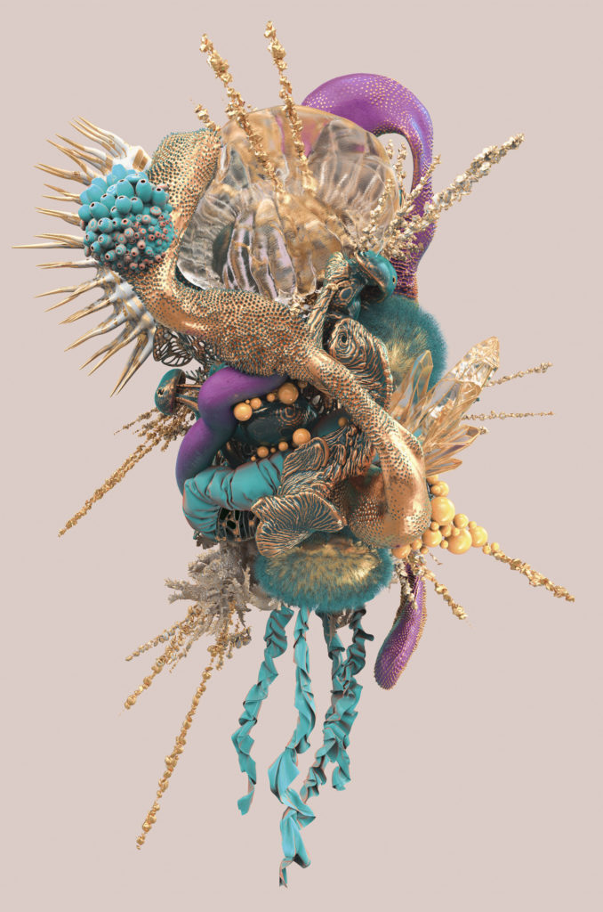
Questioning the creative process, we conceived a film featuring a pyrosome, a marine creature with multiple living bodies, nourishing itself with the organic particles found in its environment. The metamorphosis of the animal is magnified by a 3D macro approach, mixing the mineral with the organic. The whole is supported by a powerful and immersive sound design, of ASMR type.
ARES
CONTEXT
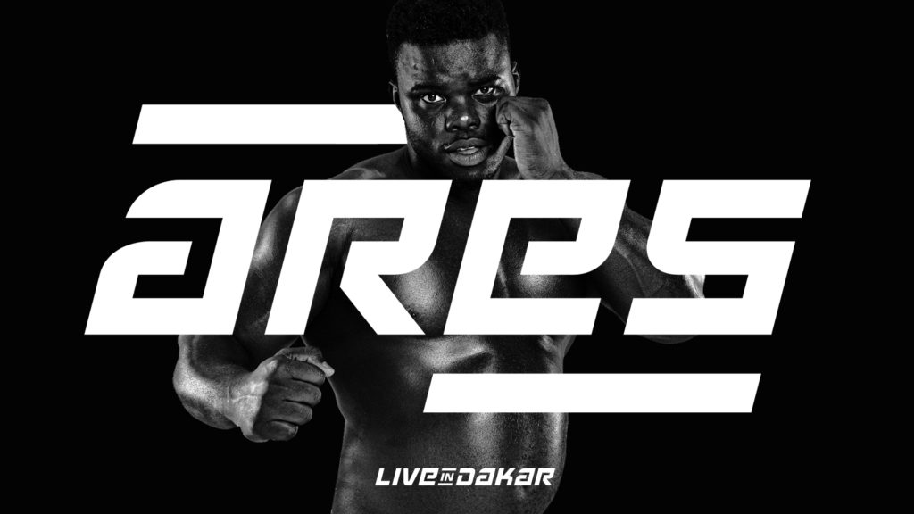
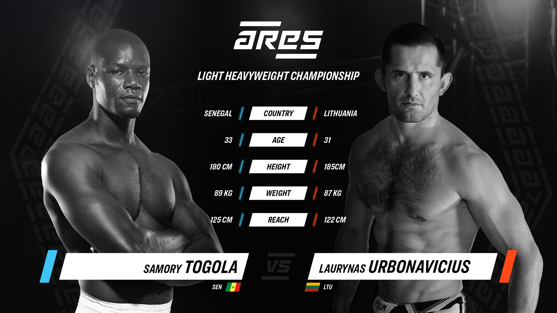
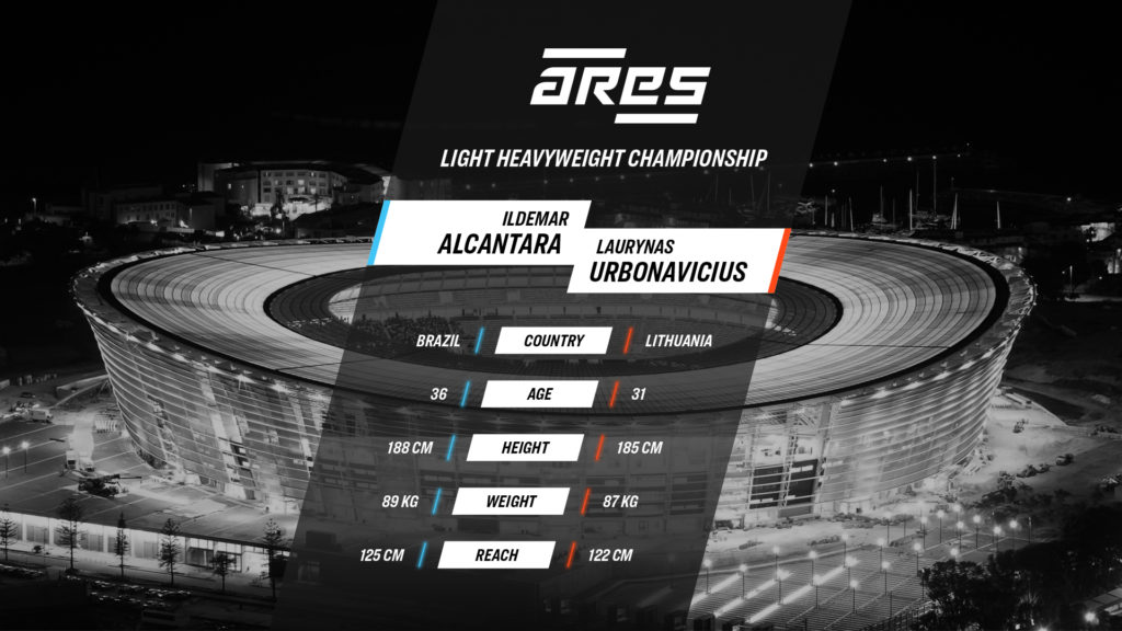
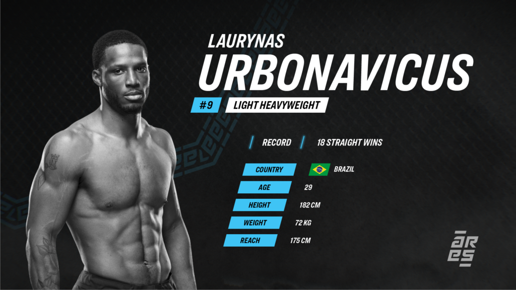
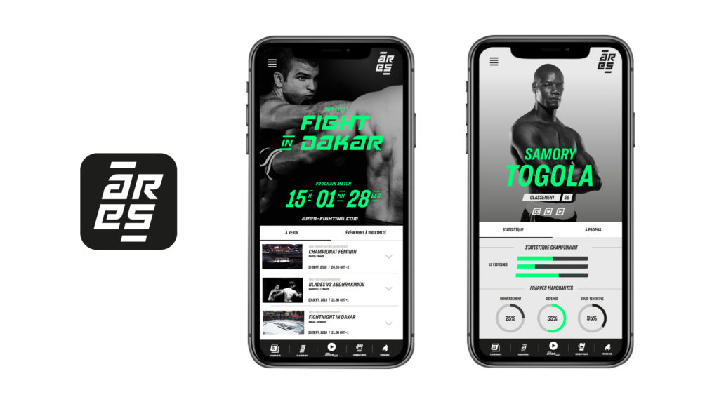
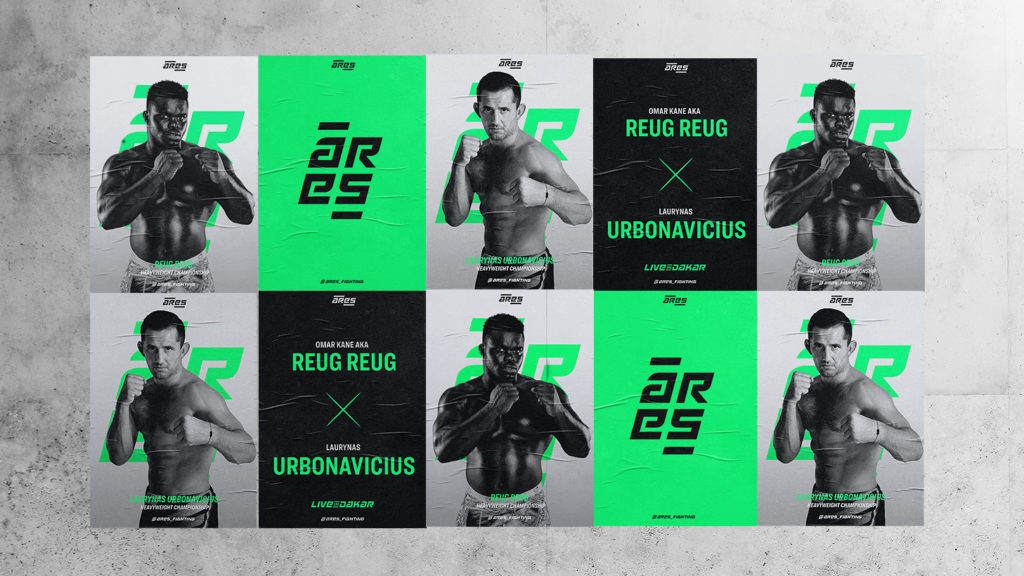
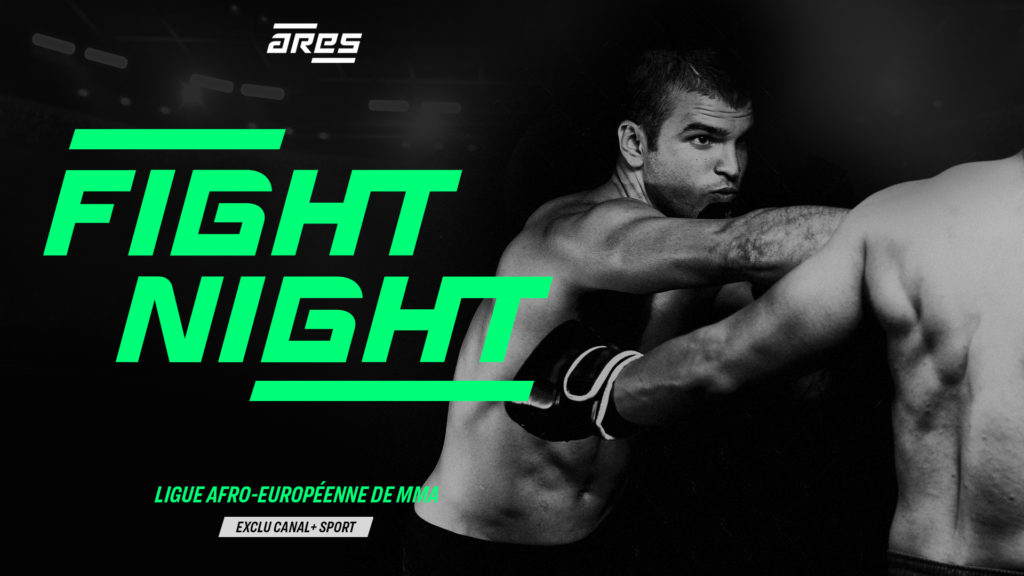
As the discipline is in the process of being authorised in France, Vivendi Sports is launching ARES Fighting Championship, a new Afro-European MMA (or mixed martial arts) league.
CHALLENGE
Convey a decent and respectable image to a sport with a sultry reputation through its visual identity.
SOLUTION
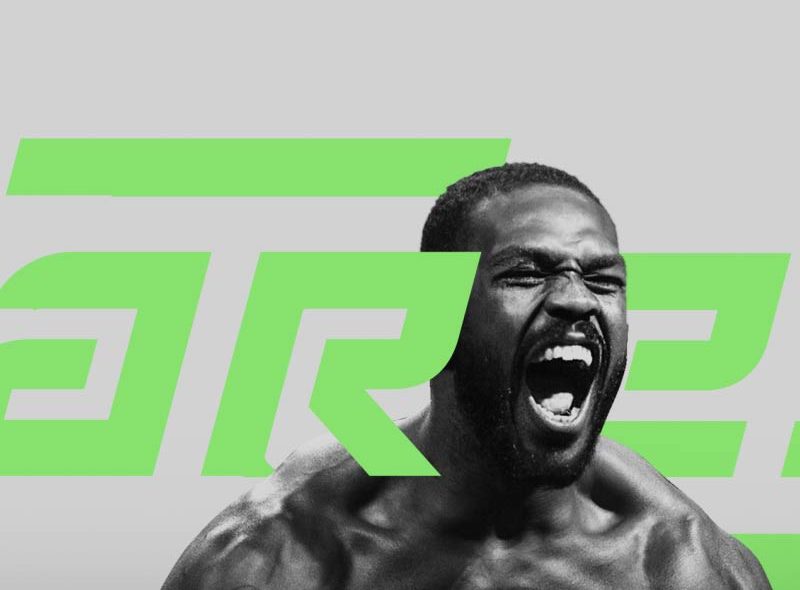
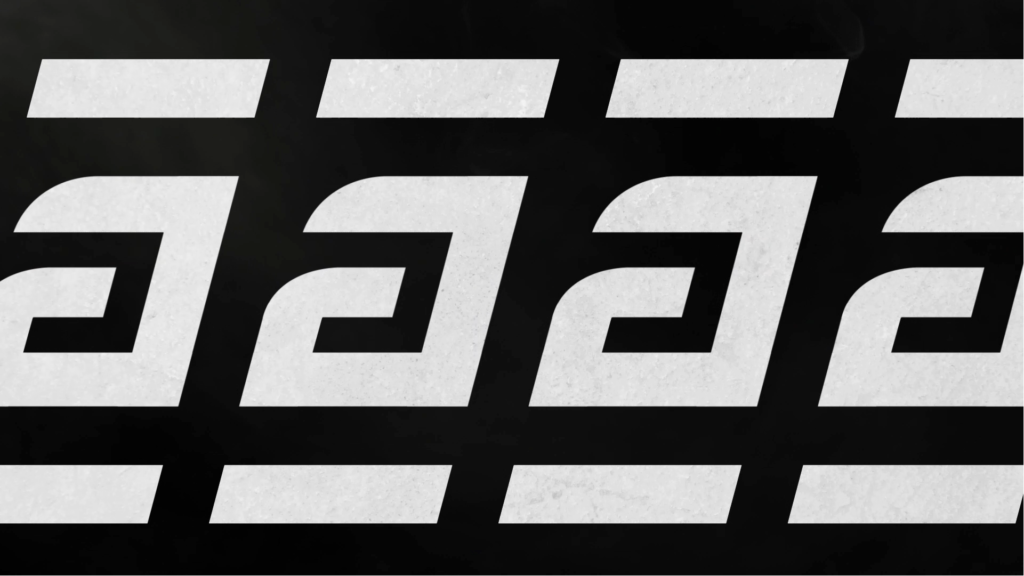
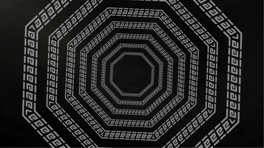
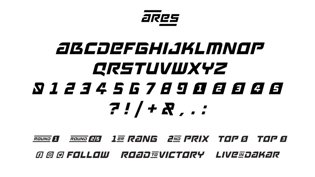
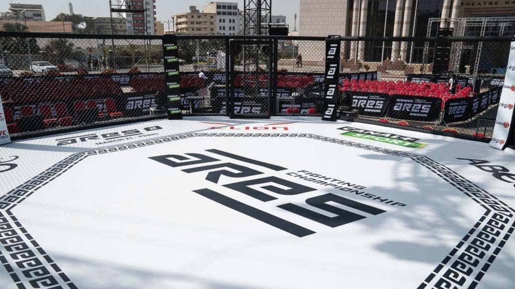
As we aimed to provide the league with strong markers, we forged an original typography inspired by Greek mythology that bonds the discipline with its ancestor, the ancient Pancrace. Based on this typography, we drew a multi-use, flexible and adjustable brand territory.
IDENTITY & TYPOGRAPHY
BROADCAST DESIGN
COMMUNICATION
CHRISTMAS WREATHS
CONTEXT
Every year, France 2 gathers its viewers around its Christmas packaging, a moment of communion between the channel and its audiences.
CHALLENGE
Re-enchant the lives of French people at the beginning of winter and share exceptional moments with viewers.
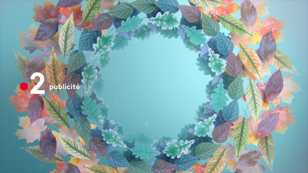
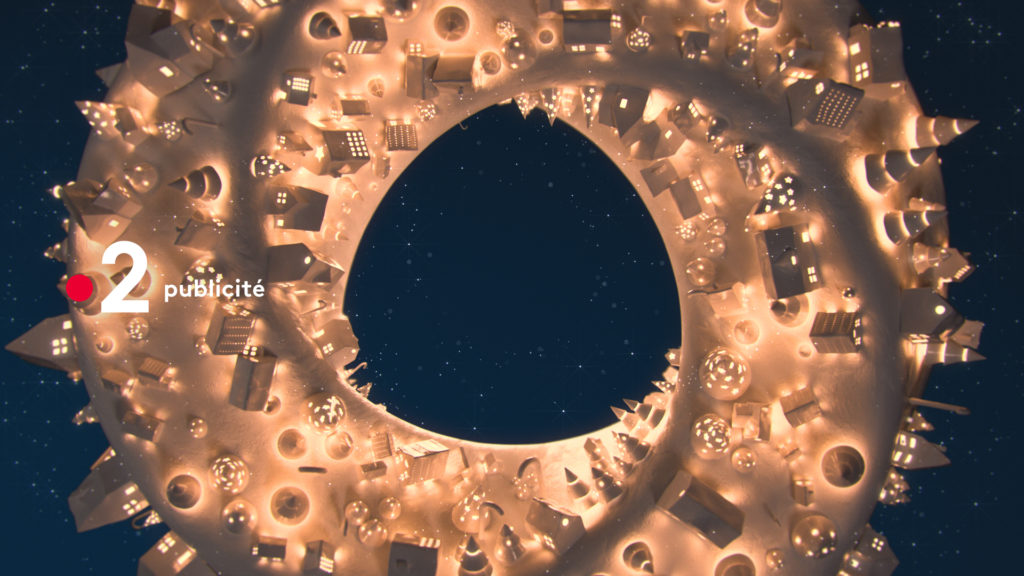
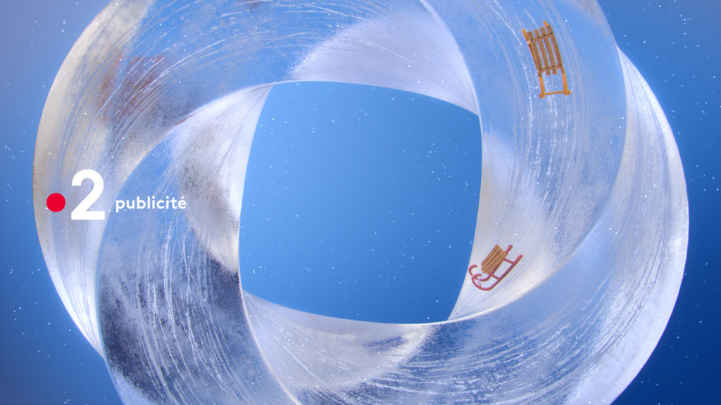
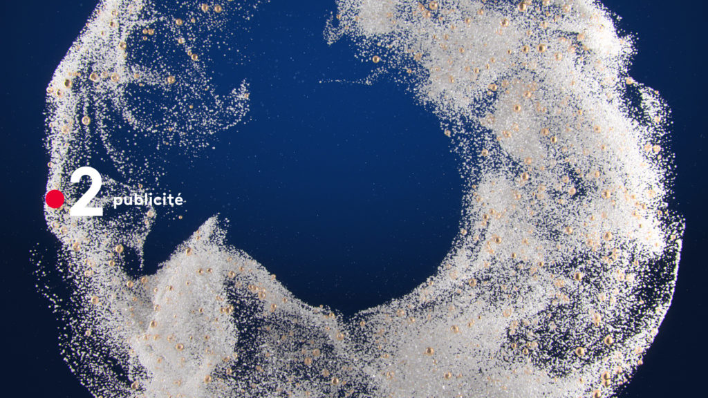
SOLUTION
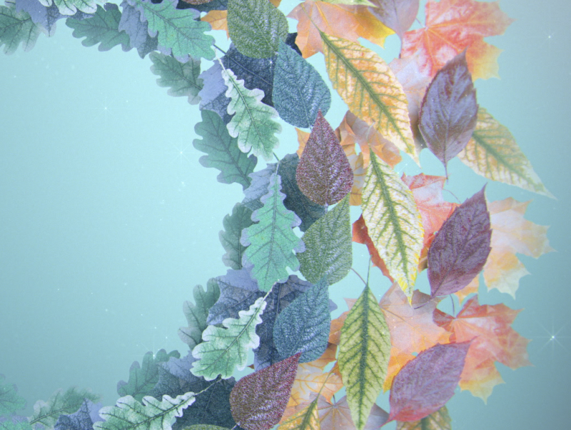
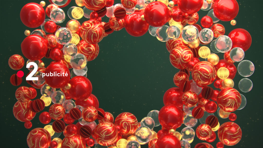
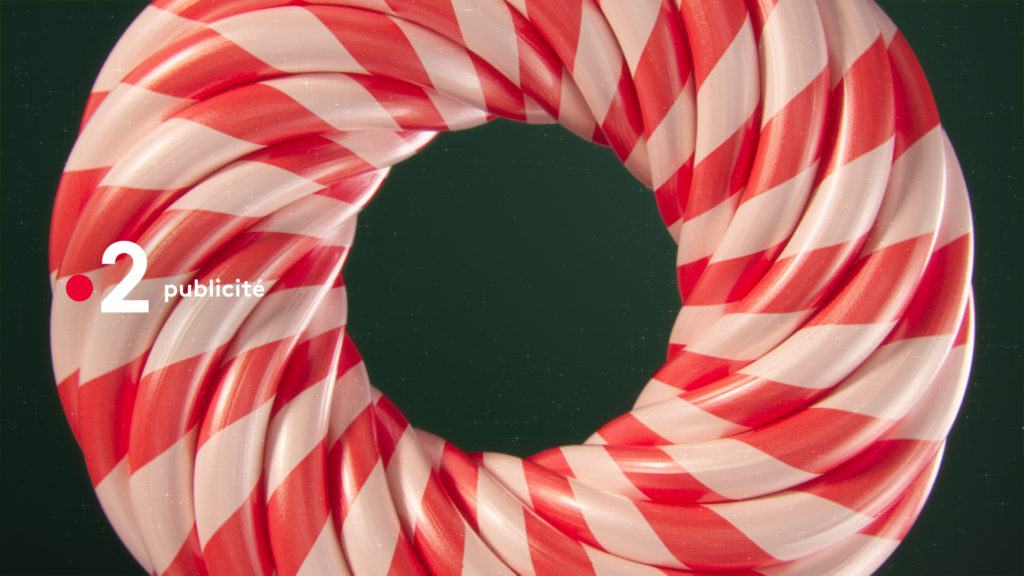
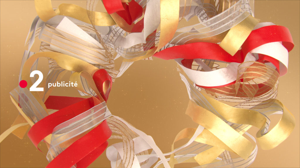
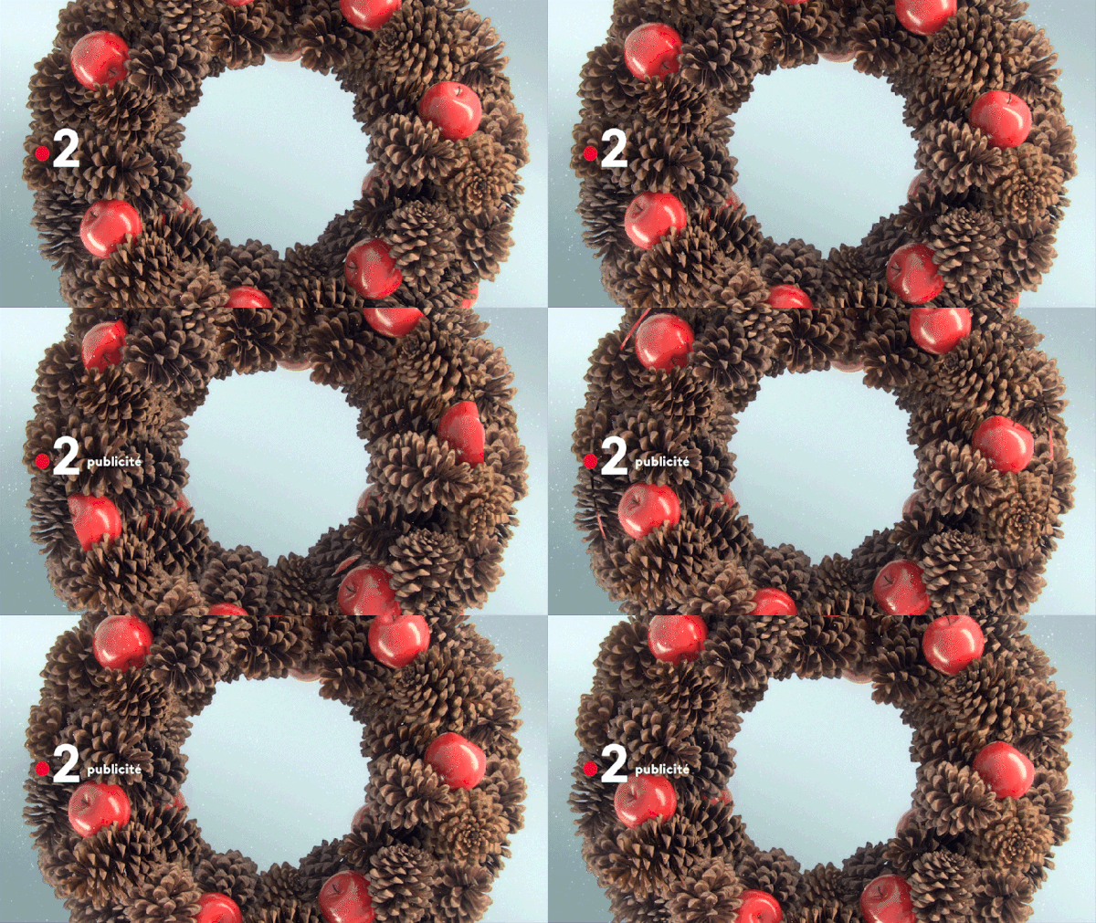
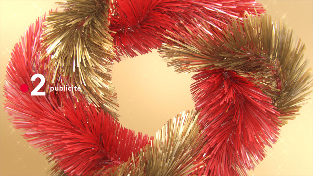
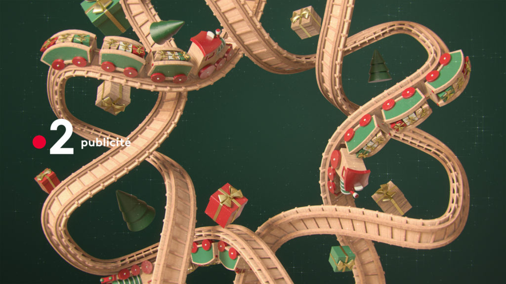
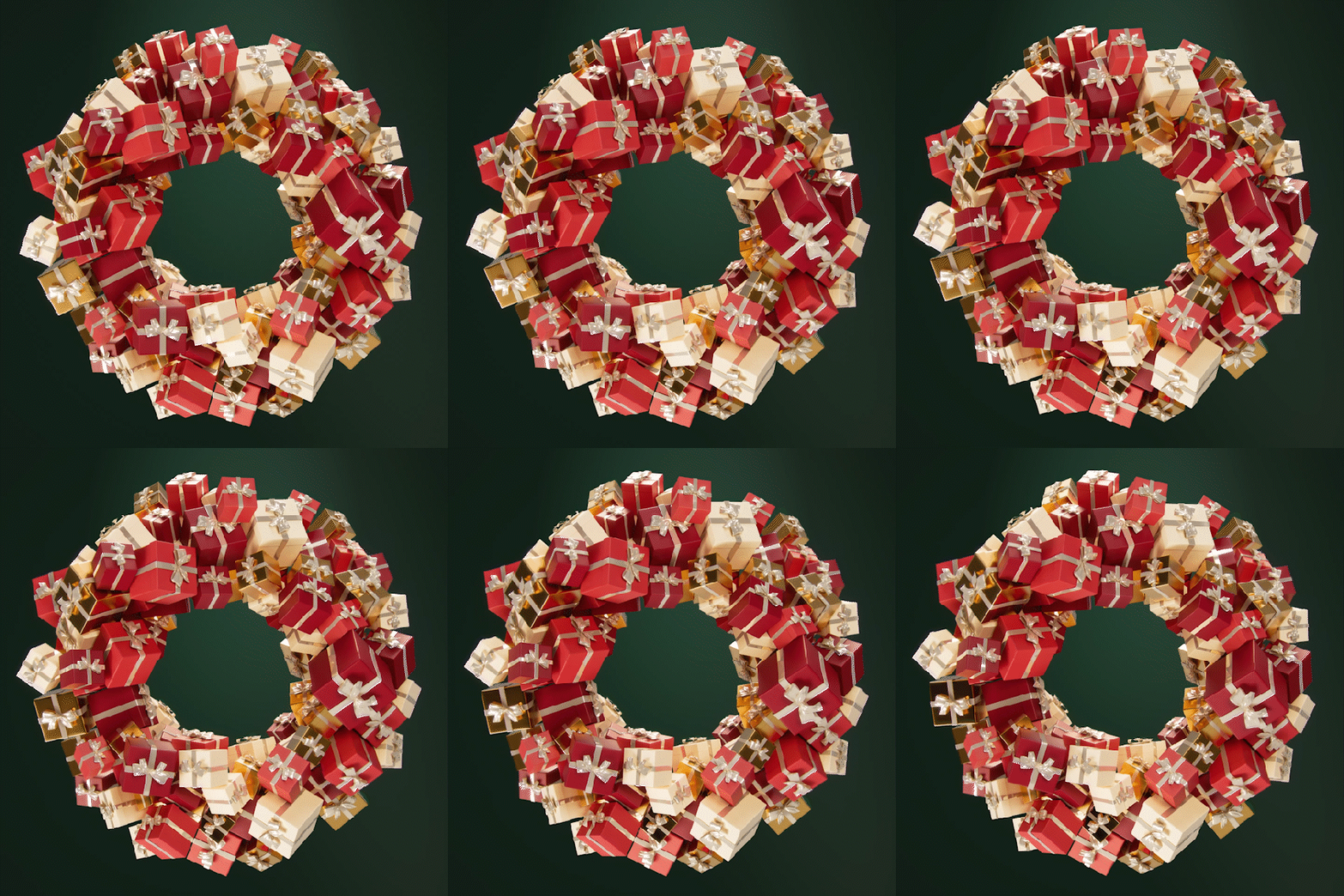
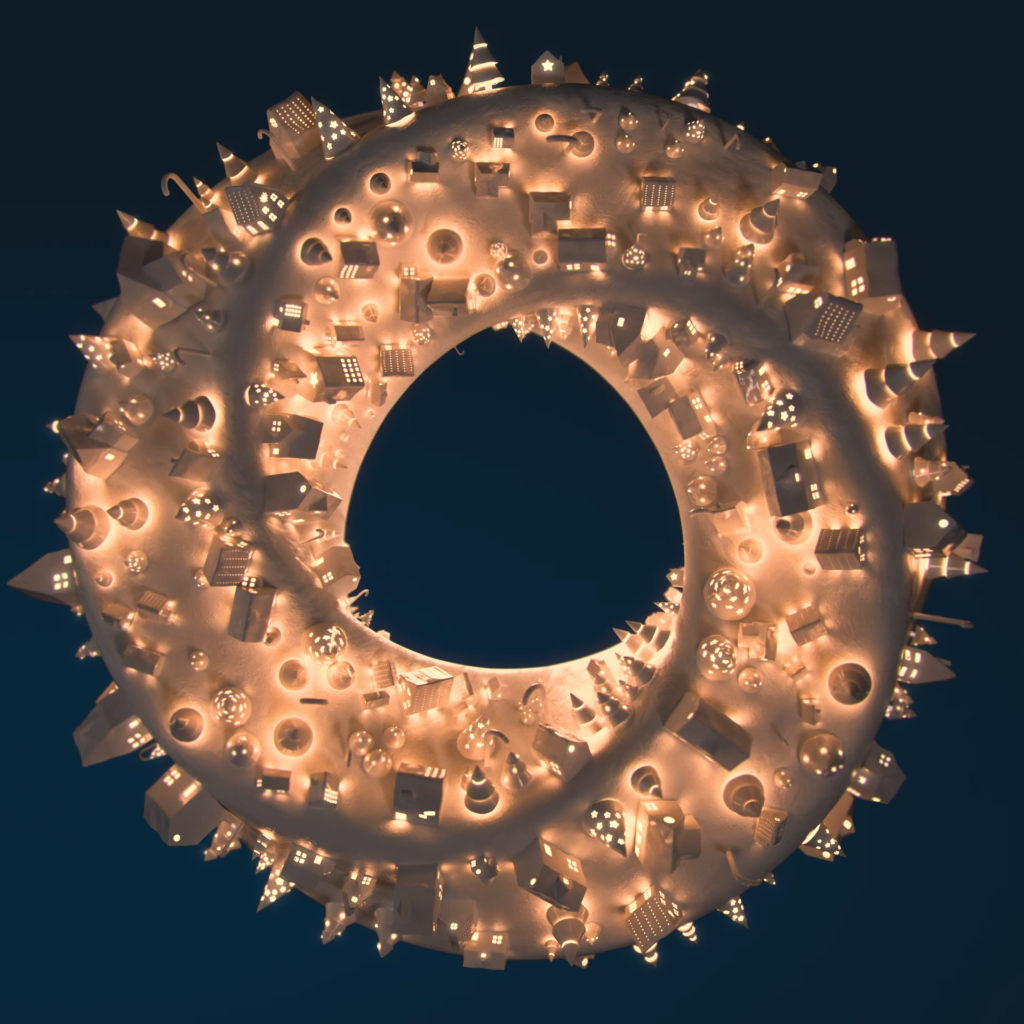
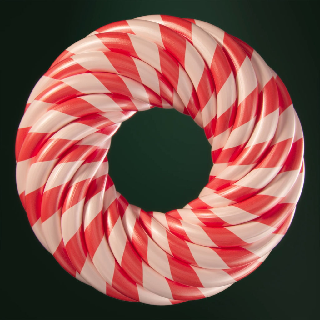
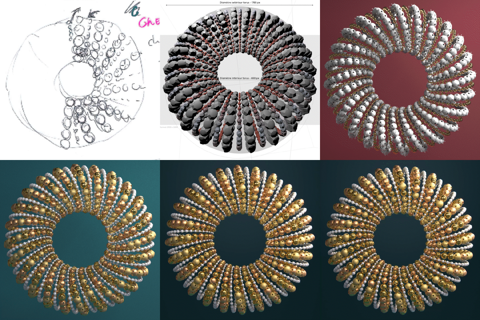
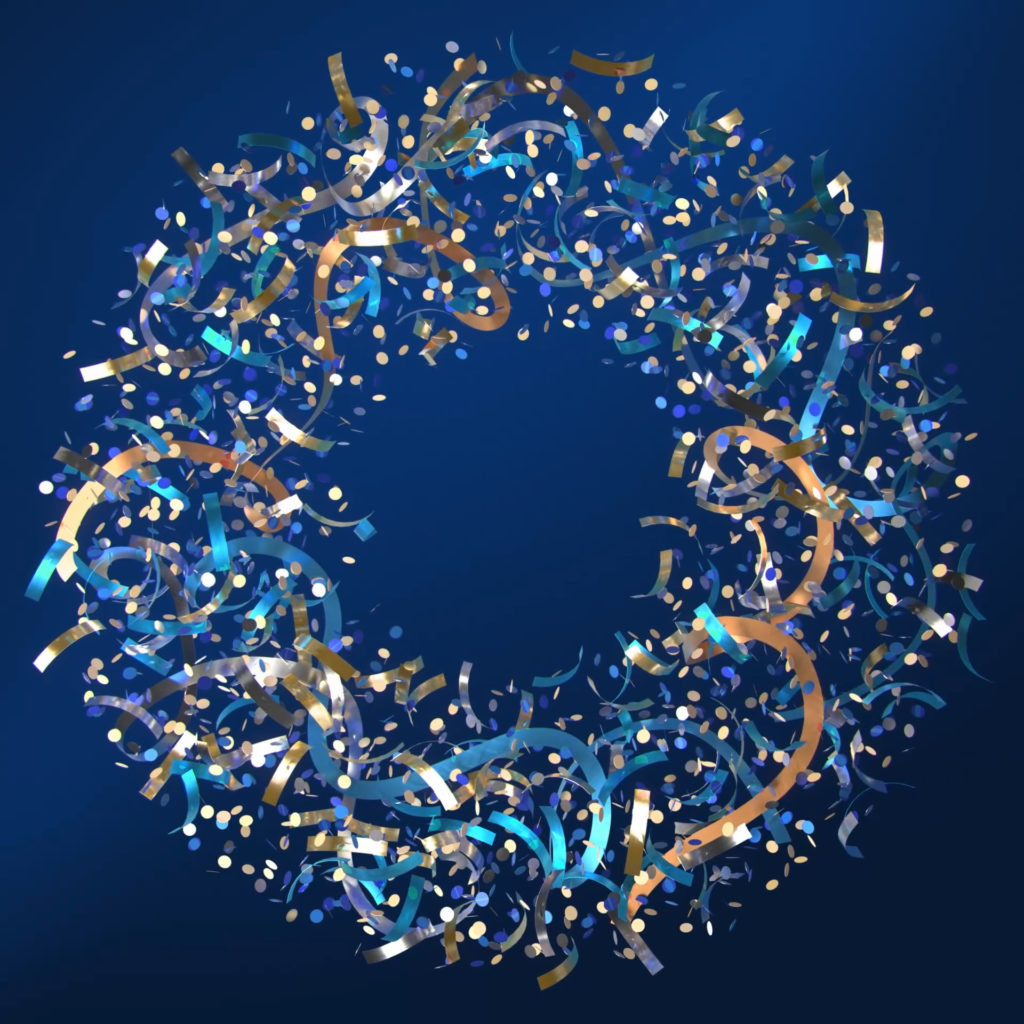
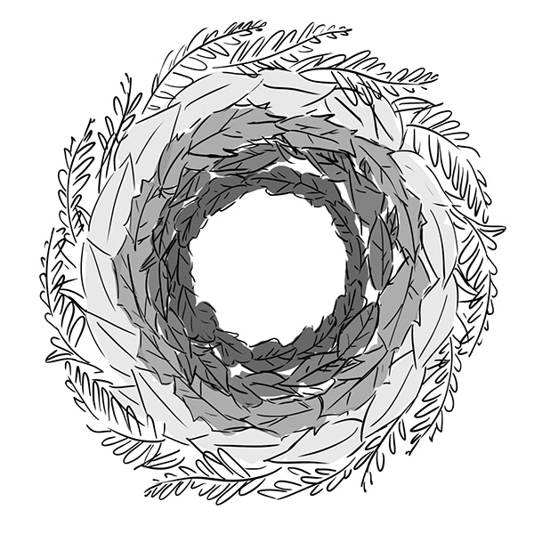
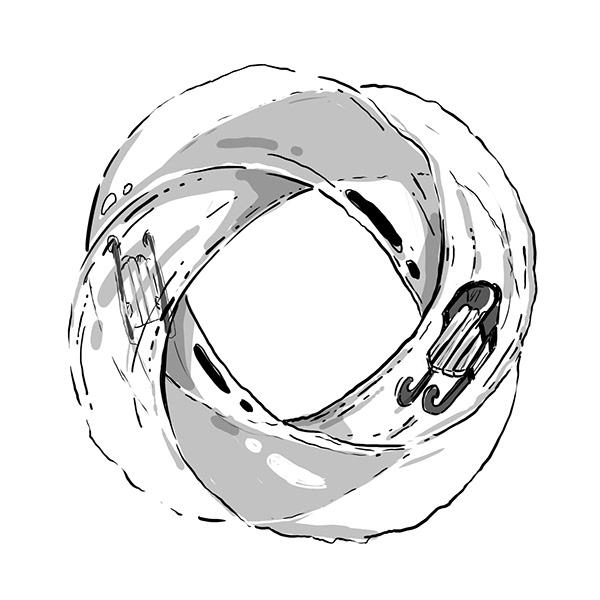
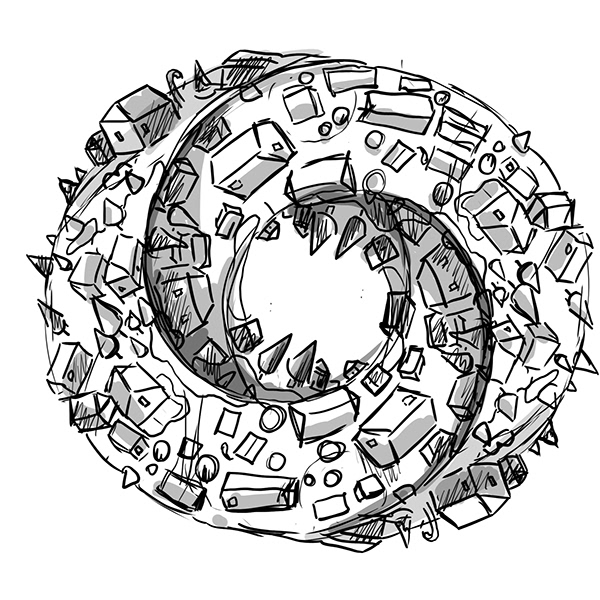
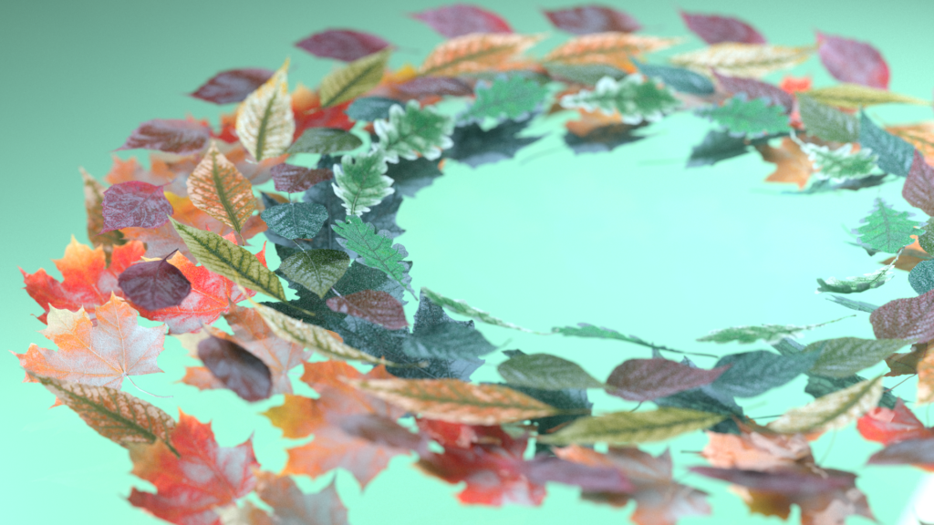
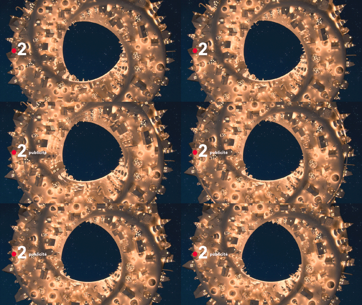
Based on the circular wave emblematic of the France 2 identity, we revisited the concept of the Christmas wreath. We imagined several stagings likely to reach the viewer in his intimate relationship with the end of the year celebrations and winter at large.


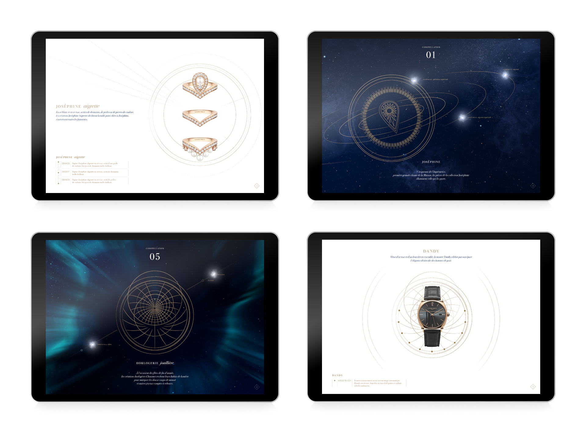
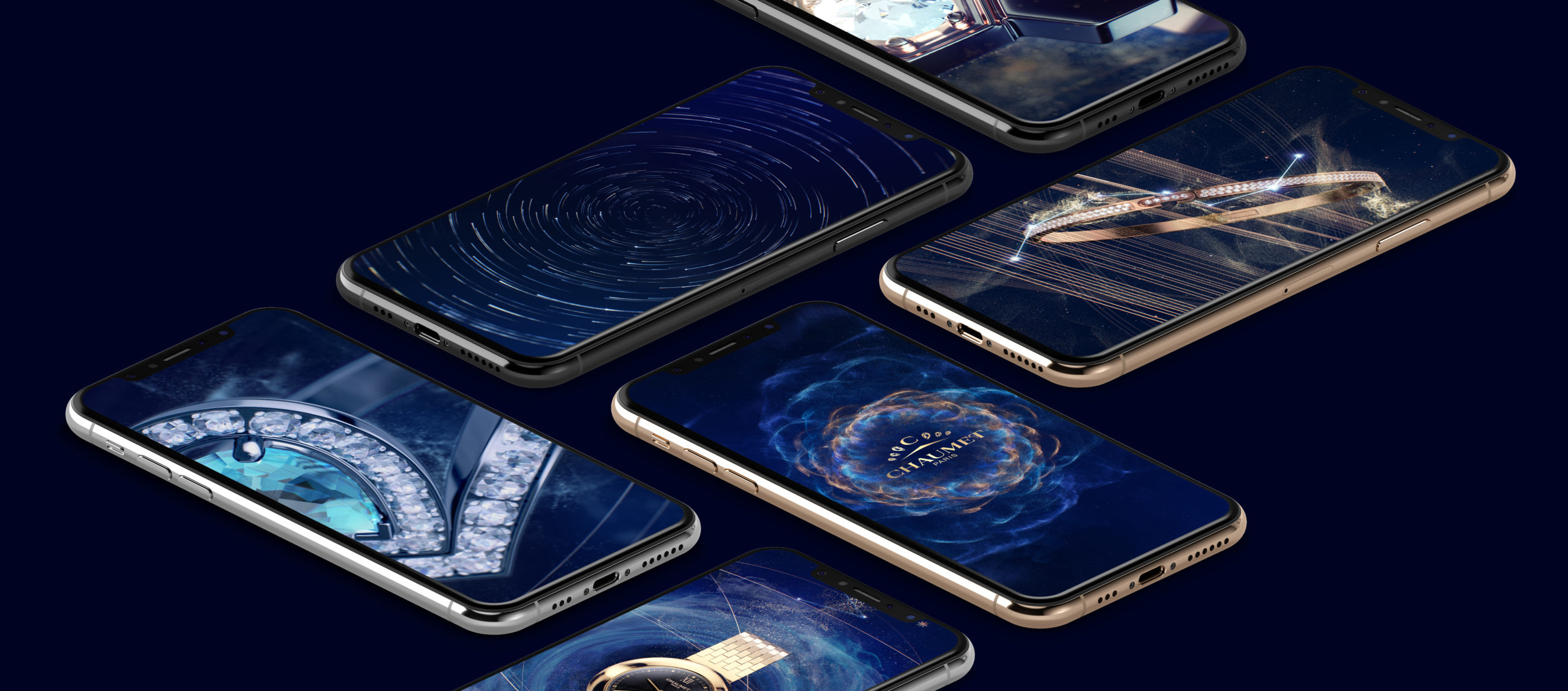
THE PRECIOUS CONSTELLATIONS
CONTEXT
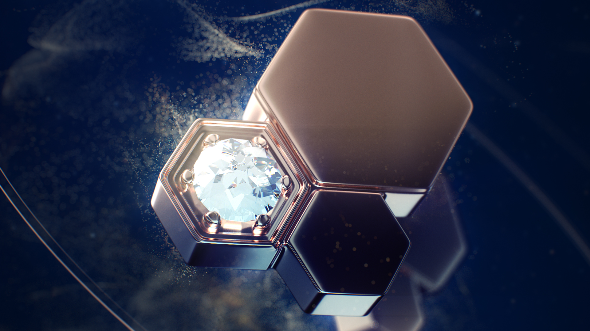
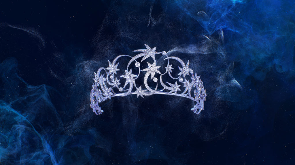
Following its successful exhibition in Monaco, the world leader in fine jewellery brings constellations to light for the 2019 holiday season.
CHALLENGE
Stage different small pieces of jewellery in the immensity of outer space.
SOLUTION
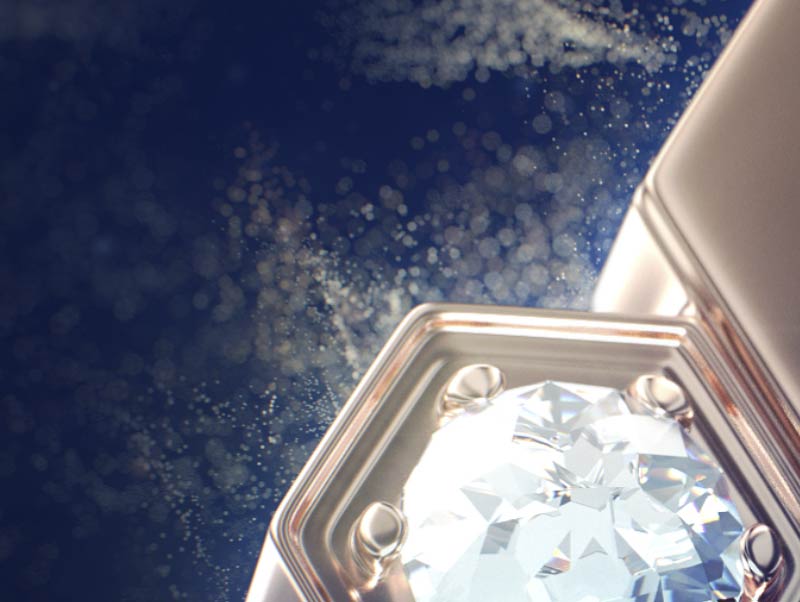
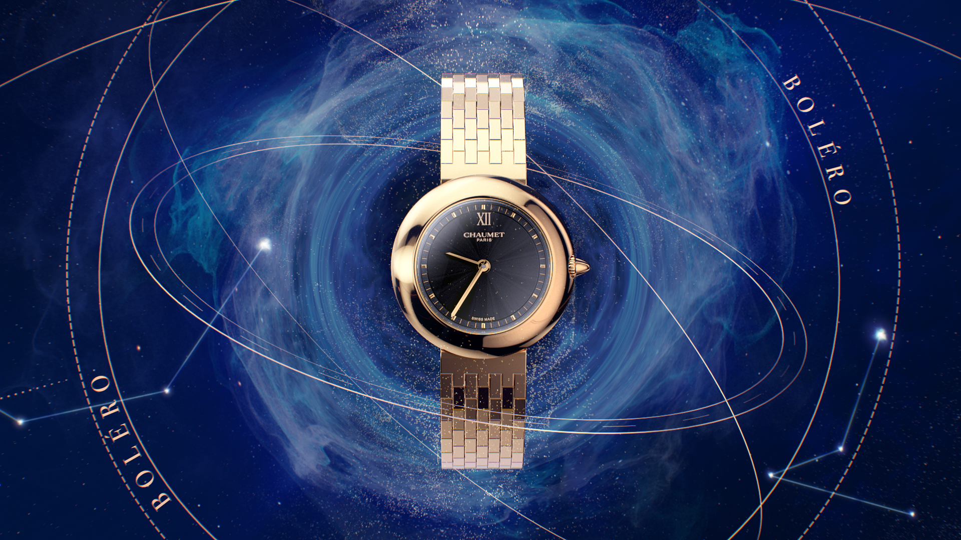
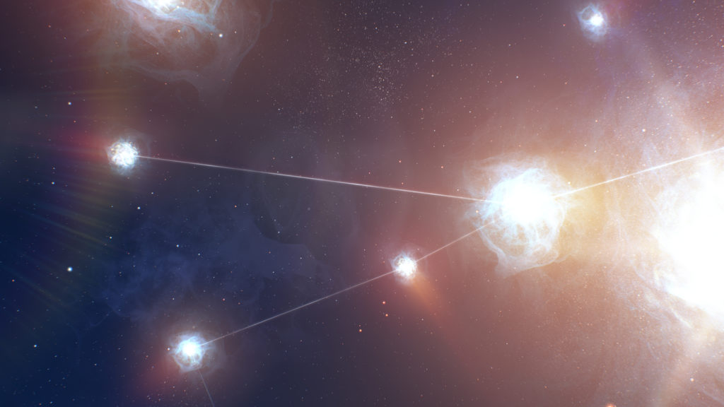
The film turns five “star” pieces from the catalog into asteroids. It takes the viewer on an interstellar odyssey back to the very origins of the noble materials jewels are made of. The brand’s celestial tropism is amplified by this campaign, which combines epic fantasy and graphic refinement. One of the starting points for this campaign was an interview given by french astrophysician Patrick Michel in which he reminds us that gold, platinum as well as other precious metals used in jewellery come from asteroids that once fell on the Earth.
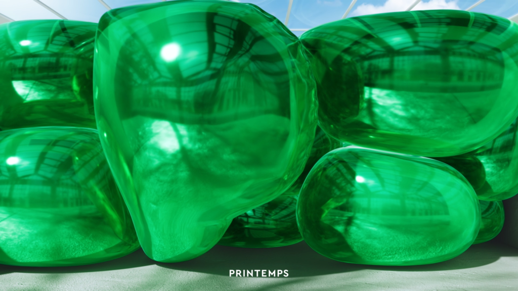
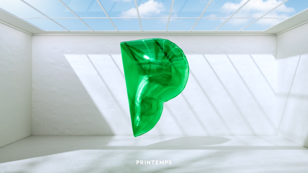
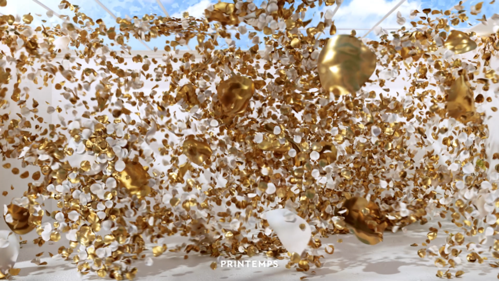
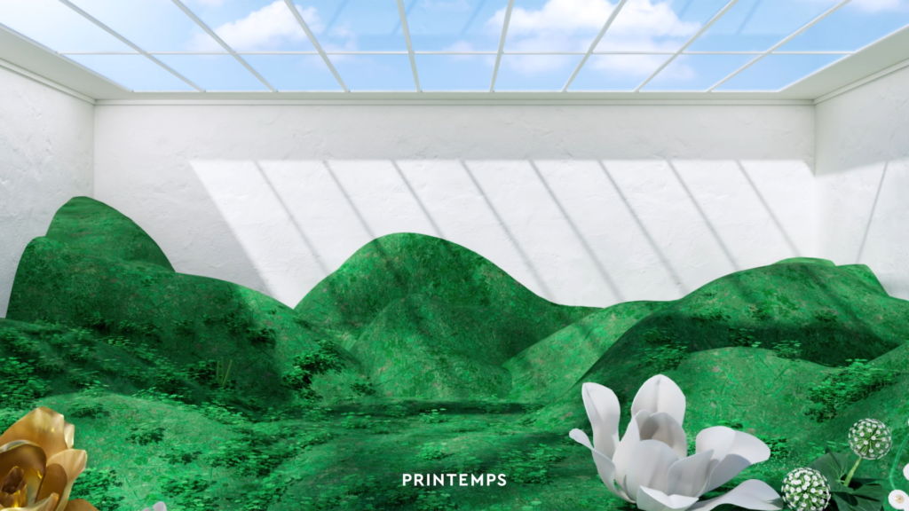
“P” IN A BOX
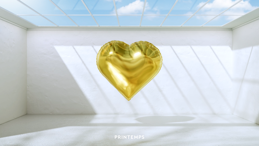
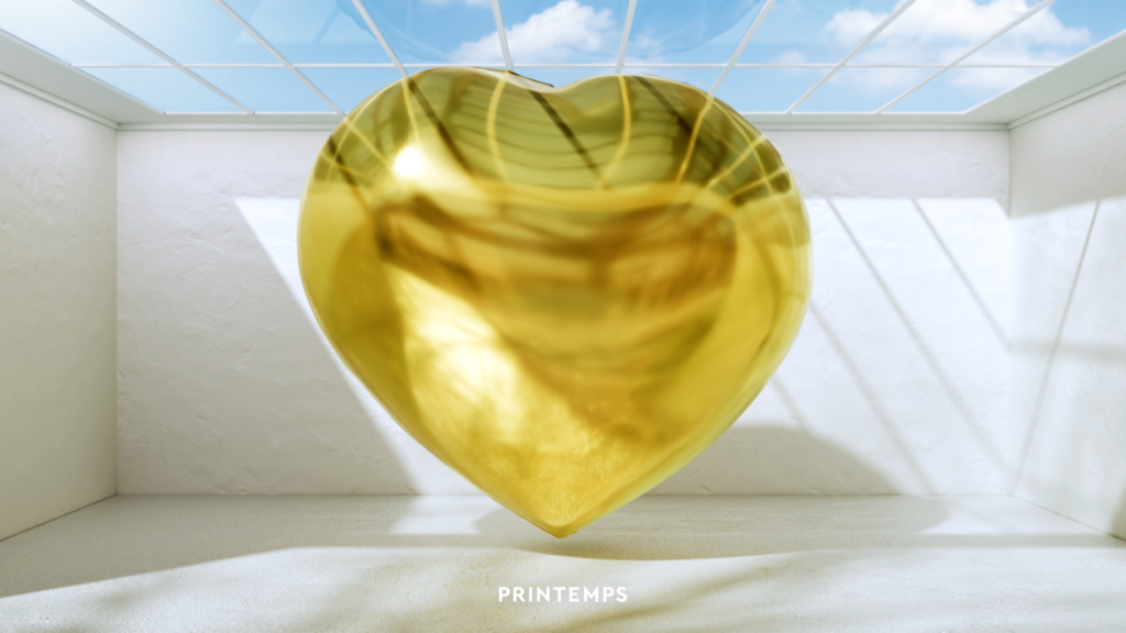
CONTEXT
With spring making its arrival in 2022, the brand chose to reveal its new positioning and identity on the storefronts of its iconic location on boulevard Haussmann.
CHALLENGE
Create an animation that echoes the interactive device that animates the storefronts.
SOLUTION
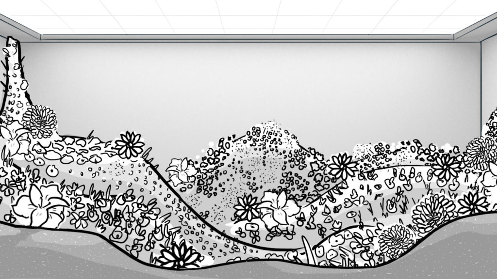
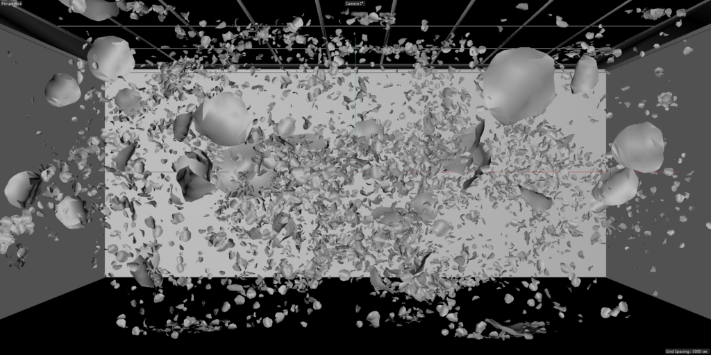
The agency brings the magic of spring metamorphosis to the heart of the city through a dreamlike film with a very plastic 3D rendering.
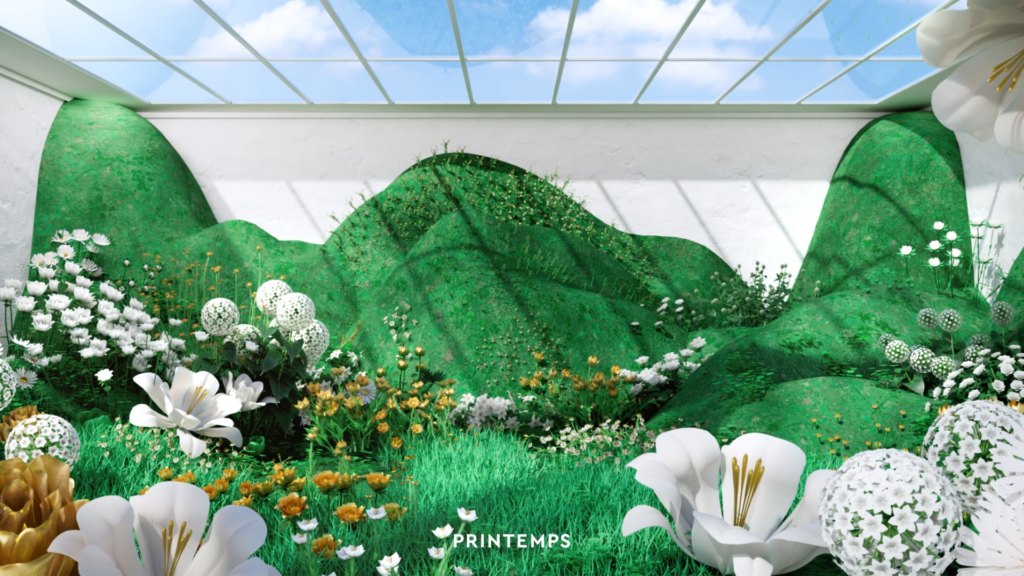
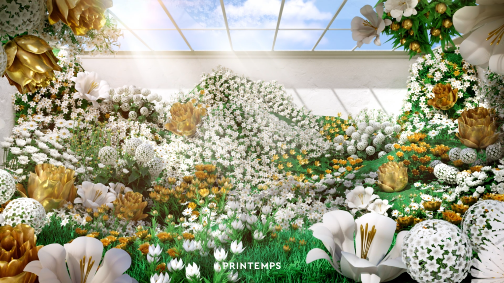
MAKING OF
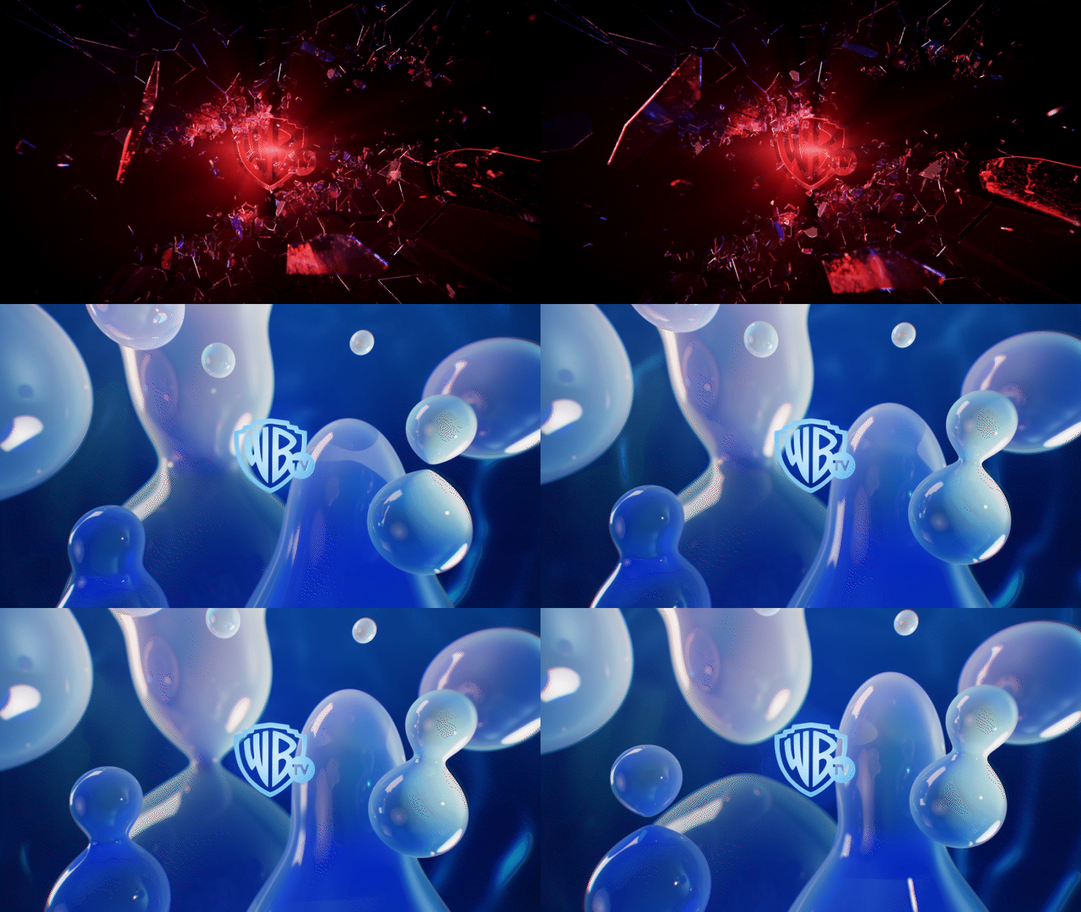
EMOTIONS IN SERIES
CONTEXT
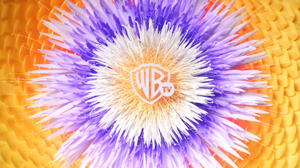
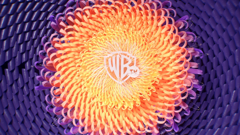
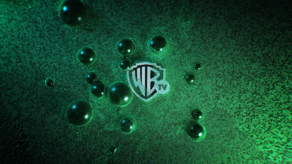
Following the launch of the channel several months earlier, the US group is looking to strengthen its on-air brand promise.
CHALLENGE
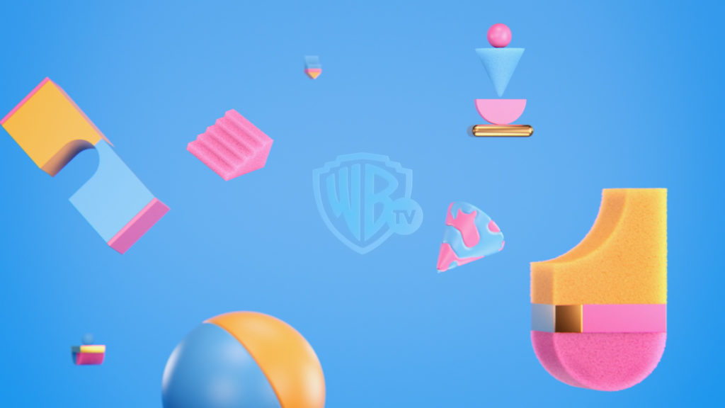
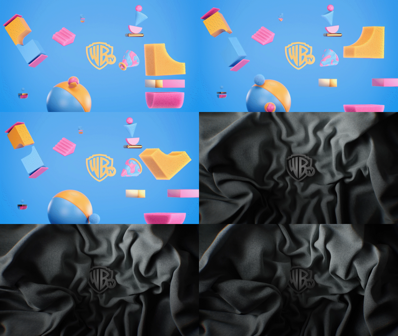
Embody the emotional promise of a channel dedicated to TV shows through its idents.
SOLUTION
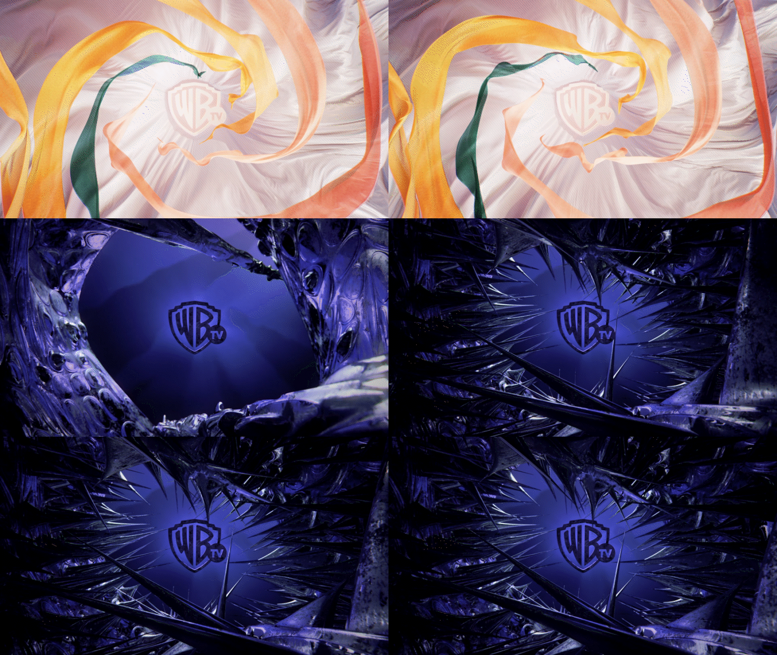
The agency created ten idents that oppose each time two contrary emotions. The result is a universe of forms and textures that trigger ambivalent sensations based on this emotional contrast, amplified by an organic sound design. In turn, the viewer experiences laughter/sadness, love/disgust, anger/serenity, fear/admiration, terror/joy and wonder/surprise, or vice versa.
MAKING OF
THE VOICE
CONTEXT
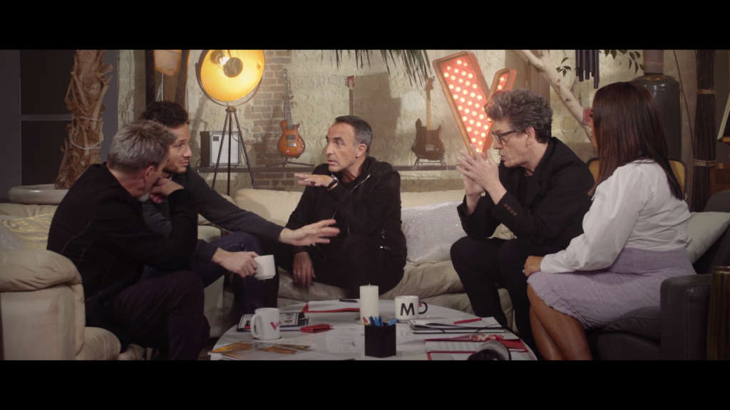
TF1 is about to broadcast the eleventh season of The Voice France.
CHALLENGE
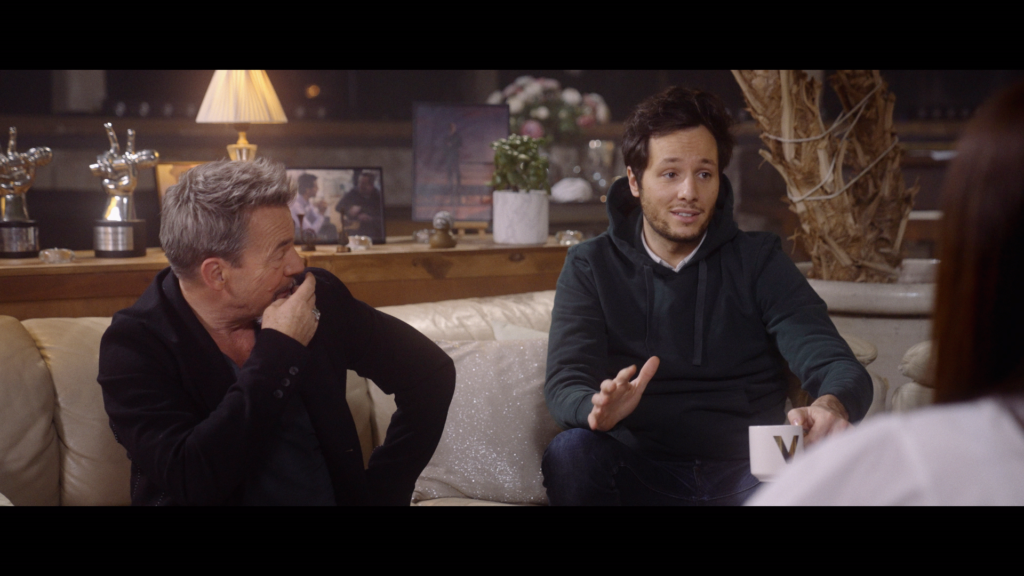
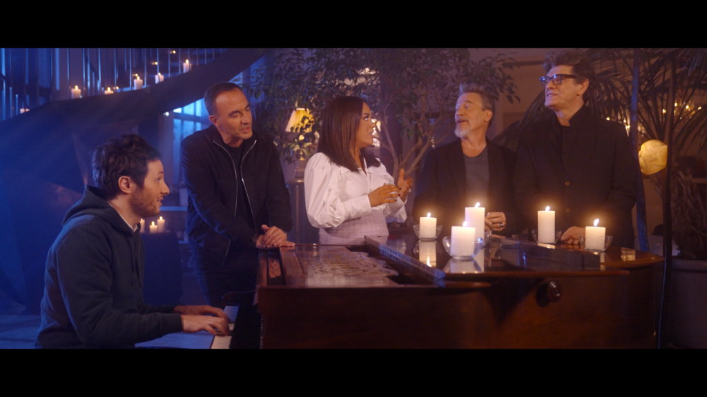
Create a trailer that emphasizes on the genuine bond the coaches share together.
SOLUTION
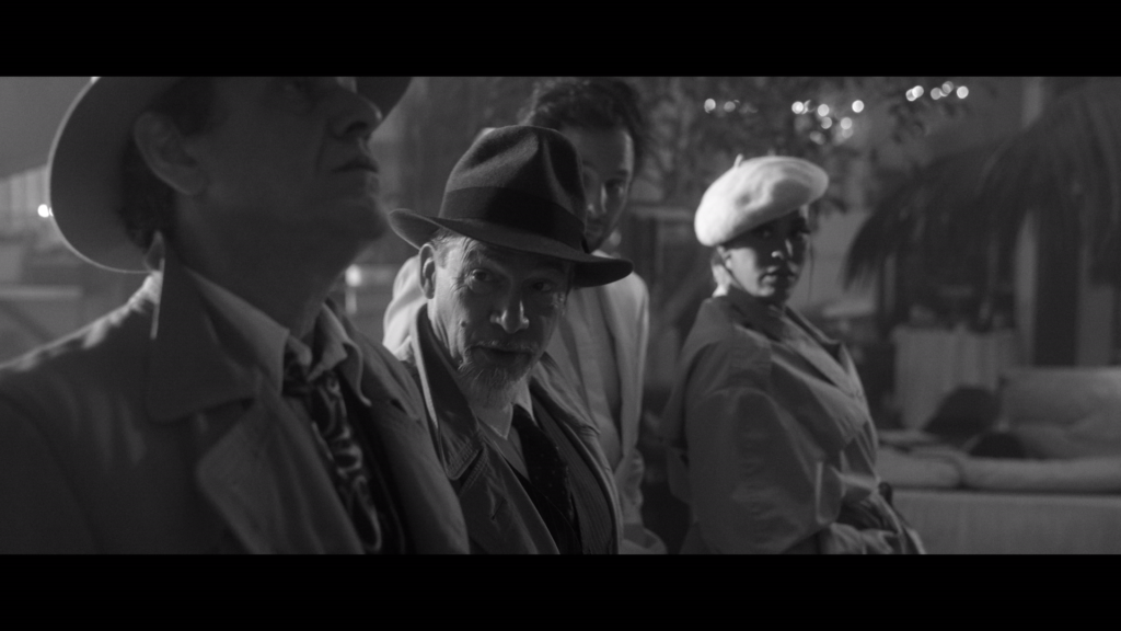
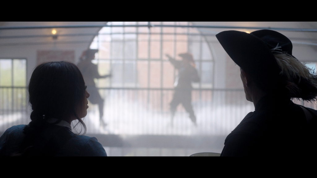
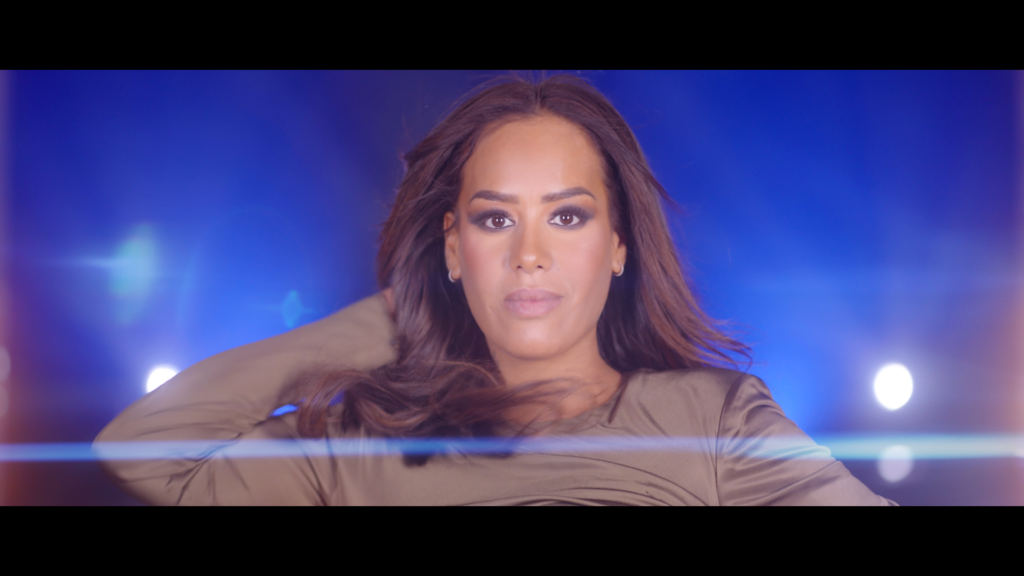
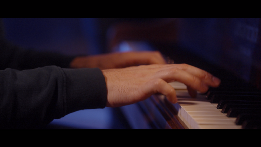
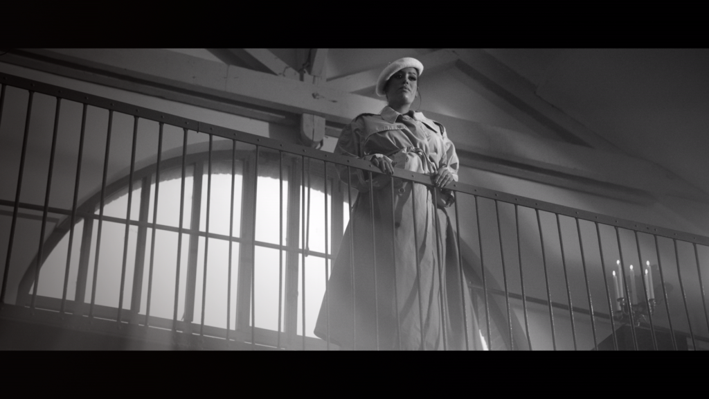
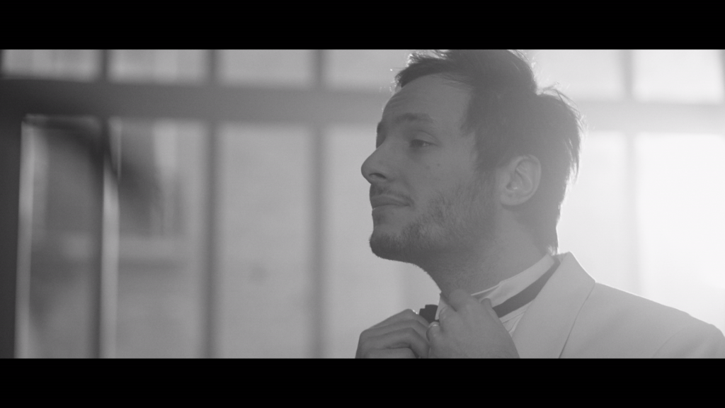
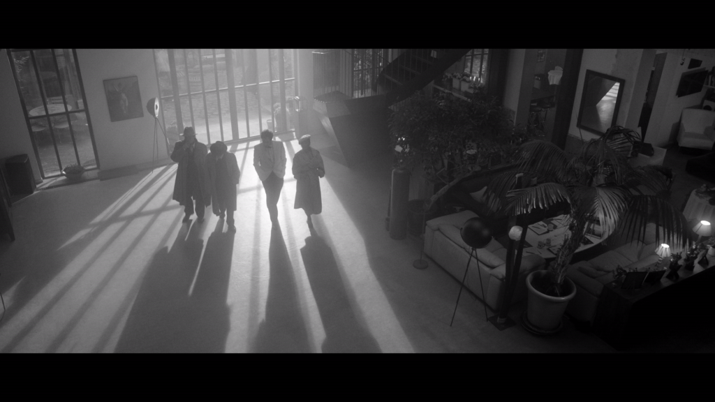
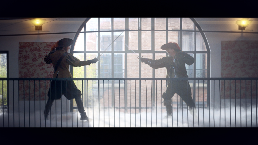
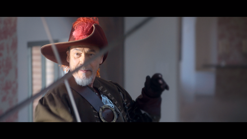
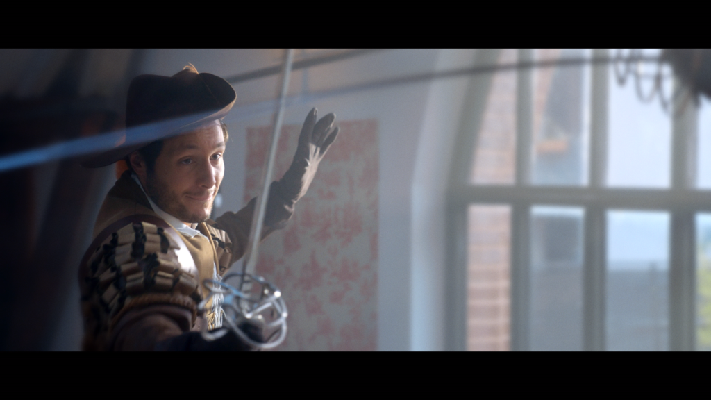
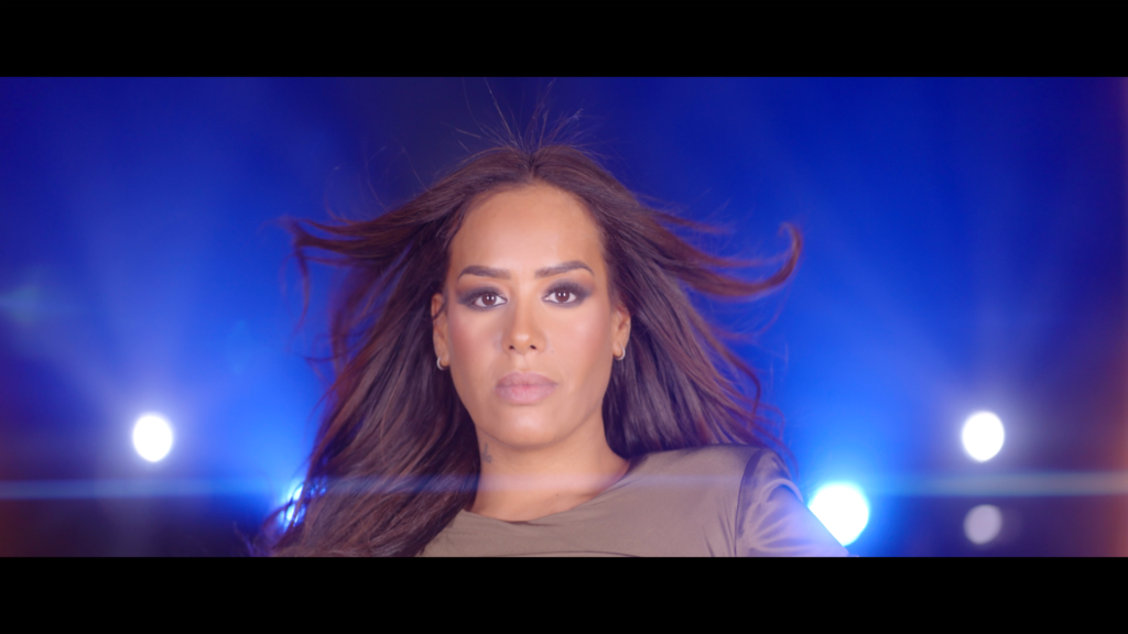
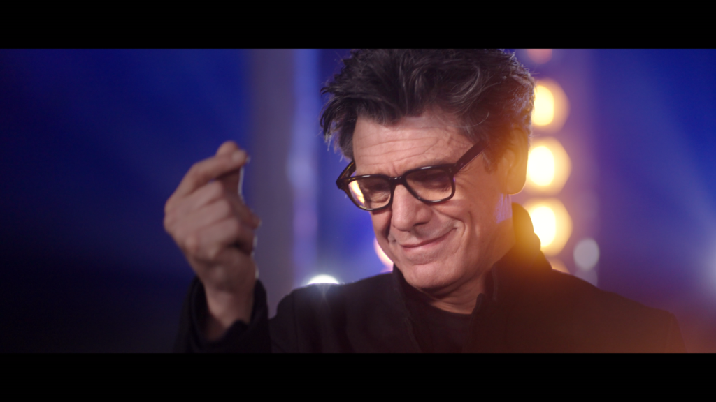
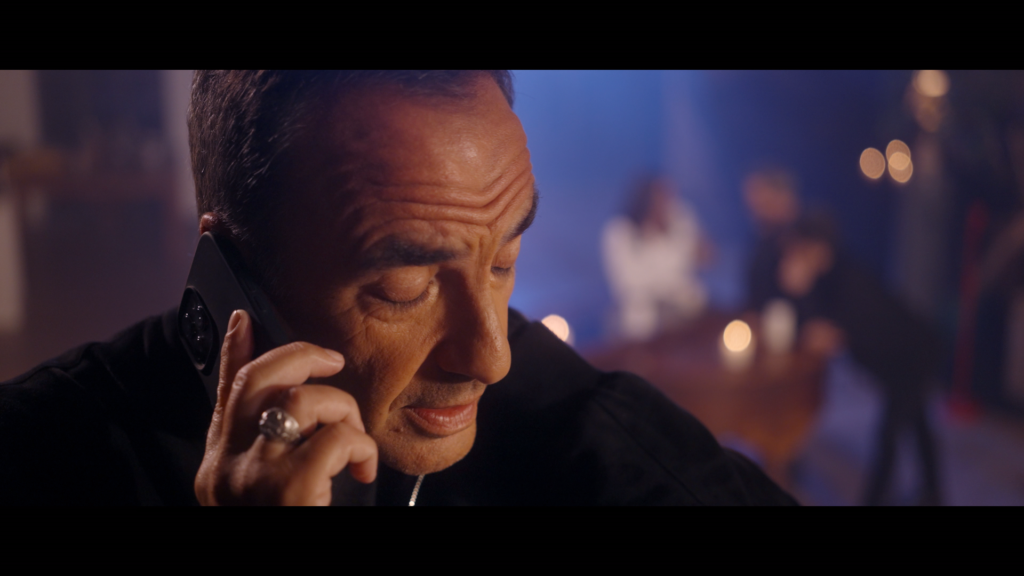
To kick off the second decade of the show on TF1, the channel took a step aside and put the coaches on stage to design their own trailer for the show. This brainstorming session takes us into universes that are at opposite ends of the spectrum but reveal the complementary personalities of the coaches. And the divergent points of view will indeed be resolved at the end…
C À VOUS
CONTEXT
The production company 3ème Oeil is launching the twelfth season of its successful daily prime time access talk show.
CHALLENGE
Bring novelty to the well-established graphic identity of a popular talk-show to strengthen its position in the french audiovisual landscape.
SOLUTION
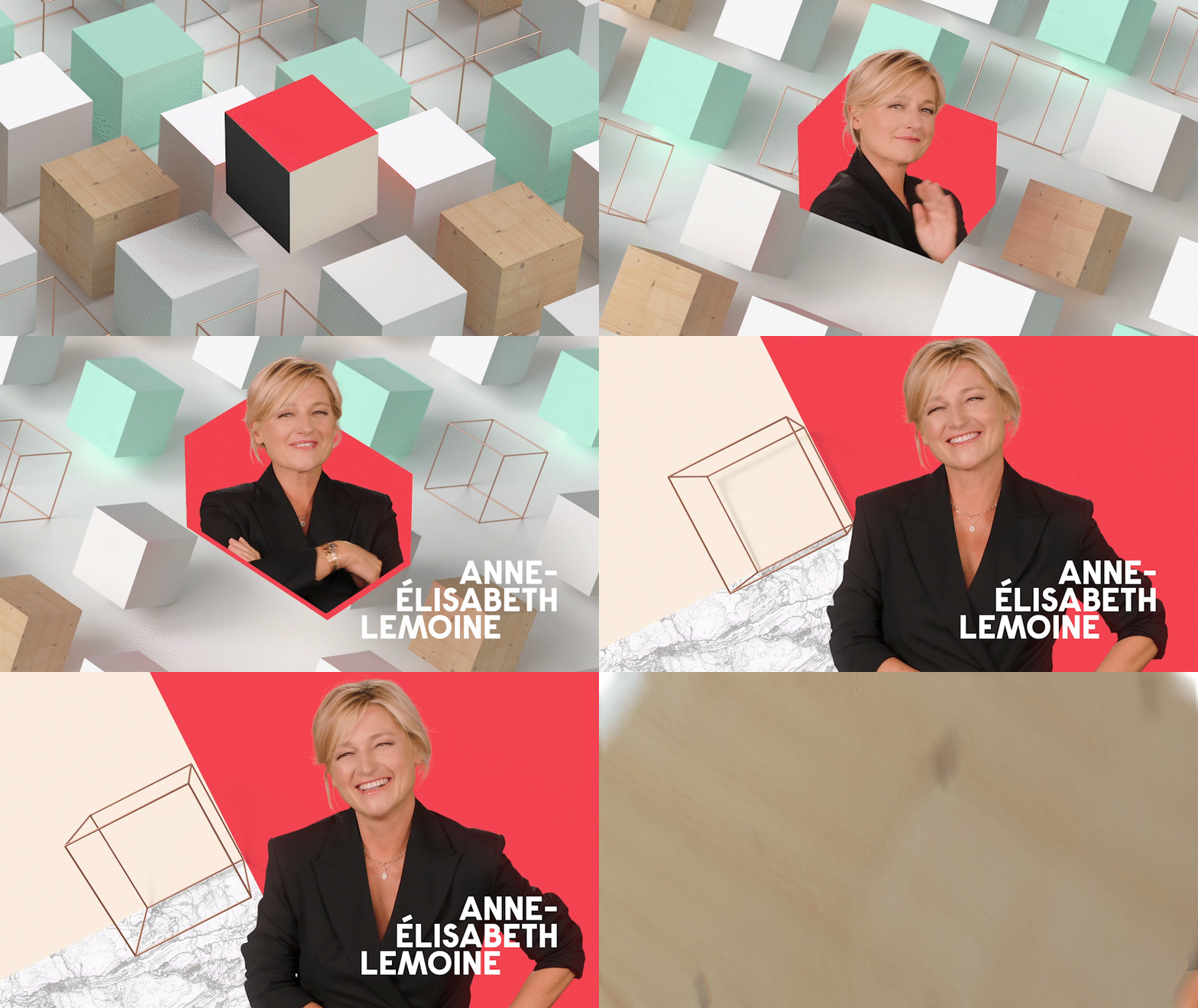
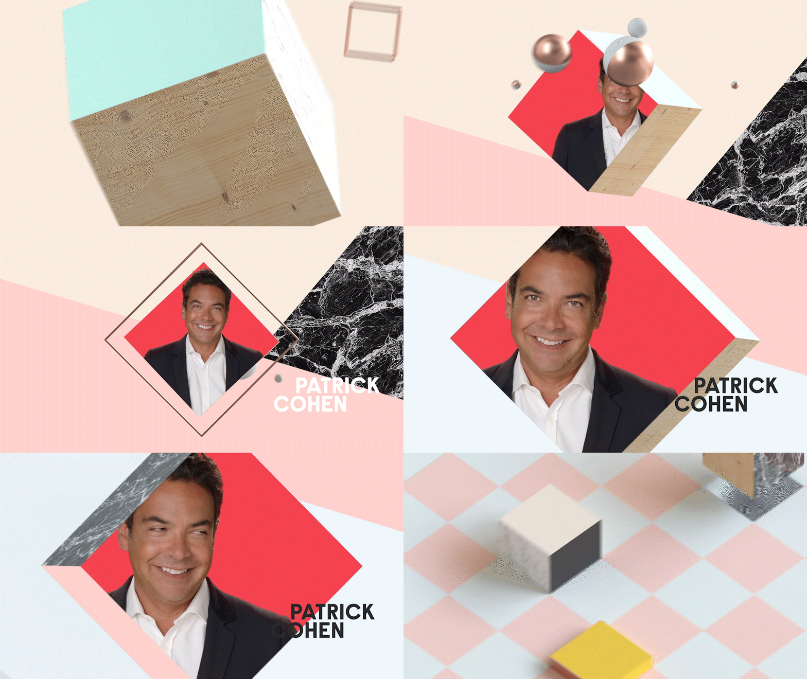
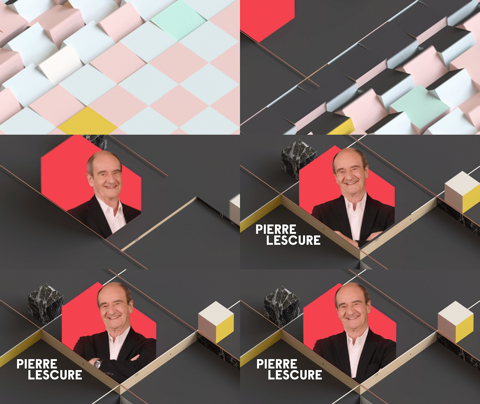
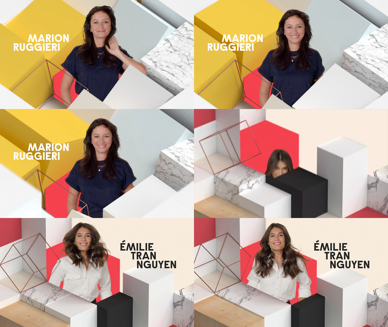
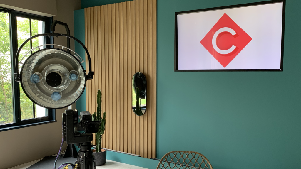
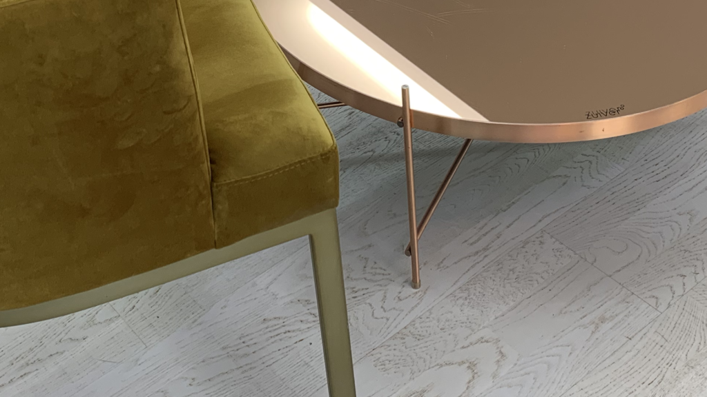
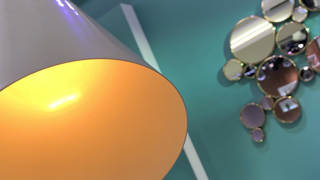
Following the same artistic direction, the new programme credits break with the flat rendering chosen three years earlier. We chose a mixed render, mixing 2D with a sleek and sophisticated 3D that plays with transitions, shadows and light. The range of colors blends with realistic textures from the show’s set: marble, wood, copper and bakelite. The result is a fresh and punchy environment that reflects the mood of the show C à vous.
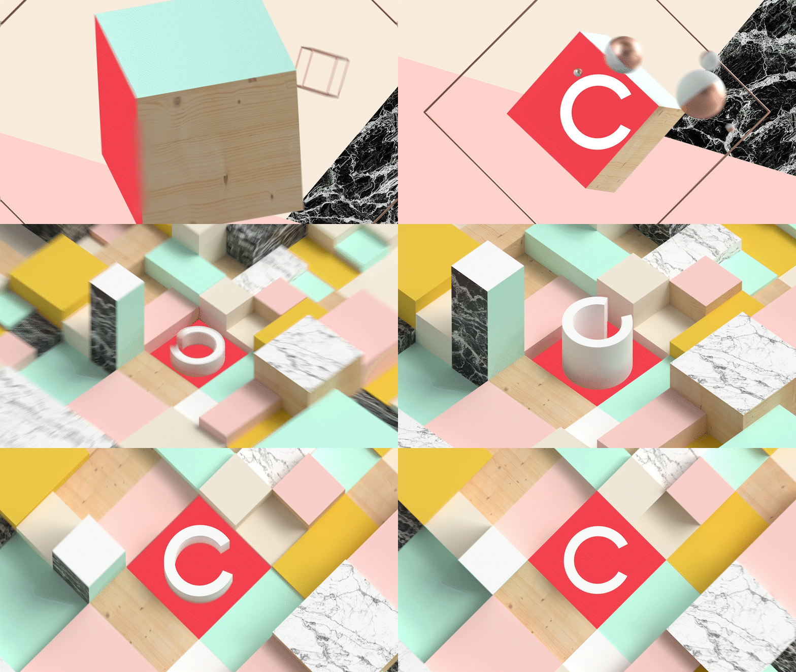
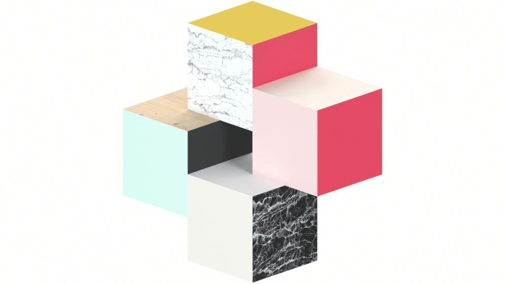
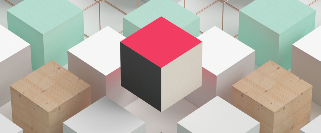
The opening credits feature Elisabeth Lemoine and her accomplices in a graphic universe built on the programme’s logo: a C in a red square.
CIVIC CONSULTATION
CONTEXT
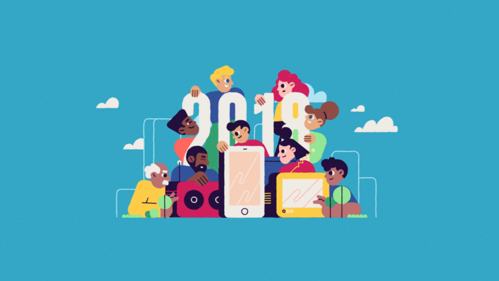
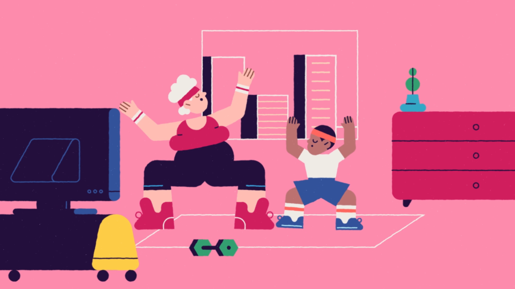
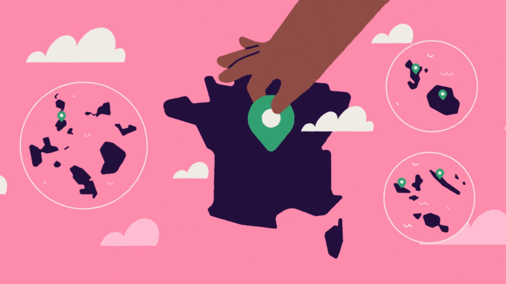
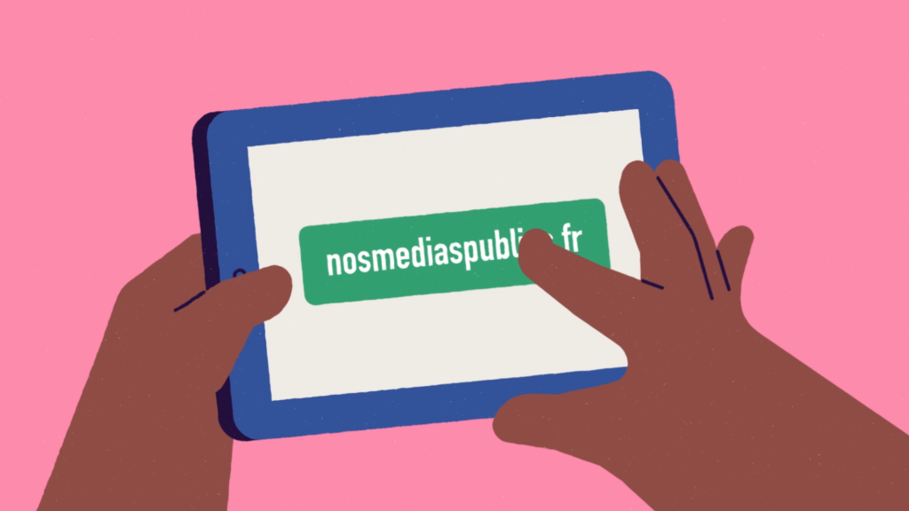
France Télévisions, Radio France, INA, TV5Monde and France Médias Monde are launching a joint campaign as part of their new operation to consult viewers and listeners on the future of public media.
CHALLENGE
Promoting the operation through a friendly spot that epitomizes the uniqueness of public service in the media.
SOLUTION
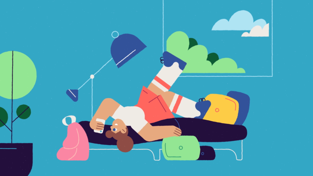
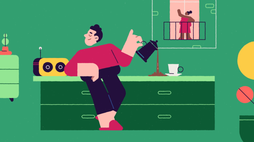
The campaign film depicts real-life media use scenarios: radio, television, smartphones, tablets, etc. The illustrative, unconventional approach tinges the campaign with a touch of humor and freshness.

MOVIE NIGHT
CONTEXT
For the launch of the channel, the US group wants to create an audience hub in its new programming schedule.
CHALLENGE
Bring the movie theater experience to television through design.
SOLUTION
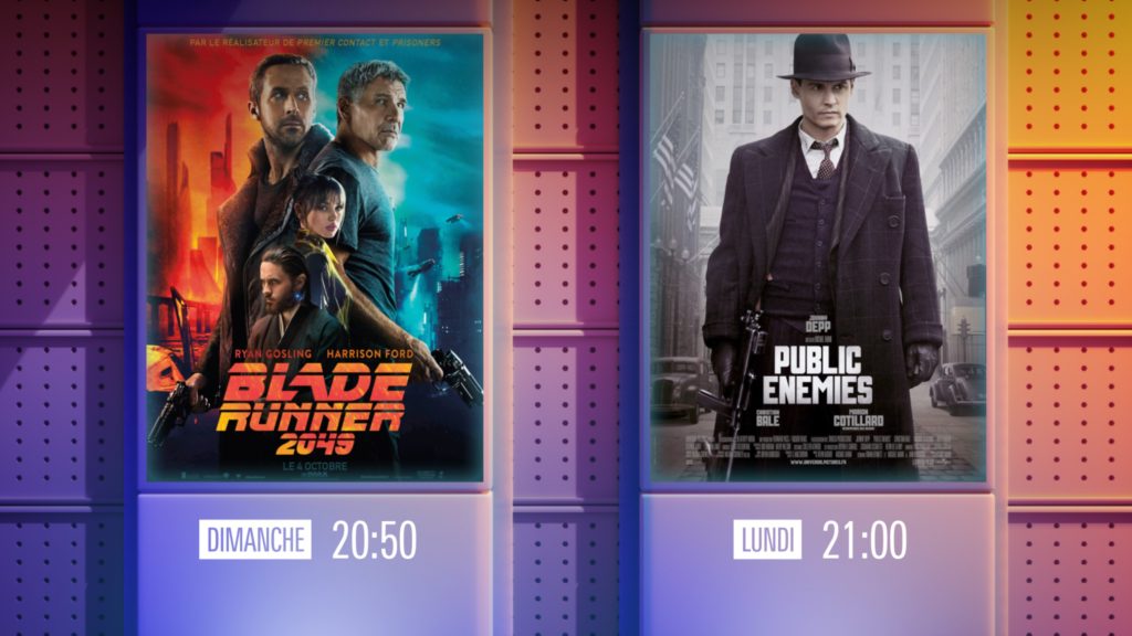
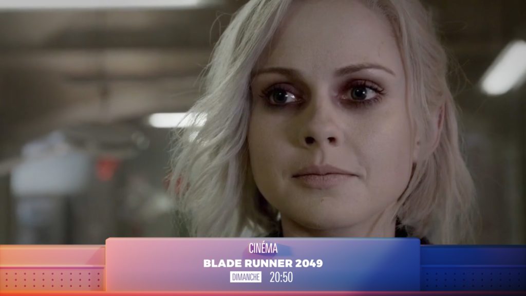
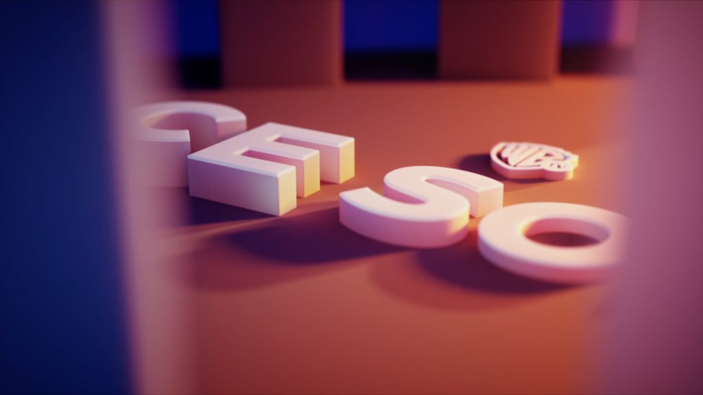
Warner TV’s movie box is designed to reflect movie theater architecture. Built with volumes in motion, this showcase with its warm and clear colors, bathed in light, displays the channel’s big show offer.
TIKEHAU FORMATS
CONTEXT
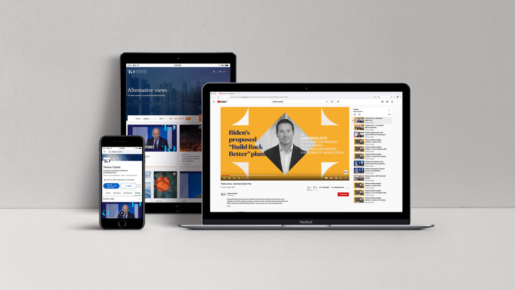
To support its development, the alternative asset management company wants to strengthen its main influence tool: brand content.
CHALLENGE
Structure the brand’s video content offer in order to institutionalize its communication and increase its traffic on social networks.
SOLUTION
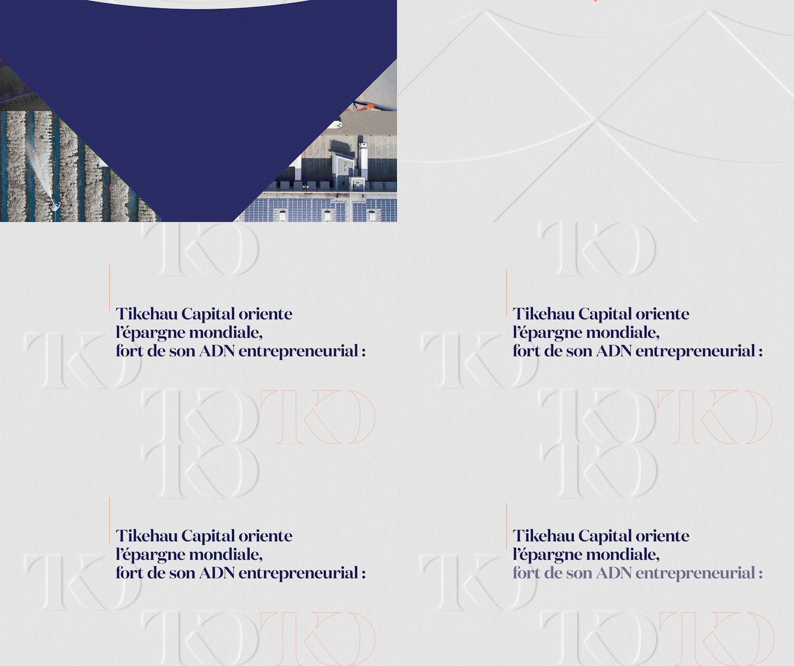
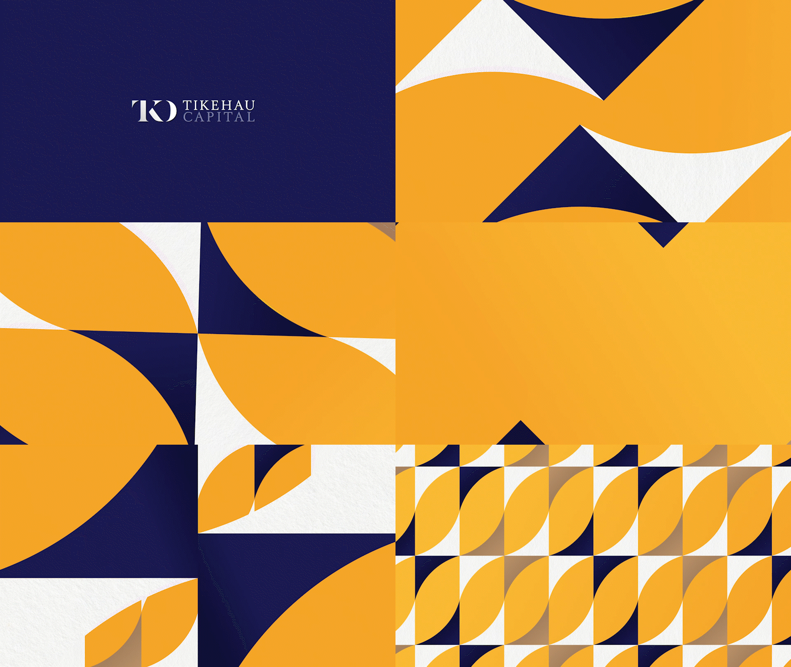
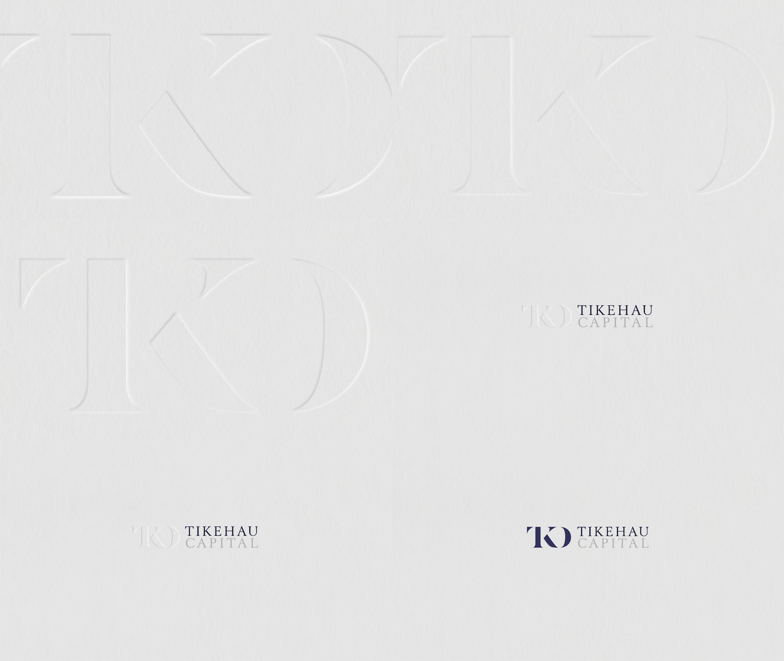
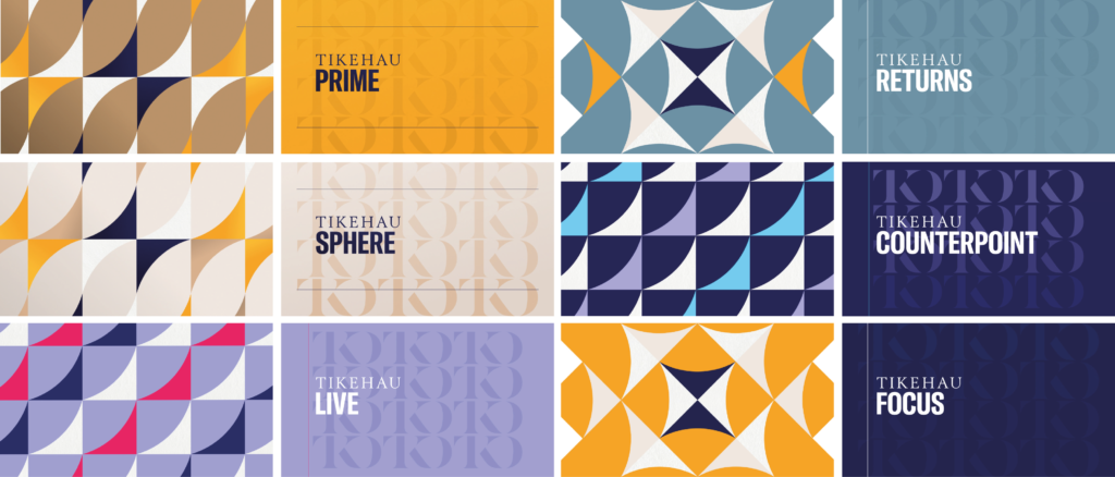
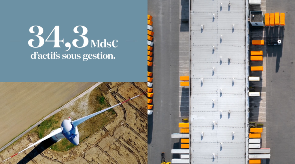
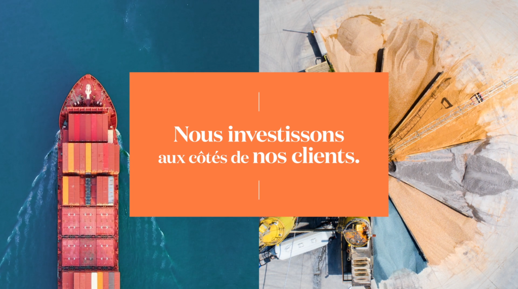
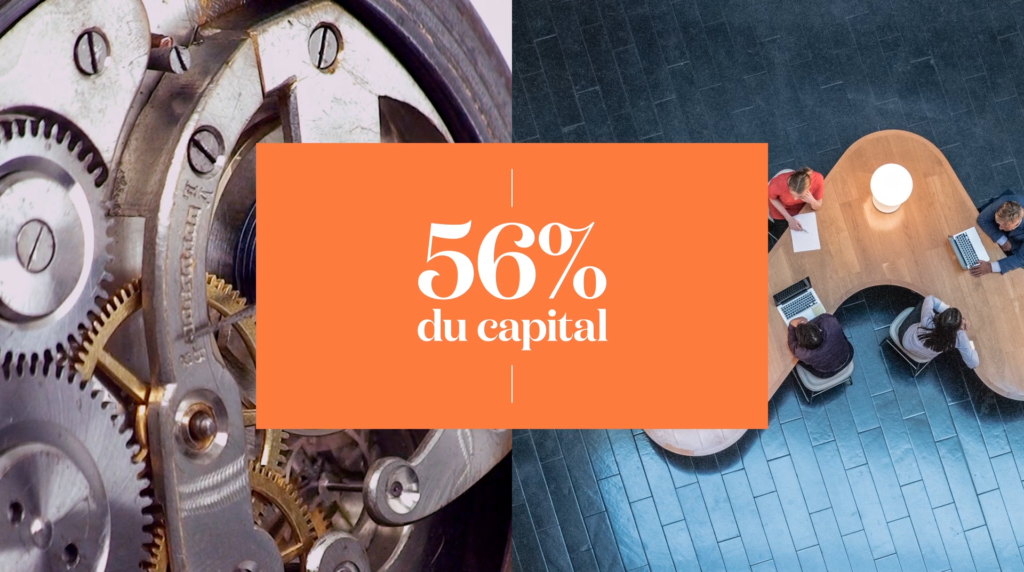
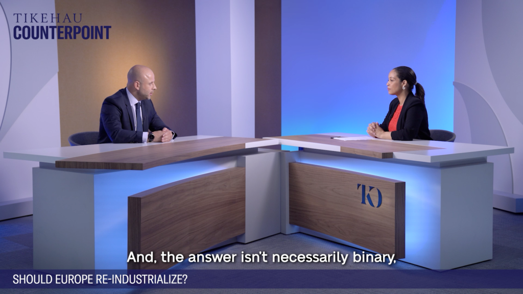
The agency designed a dozen editorial formats, divided into 4 families, according to a defined typology of speech. A modular graphic vocabulary, drawn from the corporate world, was used in a cross-functional offer. The result is a packaging charter where each format has its own identity, with a matching filming device, listed in a production charter.


THE PATHS OF FAITH
CONTEXT
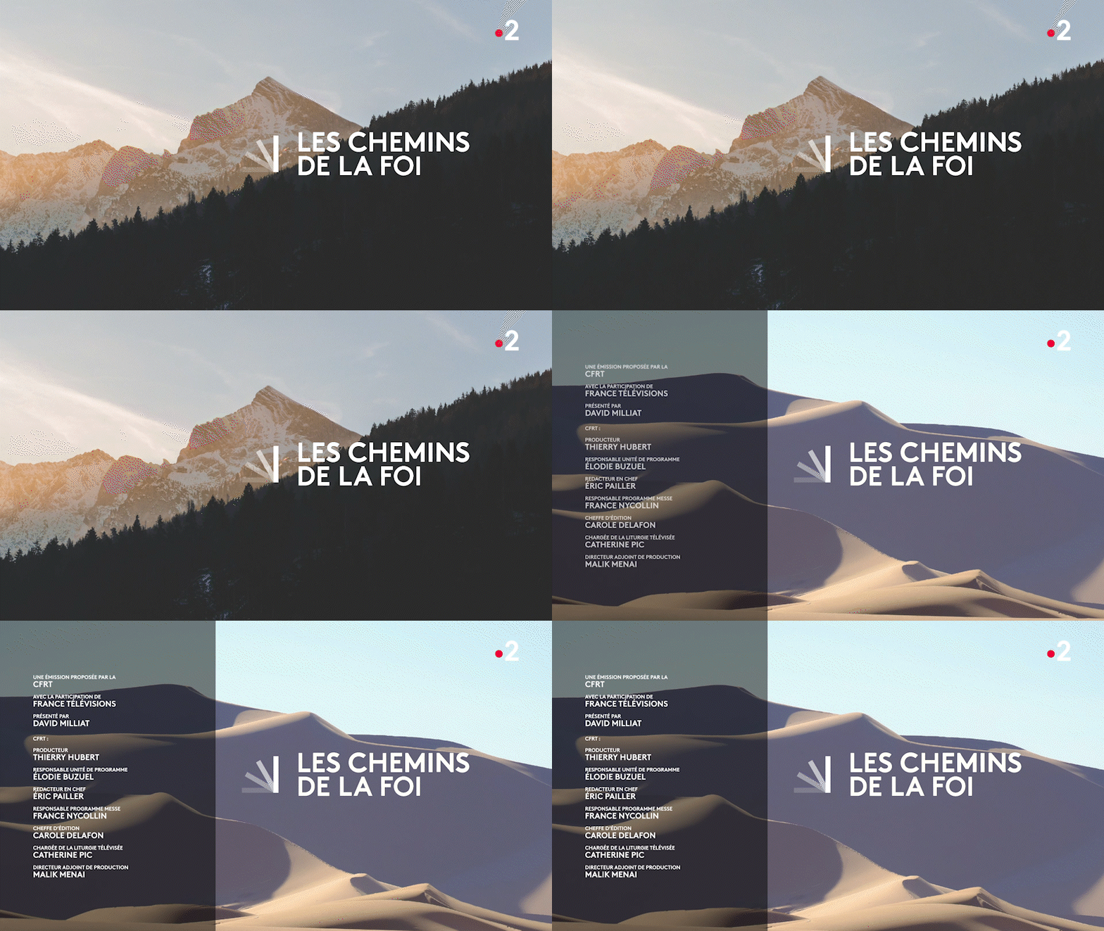
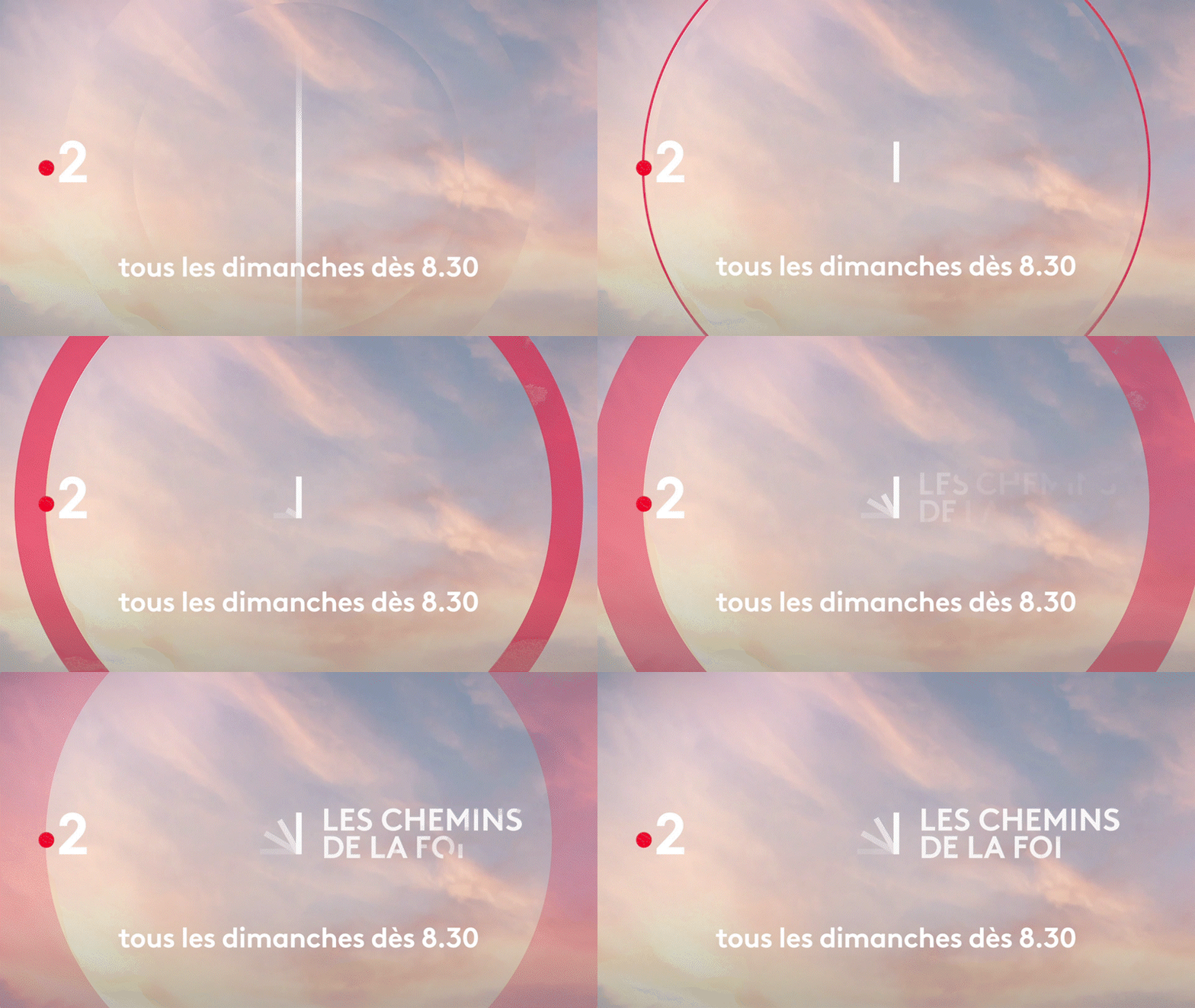
A key program for its public service television duties, France Télévisions is renewing the broadcast design of its Sunday morning time slot on the France 2 channel.
CHALLENGE
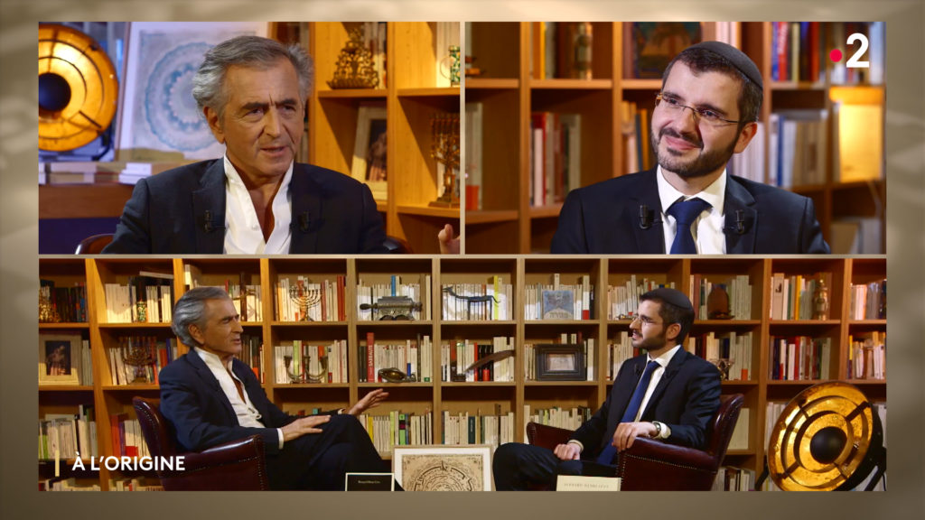
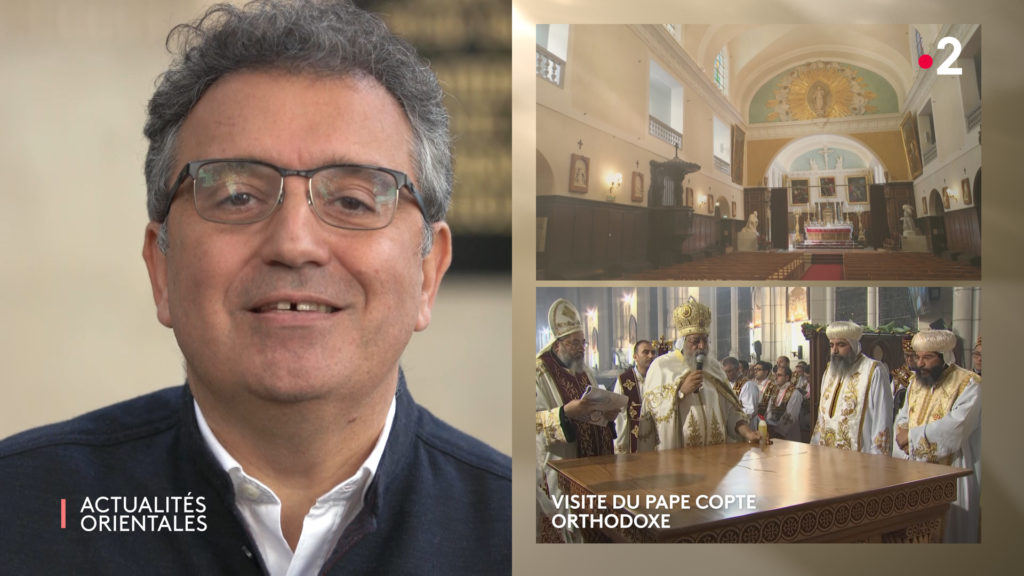
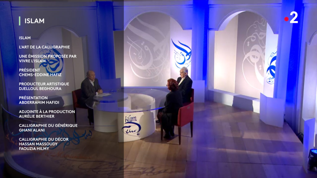
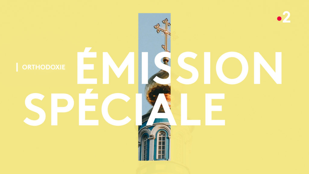
Embrace the spiritual spectrum through a graphic answer embodying the smallest common denominator of the religious practices in France.
SOLUTION
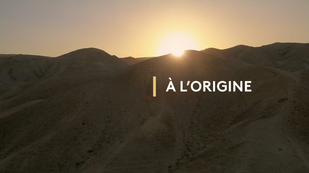
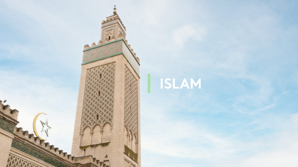
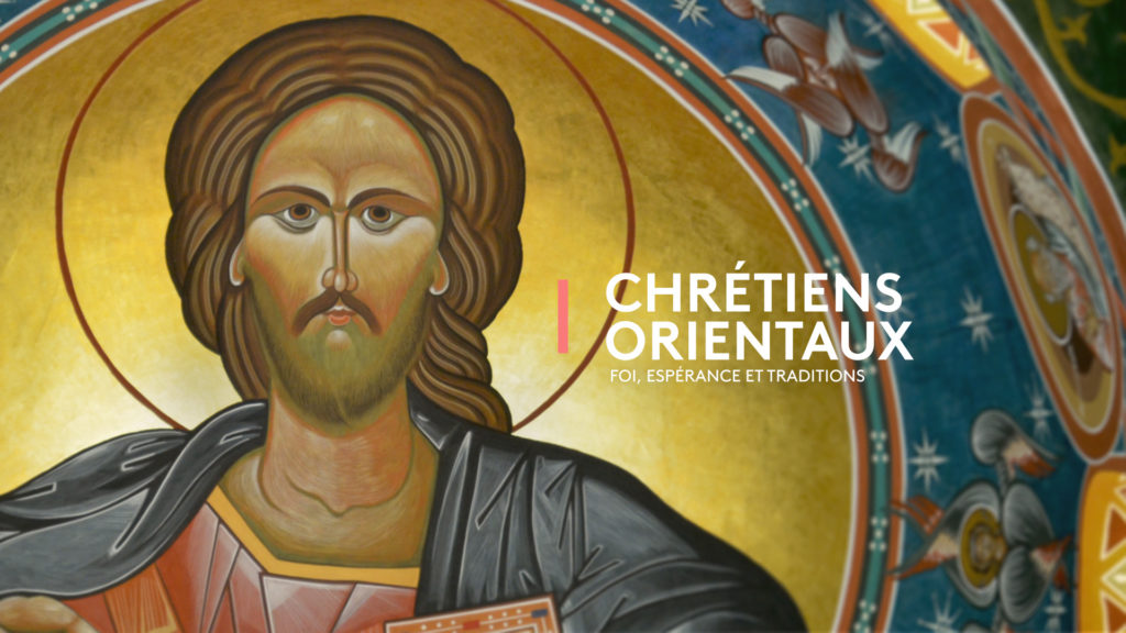
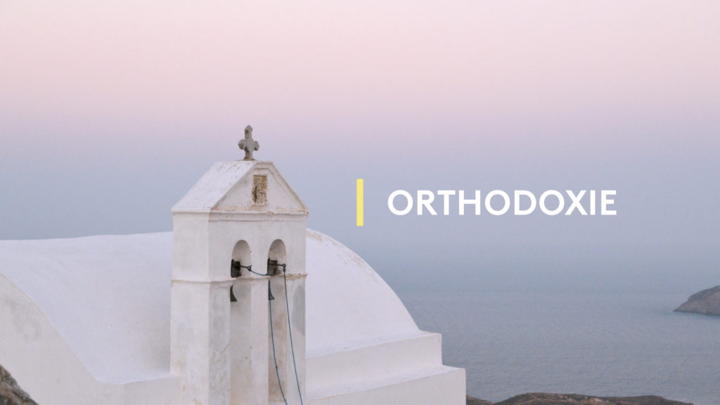
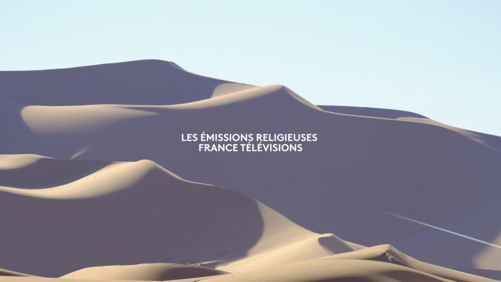
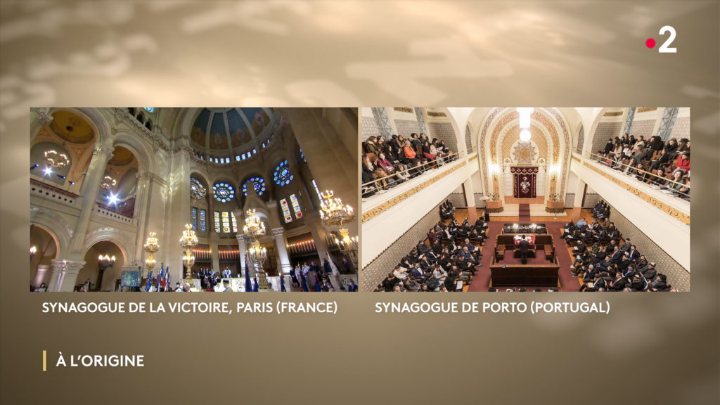
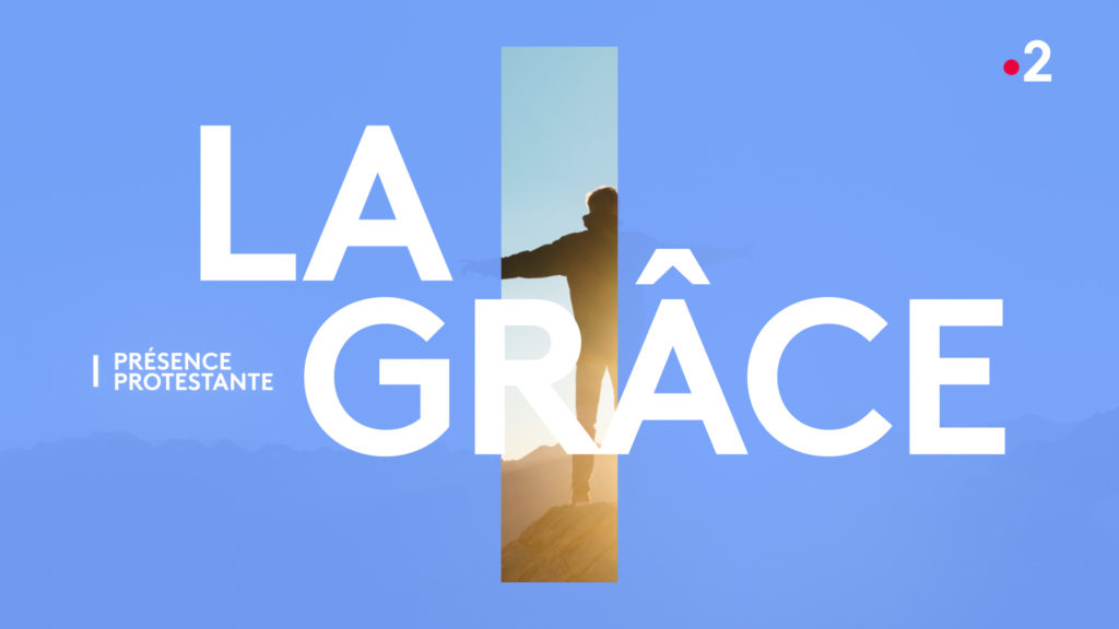
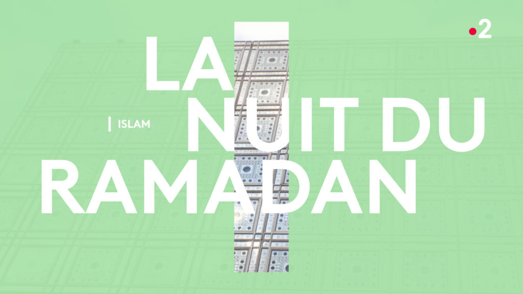
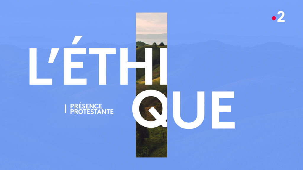
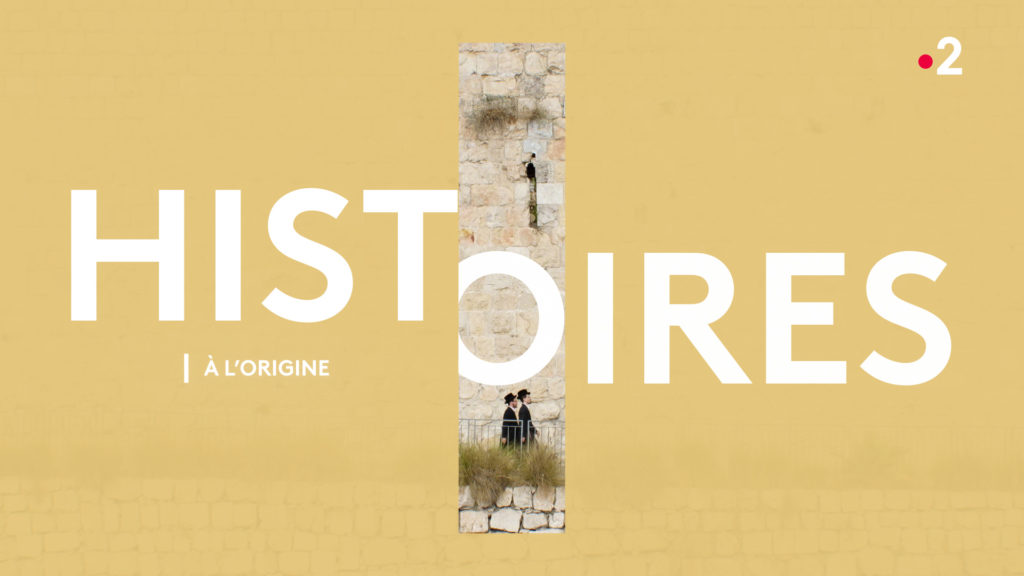
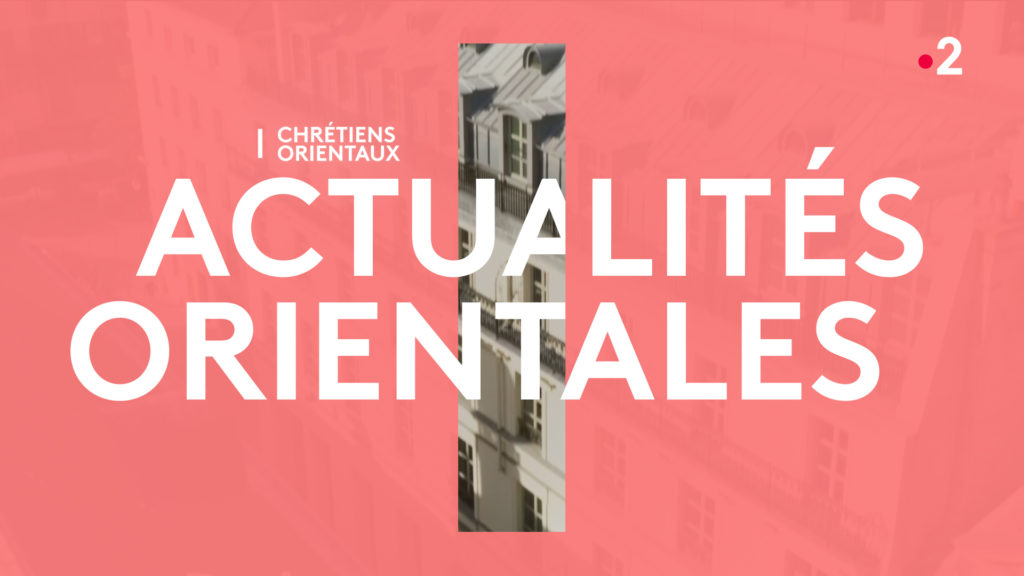
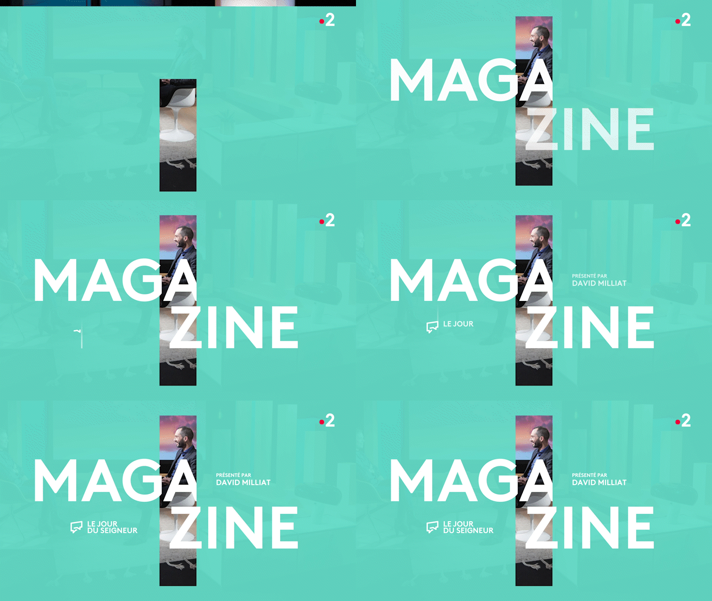
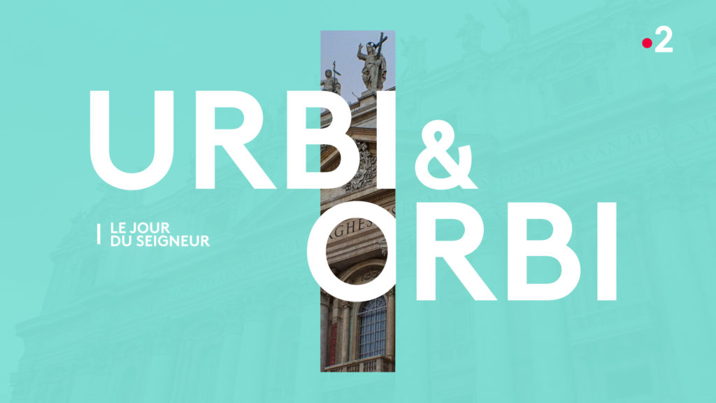
For the revamping of France Télévisions’ Sunday morning religious time slot, the agency designed a sign symbolizing the spiritual reference common to all believers. This sign, which is used to identify each program in the slot, is a vertical line that follows a color palette that includes Catholicism, Islam, Judaism, Protestantism, Orthodoxy, Buddhism and the Eastern Christians.

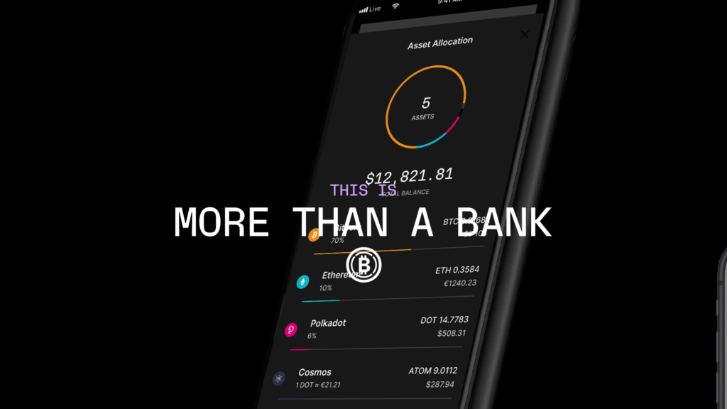
IDENTITY REVEAL
CONTEXT
The French unicorn Ledger unveils its new visual identity.
CHALLENGE
Create a film that reveals how the new identity fits with Ledger’s positioning.
SOLUTION
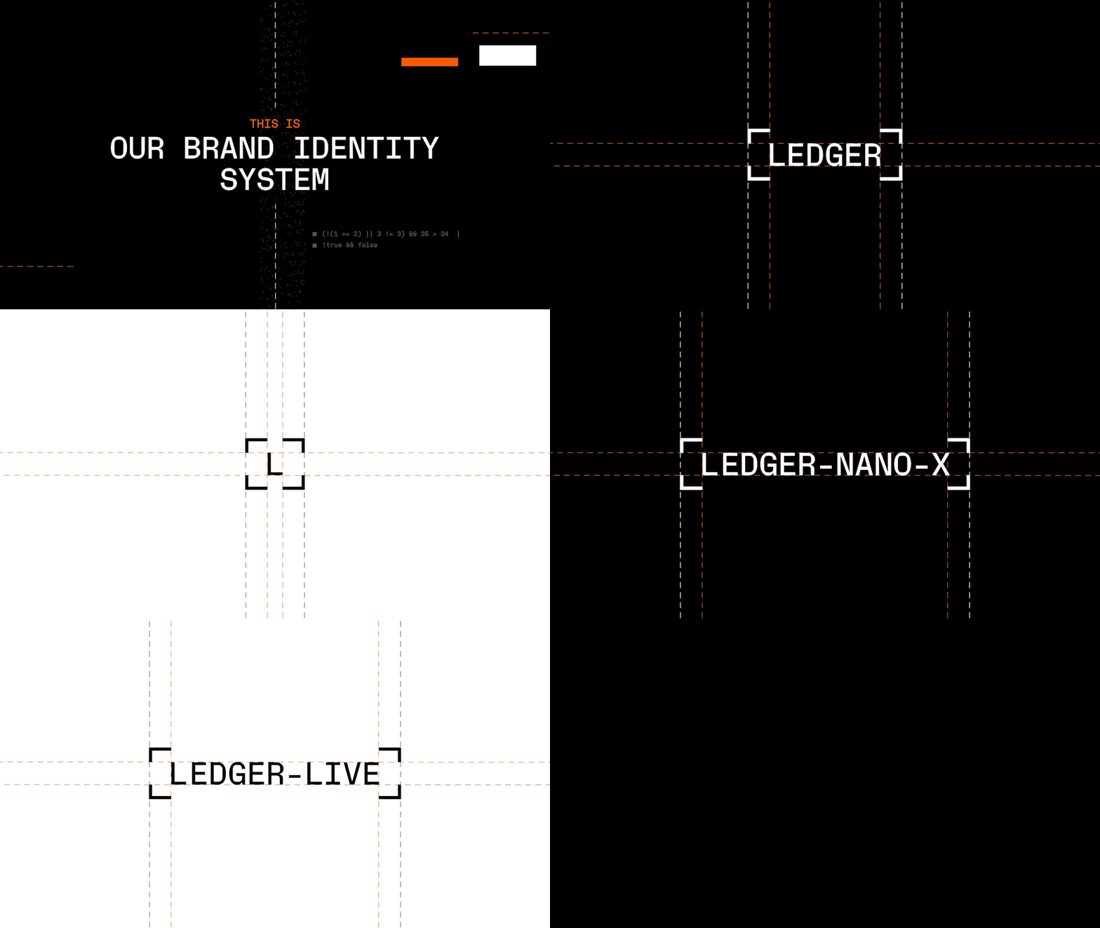
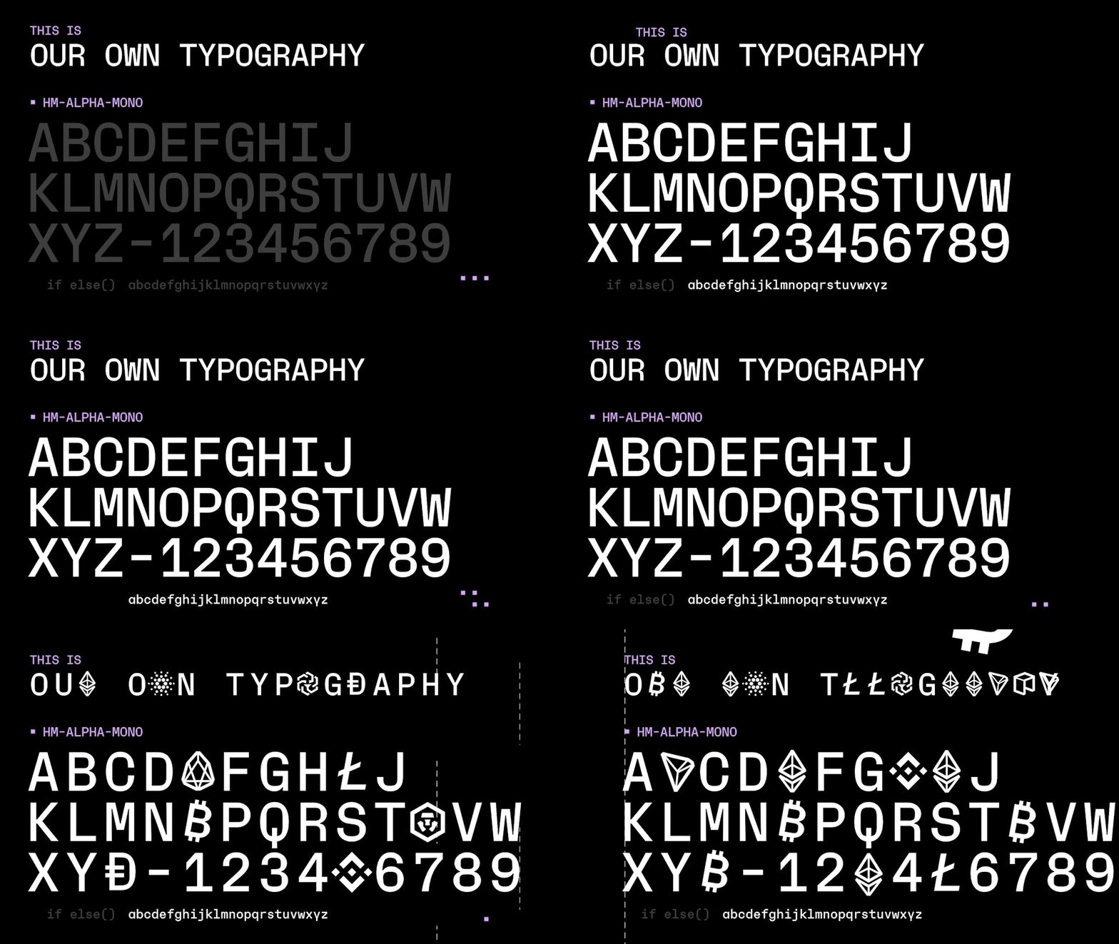
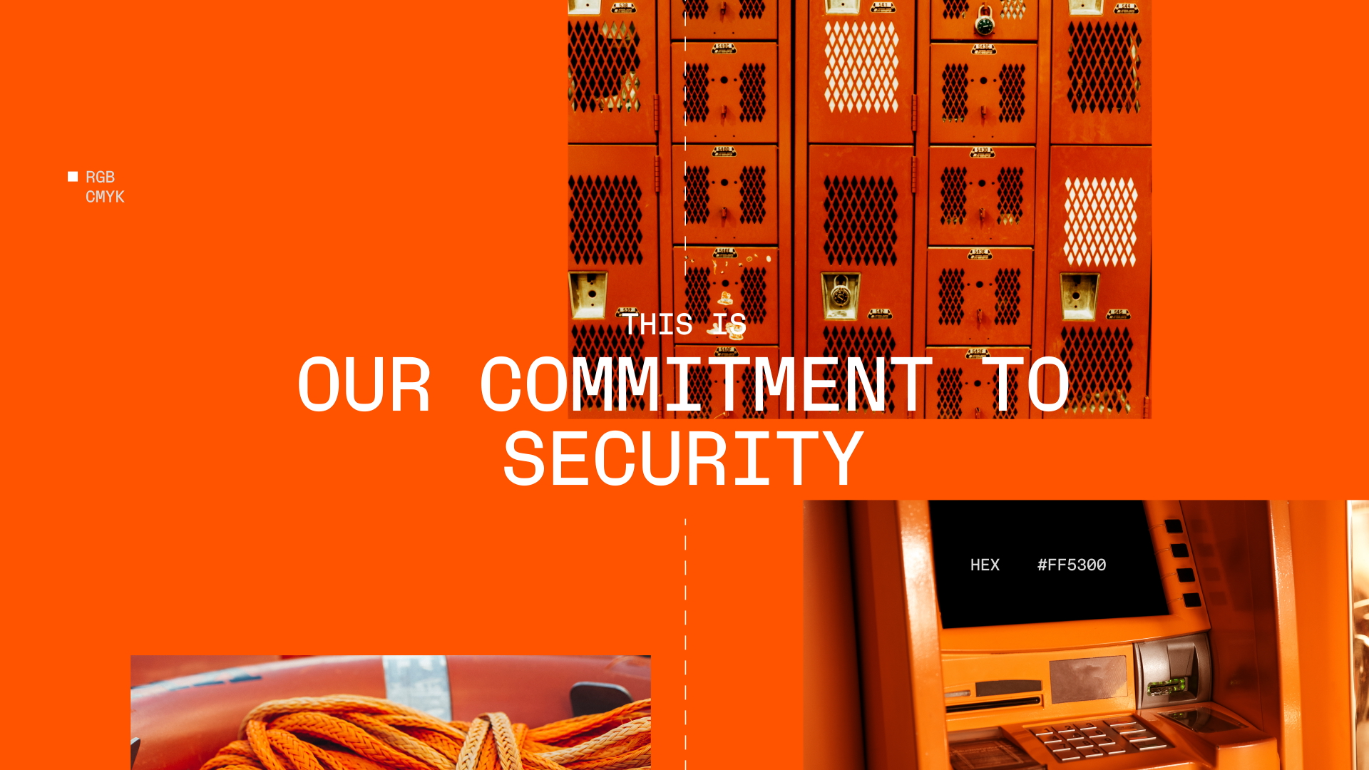
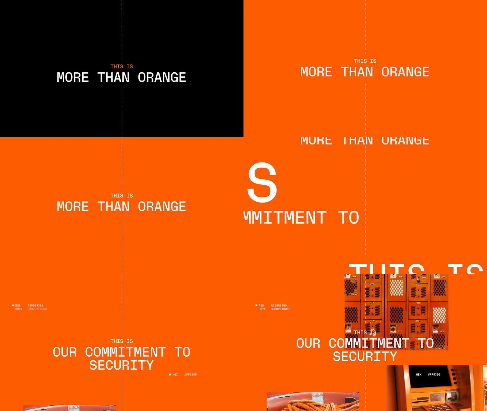
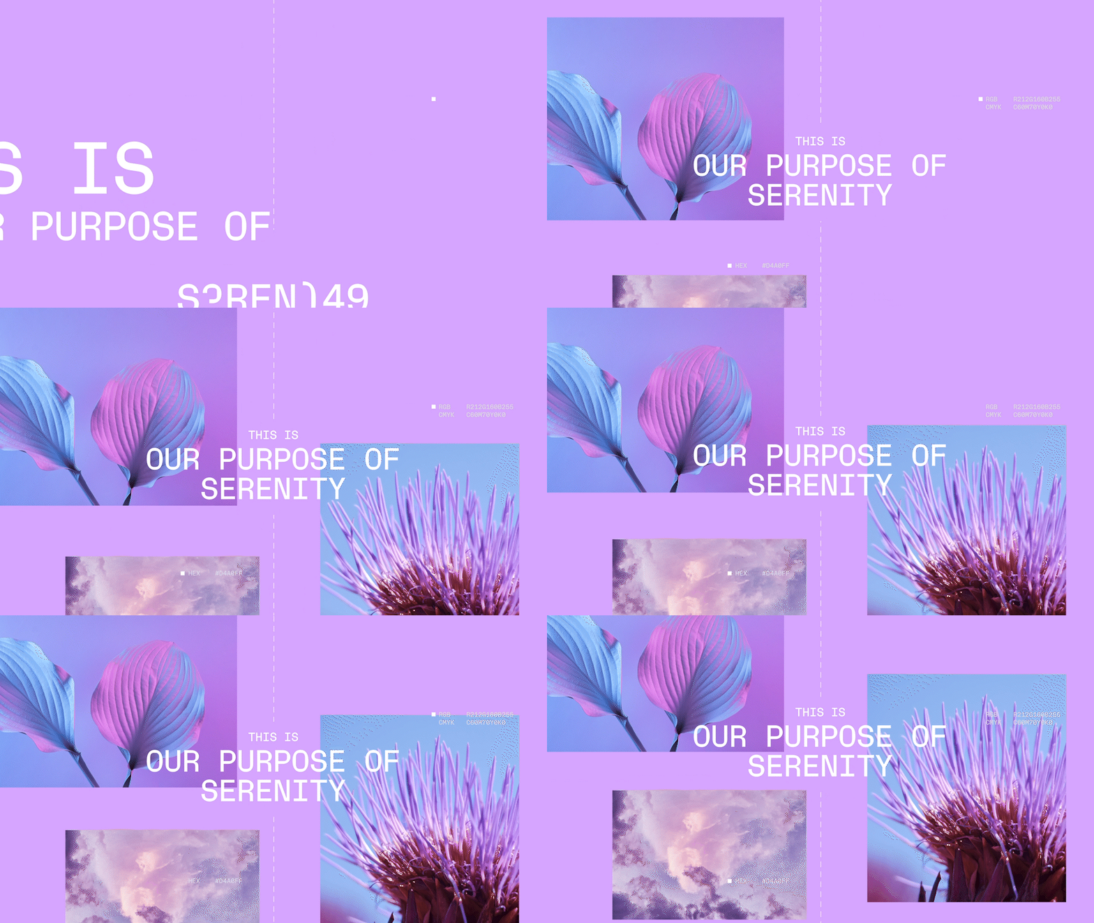
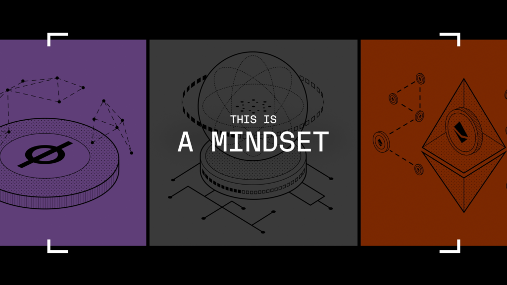
This film highlights the essence of the new brand in 5 points: a brand system, a typography, a colorimetric range, a know-how, a mindset and a way of life.
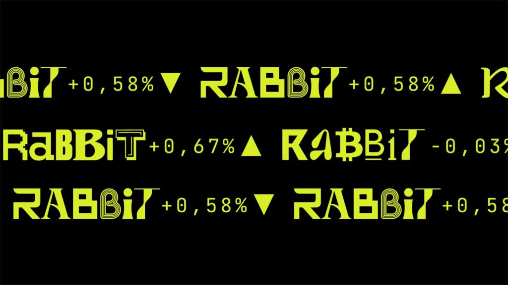
DOWN THE RABBIT HOLE
CONTEXT
Betting on brand content to boost its awareness, the French unicorn is launching a programme on YouTube dedicated to cryptocurrency news.
CHALLENGE
Reinventing the codes of broadcast design for a programme that claims to be anti-mainstream.
SOLUTION
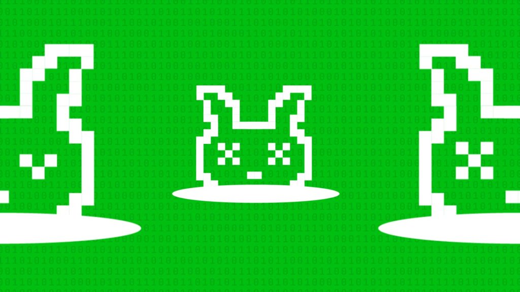
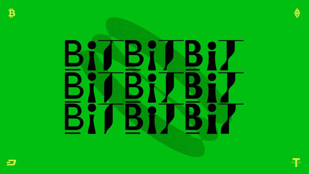
We’ve created a broadcast design that borrows from the codes of social networks and developed a graphic universe based on the pixel. Follow the white rabbit…

TIVI5
CONTEXT
The global French-language channel TV5Monde is looking to revitalize the visual identity and design of its youth programming.
CHALLENGE
Make the public channel stand out from its commercial competitors.
SOLUTION
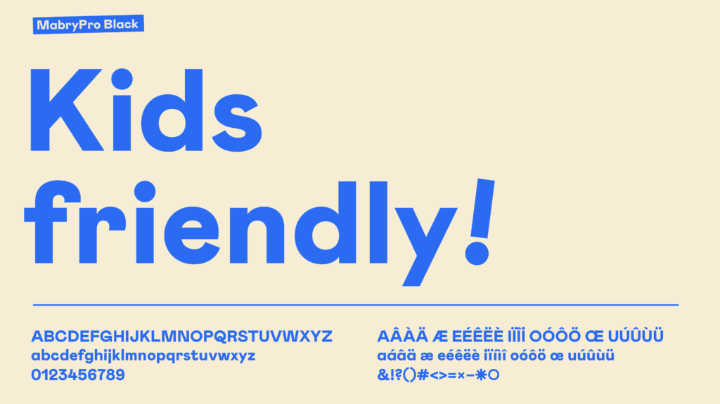
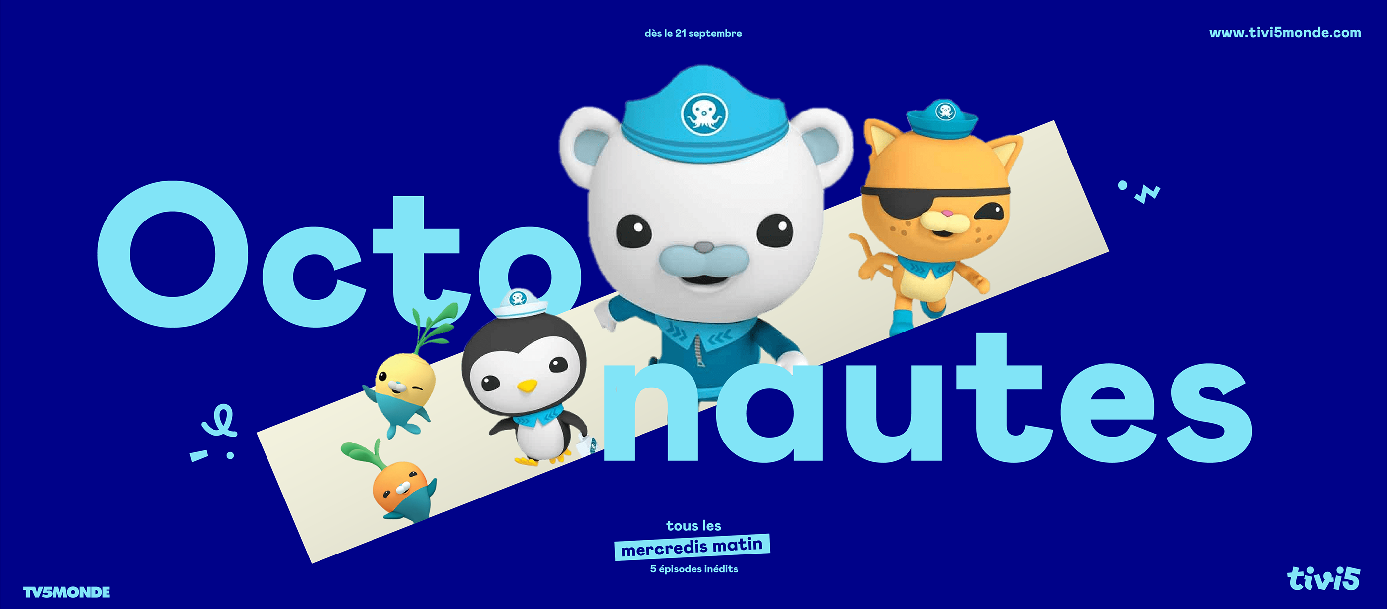
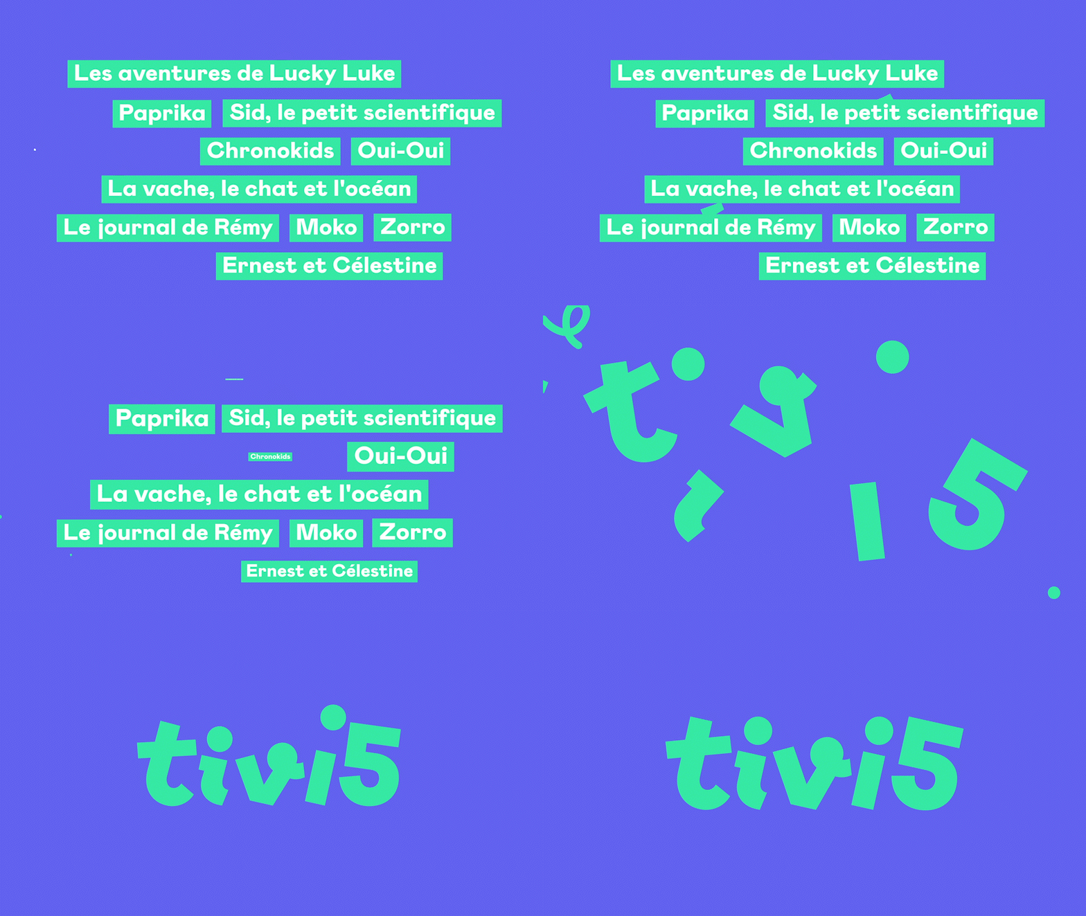
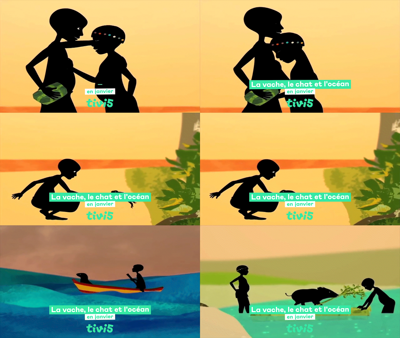
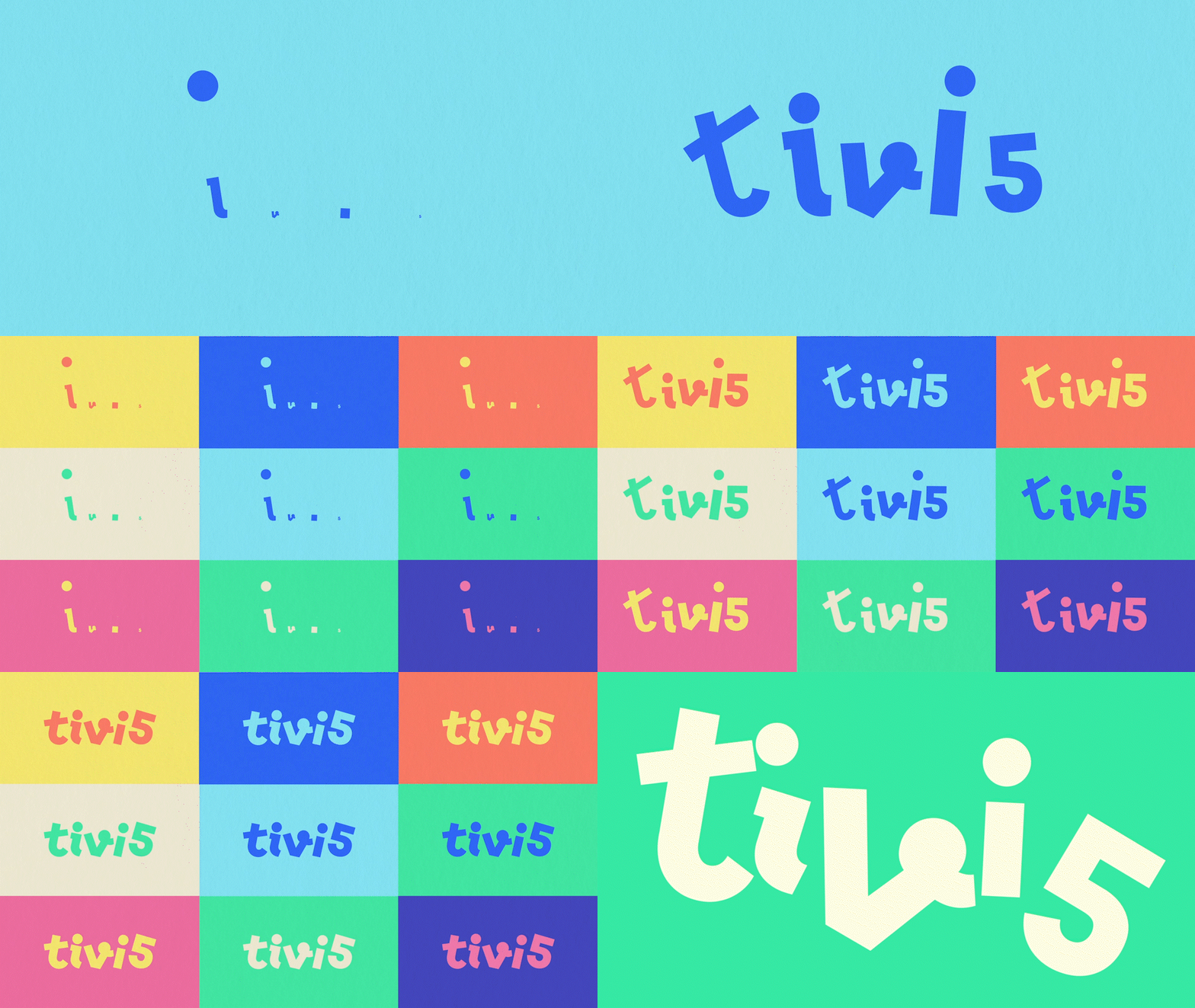
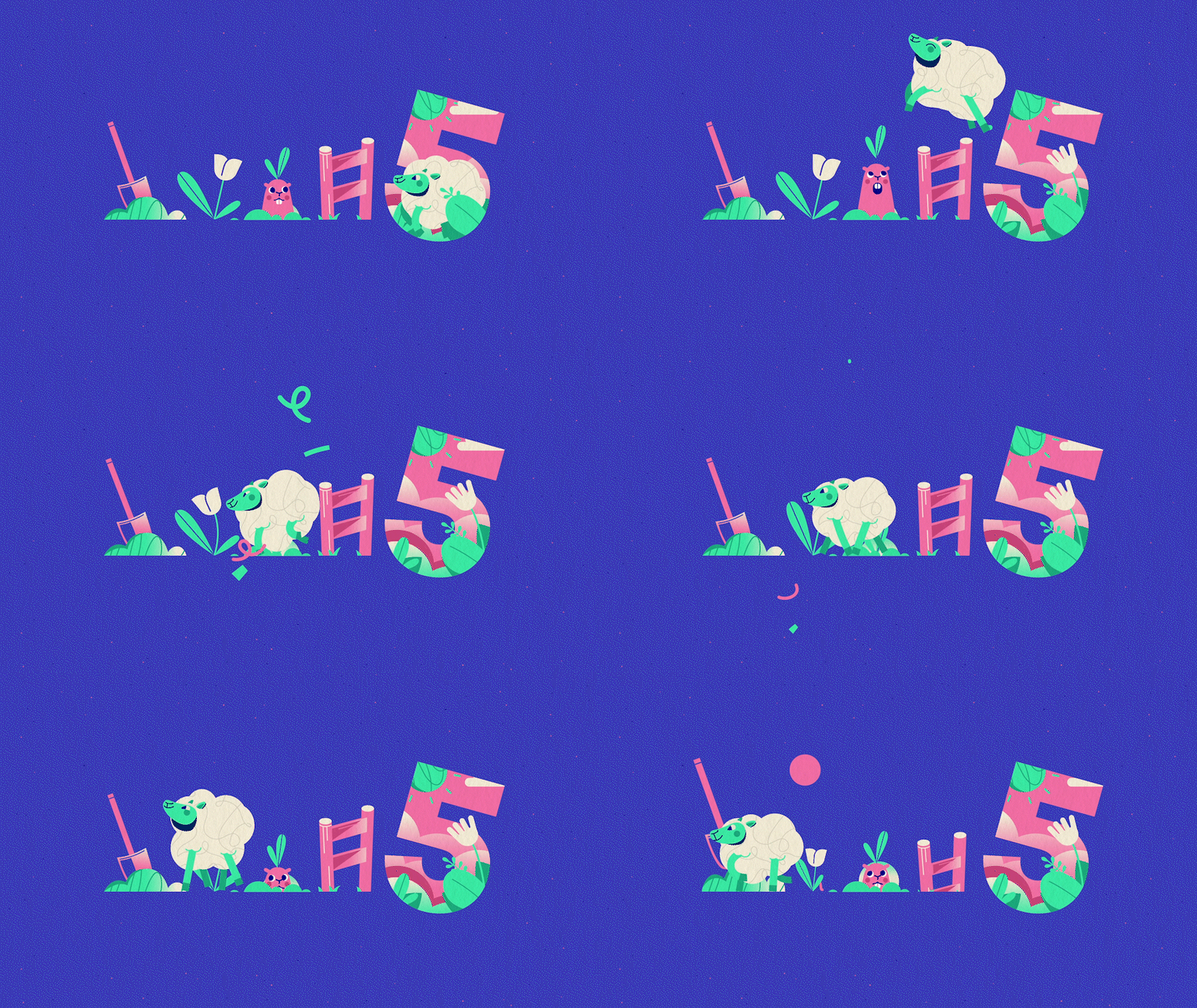
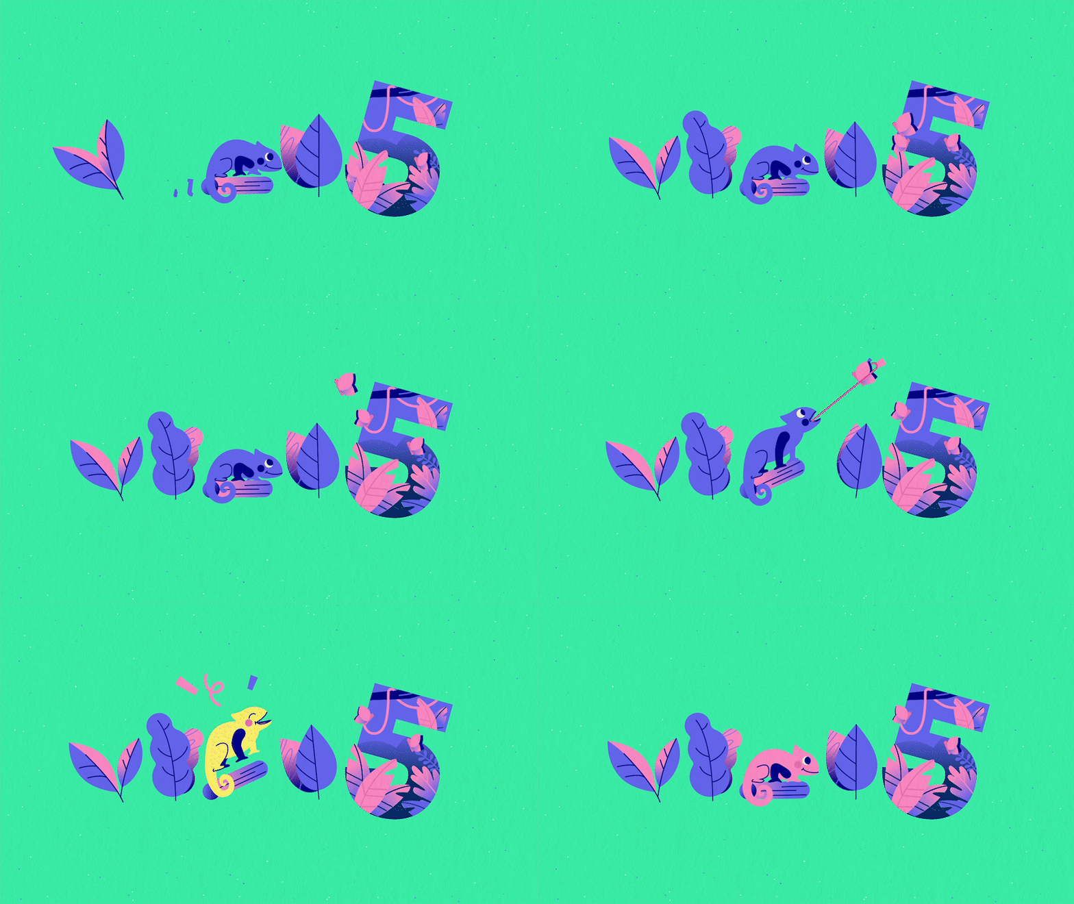
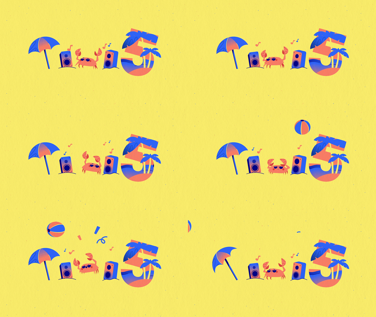
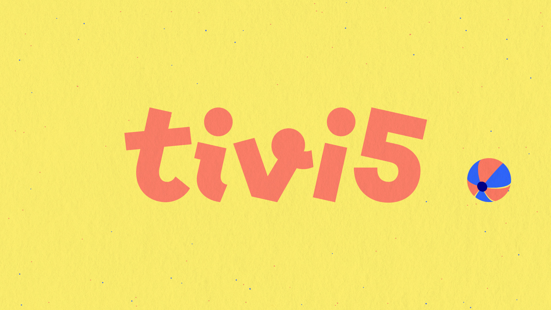
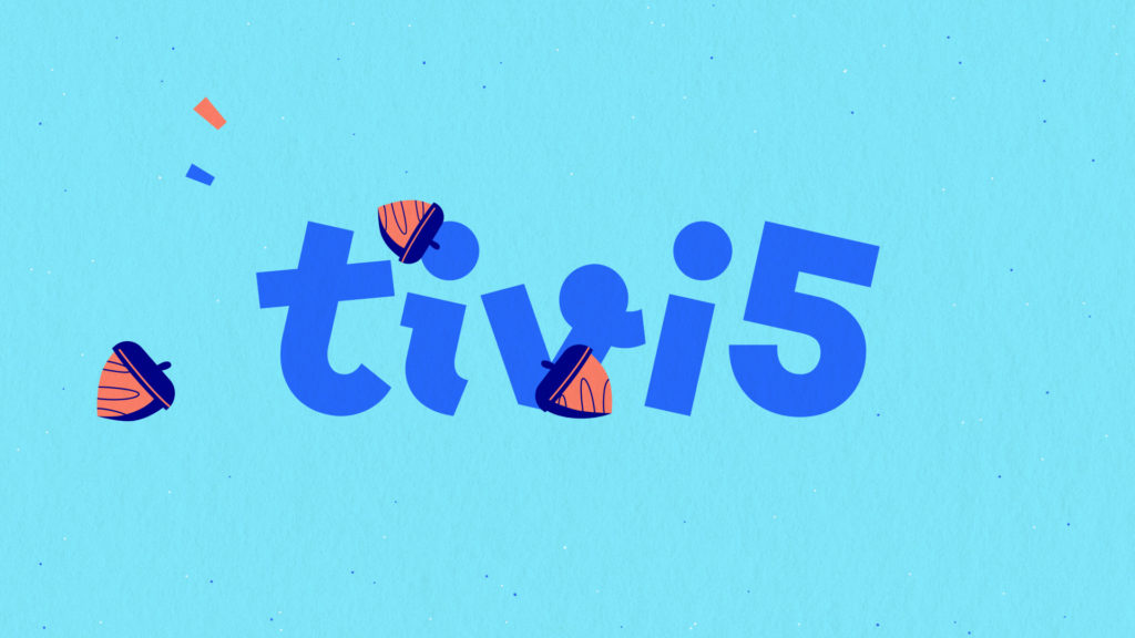
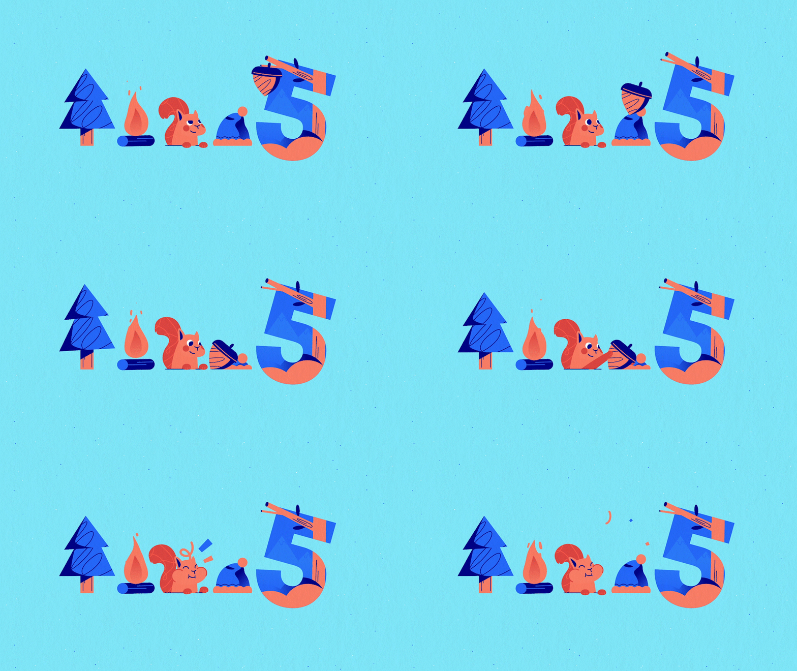
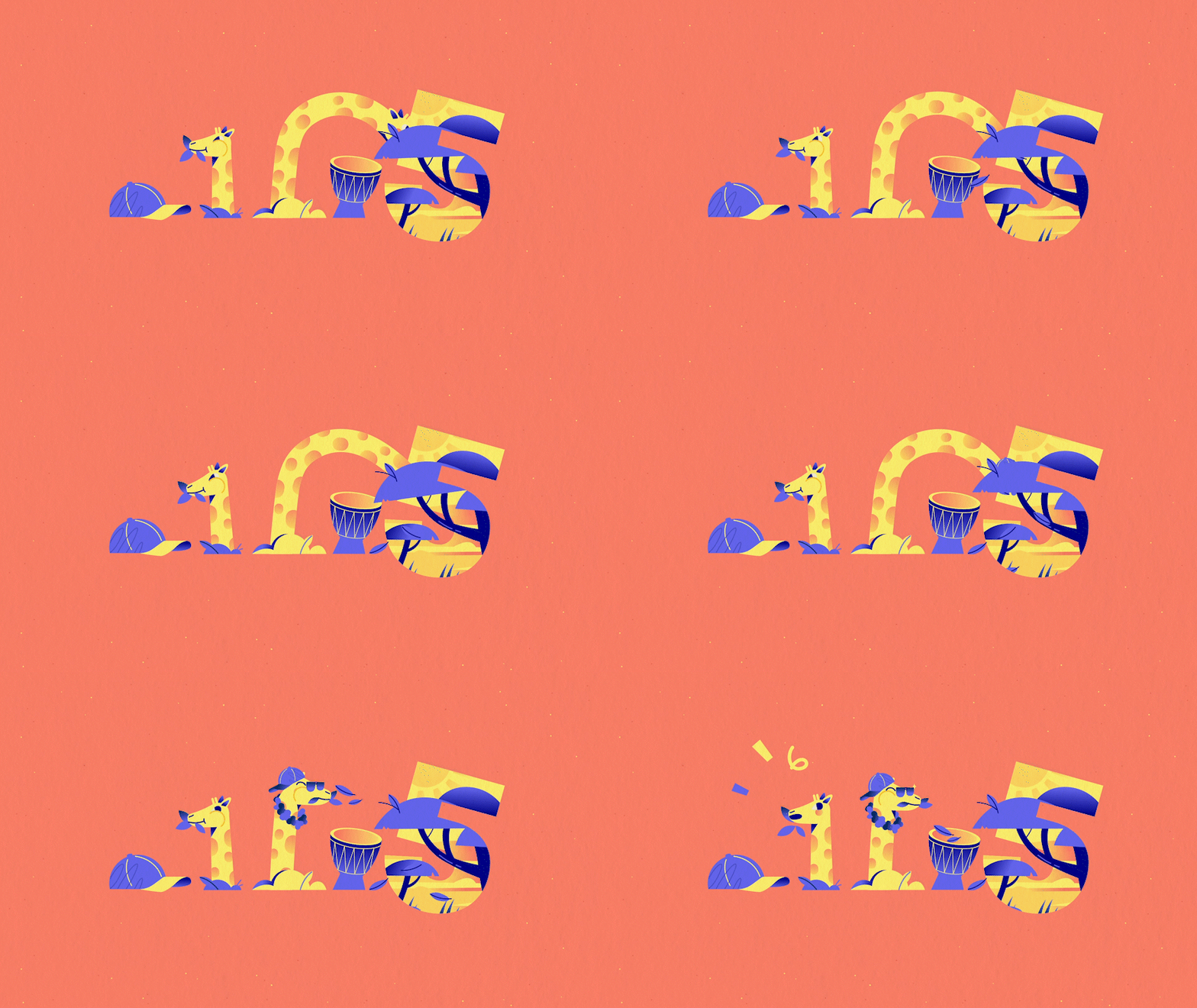
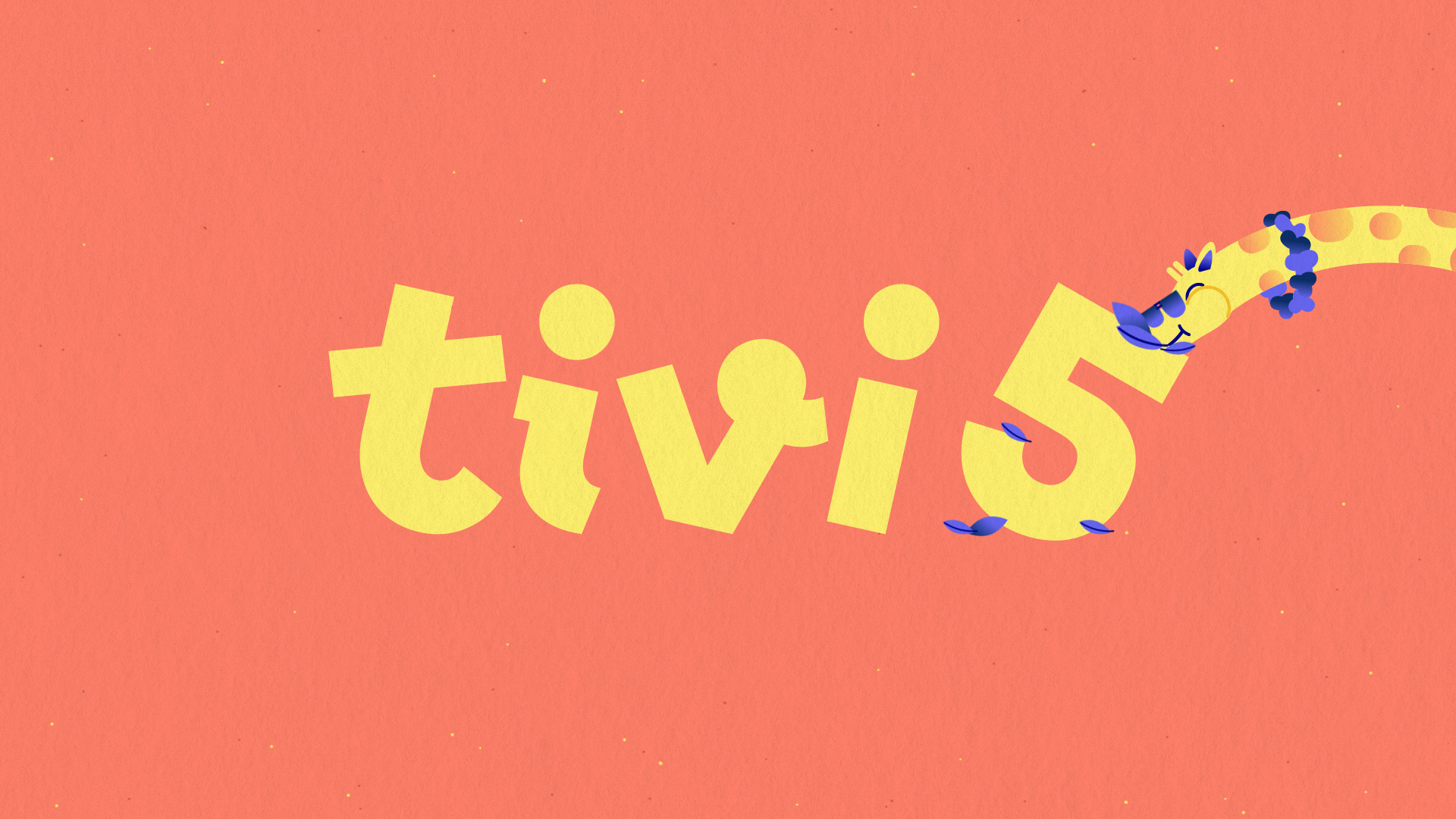
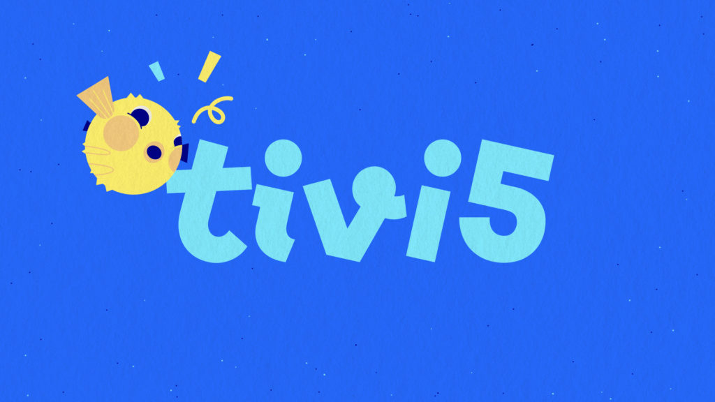
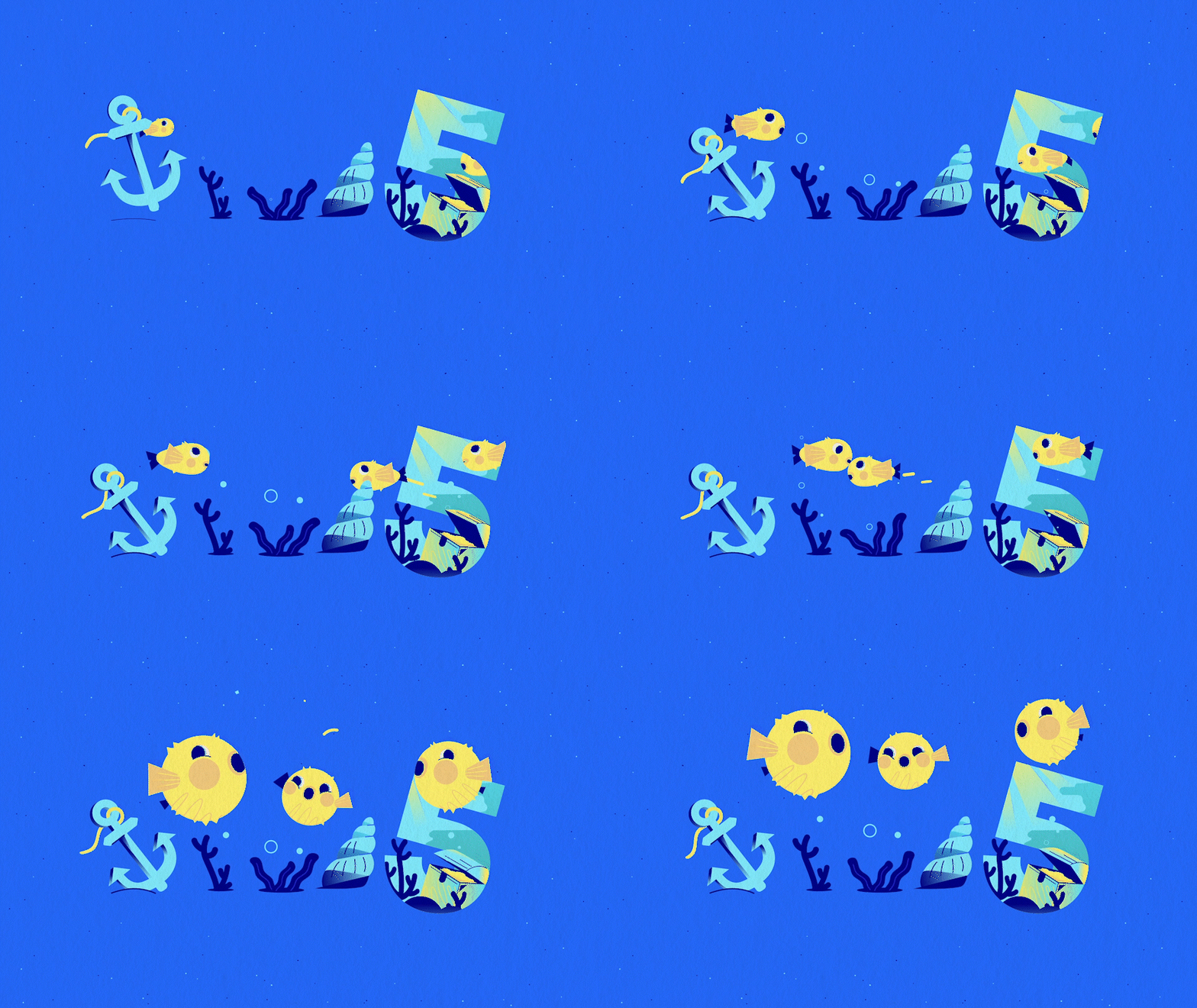
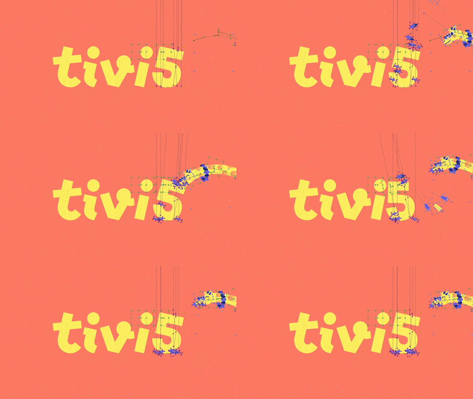
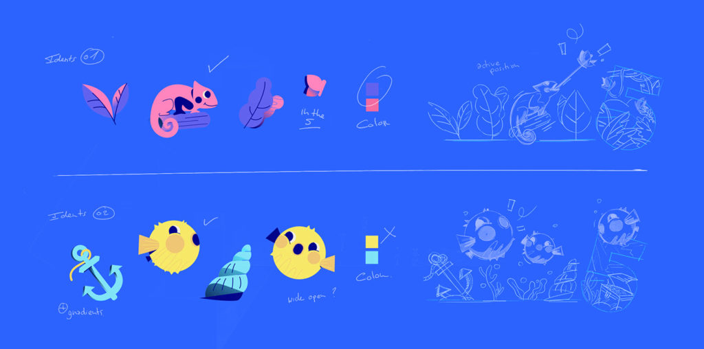
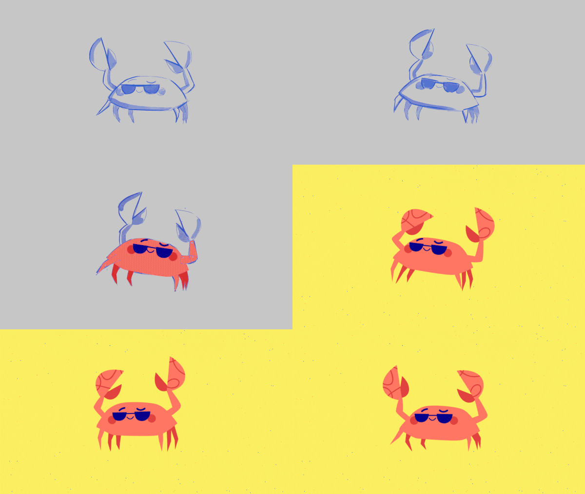
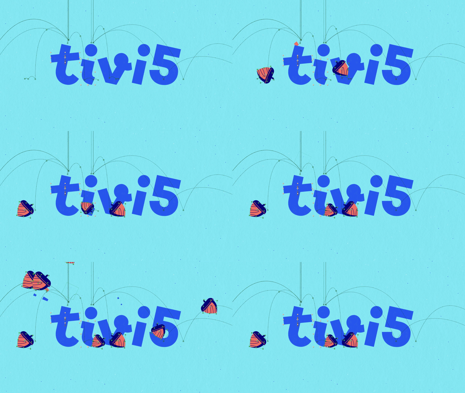
Expressing the mischievous character of the brand, the rebranding of TV5Monde’s youth offering is based on an innovative and enthusiastic vocabulary: bright colors, attractive and fluid typography. Designed for children on all five continents, this illustrative approach plays with words and worlds to bring together as many people as possible.

PROCESS
LCI
CONTEXT
Faced with an increasingly challenged news market, the TF1 group’s channel is reshaping its offering in the run-up to the 2022 presidential elections.
CHALLENGE
Make a 24-hour news channel unique in an era where immediacy prevails.
SOLUTION
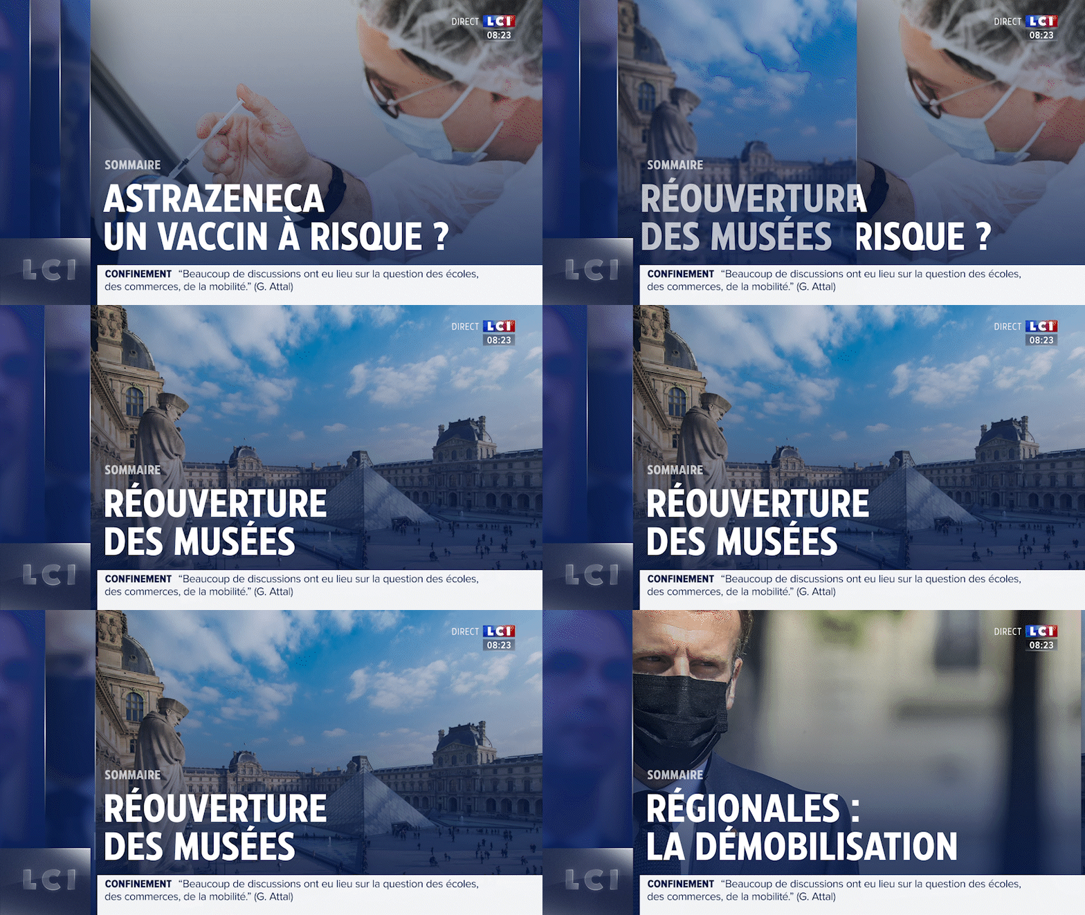
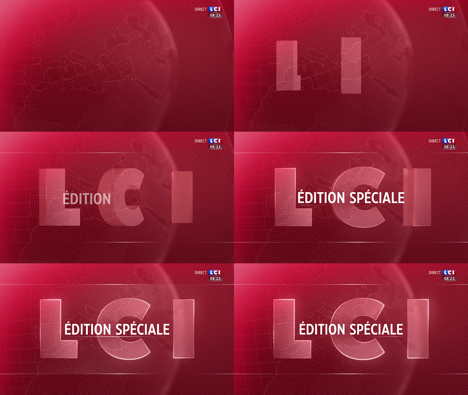
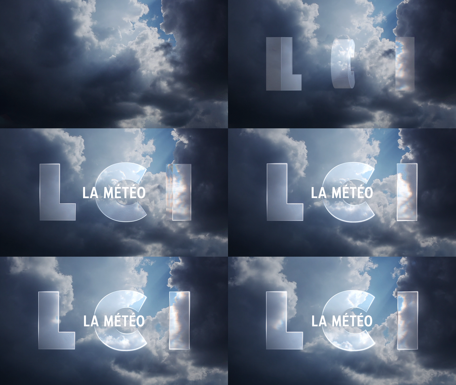
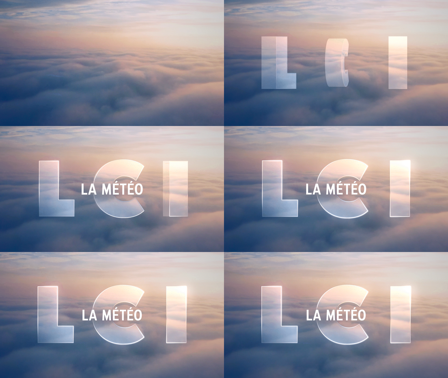
Let’s give time back to the news! The graphic system designed for LCI’s new look is based on the three main stages of the news process: listening, analysis and sharing. Three pillars, like the three letters of the LCI logo. In their most simple design expression, these three pillars represent a loader referring to the processing of information and symbolizing the controlled pulse of the airwaves. The third pillar of the loader is a visual marker, a beacon structuring the system of presentation and the hierarchy of information.
In their simplest expression, these three pillars represent a loader symbolising the controlled pulse of the antenna.
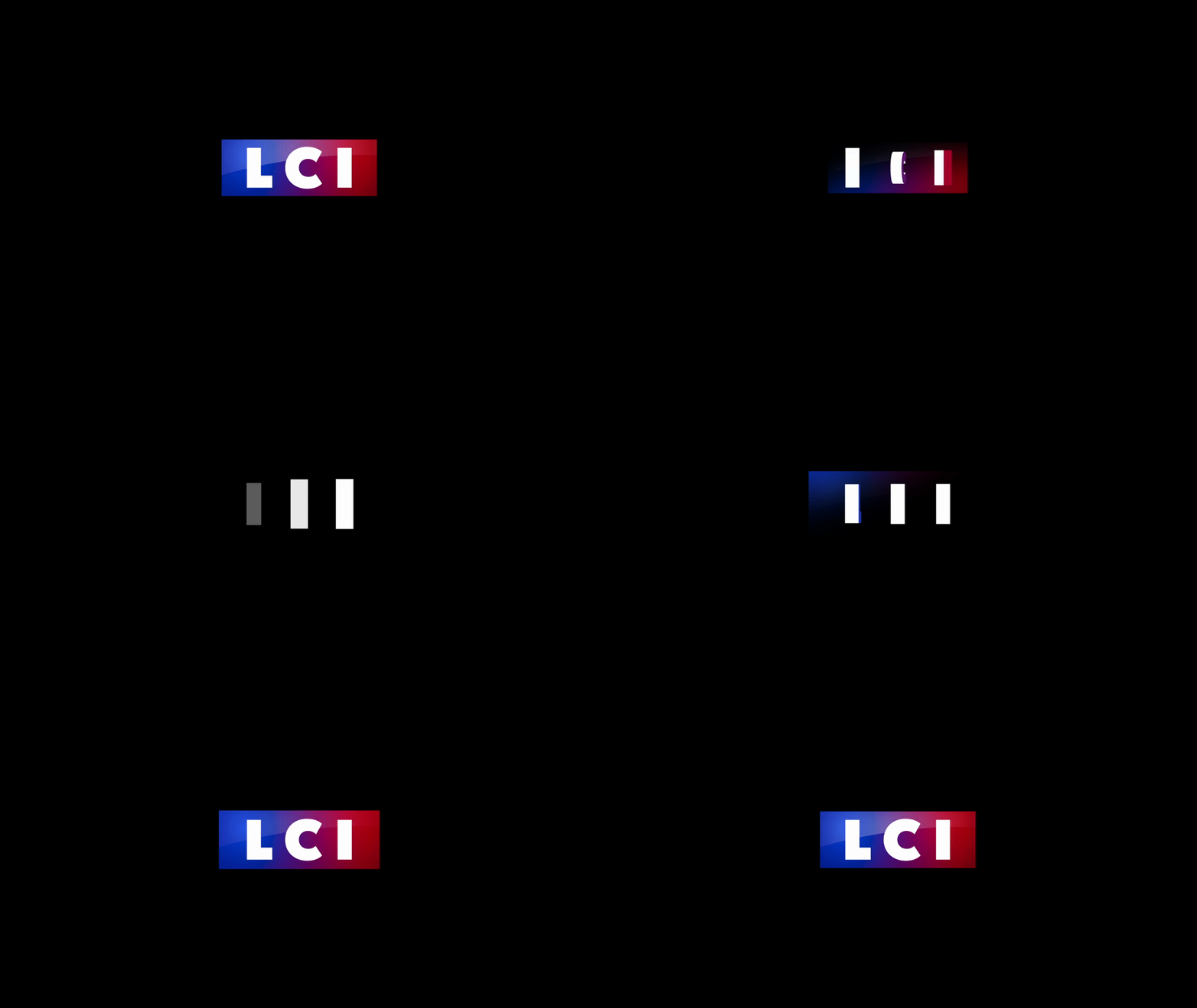
The third pillar of the loader is a visual marker, a tag structuring the information in its hierarchy. This tag lives alone and comes in three colours to indicate the nature of the information: red for urgent news (breaking news), blue for classic news (news) and white for long formats (documentaries, special programming).
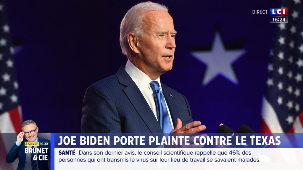
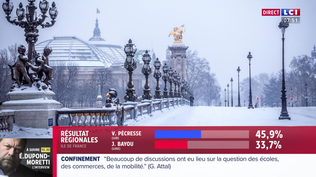
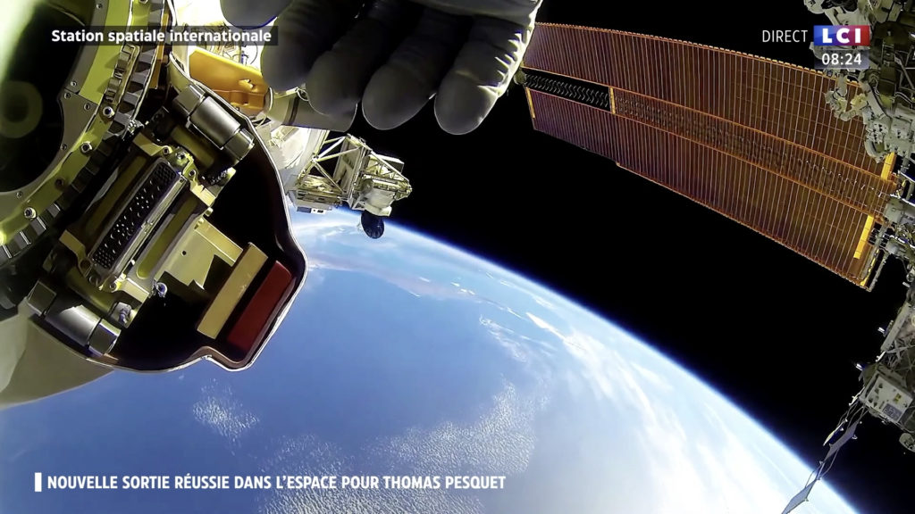
The LCI loader and its graphic tags are also found in the promo elements, the ad breaks, the interstitials and at the opening of each return to the programme.


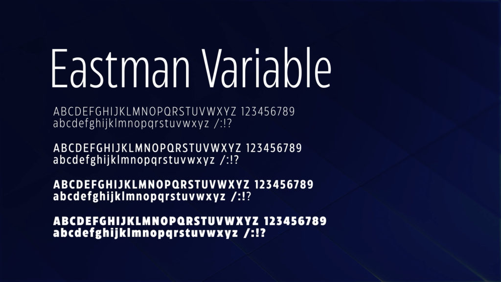
Finally, the channel chooses to adopt two new fonts: Eastman Variable and Proxima Nova.
TÉLÉFOOT
CONTEXT
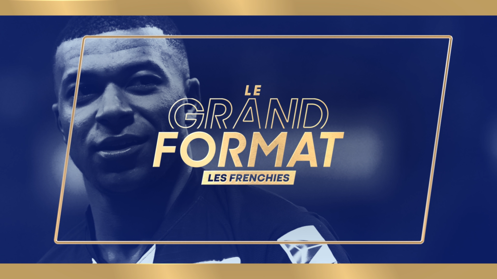
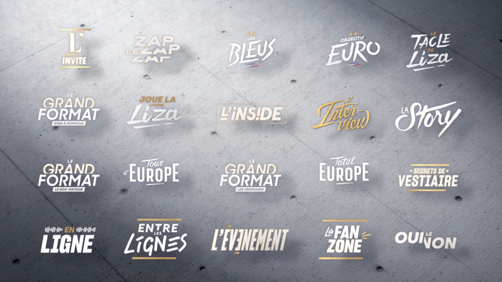
TF1’s sports department wished to renew the visual identity of its soccer news program in order to reinforce its visibility in the French audiovisual landscape.
CHALLENGE
Embody the power of soccer as well as the power of the channel.
SOLUTION
The agency imagined a protean acronym that takes the form of an S with a 2 as its counter-shape. The design is based on a palette of lively colors whose spectrum embodies the diversity of sports. The graphic device is also enriched by a series of infographics in AR.
LE MAG DE L’EURO
CONTEXT
On the occasion of Euro 2020, TF1’s sports department is relaunching its traditional daily magazine alongside the competition’s soccer matches.
CHALLENGE
Roll out a powerful, status-enhancing dressing thanks to a virtual stage and an innovative augmented reality device.
SOLUTION
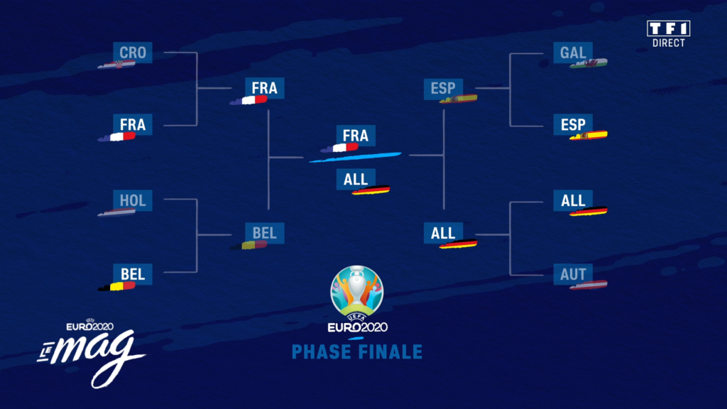
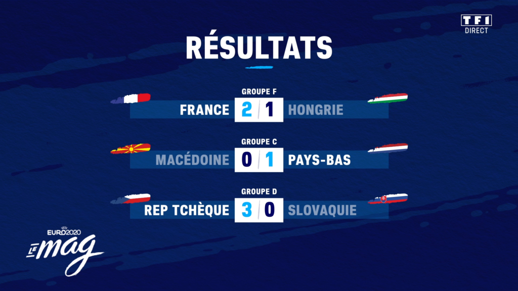
To allow the show’s set to be installed in each European city where the Euro takes place, we adapted to the constraints of the set, mixing pre-calculated renderings and real-time 3D (Unreal Engine). In terms of identity and interface, the agency focused on the energy of the sporting gesture at the heart of the graphic system by adopting a scripted brand signature and oblique dynamics.
THE ALBUM
CONTEXT
The Restos du Coeurs launched a campaign to raise awareness about bequests and donations with the support of TF1.
CHALLENGE
Address with discretion the possibilities of post-mortem engagement with those most in need.
SOLUTION
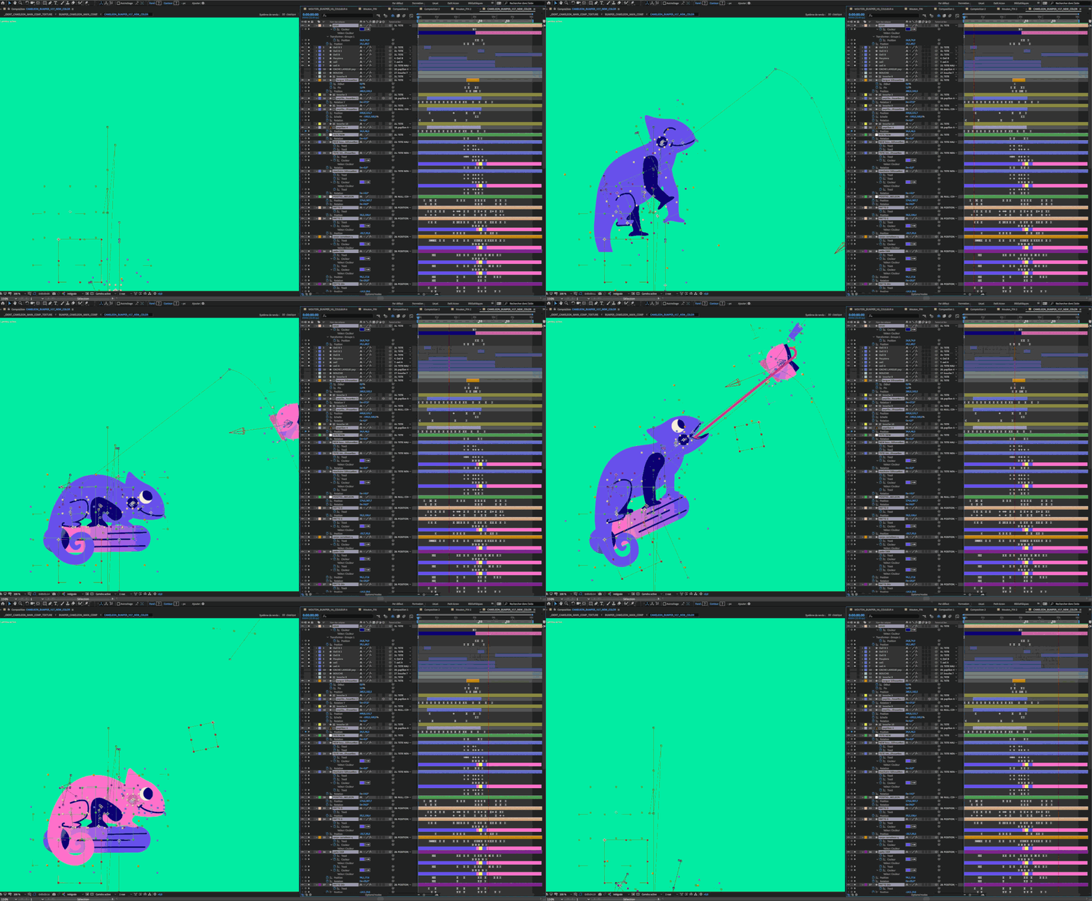
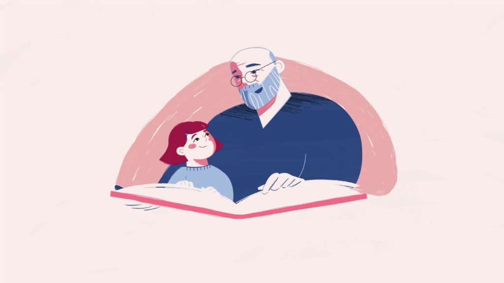
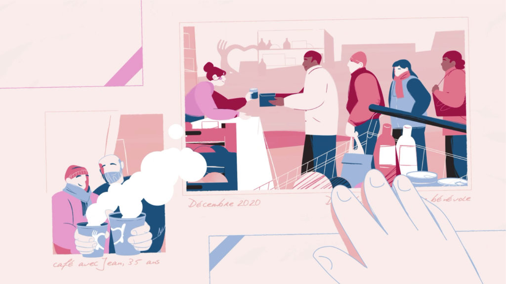
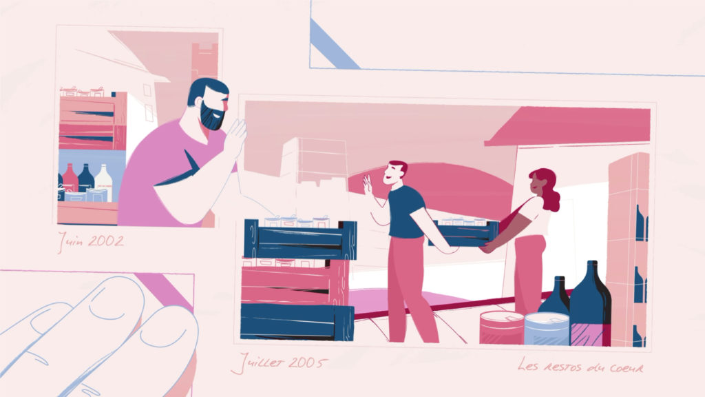
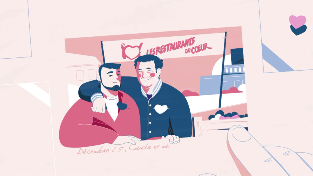
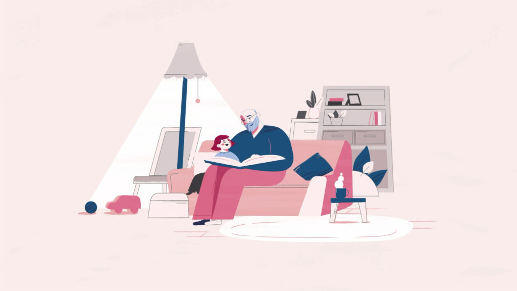
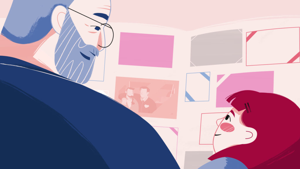
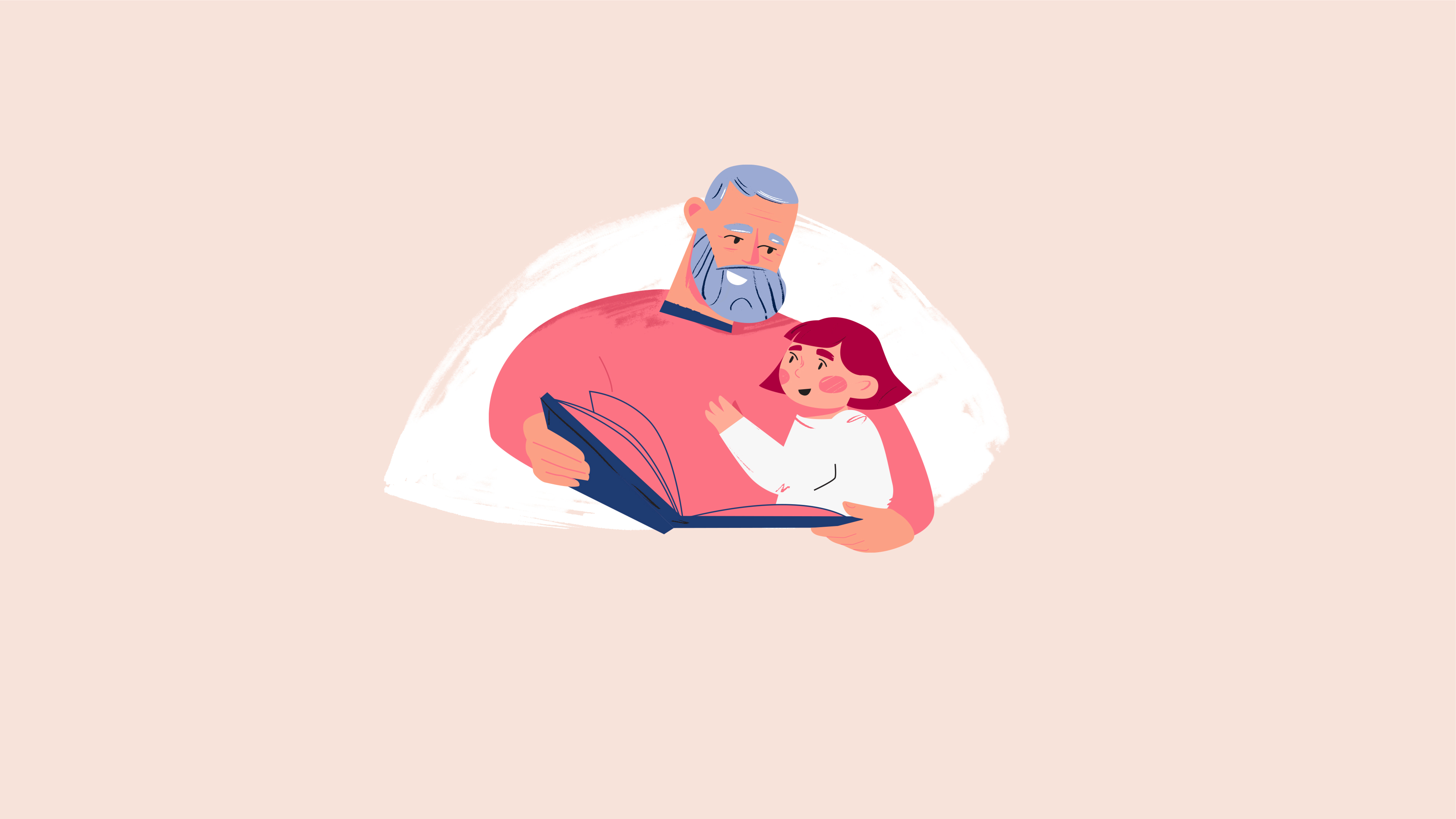
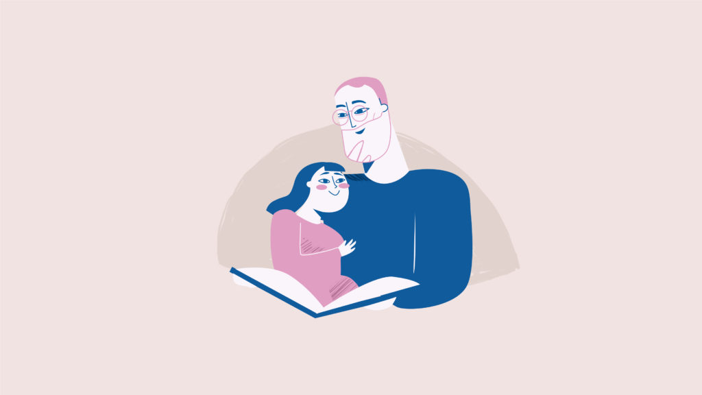
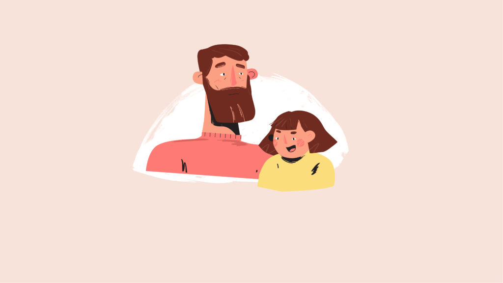
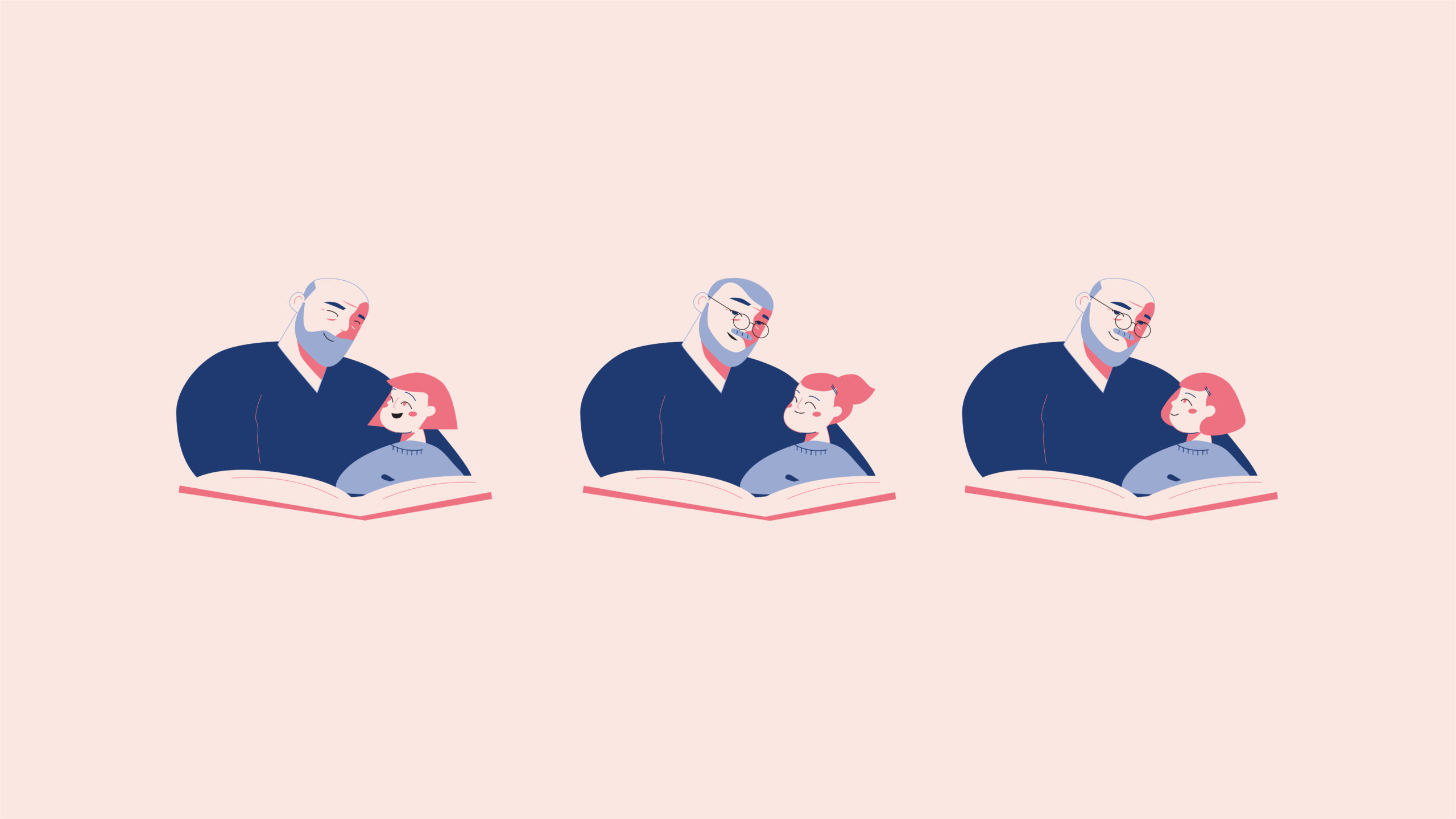
The film features a conversation between a volunteer from the association and his granddaughter, who is looking through a photo album that traces the history of the Restos from their beginnings to the present day. The agency chose a delicate illustrative approach to this sensitive subject.
CHARA DESIGN
Process
TV1000
CONTEXT
The international television group rebrands its TV1000 movie channel package and strengthens its position on all markets where the offer is available.
CHALLENGE
Embody the promise of exceptional variety in a movie channel’s offering through its idents.
SOLUTION
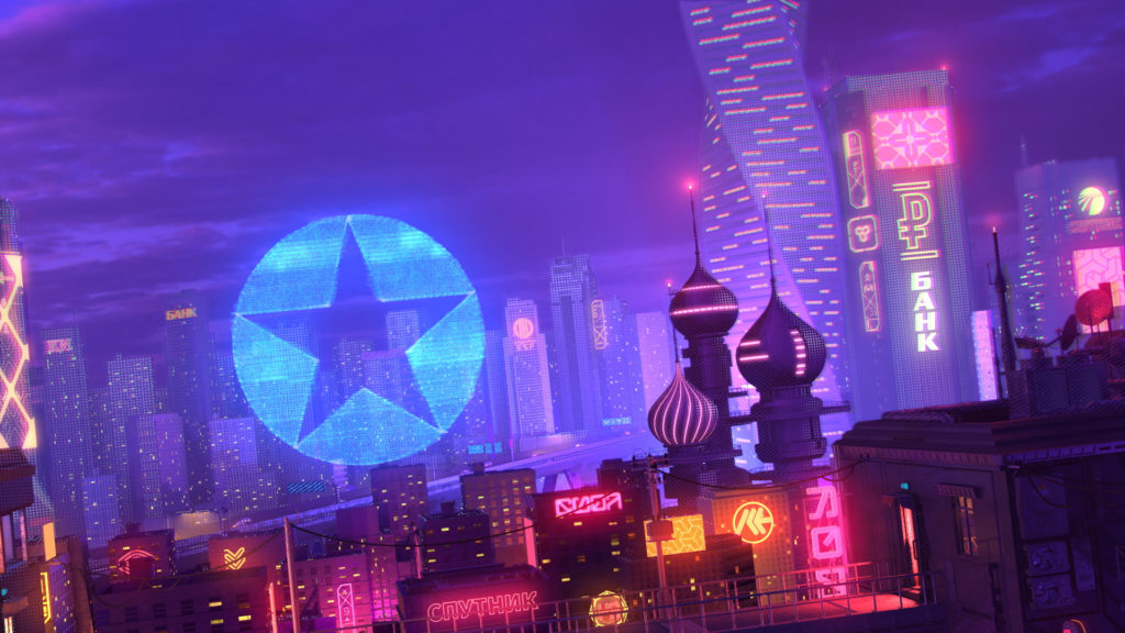
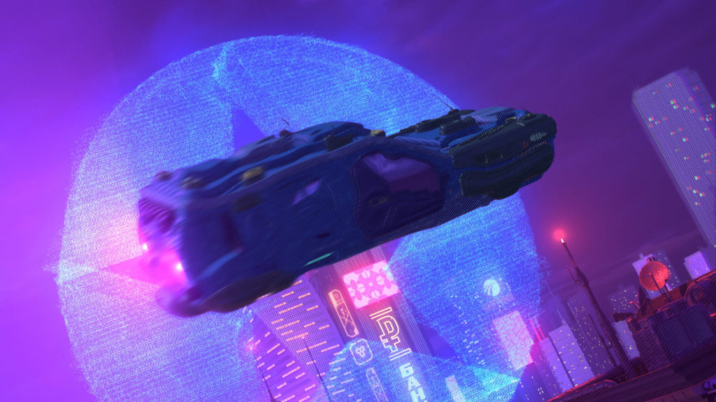
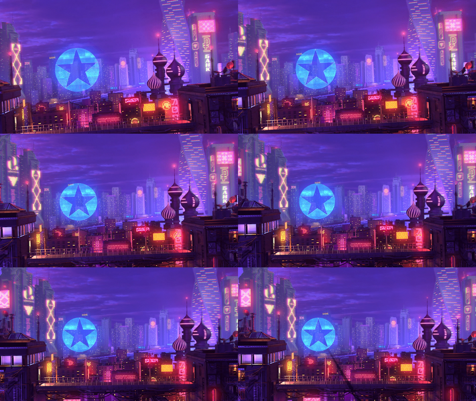
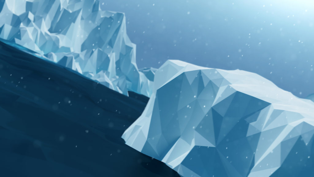
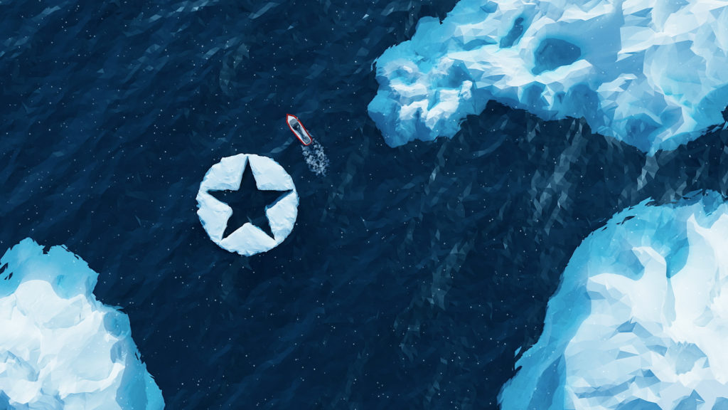
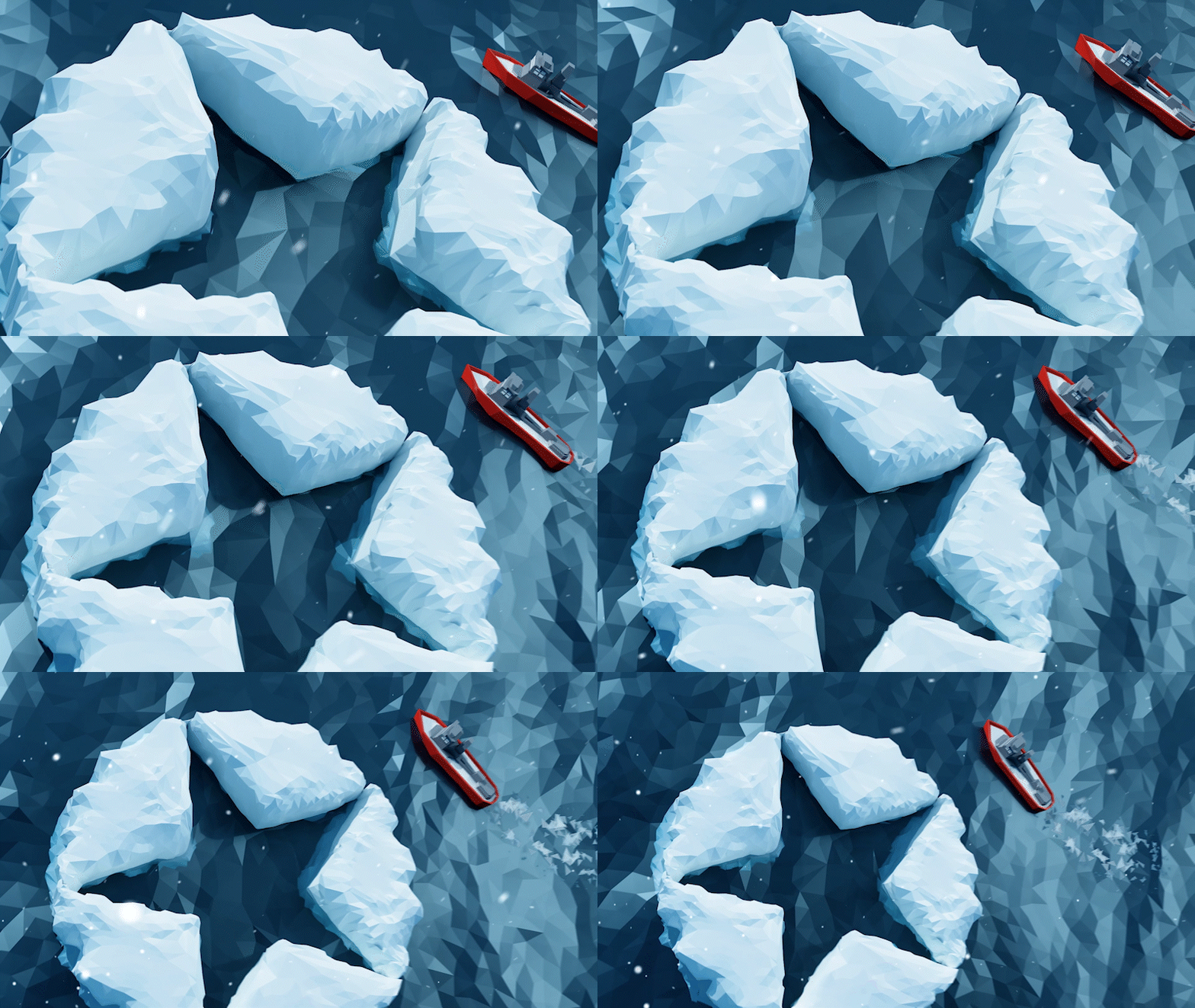
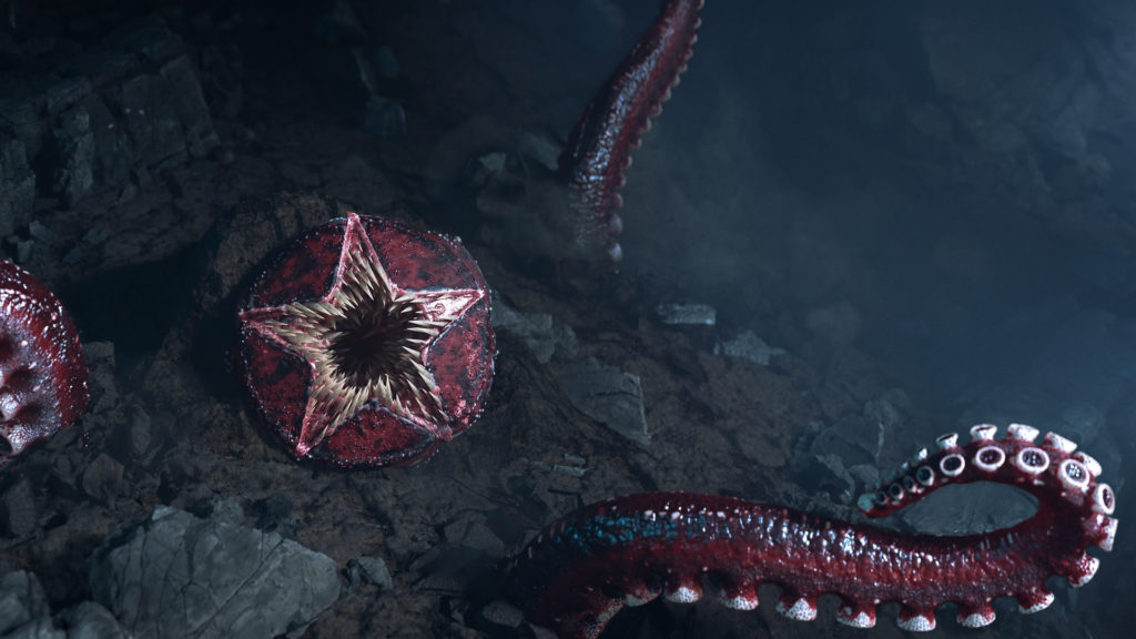
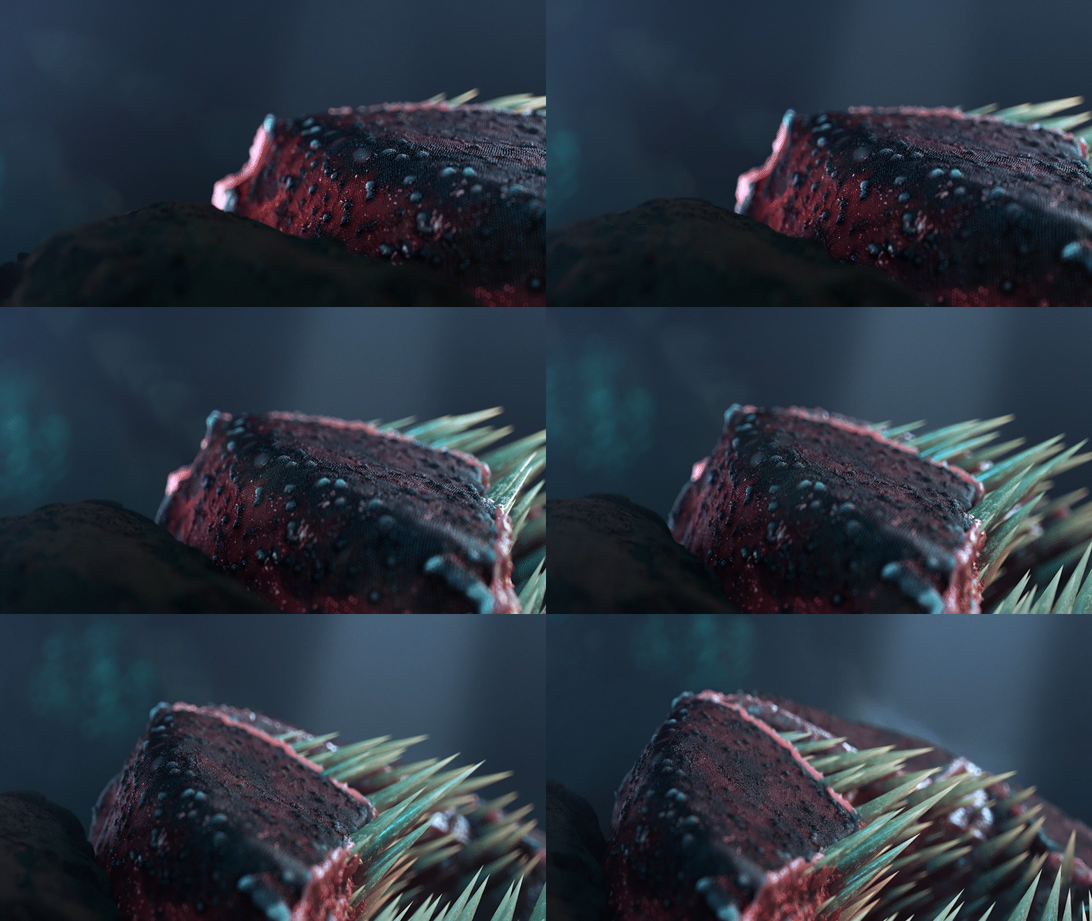
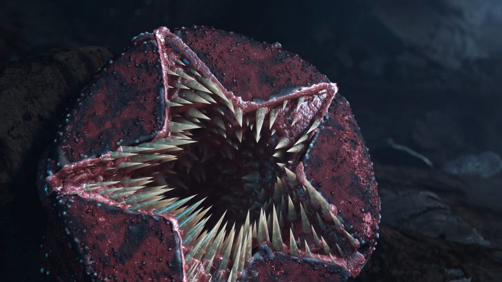
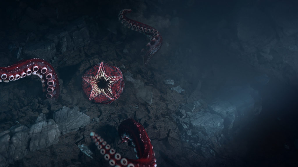
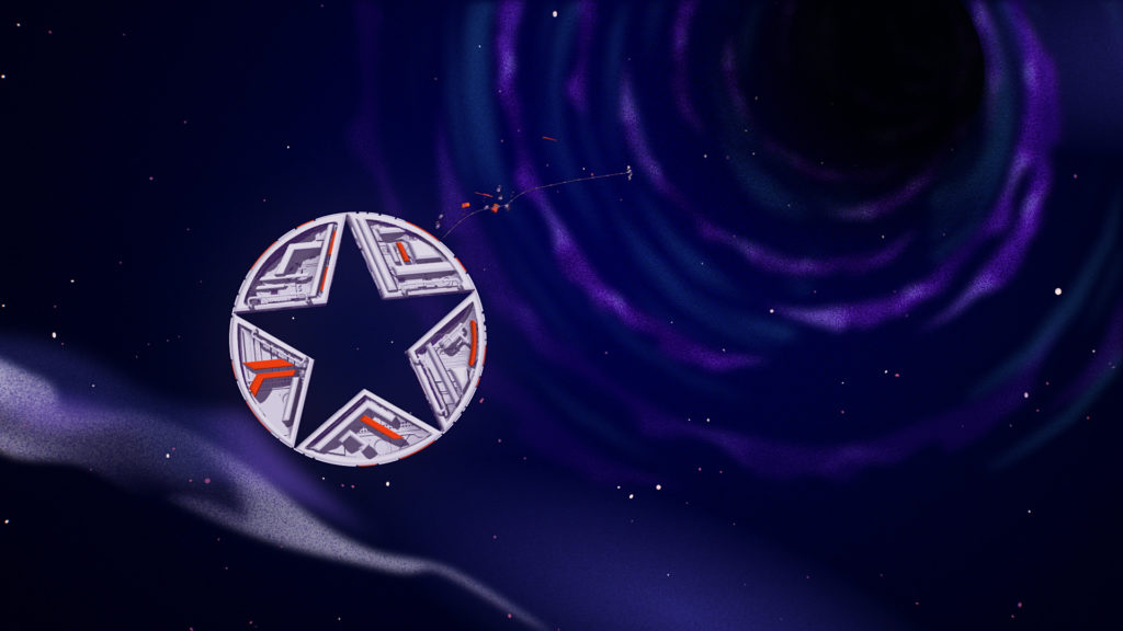
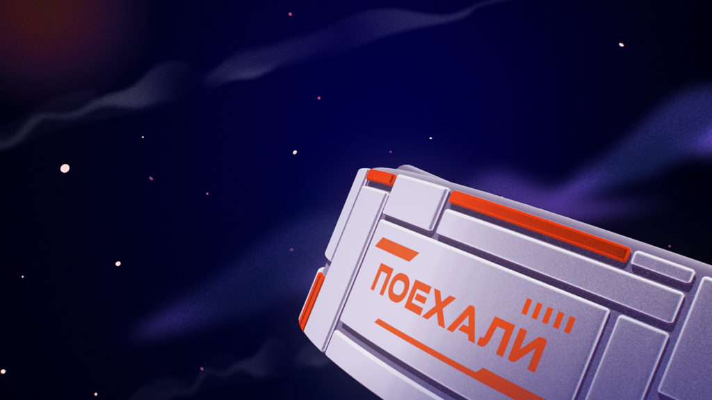
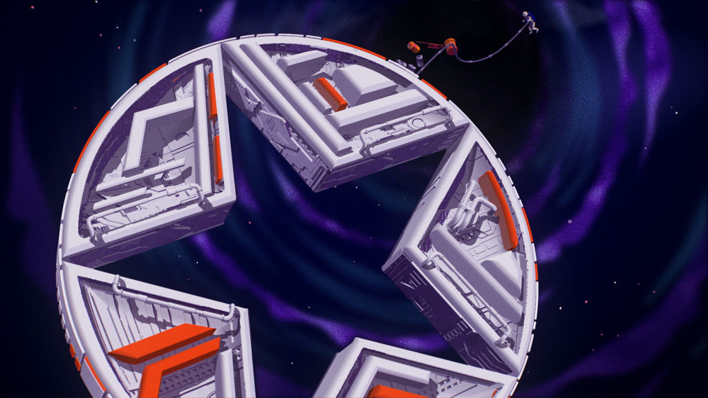
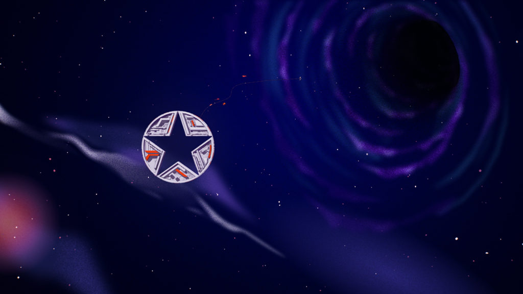
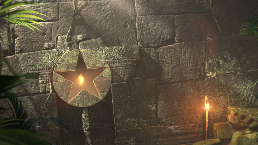
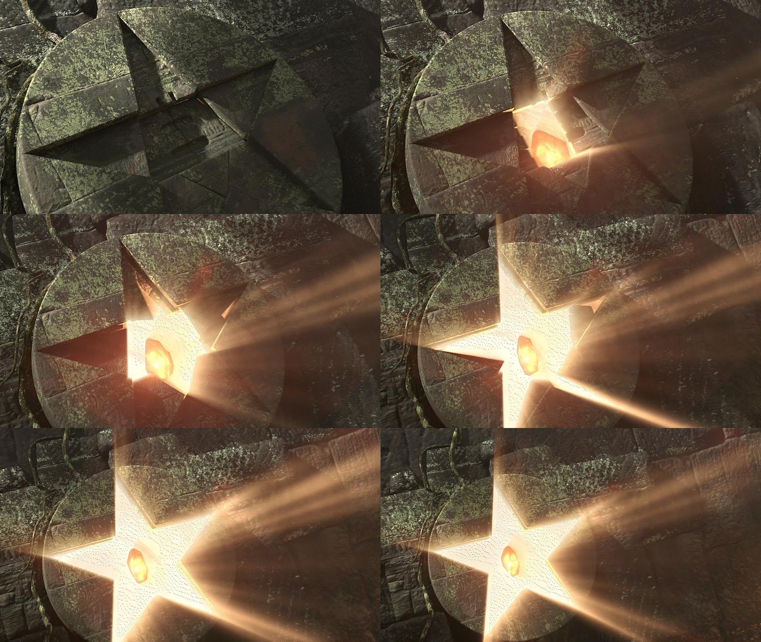
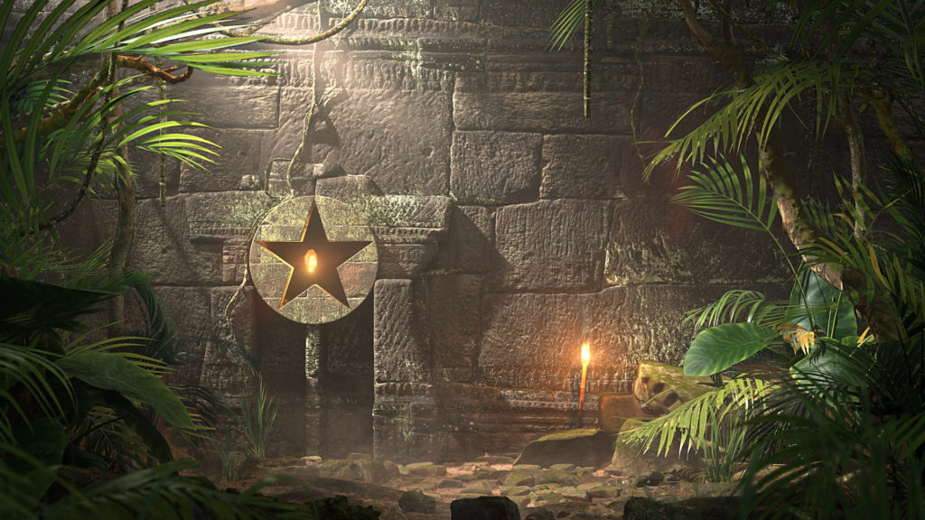
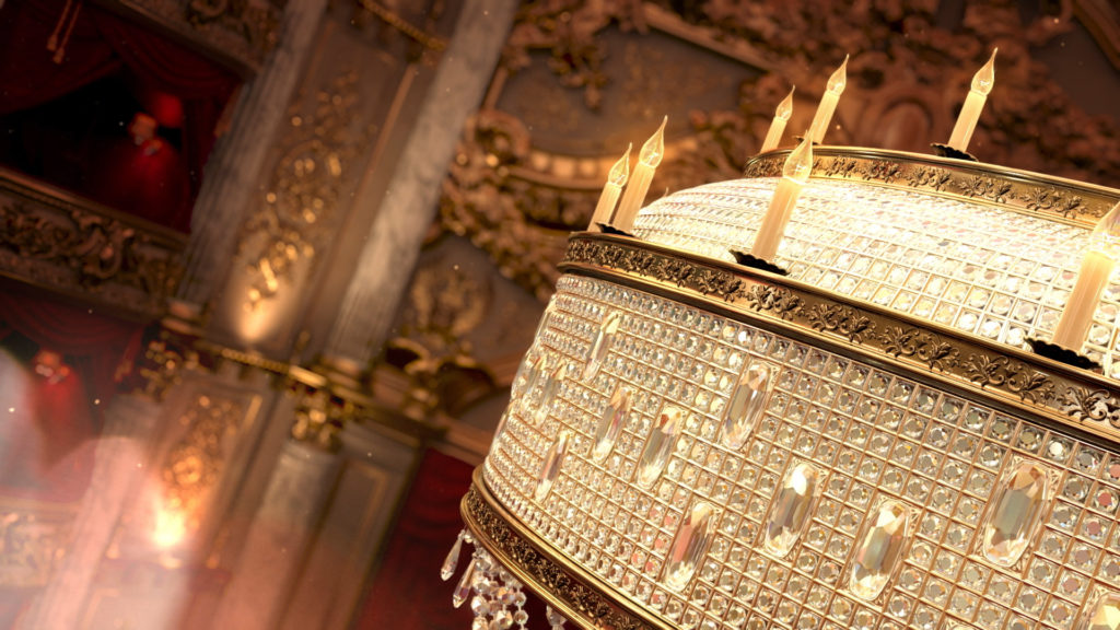
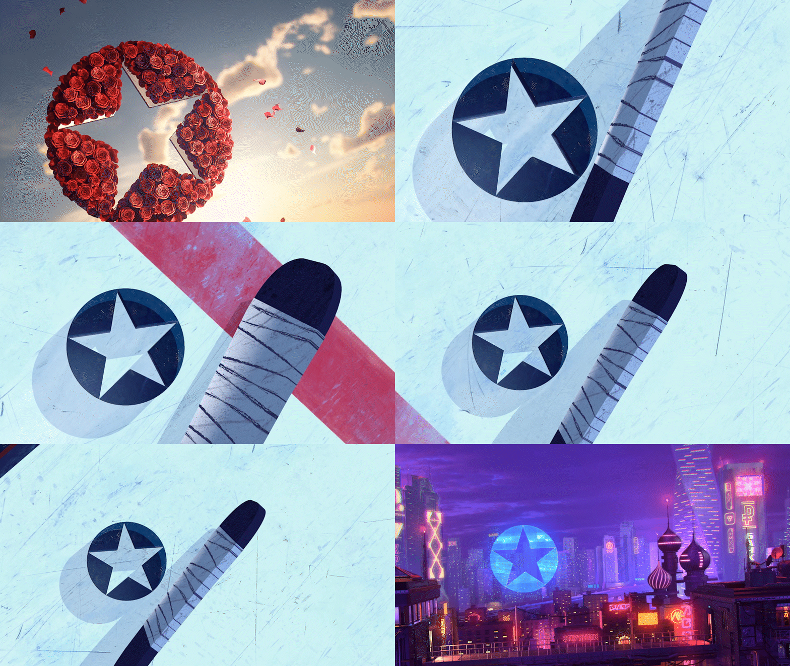
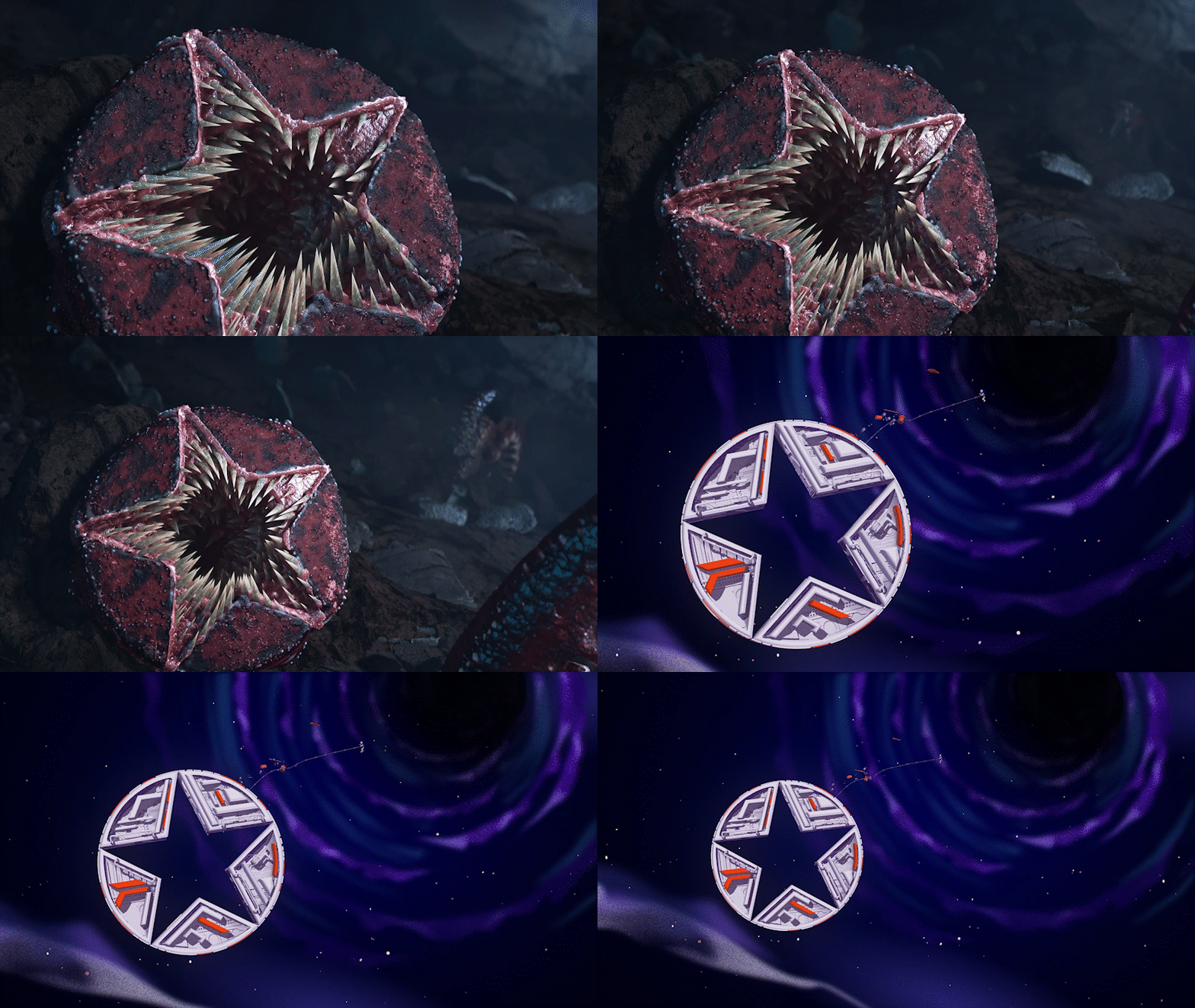
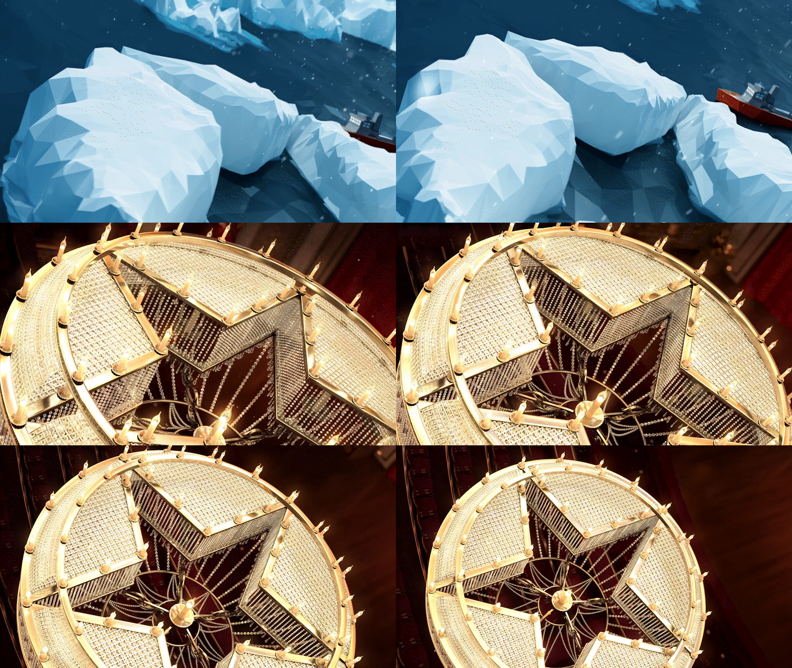
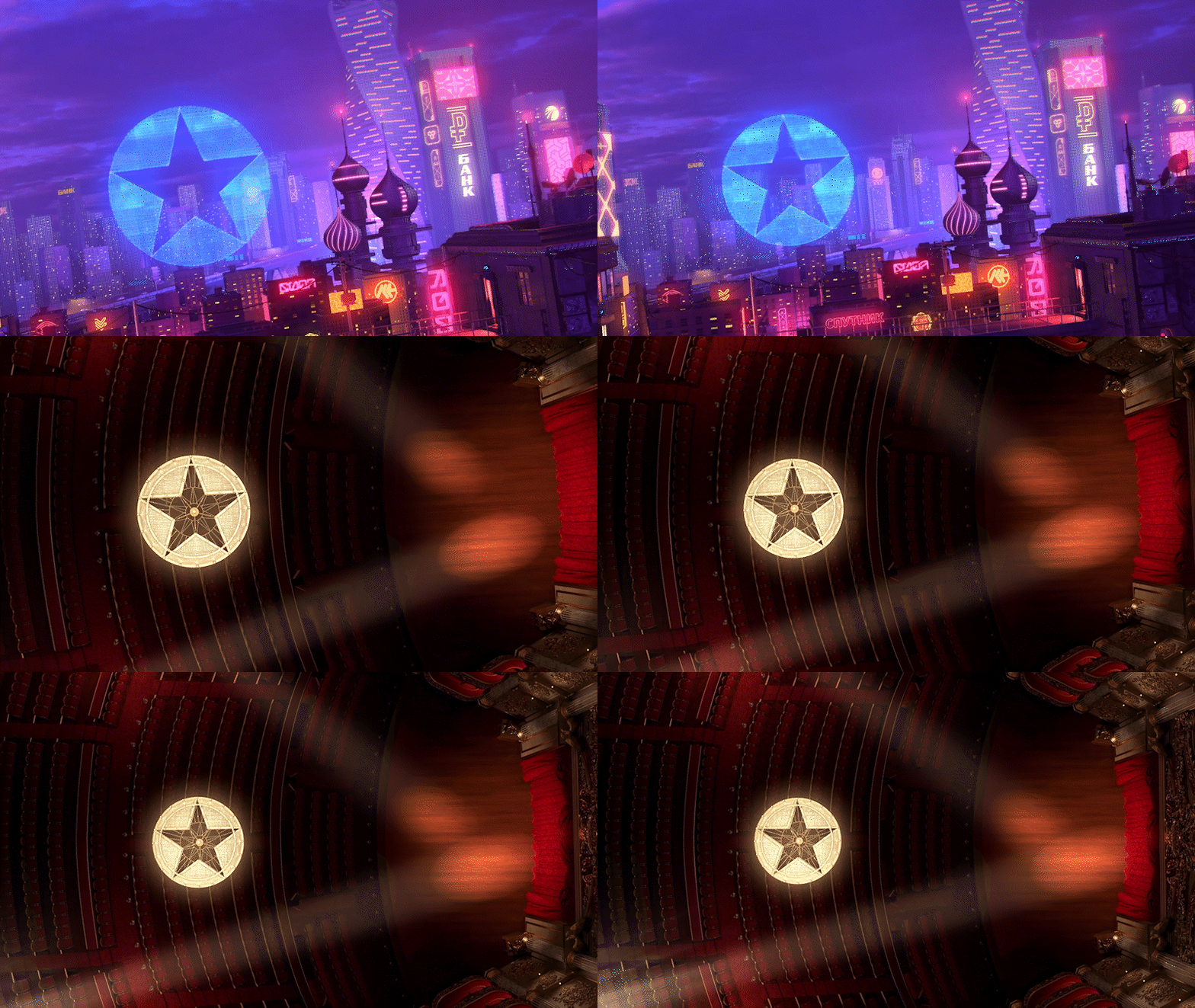
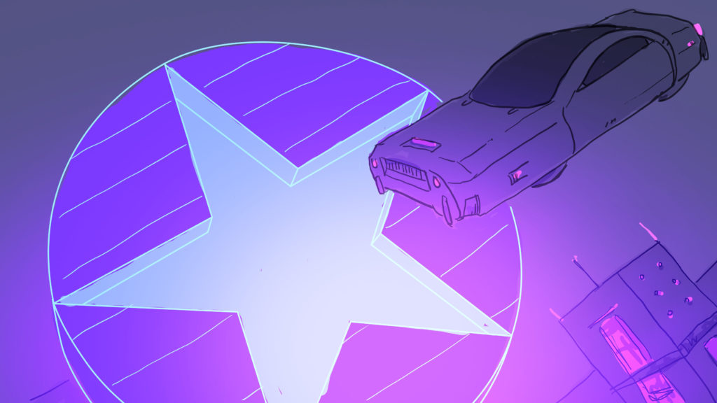
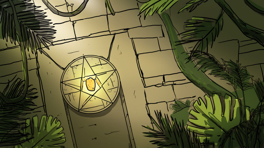
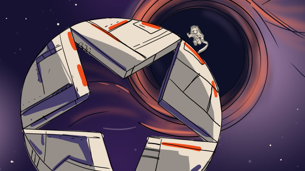
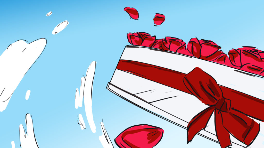
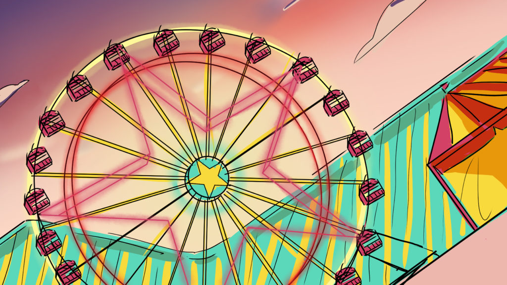
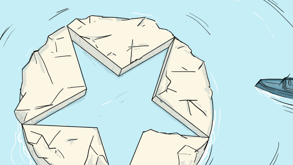
The agency imagined a single camera movement around the common symbol of the four brands: the star. The idents stage the star in a succession of cinematic universes, each with its own graphic style. A sound design work differentiates each universe, which is completed by a different musical theme for each channel.
SEASONAL IDENTS
CONTEXT
The public service’s youth channel intends to celebrate the highlights of its year with an original event package.
CHALLENGE
Create a compelling narrative universe that brings children and parents together.
SOLUTION
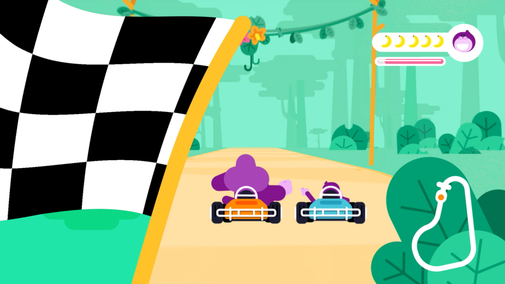
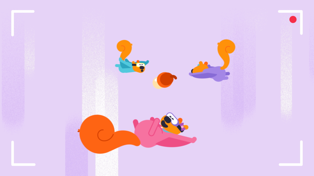
In the same vein as the TV channel’s Christmas packaging, the public discovers twelve new animal families, displayed in a moment of complicity between a child and a parent.





CHRONICLES OF THE SUN
CONTEXT
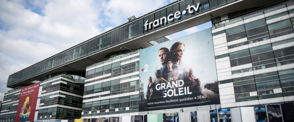
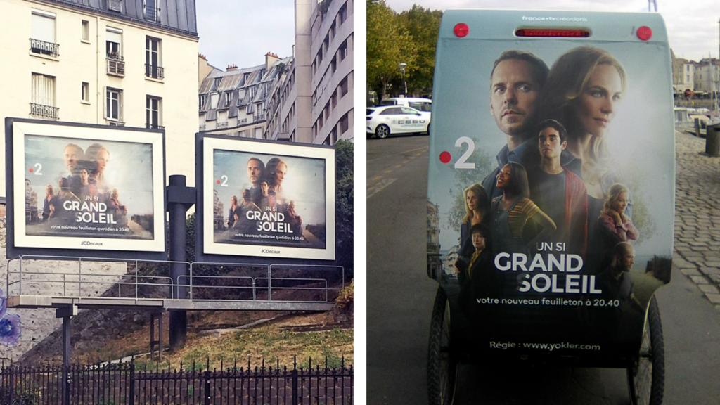
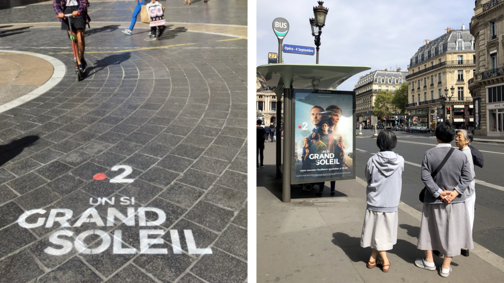
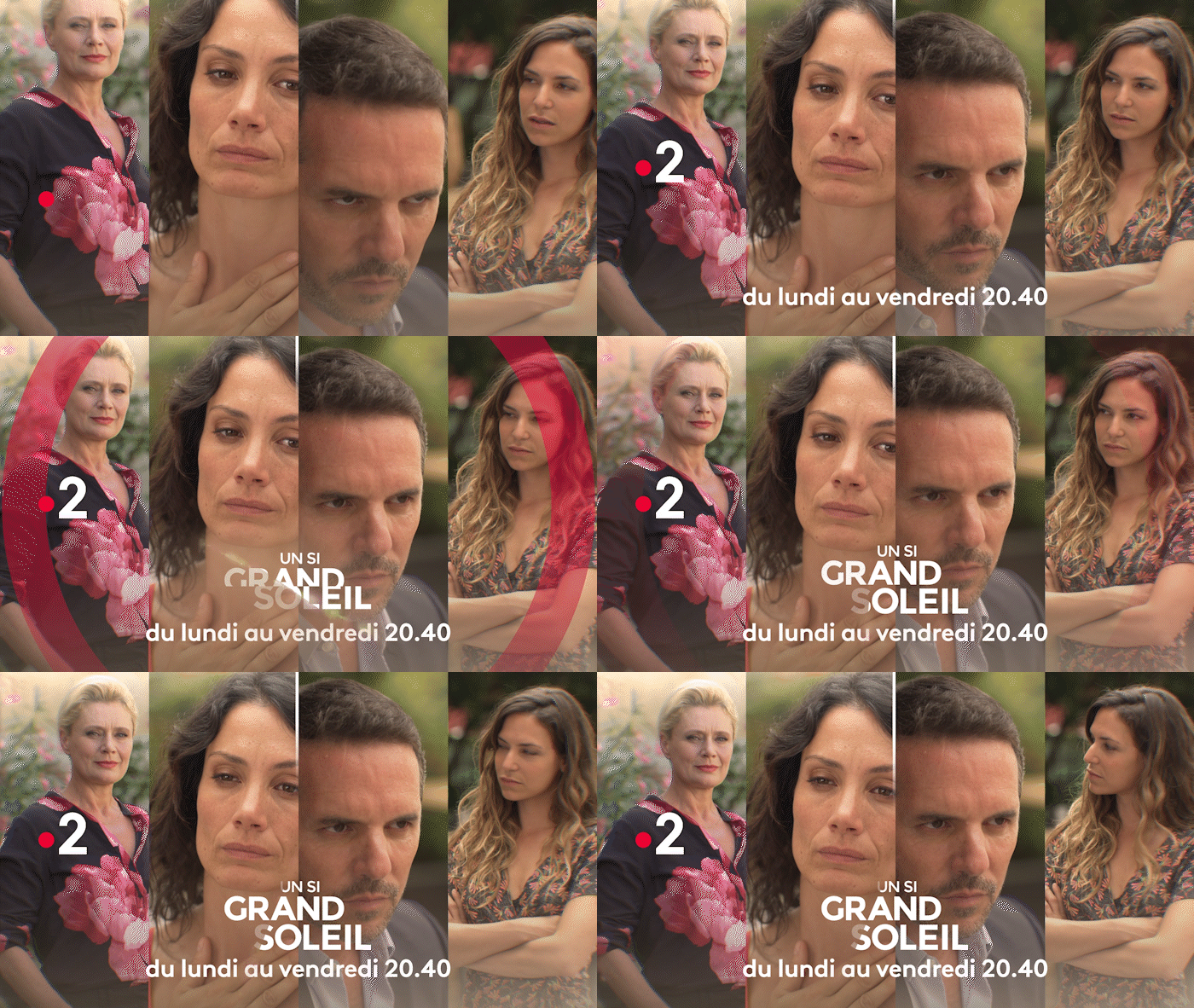
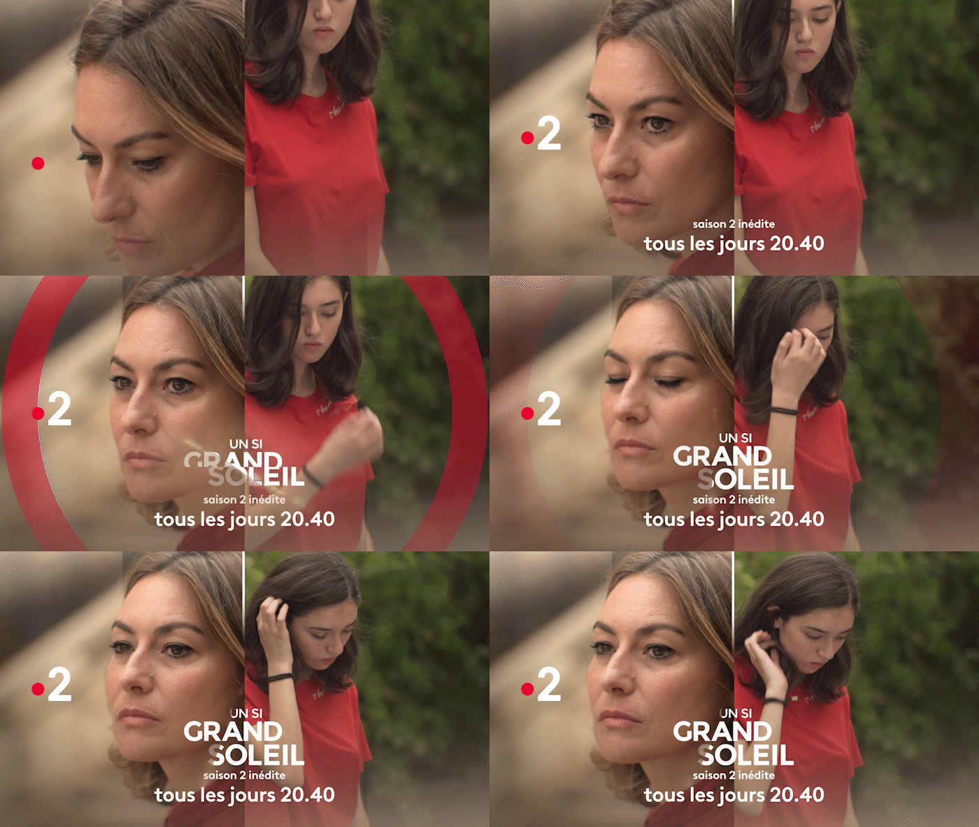
While TF1 launches “Demain nous appartient” to compete with “Plus belle la vie” on France 3 in prime time access, France 2 launches in turn its own daily soap.
CHALLENGE
Conceive a visual identity and credits that shape the fundamentals of a full-fledged brand.
SOLUTION
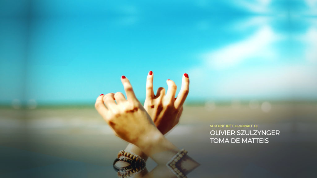
For the opening credits of this choral fiction, the agency values emotion and feeling by stitching together a mosaic of subjective shots, an instantaneous and spontaneous memory of daily life. Evoking the breakage as much as the brilliance of a jewel, this concept makes up a graphic display that enhances the discontinuity of life, while bringing into focus the idea of togetherness.
LIGHT AS A CHRISTMAS BUBBLE
CONTEXT
Every year, France 2 gathers its viewers around its Christmas packaging, a moment of communion between the channel and its audiences.
CHALLENGE
Re-enchant the lives of French people at the beginning of winter and share exceptional moments with viewers.
SOLUTION
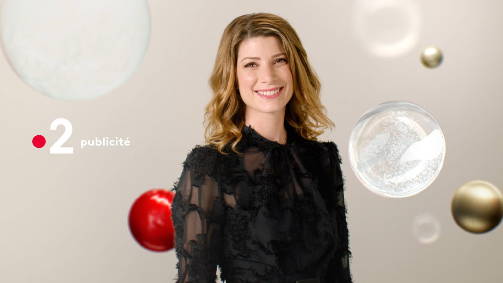
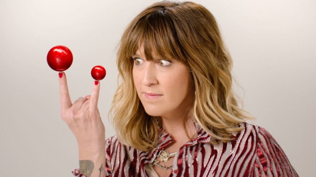
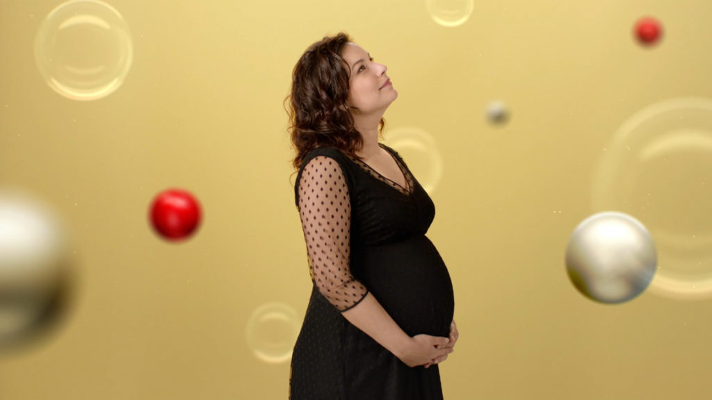
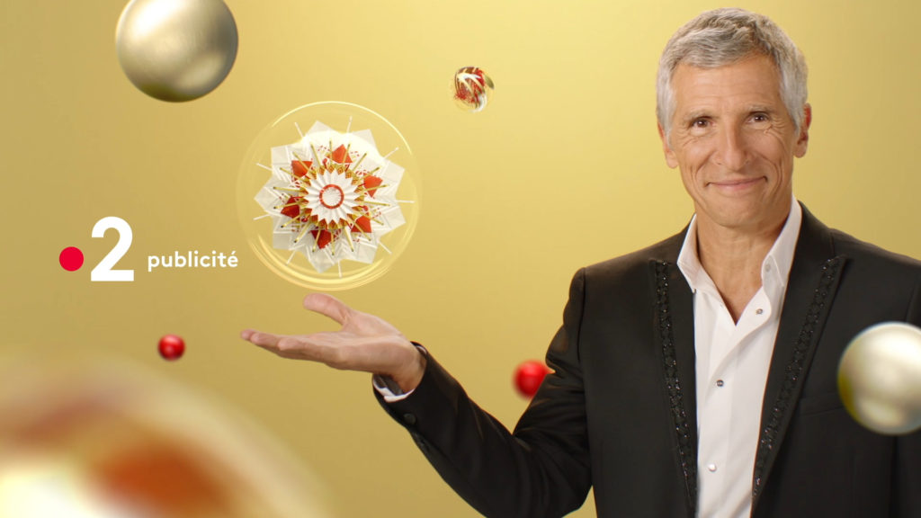
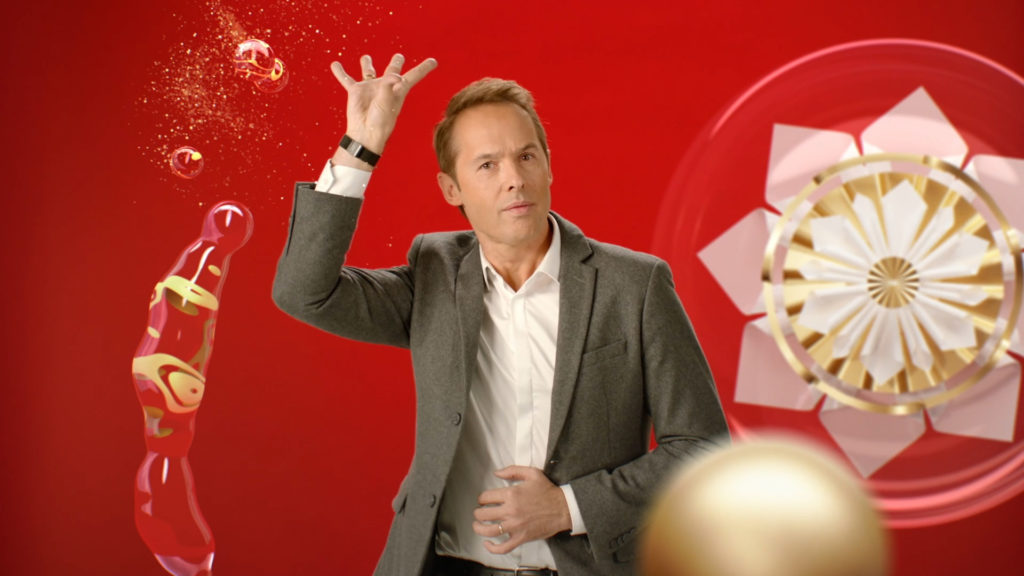
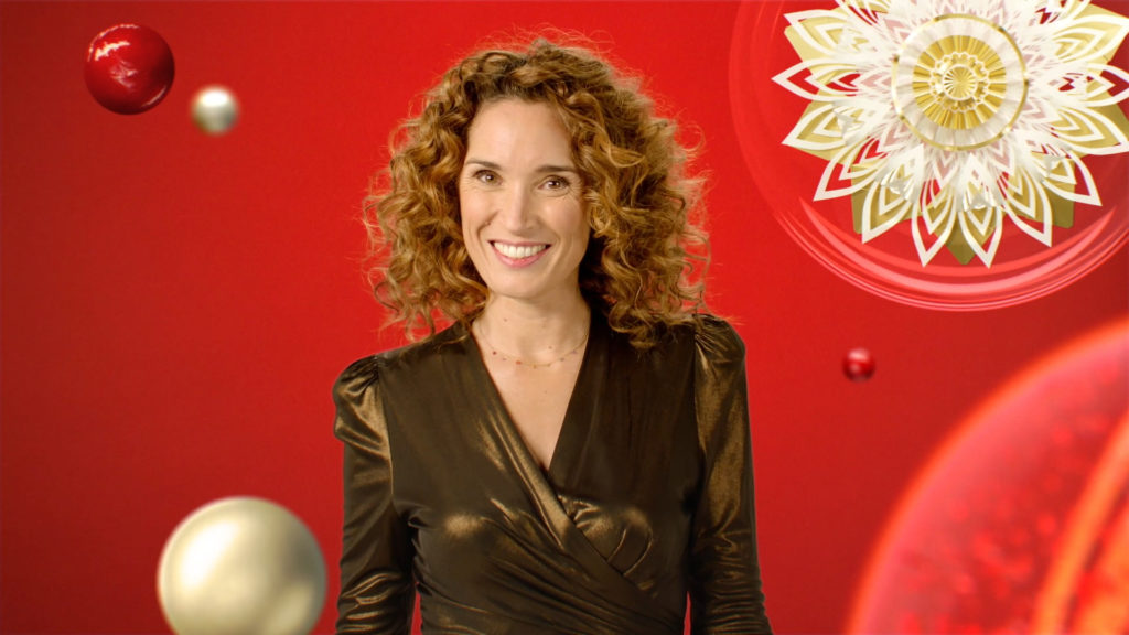
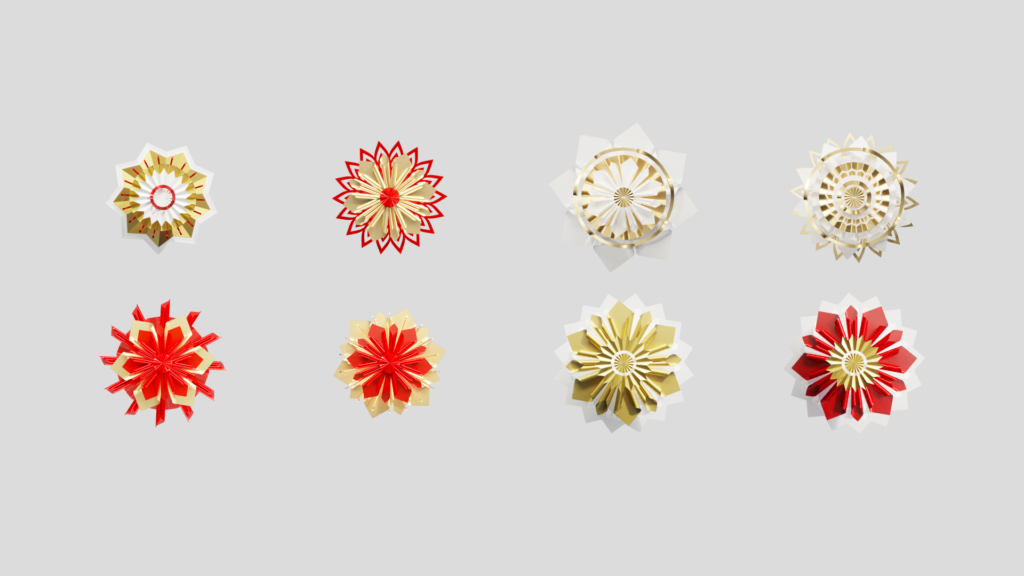
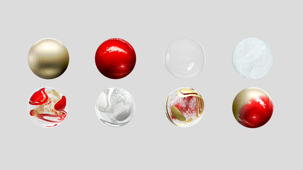
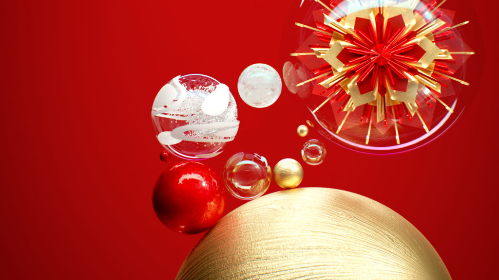
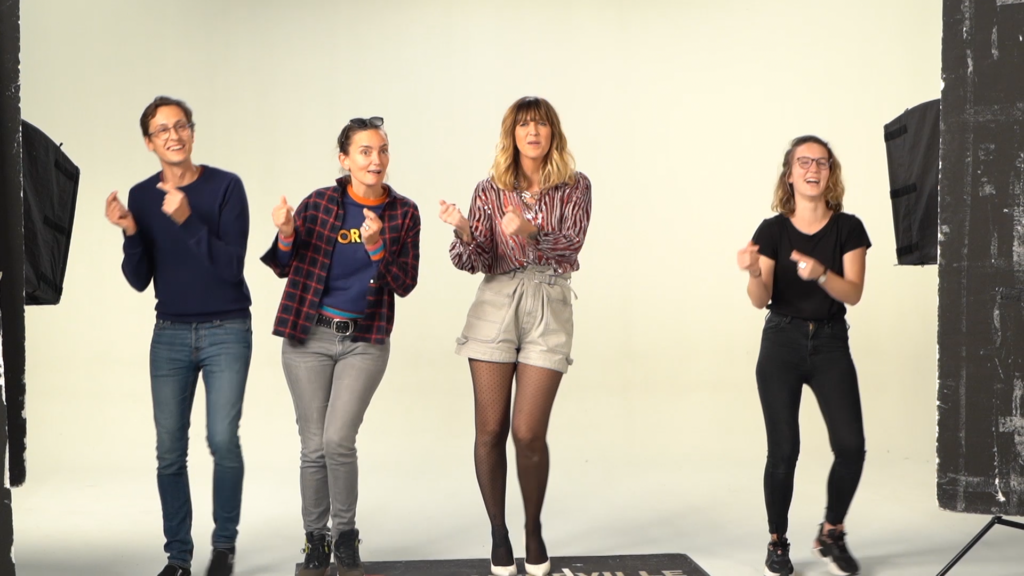
As France 2 wished to stage the media’s faces, we imagined an interactive and modular device, in which the hosts present their wishes to the viewers while having fun with suspended bubbles in which appear the rosettes.
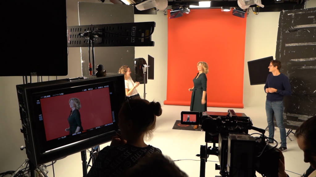
The channel’s hosts joined the game to present their holiday wishes while having fun with bubbles in suspension in which the rosettes appear. The production schedule included shooting with 50 different TV personalities and the delivery of no less than 200 assets, including five 40-second clips.
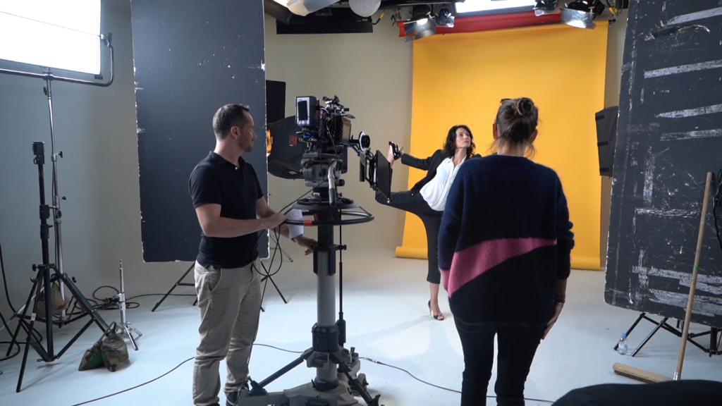
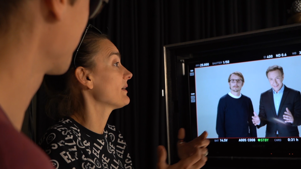
PROCESS & BEHIND THE SCENES
TRAUMA
CONTEXT
As a thriller channel, 13ème Rue launches its first original French TV show.
CHALLENGE
Highlight the atmosphere of a TV show through its opening credits.
SOLUTION
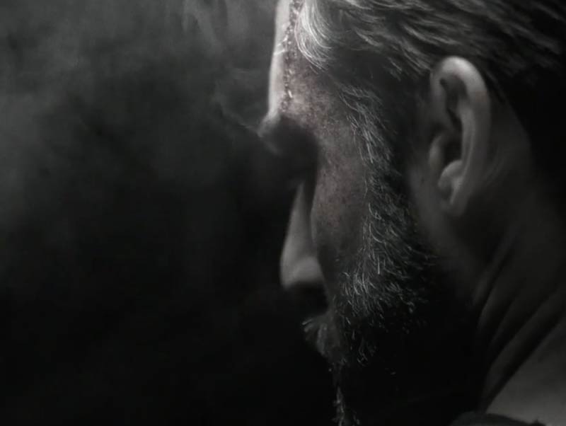
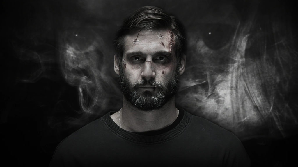
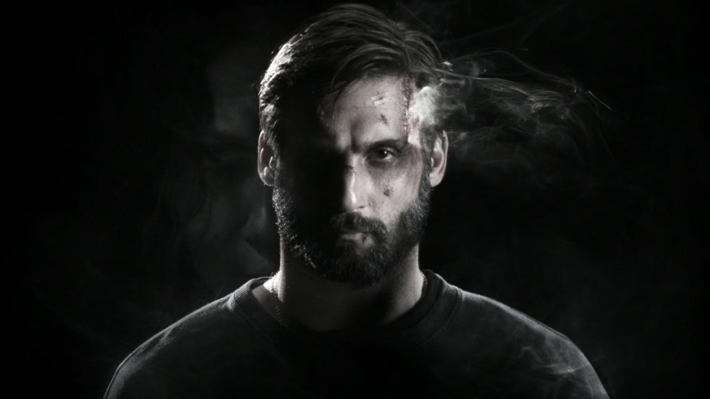
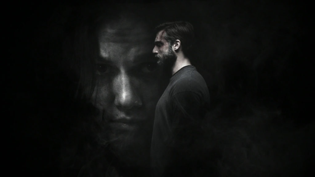
Designed as a mirror game, the opening credits of the series bring to light the faces of the two protagonists, while revealing their dark side. The scenes take place in a blackness textured by the smoke of a firearm. This smoke shapes the compositions, revealing in turn some parts of the image. It dictates the rhythm and creates tension.
TF1 SERIES FILMS
CONTEXT
In order to enhance the offering of the channel HD1, the TF1 group has opted for a new name: TF1 Séries Films.
CHALLENGE
Reinforce the promise of a fiction-focused television channel through its packaging.
SOLUTION
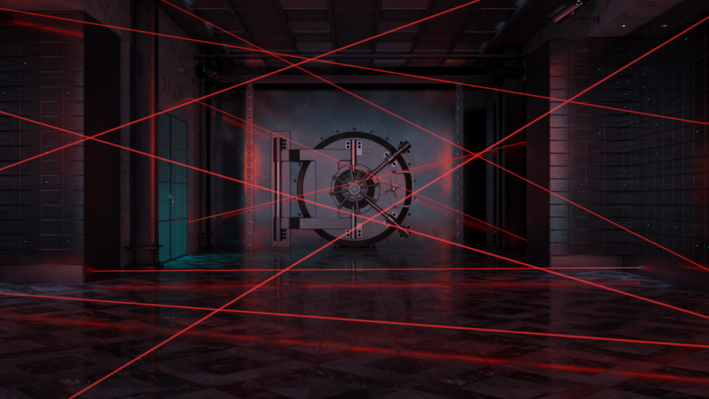
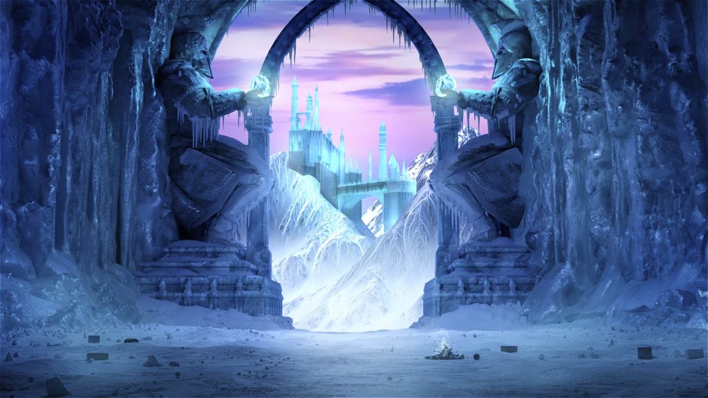
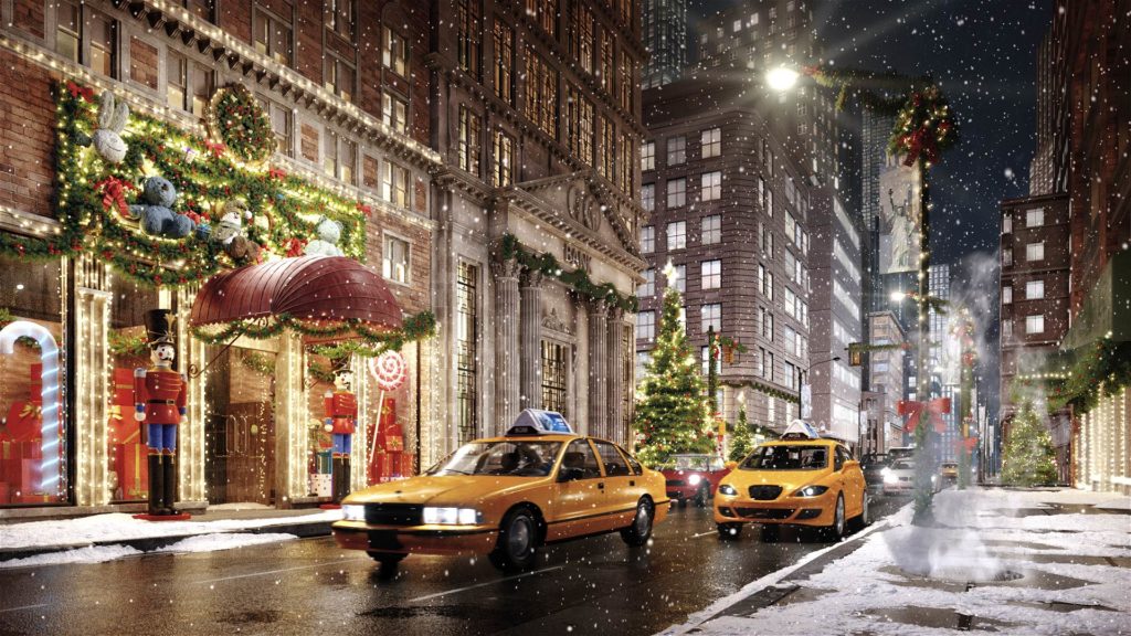
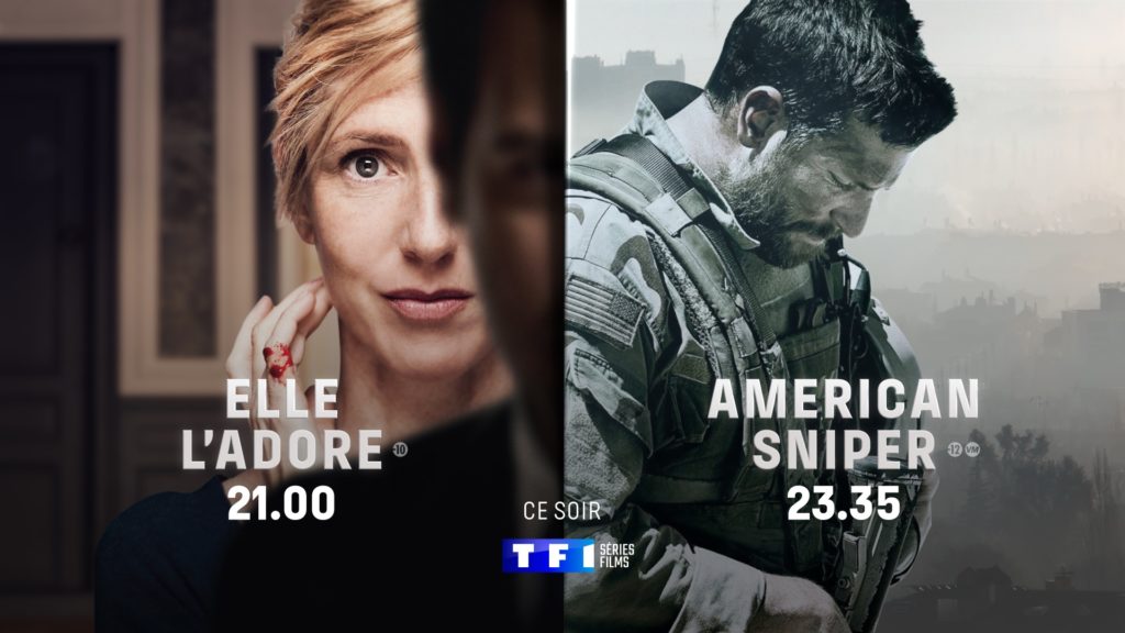
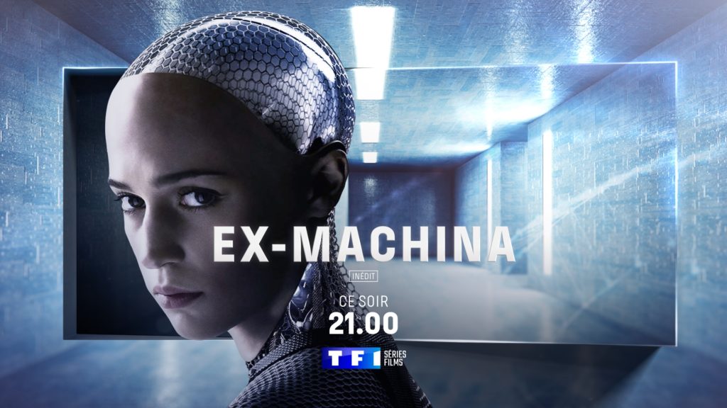
We came up with a logo that plays shapes off of one another in a way that unequivocally links the brand to its parent channel while affirming its separateness. This positioning led us to create animated visual content where blocks and frames pivot around an axis in a choreography of reflected light and changing perspectives. We also designed ad breaks, developing a concept that can be recreated in an infinite number of versions. Using iconography from the different genres broadcast on the channel, we showed the beginning and end of a story, letting the viewer imagine the plot line between the two.
AD JINGLE
BROADCAST DESIGN
GULLI
CONTEXT
Following the acquisition of France Télévisions’ shares by its partner Lagardère Active, a new era is beginning for France’s leading channel for young people.
CHALLENGE
Approach the renewal of the children’s channel’s look and feel in order to increase its appeal to children and parents alike.
SOLUTION
The Gulli brand is all about experimenting and having fun. We developed a set of words and phrases to solidly anchor the brand’s messages of growth, collectivity, and diversification.
AD JINGLES &
AUTO-PROMOTION
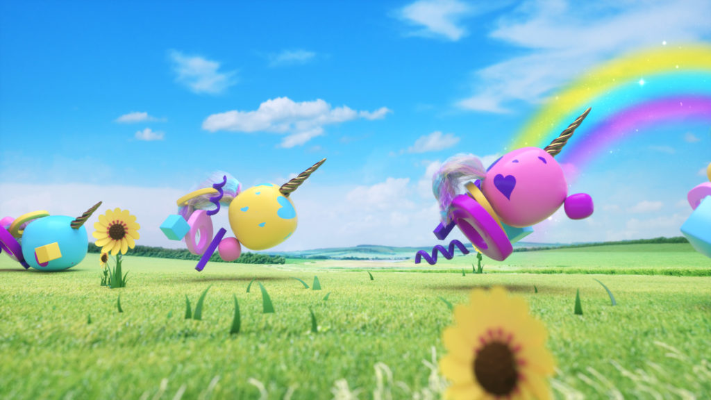
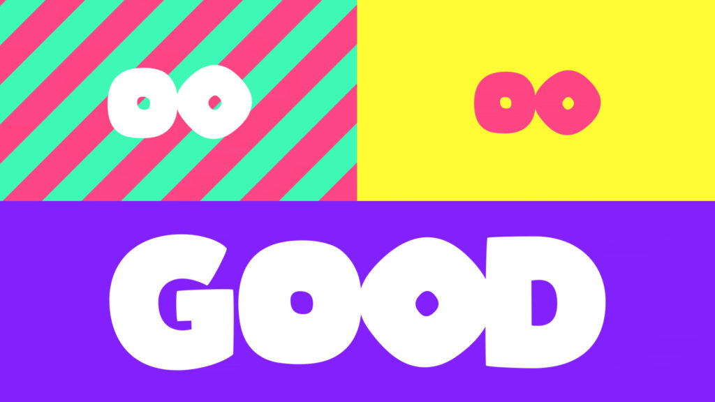
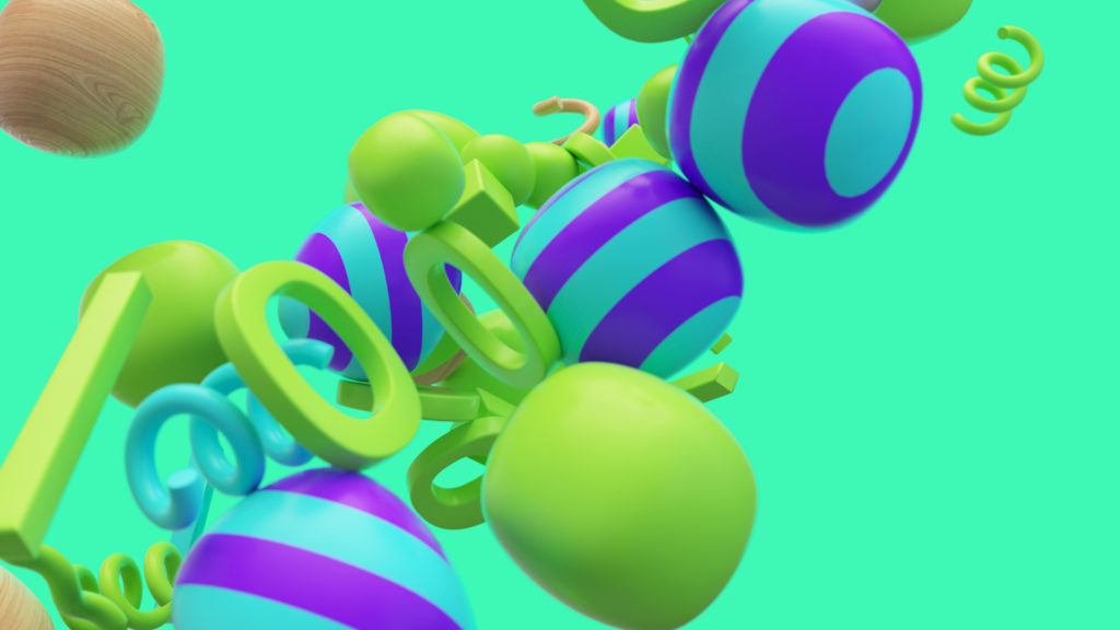
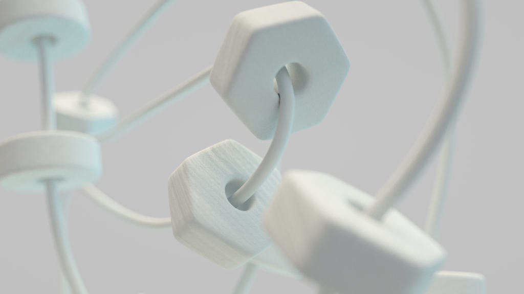
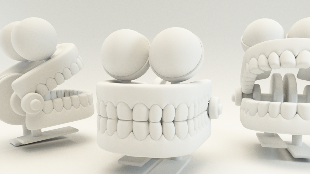
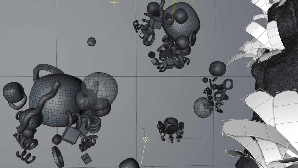
We broke the logo down, giving the shapes and colors space to play, run, jump, and bounce. Each element of the logo is a character and, together, they explore the land of make believe.
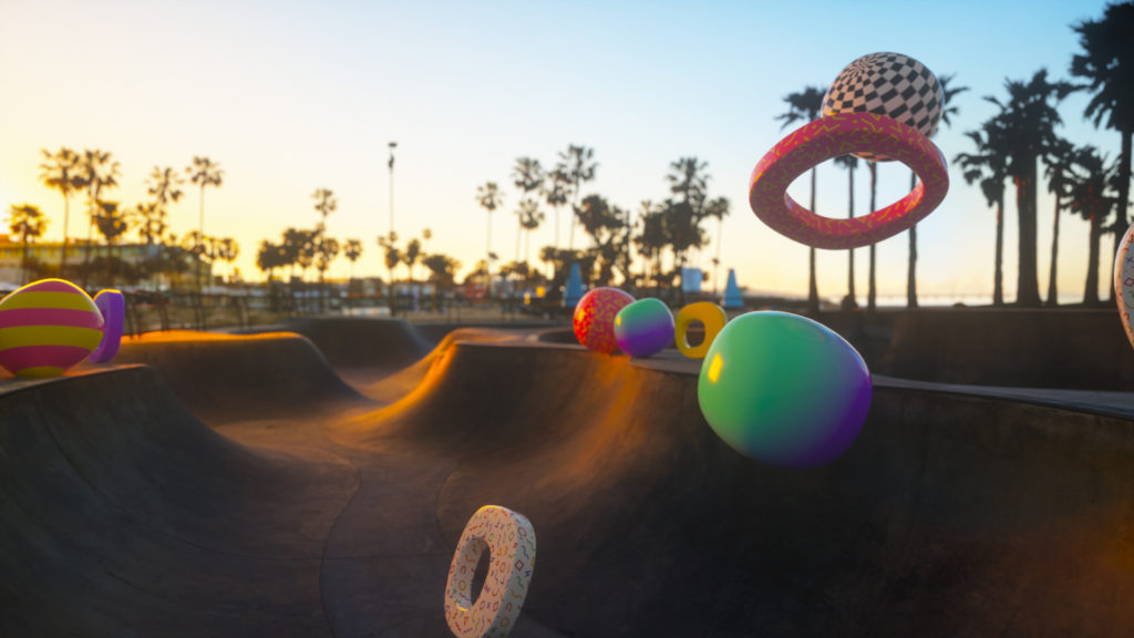
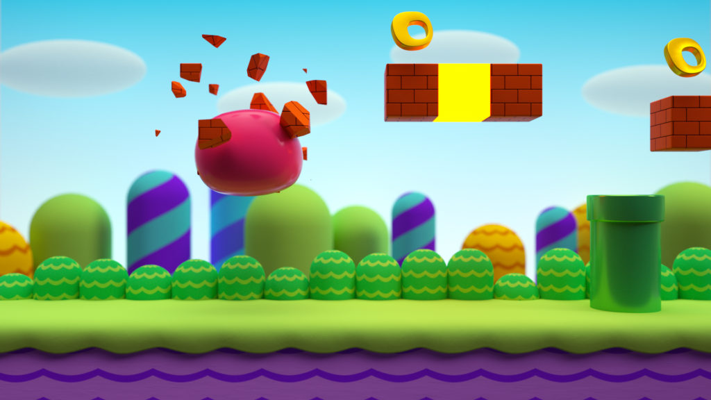
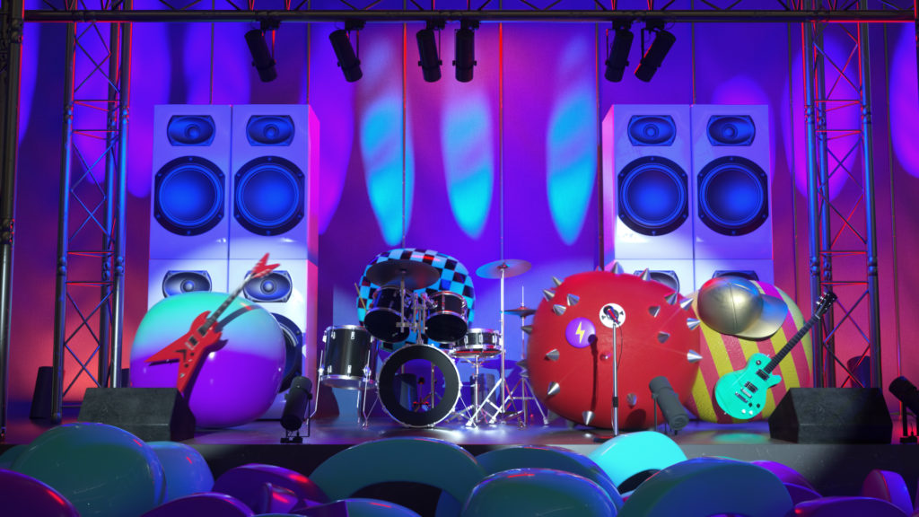
Our visual content blended flat and 3D design to surprise, delight, and elicit giggles!
PROCESS
GULLI PRIME
CONTEXT
In order to win over adult audiences in the evening, Gulli is launching a new evening time slot.
CHALLENGE
Create a breach in the on-air continuum in order to reach a new audience while remaining faithful to the brand’s graphic fundamentals.
SOLUTION
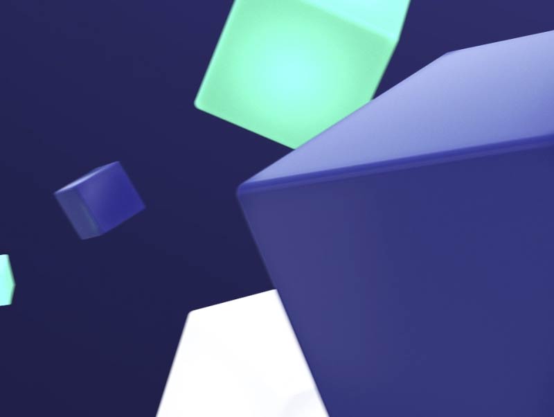
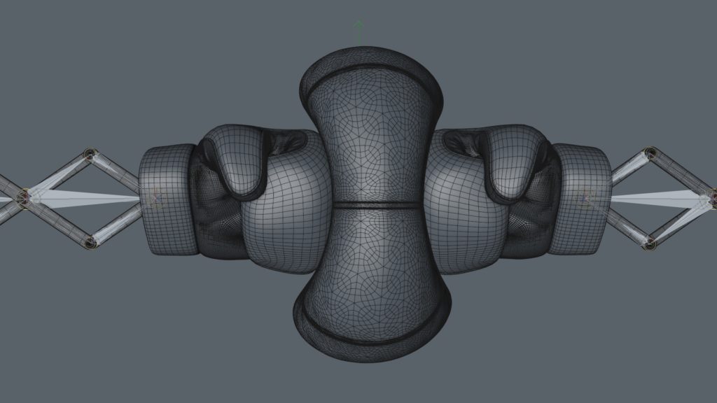
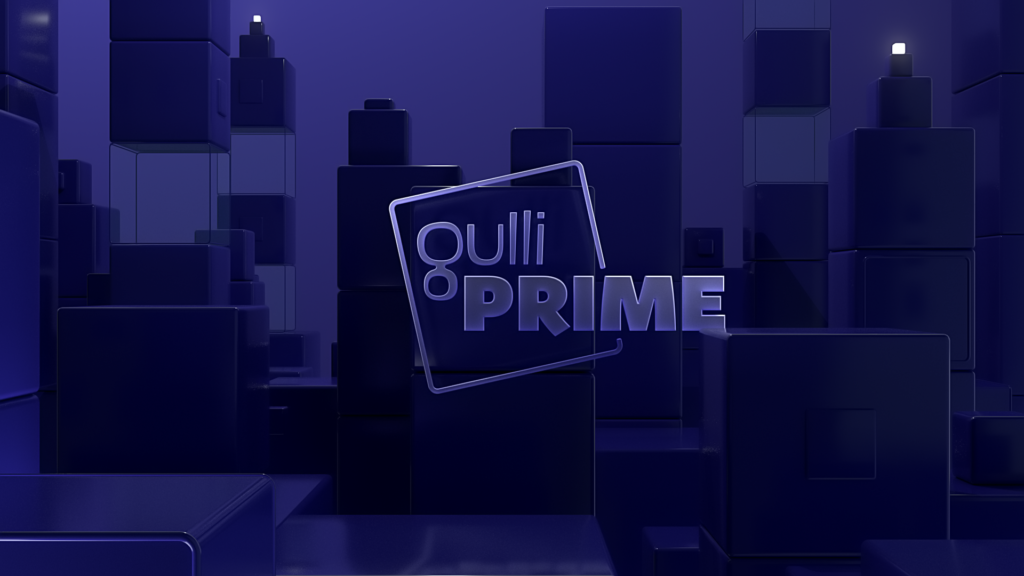
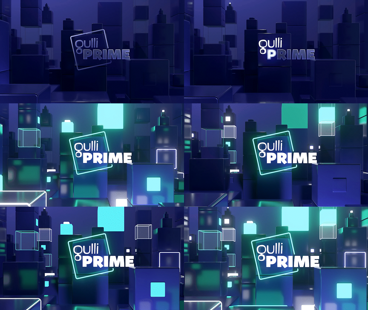
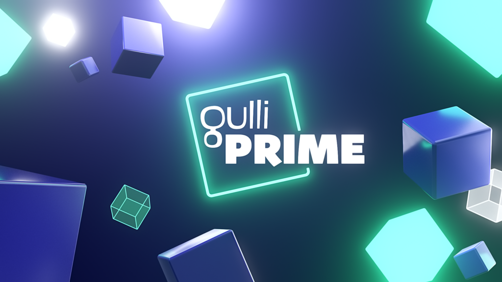
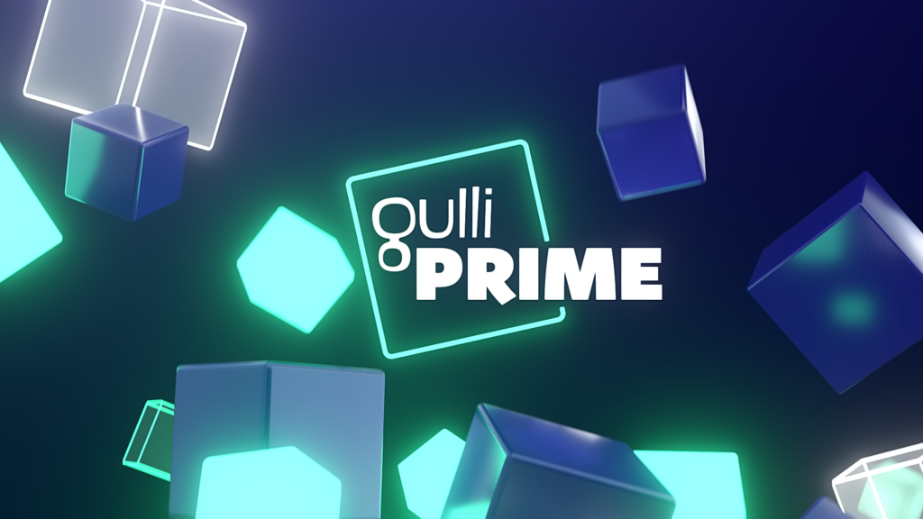
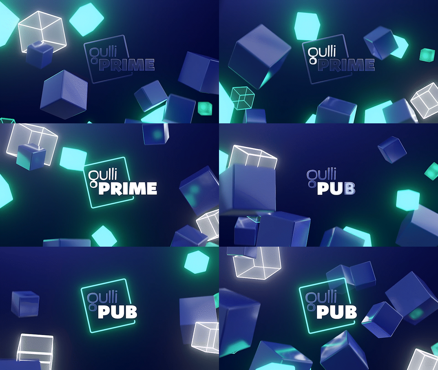
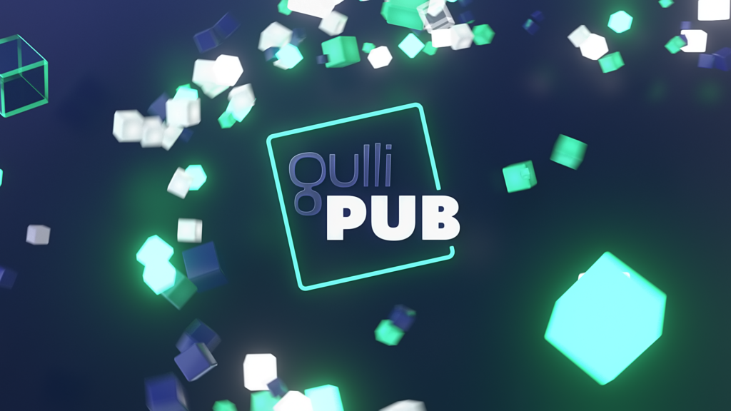
We created a feel-good environment where the neon lighting creates a bridge between the lights of the night and the good mood that is the hallmark of Gulli. Our proposal uses the square shape and green color of the Gulli logo, which is integrated into a dynamic sequence of shots featuring a device of cubes that interact together. They collide and bounce around, reflecting the entertaining and cheerful offerings of the new time slot’s various programs.
AD JINGLES &
AUTO-PROMOTION
BROADCAST DESIGN
NO SIGNAL
CONTEXT
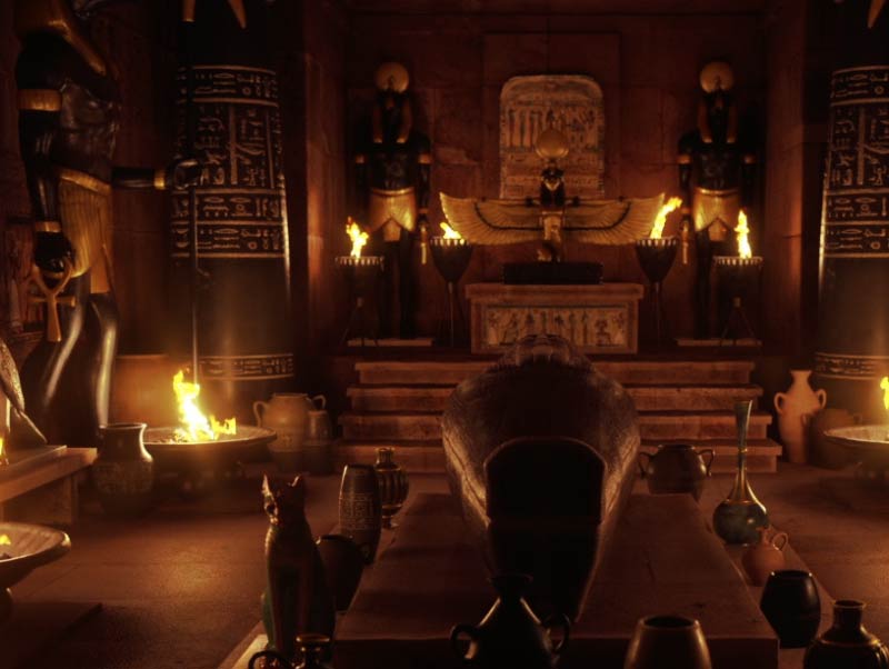
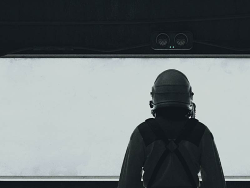
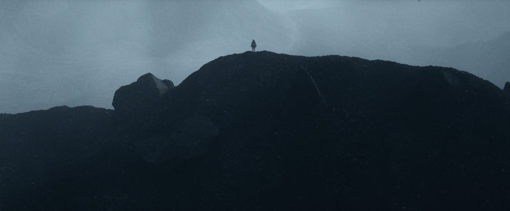
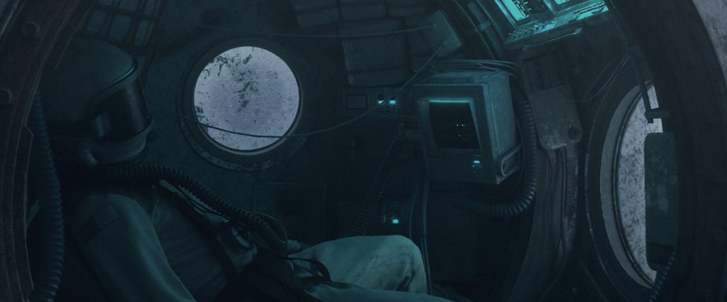
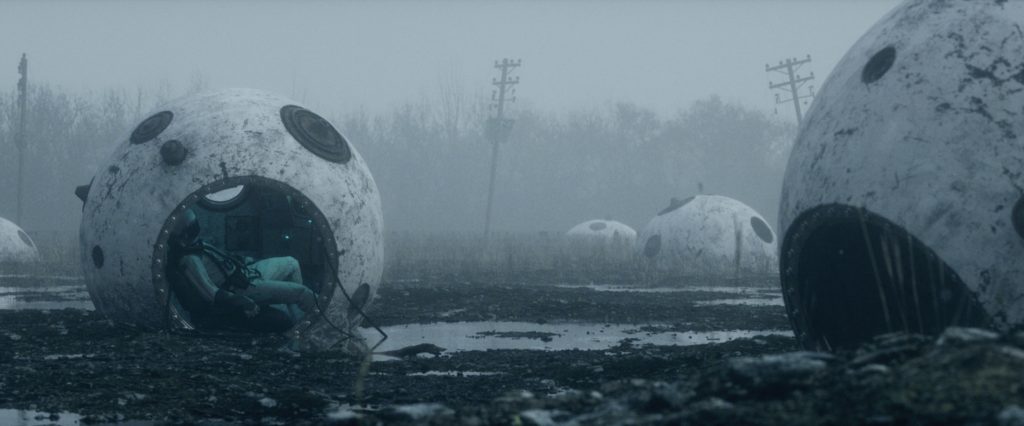
This experimental project, conceived as a generic fiction, is a tribute to the film 2001, A Space Odyssey, by Stanley Kubrick.
CHALLENGE
Assist one of the agency’s artistic directors in a project that leads our creative studio’s team to other creative territories.
SOLUTION
Freelancer since 2019 and now globally renowned, the artist Friendly Robot pushes the limits of 3D realism. Experimenting with a new form of writing, he combines aesthetic and technical mastery for an epic rendering that seduces both fiction producers and brands looking for exceptional graphic territories.






PROCESSUS


CHRISTMAS ROSES
CONTEXT
Every year, France 2 gathers its viewers around its Christmas packaging, a moment of communion between the channel and its audiences.
CHALLENGE
Re-enchant the lives of French people at the beginning of winter and share exceptional moments with viewers.
SOLUTION
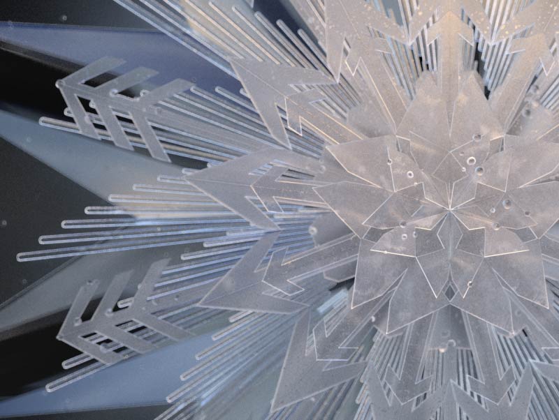
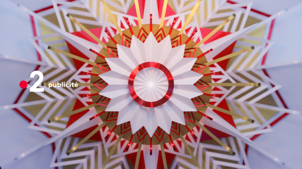
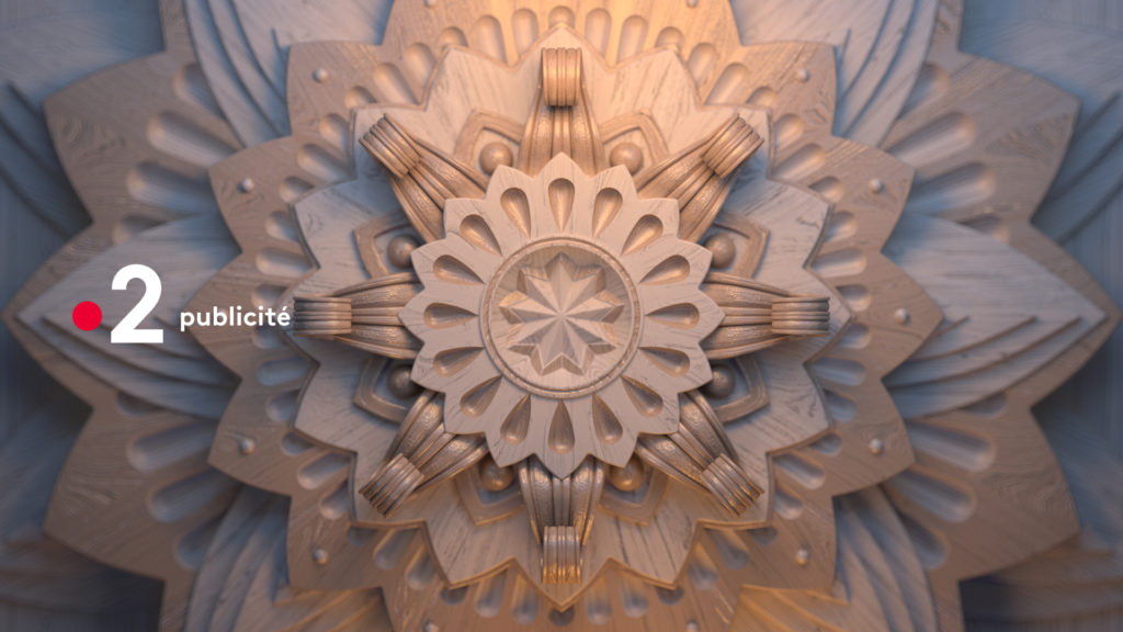
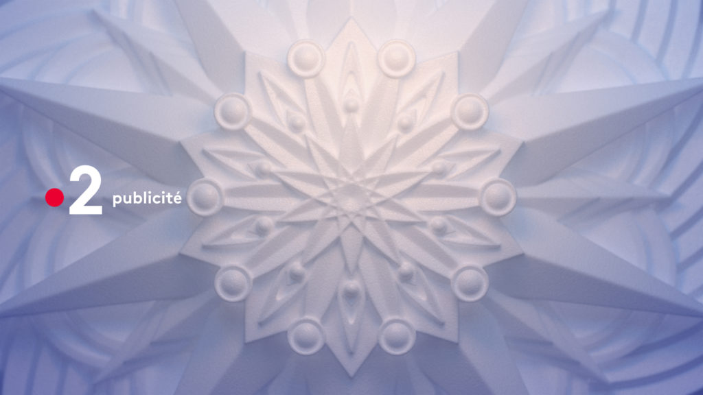
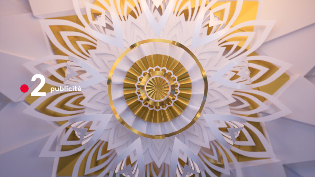
We designed a system that fits into the new channel’s skin, injecting it with a premium, fairy-tale color. Starting from the point, we imagined a snowflake with a family of rosettes. This graphic embellishment of the channel led us to explore three different materials: wood, paper and snow.
The warmth of the candle holder in cut-out paper, the fragility of the ice crystals and the softness of the finely cut pieces of wood are but a few of the ambiances that reference the attention we put into the Christmas preparations.

PROCESS
