MÉDIACLUB'ELLES
Visual Identity • 2D Motion •
MCE
MÉDIACLUB'ELLES
CONTEXT
médiaClub’Elles is a network of professionals promoting parity and gender equality in the media sector. As an active member of the organisation, 17mars offered to modernise its identity.
CHALLENGE
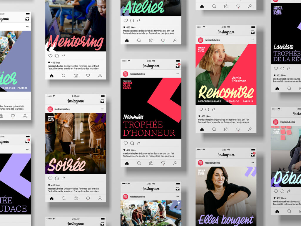
Strengthen the statutory dimension of the organisation and increase its visibility. Create a genuine brand, designing a system that can be easily deployed on social networks and communication media.
SOLUTION
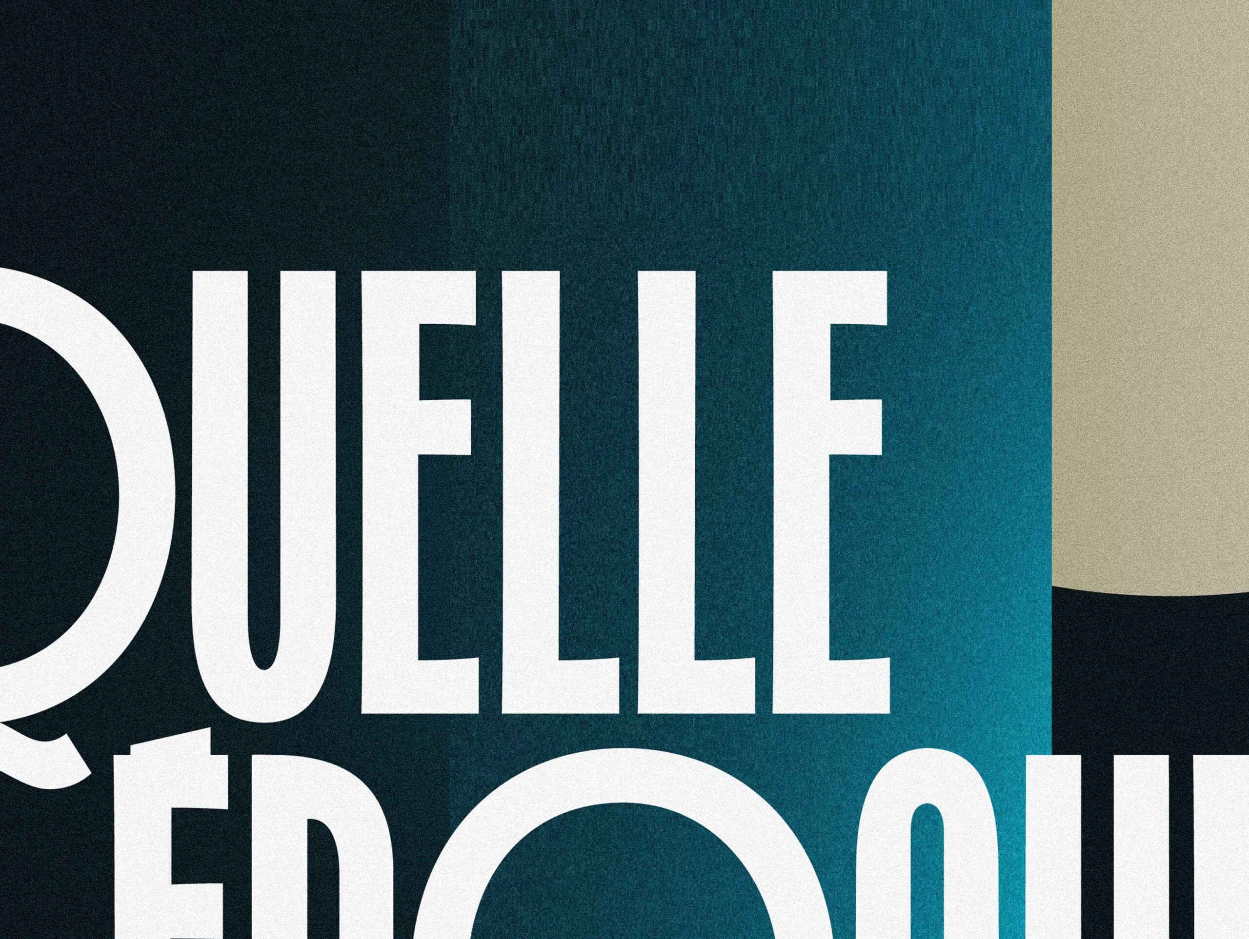
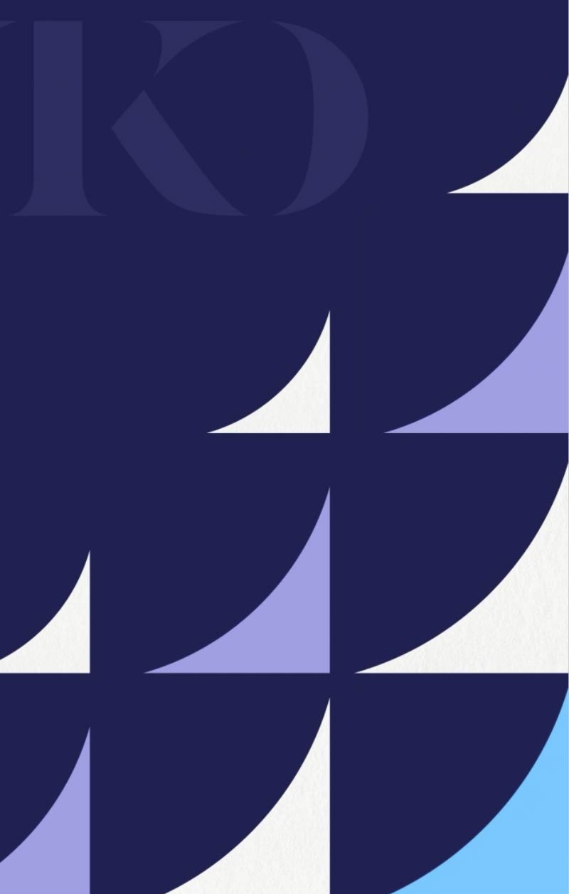
We have kept the idea of inverted commas, distinctive elements of the existing identity, referring to speeches. Keystones of the logo’s reveal dynamic, they are set at the heart of a more massive typographic block, capable of effectively labelling content and media.
The typefaces chosen for the project, Chaumont Script and Apfel Grotesk, complement each other and help convey the positive energy of the organisation, amplified by a palette of bright, contrasting colours.
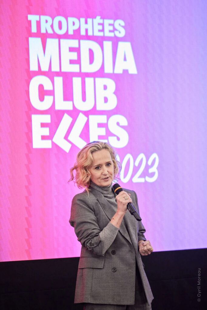
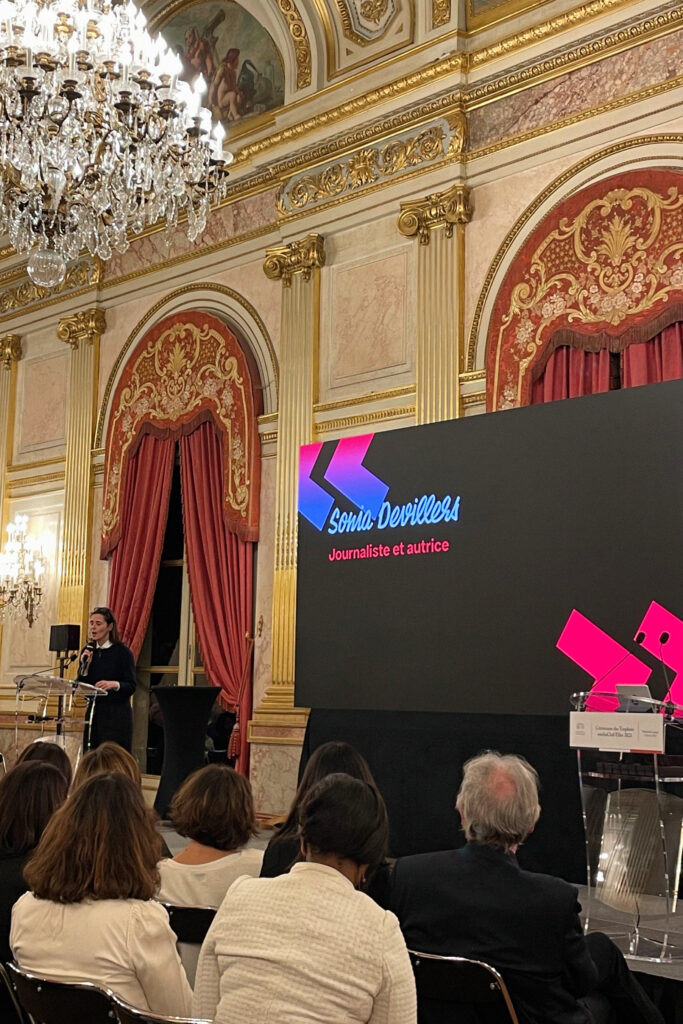
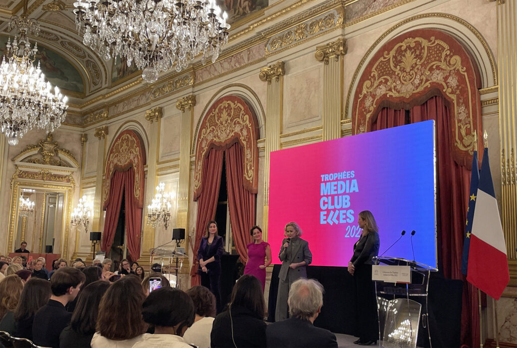
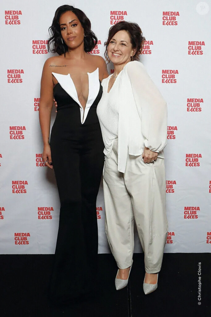
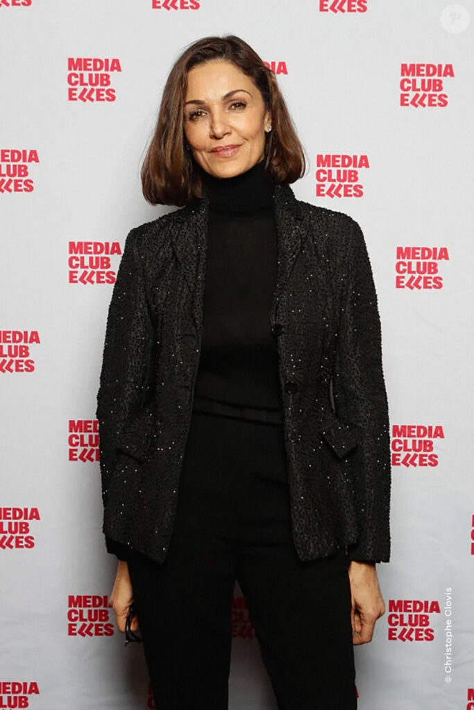
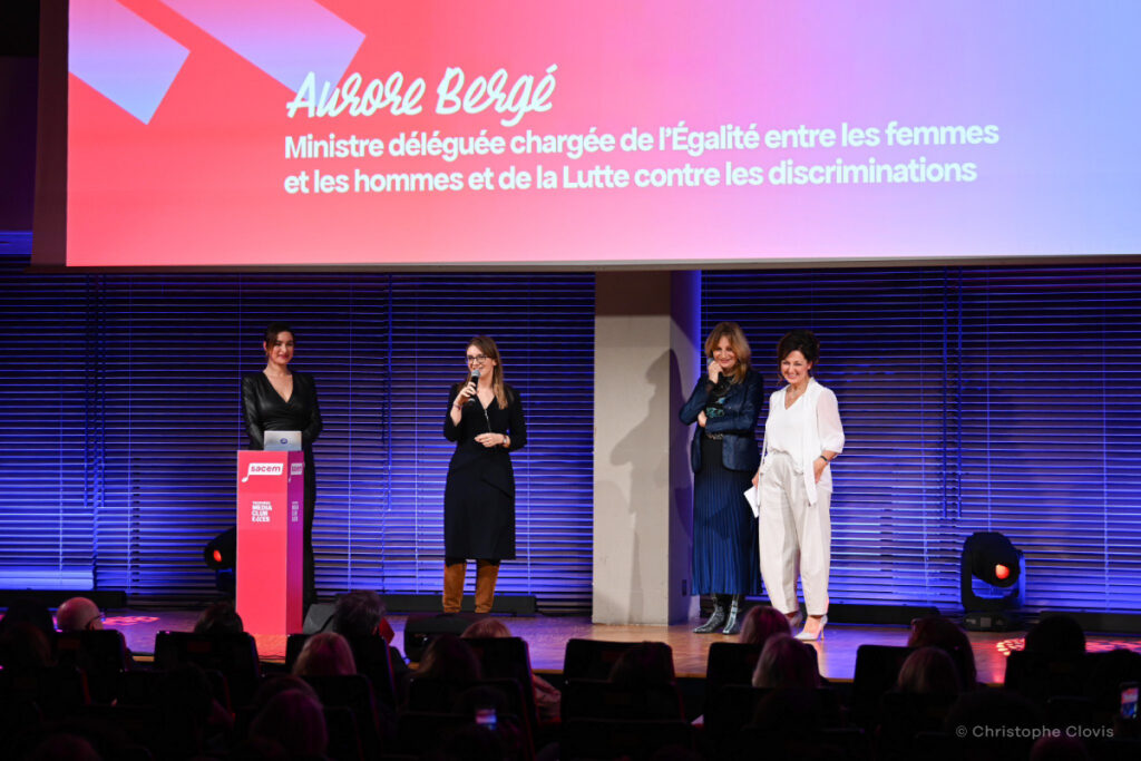
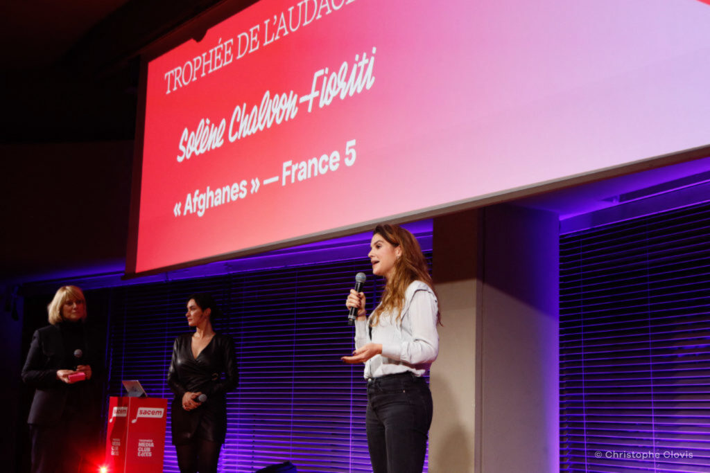
The extent of this identity is fully displayed during of the annual médiaClub’elles Awards ceremony.
TROPHÉES MÉDIACLUB’ELLES