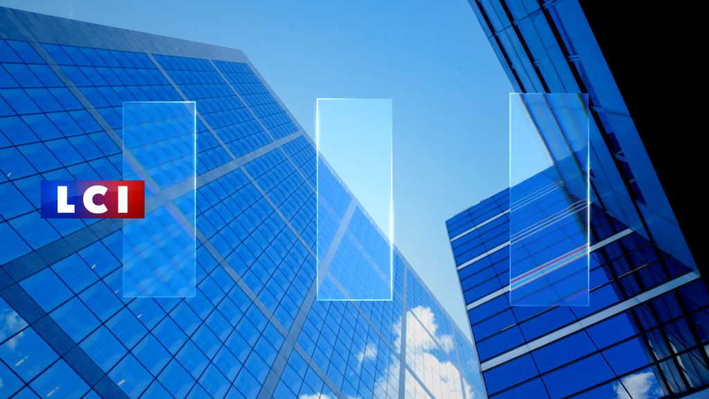
LCI
Brand Strategy • Visual Identity • 2D Motion • 3D Motion • Shooting •
TF1
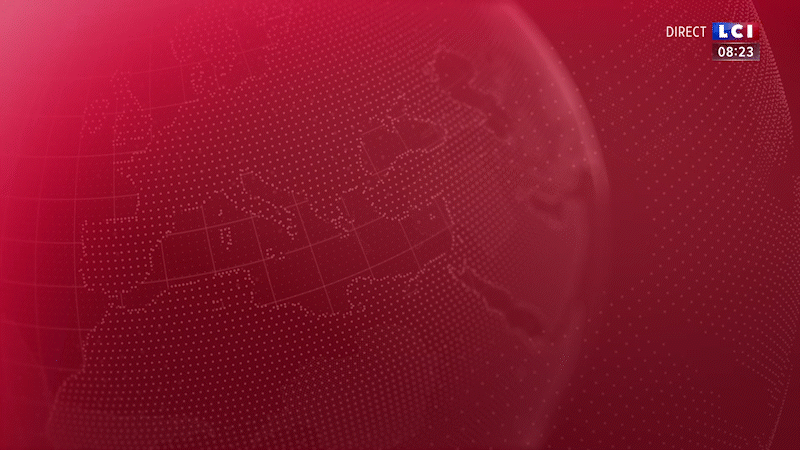
LCI
CONTEXT
Faced with an increasingly challenged news market, the TF1 group’s channel is reshaping its offering in the run-up to the 2022 presidential elections.
CHALLENGE
Make a 24-hour news channel unique in an era where immediacy prevails.
SOLUTION
Let’s give time back to the news! The graphic system designed for LCI’s new look is based on the three main stages of the news process: listening, analysis and sharing. Three pillars, like the three letters of the LCI logo. In their most simple design expression, these three pillars represent a loader referring to the processing of information and symbolizing the controlled pulse of the airwaves. The third pillar of the loader is a visual marker, a beacon structuring the system of presentation and the hierarchy of information.
In their simplest expression, these three pillars represent a loader symbolising the controlled pulse of the antenna.
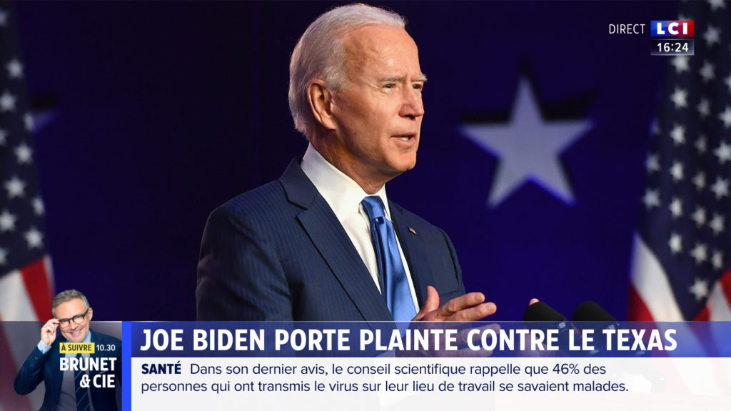
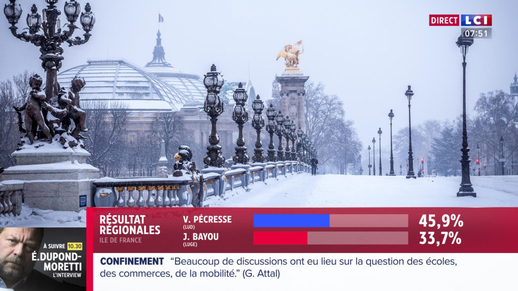
The third pillar of the loader is a visual marker, a tag structuring the information in its hierarchy. This tag lives alone and comes in three colours to indicate the nature of the information: red for urgent news (breaking news), blue for classic news (news) and white for long formats (documentaries, special programming).
The LCI loader and its graphic tags are also found in the promo elements, the ad breaks, the interstitials and at the opening of each return to the programme.


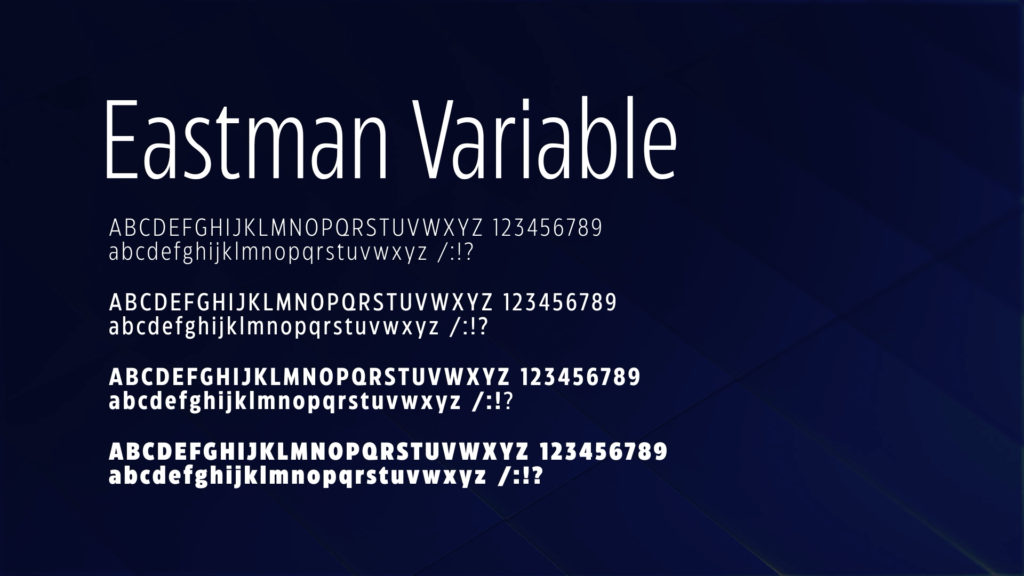
Finally, the channel chooses to adopt two new fonts: Eastman Variable and Proxima Nova.